Direct animations and motion are a big part of the user experience. Not every website will include dynamic animations, but these tend to draw in a crowd of interested users. Stunning visuals can also cross a line and turn into annoying distractions from your content. Building purposeful websites is all about finding a balance between the dynamic elements and static elements in your layout, and how these ultimately affect the user experience.
For this article I’d like to delve into some of the more common trends related to animated user interfaces in web design. I want to share some ideas for what presents clever, intuitive design skills vs annoyances to the average user. Perspective is everything and you have to cater each project for the largest demographic.
Building animation also doesn’t require lots of complex codes or backend scripts. Many open source JavaScript and even CSS libraries exist for this very reason. As the developer it is up to you to forage around the Internet and see what you can find. I will present a few live examples and strategies you may follow to achieve extraordinary results.
Menus with Flair
Navigation menu designs are a bit more complicated to pair with animation. But when done properly these nav menus provide an exceptional detail onto a website’s interface. You will want to ensure that the speed is quick enough to keep your visitors’ attention, but not so quick as to appear distracting. The links should also be easy to access and provide plenty of space for clicking. All this attention to detail leaves developers focusing more on basic UI than motion effects.

However I will point out one nice example on Design Sensory which uses a top-level menu along with submenu links. As you hover over each top link the new submenu options will appear below. This allows for quick access to all the menu links, and there is plenty of space for clicking. The only problem might be users who have poor vision and must struggle to read the smaller font sizes. But this functionality can obviously be adapted to suit other layouts with larger typography.
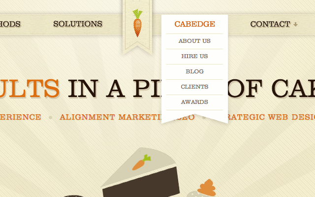
The Cabedge web design studio has a dropdown animation effect which fits brilliantly into the layout style. In the top ribbon you may hover over any of the links and generate a nice background hover effect. If you stay over the link for 1-2 seconds then a sub-menu will begin to animate and drop downwards. It’s a surprising effect when you are not expecting it! Both pleasing to the eye and useful for displaying extra content to visitors.
Parallax Background Scrolling
Parallax motion is very popular and much different from other styles in web design. Parallax sites often have changing background images to offer the appearance of 3-D motion. Meanwhile the static page elements rarely change and can even stay fixed to follow the user down while scrolling the page.
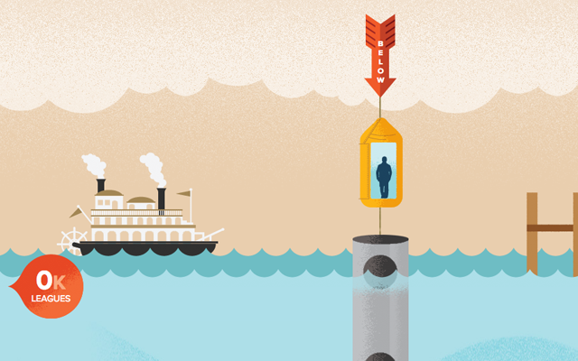
One infamous example is the Atlantis World’s Fair website design. As you move down the screen you will notice the main elevator shaft continues along with you. Then content appears to waver in and out of the various page segments. It is a nice use of faux motion because of how the layout is structured. Not every webpage is built for this type of parallax scrolling, but it does add a very nifty design feature.
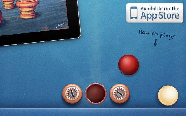
One other great example can be found on the iPad app website for the game Fingerbilliards. The background was designed so that it appears like some of the balls are fixed on the screen. And then as you scroll up and down the page, elements come into view like a static layout. I particularly enjoy their design because the motion effects are parodied in the game itself! This works great for marketing because users who find this page will also make the connection and possibly make a purchase for the mobile app.
It is crucial to find a balance between dynamic effects and useful interface functionality. Designing a website with purpose is what adds more credibility to your animations. Parallax scrolling is just one example to define how an entire website layout may be created around motion.
Webpage Transitions
Animated transition effects between content on your page is another purposeful use of dynamic motion. These effects may follow content blocks or sliding panels, but also tooltips or highlight effects switching between elements. This design trend is often used in website tours where you are guiding the user between different page elements.
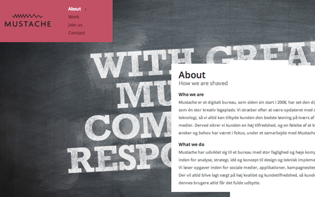
This very same type of example may be found on Mustache which uses similar page transitions when moving between content. This is a nice Ajax styled effect and does not require refreshing the whole webpage. Of course, users without JavaScript will be out of luck but any basic fallback method should work in its place.
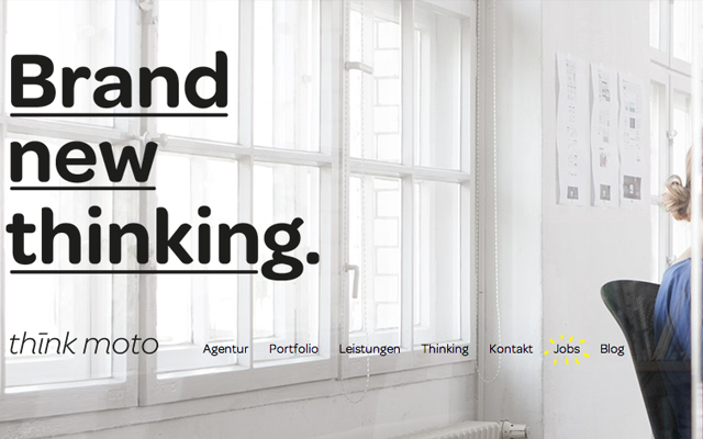
A different type of page transition may be seen on Think Moto which is a German digital design agency. Clicking between links in the menu will slide the entire page out of view to focus on a new set of data. This is important to understand because the navigation will stay fixed as you scroll. This allows users to move between entire page designs without losing access to other links in the menu.
Dynamic Input Forms
Another popular aspect of motion design can be found in webpage forms. More specifically signup forms and contact pages often use motion to signify advanced jQuery Ajax calls. This allows developers to pass frontend information into the backend code without refreshing the page. Consider the MediaFire registration page as one simple example.
But animation effects can also be used on the form elements themselves. Newer CSS3 properties such as box shadows and transitions allow developers to create frontend animation effects right within the browser. This also allows for hidden notification badges or basic form validation – such as e-mail addresses or matching passwords. The goal is to offer a sleek and helpful user interface without interrupting the user’s signup process.
One other really cool input animation effect can be seen in the WordPress Twenty Eleven theme demo. In the top right corner you’ll notice the search bar is much smaller than usual. However once you click the menu will expand open and update the background color to a darker shade of grey. Very purposeful to save space when not needed but also allows users to interact with the search bar dynamically.
Final Thoughts
I don’t want to encourage web designers to push for motion effects in every project. There are some design niches which simply do not require a whole lot of animation. But this isn’t to say that you shouldn’t try out new ideas, test the waters and see how your users respond. The beauty of web design is learning from common mistakes or finding happy coincidences by them.
I hope this article may provide some ideas for developers and user experience designers interested in website motion. Animated elements are quick to draw a user’s attention and may often provide some type of functionality into the layout. We have covered a lot of great ideas which should get you started on the right track. But if we have missed any topics or resources feel free to share with us in the post discussion area.
Related Topics
Top