CSS filters allow you to apply a wide variety of effects directly through the browser, eliminating the need for external image editing tools.
From blurring to color adjustments and adding shadows, they can enhance the look and feel of your photos and web elements, making them more engaging.
This article is a curated collection of CSS filter resources, including CSS filter libraries, JavaScript plugins, web-based apps, and tutorials.
You might also like these toolboxes: CSS Flexbox, CSS Animation, Styleguide Tools, or Tools for Formatting CSS.
CSS Filter Libraries
Collections of pre-designed libraries and classes that you can use to apply various CSS filter effects to photos or any web element.
colofilter.css
A library of CSS filters to recreate Instagram-like color overlays directly in your web designs.
Instagram.css
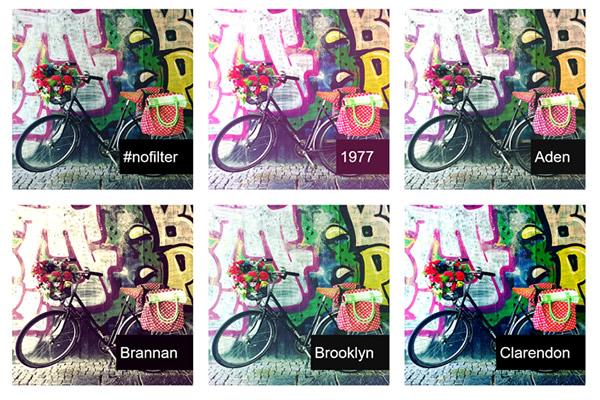
A library for adding Instagram filters with CSS classes, perfect for quick photo styling.

CSSCO Filters
A collection of CSS filters that mimic vintage film effects, ideal for adding a nostalgic touch to images.

CSSGram
A library that allows you to apply Instagram-like filters to images using CSS, enhancing visual storytelling.
CSS Filter JavaScript Plugins
These plugins will extend CSS filter capabilities, allowing for more dynamic and interactive effects through JavaScript integration.
tiltShift.js
A jQuery Plugin library for applying the tilt-shift effect to images, creating a miniature scene illusion.

Philter.js CSS
Offers customizable CSS filters and transitions for creating visually striking web elements and images.

Image Editor with CSS Filters & jQuery
Demonstrates practical applications of CSS filters, showcasing their potential in web design.
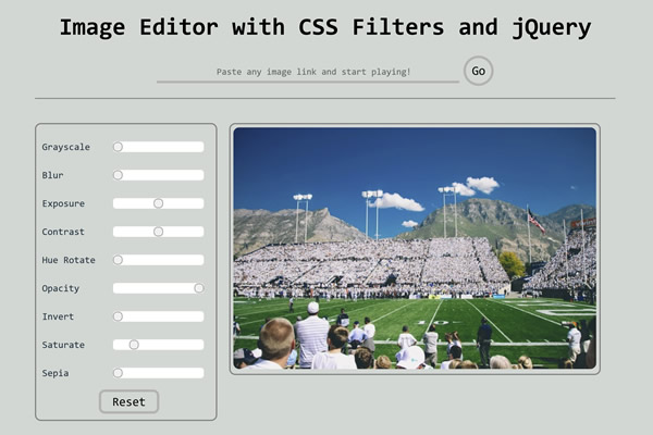
picBeautifier 3000 Javascript Library
A fun JavaScript library to apply various CSS filters to images, experimenting with visual effects.

CSS Image Filter Web-Based Apps
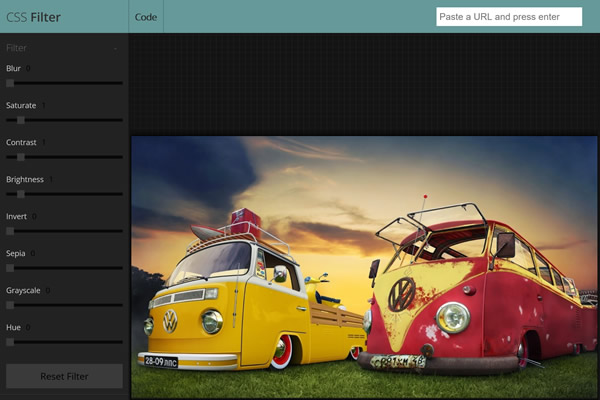
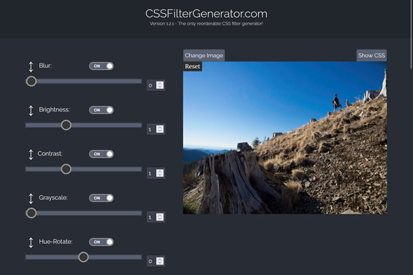
Web-based tools and applications where you can experiment with filter effects and generate CSS code in real-time.
CSS Filter Generator
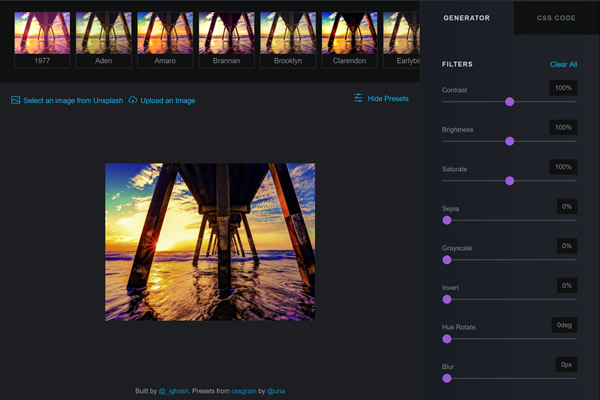
Simple web-based tool for generating and customizing CSS filter effects with live previews.
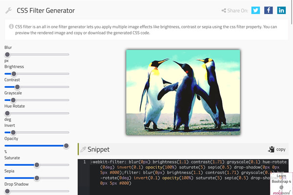
CSS Image Filter Generator
Simplifies the application of CSS filters, offering a straightforward UI for creating effects.
CSS Filter Tutorials & Guides
Educational resources, guides, and how-to articles focused on teaching you how to create and implement CSS filter effects manually.
- CSS filter on MDN
Detailed documentation on CSS filter usage and properties. - Filters on web.dev
Tutorials and best practices for using CSS filters effectively in web projects. - Filters & Blend Modes for Beginners
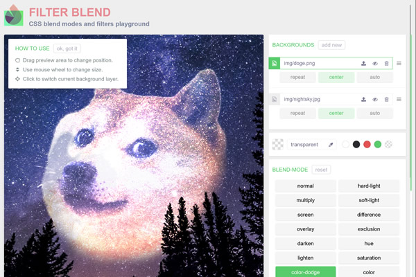
Beginner-friendly lessons on creating ‘magic’ with CSS filters and blend modes. - How To Add Filter Effects to Images
A tutorial from W3Schools for learning how to apply basic CSS image effects. - Complete Guide to Using CSS Filters with SVGs
Explore the integration of CSS filters with SVGs for advanced web design techniques.
The Simplest CSS Filter Tutorial
With just a few lines of HTML and CSS, you can quickly create a dynamic effect that changes a photo to black and white when you hover over it. This simple technique can add an engaging element to your web projects.
First, we need to set up the HTML structure. This will include just a basic container for our image. Replace your-image-url.jpg with the path to your image.
<!DOCTYPE html>
<html lang="en">
<head>
    <meta charset="UTF-8">
    <title>The Simplest CSS Filter Tutorial</title>
    <link rel="stylesheet" href="style.css">
</head>
<body>

<div class="image-container">
    <img src="your-image-url.jpg" alt="Example Image">
</div>
</body>
</html>
Next, the CSS to style the image and apply the grayscale() filter on hover. Create a style.css file and add the following CSS code:
.image-container img {
    width: 100%;
    transition: filter 0.5s ease;
}

.image-container img:hover {
    filter: grayscale(100%);
}
The CSS does two things:
- It ensures that the image fits within the container by setting its width to 100%.
- It adds a transition effect so that the change to grayscale happens smoothly over 0.5 seconds when the mouse hovers over the image.
List of all the CSS Filters
CSS filters offer a range of effects, from color adjustments to blurring and shading. Here's a closer look at each filter:
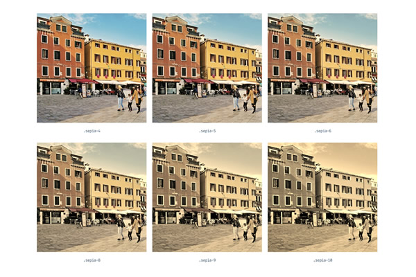
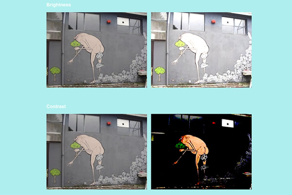
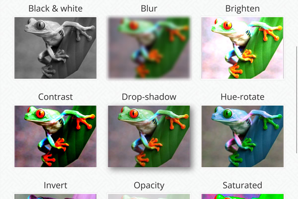
blur(): Adds a blur effect, simulating a lens out of focus. The intensity is adjustable in pixels.brightness(): Makes an image brighter or darker. Values over 100% increase brightness, while below 100% decrease it.contrast(): Enhances or reduces the difference between the darkest and lightest tones in an image.drop-shadow(): Applies a shadow behind an element, customizable in color, size, and direction.grayscale(): Converts an image to shades of gray, with 100% being completely gray.hue-rotate(): Rotates the hue of an image around the color wheel, measured in degrees.invert(): Inverts the colors of an image. 100% inversion swaps all colors for their opposites.opacity(): Adjusts the transparency of an element, with 0% being fully transparent.saturate(): Controls the intensity of colors, with values over 100% enhancing saturation.sepia(): Applies a sepia tone, making the image look like an old photograph.
Top
