In a creative profession like web design, inspiration plays a huge part in your daily work schedule. It’s not always easy to come across inspiration which is why I started collecting all of the little snippets of inspiration I could find with my new side project.
Whether you are a freelancer or part of a larger design team, getting a dose of inspiration in the morning is an excellent way to start your day. With inspiration in mind, I want to welcome you to a curated roundup of inspiring web design elements. Featuring everything from simple, animated SVG logo design to complex interactive storytelling, this page is sure to inspire – so take a look and tell us what you think!
Get A Kikk Out Of This Fun Interactive Hero Image Animation!
Kikk is a Belgian collective promoting digital art, creatives, and culture. Organizing and promoting projects that blend technology with art, it’s only natural that their website should be a work of art itself.
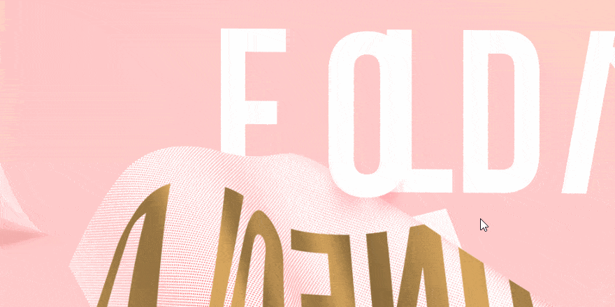
Playing with depth, movement, and texture, Kikk has created an interactive 3D landscape in lush pink and gold that responds to the movement of your cursor. Text reading ‘Fold / Unfold’ moves over, around & behind folded and bent sheets of paper. This design feature appears front-and-center on the page for their 2015 Kikk Festival.
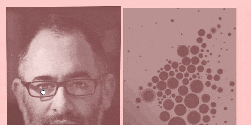
On the same page, images featuring the festival’s guest speakers are given a similar treatment, playing with depth and angles to create an Apple TV-style hover effect.
A Guided 3D Tour Through The Isle Of Hornøya
Home to over 70,000 migratory birds every summer, the small isle of Hornøya has been mocked up in extraordinary, interactive detail by Norwegian broadcasting company NRK. Hornøya, only around 40 hectares in size, houses thousands of birds along one of its cliff faces – with species including puffins, cormorants and seagulls.
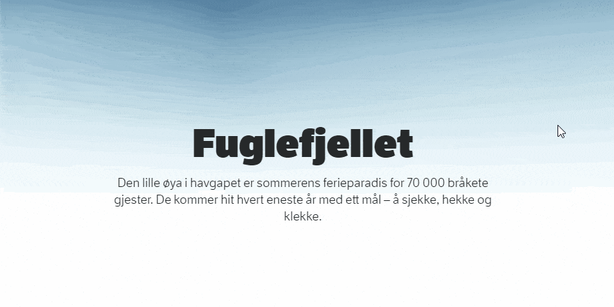
Inviting you to experience the Isle for yourself, you’re presented with a topographic mockup of the landscape, created using real satellite imagery and aerial photography. As you scroll, the screen spins around and zooms in on the main features – a lighthouse, the cliff faces – giving you the option to explore further. There’s even live-streaming footage from several nesting areas.
Printed By Somerset – Who Said Paper Was Dead?
If your company’s focus is on paper and printing, having a website isn’t really the ideal medium for you to express yourself in, is it? Unless, of course, you make your website out of paper!
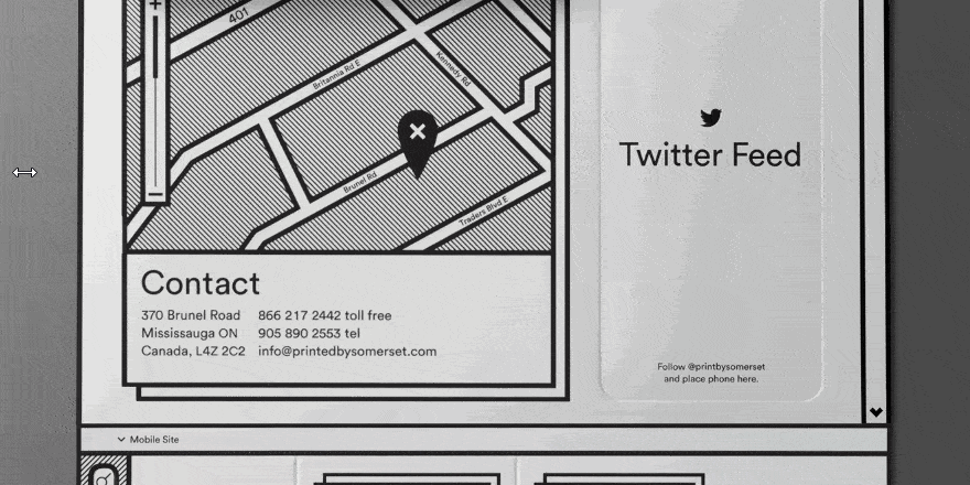
That’s the logic behind Printed By Somerset’s innovative site – it’s made with paper! The web version is an interactive rendering of a very real, physical piece of paper. The paper itself has a mobile site that tears away, a map that you can zoom in on by flipping up a patch of paper and even an advertisement for a particular type of textured paper, simply a blank square of that very paper glued onto the site.
Take A Look Behind The Scenes – Supple
Australian digital marketing agency Supple has developed an engaging, interactive landing page for one of their core services, SEO. It illustrates exactly how having good SEO and no SEO can have an impact on business. Overlaying examples of published websites on top of image sliders, you can take a look at the code that sits behind optimized and non-optimized websites respectively.
The difference could not be more apparent! Cluttered code lies behind non-optimised sites, leading to slow-loading speeds and poor browsing experience. Tidier, structured code sits behind optimized sites. Glowing information hotspots let you interact with these sliding images further, with extra details on how things like social markup can lead to better browsing experiences.
SVG animations and information hotspots are simple, effective design details which help deliver your message in an engaging way – something which we’re all trying to do with our own content, right?
B&O Play (Plays With Product Profiling)
B&O Play is a technology design company that specializes in producing a stunning range of headphones and speakers – a range that meshes functionality with fashion. So, if you’re selling products on how they look as much as what they can do, why not get right into the nitty-gritty details?
Synthesizing a fashion photo shoot with eCommerce product displays, the B&O Play site lets you scroll down a page of full-size photo portraits featuring a combination of cutting edge clothes, makeup and jewelry (all worn by attractive models, naturally). Only as you continue down the page do you zoom in on the particular B&O Play product featured in each portrait, with additional information in the form of text and video appearing for your benefit.
The line between technology, fashion, and wearable art is fast dissolving – and B&O Play’s product page is a remarkably engaging example of web design that’s recognizing this shift in the industry.
The (Ice)Cream Of The Crop – Effective Product Scrolling From Homer Hudson!
Be warned – this next design example will make you hungry! Homer Hudson is an American ice-cream maker who have found an inventive, interactive way to display their range of flavours. Anchoring you to the page with a central ice-cream tub, you can scroll horizontally through a wheel of colors and flavors. Each new color and label seamlessly slide over the static ice cream tub, eventually leading to a blank label reading ‘Coming Soon.’
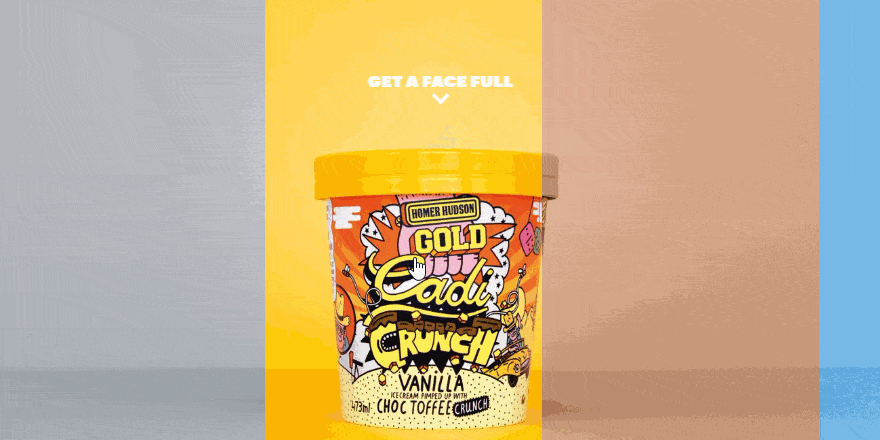
Depending on which label you’ve scrolled to on the page, you can click through to discover more information about each flavor. The ice-cream tubs themselves have incredibly fun, colorful labels – and this web design plays off this colourful-ness in an engaging, interactive way!
MarketingTool.io Know How To Market Their Tools – With SVG Logo & Smoke Effects!
Now, there are two levels to this next example. First thing’s first – MarketingTool.io hosts a bunch of marketing and social media tools. As such, they’re free to use and very helpful, so check their site out to improve your own site’s marketing and social media connectivity.
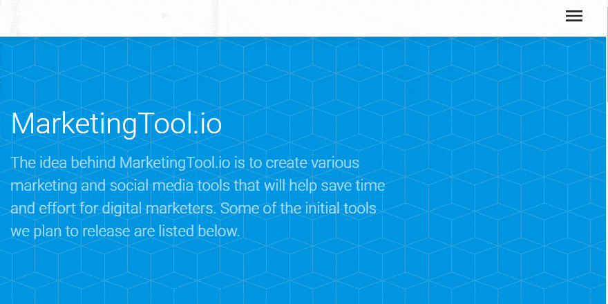
However, the site itself showcases two great examples of stunning web design. First up is a fun logo animated with SVG. Using a magnifying glass to signify how the site can help you with online and search engine visibility, along with spelling out ‘tool’ with a hammer, screwdriver, and a cog, it’s a dynamic logo that sums up exactly what MarketingTool.io does.
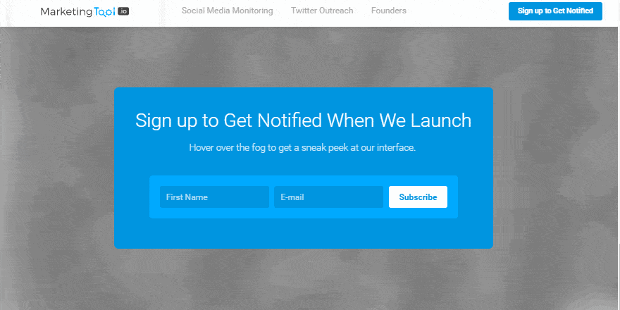
The site’s signup background also appears, at first, to be overlayed with smoke. Only when you run your cursor over the smoke does it dissipate to reveal statistics about shares, likes, and comments across various social media platforms – precisely the type of stats these marketing tools can help you boost!
Something a little exciting and different, it keeps you on the homepage that much longer – which is exactly what good web design should do!
Go With The Flow – The Drain Company’s Animated SVG Logo
A good logo shouldn’t just be recognizable – ideally, it should convey a sense of who your company is and what you do. That’s exactly why we’ve fallen in love with this unlikely animated SVG logo from The Drain Company, a service that provides specialist drain clearing and plumbing.
![]()
The animation starts with an apparently blocked cross-section of pipe – the water flowing in is much more than the water flowing out. But, as an inner lining is inserted and The Drain Company appears over the pipe in bold lettering, the flow is good as new! It’s a minimalist animation on a loop, succinctly capturing the company’s brand – a great example of really clever logo design.
Rain, Rain, Don’t Go Away – Because You Look Amazing!
Quechua’s range of Rain-Cut jackets are specially designed to offer maximum protection from the rain – in short, they’re a solution (rain-jackets) to a problem (rain). That seems like a very simple observation to make, but it serves a necessary reminder of marketing’s most basic rule; if you’re selling consumers a solution, it’s always good to remind them of the problem.
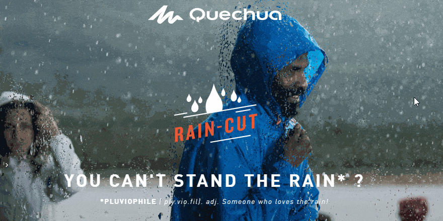
Well, Quechua’s Rain-Cut page certainly does a great job reminding you about rain. The homepage’s hero image features a fantastic animation overlay, which gives the impression of raindrops sliding down a window pane as you look out into a field of people using the Rain-Cut jacket.
The hero image also features an animated scroll down icon, encouraging you to keep on scrolling down the page.
Top Of The Klasse – Klasse Grafik’s Clever Design Features
It makes sense that the portfolio page for one of Germany’s leading design institutions is an example of great design. As you hover over links to class projects, the webpage splits down the middle, offering you a sneak peek.
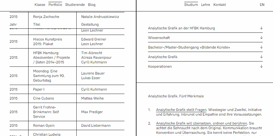
If you click through to a particular project, that slither extends out until the whole page becomes images and details about what you’ve clicked. It’s a highly unique take on web design, and something which caught us off-guard – leaving us engaged and keen to explore the page more.
And that’s been the design roundup for this month! Have any thoughts, comments or questions? Let us know what you think below!
Related Topics
Top