Whether you agree with them or not, design trends can teach us important lessons on what works and what doesn’t for users. They’re popular for a reason. The true value of a trend, however, lies in its longevity.
If you can identify trends that have the potential to last in the distant future, you will have a great advantage in making your own work successful — especially if you manage to pinpoint and isolate the core element in the trend that allowed for it to strongly resonate with users in the first place.
So take a look at these trends below, identify what makes them work, and consider incorporating their lessons into your next design.
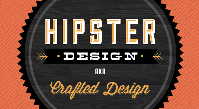
Hipster Design, aka Crafted Design
Hipsters have recently garnered a lot of attention in the world, and why is that? Is it because of their attention to detail on certain aspects of their fashion and lifestyle? Maybe it’s due to their notorious attitudes and passionate outlooks on life. One thing’s for sure: they’re hip and passionate in what they love and do — and it shows.
Lately, there has been a lot of hipster essence in design, and I’m not just talking about stylish arrows, distinguished typographic treatments, and bold color palettes. No, I’m referring to that special element of passion and craft that has been shining in the design world.
For every drop shadow, arrow, or pattern you see in a hipster design, you know that undoubtedly, some amount of time was poured into determining how much craft and personality that particular graphical element would add to the overall impression of the design. When a simple but humorous notification pops up in your favorite app, you know that some time was spent designing that interaction to evoke an intelligent, emotional response from you. There is an increasing amount of intentional crafting that goes into reaching you, the user, at a deeper and more personal level. This crafting, in turn, creates relationships and emotional impressions that are made to last.
Really, the lasting element of “hipster” design will be thoughtful, well-crafted, and meaningful interactions. The web is at a point where users are more than ready to appreciate and embrace the effort and meaning behind well-crafted design. Crafted design certainly creates a more visually pleasurable experience, but more importantly, it adds new intrinsic value to your project’s identity and core.
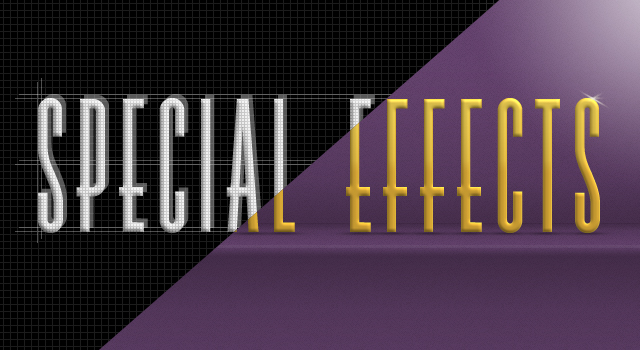
Special Effects
It’s becoming more and more frequent that I get tickled by a fun special effect or interaction. This can come from an unexpected animation of a button that actually presses down when I click it, or from a fun rolling of avatar bubbles in a graphical circle. But soon it’s not just going to be a pleasant surprise to experience these effects as a user, it is going to be commonplace, and expected.
There are two significant roadblocks that, up until recently, have prevented more complex interactions and visual effects from having more of a presence in design. One is current technology, and the other is the learning curve of user experience and interaction.
As to the first roadblock, there have been marvelous improvements to technology (such as HTML5, CSS3, innovative CMS systems, etc…), as well as progressive enhancement and graceful degredation methods to help support those who aren’t yet on board with these improved technologies. With the technology obstacle out of the way, designers are beginning to play more with the idea of introducing innovative special effects.
The second roadblock, the learning curve of user experience and interaction, has also been falling due to the increasing integration and reliance on complex applications and devices.
Users are being introduced to and trained in rich interactive experiences through the usage of diverse and innovative mobile and web applications; in turn, designers are becoming increasingly bold and creative in designing and enhancing the interactive experience.
As the barriers to special effects continue to fall, designers will push new trends in user experience and special effects. We’re already seeing more interactive and “touchable” buttons, sliding and fading visual elements, subtle glows and hover treatments, parallax experiences on scrolling sites, elements of augmented reality, reappearing sticky navigations, and the list goes on and on.
So long as you’re keeping your audience in mind and designing responsibly, now is the perfect time to use crafted special effects and interactions to bring an enhanced, rich experience to your users. After all, as these trends become more commonplace and technologies continue to improve, users will begin to expect less friction in their experiences.
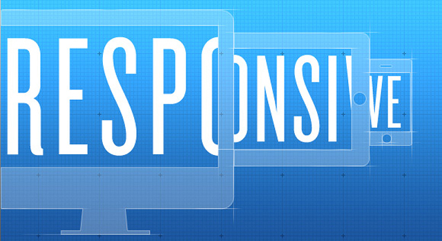
Responsive
The multi-screen experience is something that we can’t put off any longer. Designing for various browsing experiences is a necessity that we must address in our design.
The current resolution to this requirement is the use of responsive design to accommodate for different screens and devices. Through responsive design, web experiences can be tailored to various browsing experiences, thus maximizing the number of users who can easily enjoy a design interface.
There’s a world of potential for creativity and innovation that can be explored through responsive design. As a matter of fact, you can see this creativity being put to good use via responsive design techniques like media queries.
One of the best parts about responsive design is that the world recognizes its importance. Sure, your clients might not recognize the terminology of multi-screen experiences or responsive designs. They will, however, acknowledge the importance of reaching larger audiences by accommodating the various devices and platforms that users are accessing sites and apps from.
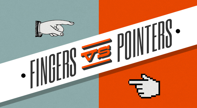
Fingers vs. Pointers
We are currently in a transitional period where screen interaction is moving from mouse point-and-click to finger swipe-and-tap. By 2016, over 1 billion people are estimated to have smartphones.
That’s almost 1 in 7 people accessing the Internet through their mobile devices! Many mobile companies have picked up on this point and are leading technology through their innovative and intuitive user interfaces and experiences. One classic example is Apple’s introduction of an intuitive reverse trackpad scroll (which they’ve even deemed in their settings as “natural” mode!) which mimics the same experience as that of a touch screen device.
Whether we label ourselves as web designers or mobile user interface gurus, we should constantly be mindful of the interaction between touch capabilities and traditional mouse usability.
Especially in creating mobile applications, we have a responsibility to educate and guide our users toward the most appropriate and intuitive interactions they should be making with their mobile devices. After all, mobile is a growing device platform that more users are familiarizing themselves with.
Other ways of staying ahead of the curve include the utilization of click-and-drag functionality on a website and the introduction of progressive enhancement features like gestures and keyboard functionality.
With both of these methods, we’re allowing the users to fall back on what they feel is natural to their user experience while at the same time softly training them to enhance their interaction and experience with newer applications and sites.
Less is More
With the wide disappearance of scroll bars, increased attempts at simplification (via the use of elements like modals and autofills), and continued popularity of minimalistic web layouts, there has definitely been a strong call for keeping a user’s experience as simple and refined as possible.
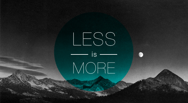
Usability and user experience are being more valued and prioritized so that users receive the most optimized yet compelling experiences available.
Popular design principles (of simplicity, honesty, and intuition) that many follow give increasing significance to the argument that “less is more.”
In addition, the efficiency and impact of simplification in design is being proven through the results of conversion, metrics, and marketing as well as through the success of popular products that pride themselves on honest and simple design.
Ultimately, while we shouldn’t get carried away with over-simplifying designs to a point of obscurity, we should always keep an observant eye to evaluating what is necessary to a design. When evaluating a design, consider what you can do to make its experience better.
Can that section of “reading more” content be augmented through a modal or some other multi-layered experience? Is that check out process you’ve wireframed as efficient and painless as possible for a customer?
Think about the main points of your design and augment these elements by reducing obstructions that can get in the way of an otherwise effective interaction.
Reducing the Footprint
For too long, the web environment has been plagued with relying on a traditional site map filled with a multitude of pages where often times a page will contain barely enough content to fill the screen.
Whether the movement towards pageless, long-scroll, microsites was brought on by trends like the previously mentioned, “Less is More” ethos, or the growing readjustment of the scrolling experience on touch devices, reducing the footprint on a website has been steadily gaining popularity.
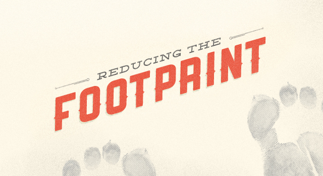
Site links and CTAs no longer point to other pages and instead go to internal anchor links within a scrolling site. Furthermore, the usage of layering a site, with unveiled hidden divs, overlayed modals, and sticky navs and CTAs has brought a level of dimensionality to the normally flat and traditional experience of a layout.
While reducing the footprint might not be for every site, it does propose the question of whether or not you’re dragging around unnecessary weight through superfluous pages that users would not be apt to clicking. So, check and see if this might be the case with your next design!
Covers
Due to the growing prevalence of rich user experiences, there has been a definite push towards finding that extra little something that tells a story, makes an experience, and creates a lasting impression. The recent trend of covers has been something that more apps, websites, and products are embracing.
Facebook timeline covers allow users to put their own unique representation into their personal profiles. Path places a cover at the top of your Path experience in order to enrich the visual sensations a user would experience with the application. Even phone companies are stepping up their game by taking time crafting creative and intuitive lock screen “covers” for their users.
Covers add an extra layer of “tangibility” to an otherwise digital and detached experience. As in the case of Facebook and Path, covers give users some foreshadowing into what they’re about to interact with and thus eases them into an experience.
Also, similar to the feeling that isomorphic correspondence creates for users, covers can offer a nostalgic and familiar feeling. The experience of a cover is very closely related to other natural interactions that we encounter, such as opening a book, looking at a dvd cover, or unwrapping some packaging.
By refining this trend and using it in our designs, we can create more emotional, connected experiences for users.
Drive the Future with Your Design
An understood but silent truth about trends is that they set standards, and that these evolving standards drive innovation.
As the core elements of design trends become commonplace and users begin to expect better experiences, new doors for innovation in both technology and design are opened.
In this sense, design has the potential to drive trends in user experience, technology, and everything in between. By identifying and building upon the core elements of whatever makes a trend so… trendy, you become a part of an ongoing cycle of innovation in user experience.
Related Topics
Top