Many graphics designers are moving towards the popular trend in mobile apps. You can design some incredible native applications and mobile web interfaces by working with well-deserved techniques. The best mobile experience should function as quickly and effortlessly as possible.

In this article I want to introduce some important elements for any mobile design. You’ll have to consider many situations involving user navigation and tap/touch controls. The smartphone market has exploded causing new trends to develop all over the mobile marketplace. But aside from some heavy competition, now is the perfect time to launch your own mobile idea online.
Streamlining Content
It’s arguable that your content is the only thing your visitors really care about. Whether this content is posted on a website, inside a game world, or featured in a photo gallery is irrelevant. All mobile devices are working with limited screen real estate and you need to use this to your advantage.
A good starting point is to always keep your font sizes large enough to easily read at a distance. It’s no fun to hold your phone mere inches away from your face just to read through a webpage. I still notice this all the time in smaller iOS apps. It’s not worthwhile to save the space with a smaller font – I’d honestly rather scroll down a longer page with much larger type.
You’ll also want to think about this content as a “stream” flowing along the page. Don’t try cramming too much into one section or your interface will appear cluttered. Generally a single-column system is best unless you’re building a specific page layout(ex: user settings, profiles, music lists, photo thumbnails…).
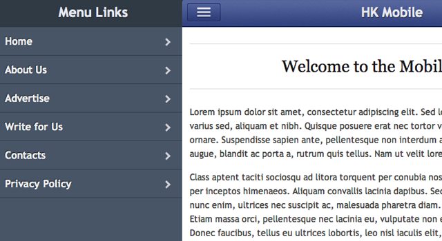
Although we could use many different phrases, the purpose of a navigation system is to move visitors onto their intended destinations. The problem is that not everybody knows your menu system or where they need to go. Make sure it’s easy getting back to your home screen so users aren’t lost within the details.

iPhone and some Android-based applications have adopted the bottom tab bar interface. I love this concept because you have access to 4 or 5 different webpage views from anywhere in the application. Unfortunately there aren’t as many options for HTML5/CSS3 webapps because of the limited browsers. But there are some unique tutorials involving Sencha Touch which help you build a very similar UI.
Consolidating Views
Websites like Twitter often have a settings page with 6 or 7 different sub-pages. You can choose to update your password, edit profile info, notifications, profile design, and many other options. In a web browser this is often acceptable but cannot translate well onto mobile.
Consolidate and combine any pages which you think could be together. Ultimately this will save your visitor’s time and patience looking through all the available options. Even if your website doesn’t have user interactivity there could still be related static pages combined together. You should use your best judgement and put yourself in the shoes of your visitors.
Make the browsing process super-simple between opening the app and finding exactly what you need. It looks nice to setup a hidden side navigation menu which you can show/hide by the tap of a button. The animation in that tutorial is created using jQuery – but there are similar libraries in Java and Objective-C.
Creating a Brand
Whether you’re building native smartphone applications or coding mobile websites, both design styles leave room for branding. You should consider which colors and textures will best represent your product. You’ll often include a logo towards the top of the page which catches people’s attention right way.
If you code a fixed top navigation bar you should include a logo somewhere in the middle. This is a typical convention with iOS apps, and it can be accomplished with HTML5/CSS3 as well. When I launch something like Instagram or Gowalla it’s easy to recognize the branding just by their title bar. I like to think this this top bar replaces the browser window <title> element.
But there are so many other situations where you can setup branding opportunities. At the very bottom of each view in the footer area you should have some extra room for logos or small icons. You can link to a parent company website, or give credit to the designers/developers of your application. It’s all about making yourself known without getting in the way of important content.
Account Authentication
I’m sure most web developers have at least heard about OAuth direct connect. This is the protocol used to connect 3rd party apps with your main social networking profiles. Any popular website with an API usually allows OAuth – Twitter, Facebook, Instagram, and Foursquare are some well-known examples.

Not all mobile applications will work with this type of dynamic content. But it’s hard to ignore that users love interacting with a website or native mobile app. If you have the ideas for social networking features why hold back? You can quickly start building a userbase if you work with open APIs instead of building your own custom register/login process.
Users are more likely to connect an already existing account rather than register with another service. The process is much slower on a mobile screen and it’s a struggle to work with mini-forms. But OAuth is a brilliant system for a clean and secure account connection.
Translating a Full Website
One of the biggest challenges is translating a full website design into a mobile version. You have to consider how you’ll rework the navigation and where all this content will fit! It’s a difficult job, but definitely nothing impossible.
You should first realize that mobile websites often do not contain all the same information as the desktop counterpart. There simply isn’t enough time for visitors to read through all your graphics and website tours. Keep the process very basic – I like to start user interfaces sketches with just a pencil and some paper.
Get a few ideas of how your top toolbar will look. Should you use jQuery for a sub-menu navigation? Or should you add those links only when viewing a parent page? These questions do not have a universal answer because they differ with each project. But you’ll only come to a sound conclusion by planning first and then taking action.
Final Thoughts
You won’t be able to jump right into mobile design and start creating web apps on your first day. The skillset will take weeks of practice, and you will develop this knowledge over time. I hope this article can offer some initial ideas which are crucial for any mobile experience. If you have any similar thoughts or suggestions feel free to share in the post discussion area below.
Related Topics
Top