Product design is a team sport. The best teams tend to have lots of moving parts: designers and developers and managers and researchers all working in concert on a single, refined vision.
All those moving pieces come with a cost, though, in the form of meetings, emails, and file versioning—all things we do in order to stay on the same page.
One such practice on the design side that’s proven itself time and time again is the style guide, a collection of agreed-upon brand decisions (like colors, typefaces, brand imagery, etc).
A style guide is what allows everyone to use the right color blue, every single time. A style guide is what allows a developer to crank out a simple page without having to loop in a designer. In short, a style guide is what keeps your brand looking good.
Craft Styles by InVision Labs
Recently the folks at InVision Labs launched Craft (check out our post here), a collection of free tools for the design workflow of the future. It lets you design layouts with ease and design with real data. And the latest update brought a new tool, Styles, that lets you create a living style guide with a single click.
Like everything in life, I think the awesomeness here can best be explained with GIFs. Styles can automate a bunch of tricky design tasks, all of which used to require major manual labor.
Let’s take a look at the greatest hits…
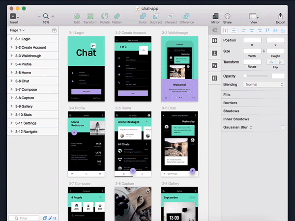
A Living Style Guide
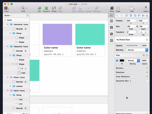
Styles is able to create a living style guide from your .Sketch document in just a single click.
Skeptical? There’s a GIF for that:
The tool is able to sniff out every single color, font, and type style in use throughout your document.
And the living part? It’s just as easy to update your style guide as it was to create the first time around. Simply make a change in your document, click the “Sync Styles” button, and your style guide will fall in line.
Let’s take a quick look at how the Styles panel works, which is located in the Craft toolbar along the right side of the Sketch interface.
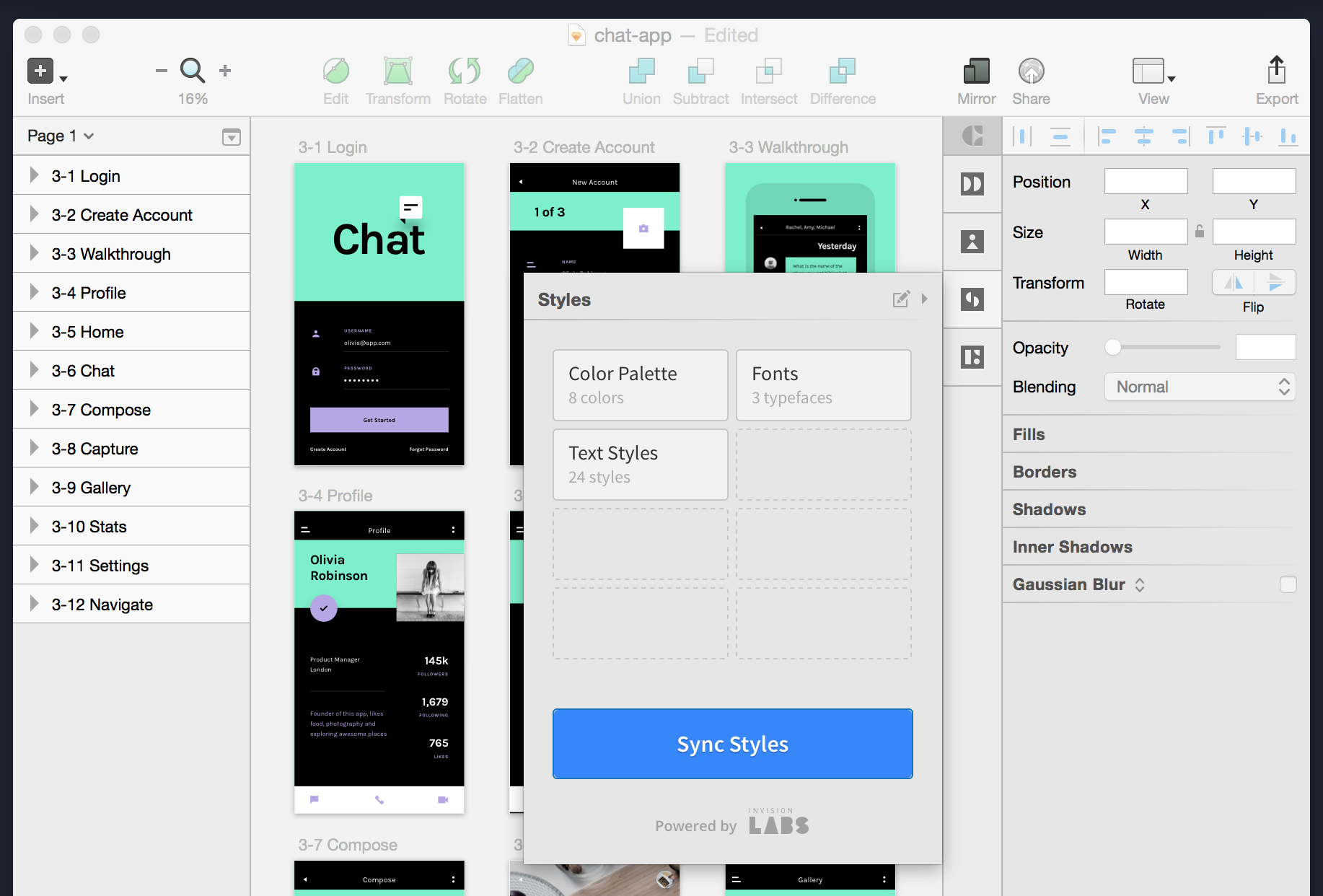
Styles comes ready to track 3 things automatically: your color palette, your fonts in use, and your text styles (things like size, weight, color, etc.).
Clicking that blue “Sync Styles” button is what triggers the magic. Every time you make a change you want to show in your style guide, simply click that button. Change orange to red? Sync and your style guide will show it.
See those dotted lines, the slots ready to be filled? Those are for custom symbol groups, allowing you to manually select which elements you’d like tracked in the guide.
Symbols are perfect for little chunks of repeated design: icons, cards, modules, headers, etc. If you’re going to use it again and again, you’ll want it to be a symbol. Oh, yeah—and I have a GIF for you:
In the above demo, we’re grabbing a bunch of custom icons and adding them to a symbol group called “icons.”
Creating these custom groups is a great way to present an organized list of components across your design. Through the power of Symbols, all these elements stay in sync wherever you use them and update whenever you feel like making changes. Speaking of changes…
Making Sweeping Changes
There’s not a design task more tedious than changing the color of specific buttons across 19 PSDs. Head? Meet desk.
Styles makes executing a sweeping set of changes about as easy as it’s gonna get. The style guide even syncs in both directions (meaning you can make changes in your design or in your style guide, then apply them file-wide).
Let’s take that original example of making a sweeping color change, for when your boss decides he wants the purple to “be more purplier.”
Let’s unwrap the GIF above. The entire file is designed with a light purple color, which shows up in the style guide generated by Styles. Instead of changing each item using the color manually (woof), we hop into the style guide and make the change there.
With the new purple in place, a simple “Sync Styles” is all it takes to apply the new swatch file-wide. The boss changes his mind later? Swapping it back will be just as easy.
This example shows a simple color change, but it works the exact same way with everything else inside the style guide. Rounded button needs hard corners? Sync! Your headline font looks better condensed? Sync!
Finding (and Fixing) Inconsistencies in Your Design
One of the great things about letting a plugin generate your style guide is you can rest assured it’s not going to miss anything. And that includes those 4 different shades of green you thought were identical.
Even the best designers can sometimes make mistakes (shocking, I know). With a generated style guide, finding and fixing them is a snap.
Like the example above, we’re going to keep it simple, fixing an accidentally duplicated color (it was just a few shades off). Also, like the example above, this works with anything in your style guide: fonts, text styles, symbols—anything!
After noticing two similar swatches in the palette, I simply selected the second green and used the eyedropper to match it to the original green (the correct one). After clicking “Sync Styles,” the offending green disappears because it’s no longer used in the document (yep, Styles is smart enough to match exact duplicates and combine them).
An automated style guide will catch things that your eyes won’t. Find four text styles that are identical in every way except line-spacing? Change them to match, click “Sync Styles,” and watch inconsistency fly right out the window.
A Better Handoff
No matter how much prep work you do, the handoff from design to development is a complex process. Traditionally we try to ease the handoff with notes, build documents, and, yes, style guides (all created manually!).
If you’ve never developed a front-end, you might not know how manual that process can be. It’s almost like translating a design file into written word: look at the design file, investigate the attributes, transcribe what you see into CSS (or whatever build language floats your boat).
Another thing developers do? Avoid duplicate code. Just like we use Sketch’s symbols and styles to keep things in sync, developers code flexible and extendable modules, because no one likes doing the same thing over and over.
With Styles, you can easily highlight and organize your design’s most-used patterns. It’s like an inventory of reusable bits your developer’s going to need to code.
Once you’ve got a slew of interface symbols added to the style guide, not only will your document be more organized for handoff, you’ll be ready to make any last minute changes at scale (you know, because of the living style guide thing, at the risk of sounding like a broken record).
It’s Dangerous To Go Alone! Take This
A style guide is the secret weapon of a well-oiled brand (and the team that creates and maintains said brand). It keeps your entire team, even outsiders, on the same page with a simple set of rules and common elements.
As design systems grow larger than ever, keeping track of decisions and changes is becoming a real challenge. Like lots of things in the modern product era, it sure is nice to have a plugin handle the heavy lifting for me.
To give Craft a try, simply head over to the InVision Labs site to download. It’s free, it’s fast, and it’s evolving.
Related Topics
Top