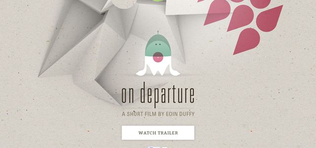
Breathing life into digital design can be a tough call. A flat surface will always command less attention compared to the one that creates a 3D-feel. Adding depth to a flat page is a way to combat this. It creates a sense of realism and immediately adds interest.
It’s also a helpful technique to emphasize particular elements within the page, such as interfaces or headlines, and helps create a hierarchy within the design. A lot of designers have produced unusual and creative ways to add depth, here is a look at some of these excellent examples plus some tips on how to add creative depth to your web designs:
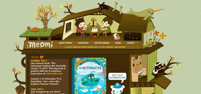
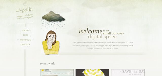
Introduce a sense of perspective to boost realism, as can be seen in these cartoon-like designs.

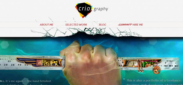
Creating real looking interfaces and elements will make your design much easier to interact with. What’s more, in doing so you’ll increase the success of your call to action. As seen in the two examples below.


Layering your elements and playing with translucency is a brilliant way to add creative depth and interest, as can be seen in the two examples below, which uses the technique to create an unusual top-down perspective.

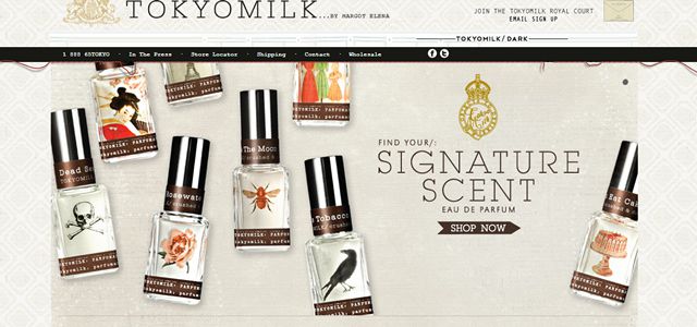
A wraparound is another technique to try. Check out the red ribbon and red thread seen in the examples below. It extends the real estate of the pages by giving the illusion of continuing behind it. It’s also an excellent way to accent a particular element on the page. You can use ribbons and threads for anything; dates, headlines, logos or featured items.

Just like you learnt back in your high school art class, creating a sense of depth-perspective follows a fairly basic set of rules. You need to follow consistent angles. You need to keep your horizontal alignment consistent. Keep tabs on your use of proportion and any changes across the horizontal space; check out these two creative classic examples.


Add a drop shadow to a non-uniform grid layout to enhance the effect even further.

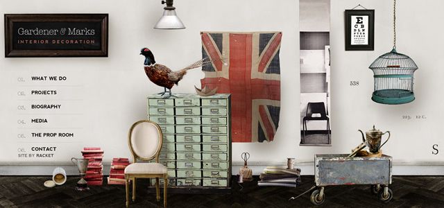
By breaking your grid layout you can instantly add depth. Simply overlap a few elements on the page and depth, and a sense of order is created. It also stops the design from appearing too predictable.

Despite the flat elements of this design, the simple ribbon banner adds texture and depth.

Here is an example that uses all flat elements and sections, yet has still managed to create depth. It achieves this by overlapping the elements within the background across the entire design. By not employing this layering technique on the interfaces they are given excellent emphasis in contrast.
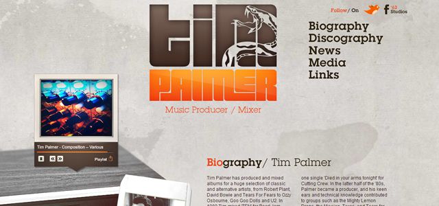
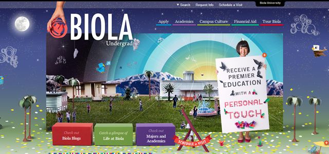
Using cut-out photography is a good technique to try. The application of drop shadows enhance the sense of realism and introduce a 3D quality, whether you’re using a lifelike element, as seen below, or a flat design feature.
Creative depth is achieved by the use of scenarios and stories, the 3D look is simple to achieve by taking offline design tactics and placing them online, for example symmetry and the use of prospective. If you are looking to create a unique web design think about what creative stories you can invent to add depth in web design.
Related Topics
Top