The internet has changed a lot over the last few years, and so has the way we view things online.
As such, in this article, we will be taking a look at some of the recent accessibility improvements that Flat Design has brought and helped make the internet that little bit more open and accessible to everyone.
Flat Elements
Skeuomorphs are used to emulate colors, textures, shapes, and even features of actual objects in real life, and thus can be really helpful for those who are not used to new technologies and prefer simulations of their environment.
However, how accurate will it be for people with visual disabilities? Will it really be worth the effort to keep designing this way for them? Well, the counterpart of this option, flat design, has a lot of advantages that can help those with special needs.
As flat elements make use of basic shapes such as regular/irregular polygons, they are more recognizable.
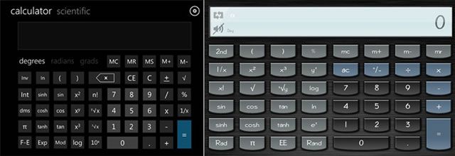
In the image above, the comparison of both flat and skeuomorphic calculators shows the difference between both techniques. Flat design gives less importance to the button itself and enhances the content (in this case, numbers and mathematical functions).
On the other hand, skeuomorphic design makes buttons stand out by giving importance to their details, and as such, content may be lost due to low contrast.
The above example shows how flat design (complemented with certain other items that we shall discuss later) improves and gives more importance to content and can prove useful for the visually impaired readers.
Huge Typography & Simple Icons
Not just in flat design, but in minimalism as well, huge typography has been taking the lead. Fonts can help put the focus on content and, as a result, are one of the most important components of the design process.
The current trends in design include the usage of huge typography with high contrast. Clear font faces and balanced paragraphs – basically, bringing printed typography basics to the web.
These principles have improved legibility and readability, scoring another point on the accessibility scale. After all, it is a well-known fact that a higher contrast with clear font faces can improve accessibility features.
Moreover, clear and big typography can be used inside basic elements to create web and UI buttons with strong contrast in order to help users easily identify the functionality of a given element and differentiate it from the others.
Speaking of elements, such flat elements have become really important in the design process as they help in giving personality and strength to the flat design stream, thereby contributing towards a better appearance, visibility, and clearness of all the buttons and interface elements.
Solid & High Contrast Color
So far, we have talked about high-contrast colors when applying typography and icons to basic elements. Now, let us get into detailed aspects of the same.
The usage of high-contrast colors in web design is not a new concept. In fact, for many years, high-contrast colors have been used to lend better visibility to certain key elements of web design.
The internet has many amazing tutorials and tools to help you create accurate combinations of colors.
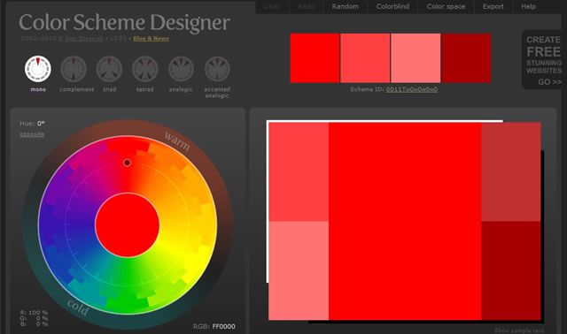
For example, Color Scheme Designer shows you palettes of single, complementary, triads, tetrads, and analogic colors and helps you get a better idea about how certain colors interact with some others.
Also, contrast may be applied to some other aspects different from colors themselves, such as shapes, distributions, font weights, heights, strokes, and textures.
In fact, playing with all these elements and their corresponding contrast can improve the appearance of your design and also help you make the design more accessible for people with reduced vision.
Related Topics
Top