There are many arguments for and against flat design, so in this article I wanted to take a quick look at how flat design can actually affect your bottom line. When it comes to arguments, nothing speaks louder than actual dollars.
I examine three case studies where flat design has increased conversion rates (and in some cases sales!) and how you can apply these to your next project.
Read to the end to get my free bonus resource: “25 conversion rate best practices to test in your next design.”
Minimalism Increases Conversions by 261%
Let’s take look at our first case study and see how minimalism can increase conversions.
Underwater Audio redesigned their website with a flat layout. They A/B tested a more complex version of their homepage against a stripped-back minimal version.
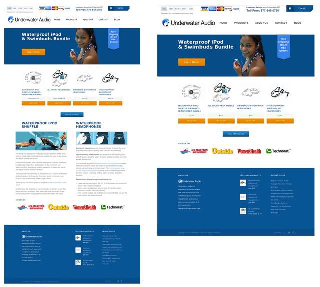
They made the design much simpler by removing some product information and images. They also removed social proof, something that is often thought to increase conversions, but in this instance, it did not.
The simpler version had a conversion rate increase of 261% or 3.6x. Customers liked the minimal approach more.
Content-First & Mobile-First
When approaching a design with a content-first approach, eg starting with all the copywriting before even thinking about sketching a wireframe. A few things happen.
Firstly you end up with a content inventory which helps you visualize the page hierarchically before getting bogged down with too many layout options. Secondly it helps you refine the content and copy into something concise.
By reducing your unique value proposition to it’s simplest form you make the user experience of the page much better. When it is clear what people are looking for and what they should do next, they enjoy the experience.
The user should be able to tell within a split second why they are on the page and how they can actually benefit. Benefit, not your features, it’s the benefits that sell.
Mobile-first design takes into account the huge number of people surfing the web from mobile devices. The website or app is optimized for the smallest screen first and then feature-enriched as the devices get larger and connections get faster.
Because good developers care about performance they care about what actually makes it onto the page. Resulting in the content again being streamlined and considered in much more depth.
As you can see the two go hand in hand and result in fast loading, concise, well thought out content that speaks to the users needs and wants.
Content-first and mobile-first says ‘We give a shit.’ Flat design says ‘How we give a shit.’
Elements are bigger, simpler, type is generally larger and padding and margins increase. On touch devices this means bigger touch points, easier navigation and, of course, an improved user experience.
The decision to strip back and simplify at every point, from content, coding, and designing, has a cascading effect of clarity and focus on the overall brand communication.
And remember the best converting pages have only one focus per page.
A Flat Button Increases Conversions by 35.81%
Many marketers argue that designers should use buttons with drop-shadows and gradients, so that they stand out more, especially when it comes to primary calls to action.
Sounds logical, what I’ve seen and what this next case study shows is that button design comes down to contrast, not shadows and gradients!
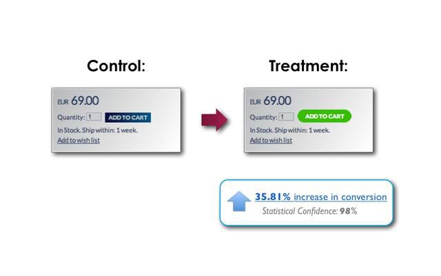
In this instance they were able to increase not only click-throughs, but sales by 35.81%, by simply changing to a flat designed button.
No gradient or text shadow. Simple flat design, with CONTRASTING white text and a simple border radius.
Another win for flat design.
Bad Flat Design Can Reduce Discoverability
However it’s not all good news for flat design.
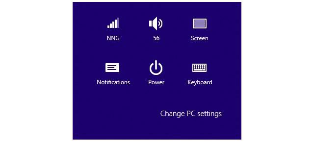
The Windows 8 Metro style UI is a classic example of flat design gone wrong. With no clear separation of elements including clickable area’s or inputs, it is hard to know what to click. Even though the new look is more aesthetically pleasing it falls short because there is still a need to make objects look actionable; if not through details like shadows then in other ways.
The Nielson Norman Group conducted a study with 12 experienced PC users who struggled not only with the two environments the new OS offers (touch and classic, who wants to learn an interface twice!) but with knowing and clearly seeing where to click and interact.
The ‘Change PC settings’ is actually a button here… dodgy.
However given the right approach, even this level of minimalism can still be functional if usability is taken into account (sorry Microsoft). Take for example the beautifully crafted Take Your Pulse website below.
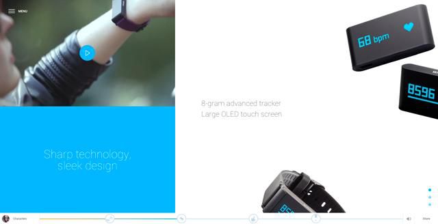
Even though many areas are not clearly defined as buttons or inputs, because of the subtle animations, the buttons still make themselves known and usable while the design speaks for itself.
Readability Increases Task Completion
Flat design has a focus on legibility and creating truly great reading experiences (yes I’m thinking of Medium.com too!). With so many elements stripped away you are often just left with the copy.
A study by MIT showed that when faced with cognitive tasks users that are shown easy to read typefaces performed much better than users that were shown hard to read ones.
In the first half, the testers were given the candle problem, and in the second half, they were given the remote associates test.
During the candle problem, 4 of the participants in the easy to read typography group successfully completed the test, while 0 participants in the hard to read typography group completed the task.
In the remote associates task, participants in the easy to read typography group completed 52% of the task at an average speed of 6395 ms, and the participants in the hard to read typography group completed 48% of the task at 6715 ms.
Here we can see readability and clarity, a core focus of flat design, improves UX and enables users to complete tasks easier and quicker.
Why Great Flat Design Is Hard
People like intuitive interfaces. Skeuomorphic design aims to be explicitly intuitive by relating tasks and representation to real world objects.
Raskin (1994) says designs are intuitive when they feel familiar. Intuition therefore comes from past experiences that we can draw on easily, reducing the learnability of an interface. Skeuomorphic designs aim to harness these familiarities to improve the user experience, so that the patterns you learned in the real world are mirrored in the interface.
However the real and digital world are not one and the same. A folder for instance on a computer can hold infinite numbers of files, have nested folders and all sorts of complicated intricacies, while the real world version cannot. Therefore this intuition can only be taken so far.
Spool (2005) says that intuition comes from bridging the gap between the users current knowledge and required knowledge of the system for effective use. He refers to this gap as a ‘Knowledge Gap.’
Flat design is new, and still developing it’s design patterns. This means that it is intrinsically harder than skeuomorphic design to get right.
However when we combine existing design patterns with flat design, taking into account what we know about content-first, mobile-first, typography and contrast, and ensuring that our minimalist approach does not remove elements and details necessary to maintain Spool’s knowledge gap, the result can be wildly successful designs.
Conclusion
Flat design is no trend, it’s here to stay, but only when paired with content and mobile-first approaches that present information in intuitive and familiar ways.
When our designs are flat, simple and content focused with good reading experiences, we can dramatically increase the likelihood of users completing desired tasks per page or view.
Users complete tasks, conversions go up and more often than not that means more revenue as well.
Related Topics
Top