Part of my education as a graphic designer was learning about the field’s history. Before, I thought history classes were stuffy and dull. Not this class. I was floored by the bold approaches and radical experiments I saw in this “old” work.
I wrote Graphic Icons: Visionaries Who Shaped Modern Graphic Design to highlight the pioneers, like John Maeda, Cipe Pineles and Milton Glaser. Each one offers lessons for today’s creatives, and provides inspiration for new ways to innovate.
As part of our series profiling some of these icons, here is the second: Wim Crouwel.
Icons of Graphic Design: Wim Crouwel
The Netherlands is a small country, but it’s had a big impact on design. Wim Crouwel‘s typographic work is a good example of Dutch design at its best: clean and functional, like the work of his forefather Theo van Doesburg—yet progressive and surprising.
In the 1960s, Dutch graphic designers usually worked solo, and companies with large projects hired firms outside the country. In order to attract those large projects, Crouwel and four partners, with a range of experience in graphic and industrial design, formed Total Design.
It was the country’s first multidisciplinary studio, where teams handled complex two- and three-dimensional projects. Private corporations, government agencies, and arts organizations hired Total, and their designs for postage stamps, airport signage, and museum posters made a distinct mark on the country’s visual culture.
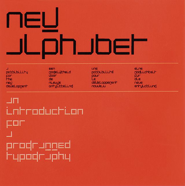
1967s New Alphabet Typeface.
Crouwel had an uncanny sense of how computers would influence design and vice versa, and he created a groundbreaking typeface to work with this emerging technology. At the time, dot-matrix printers and computer screens couldn’t reproduce traditional type with curved letterforms.
Starting with the Swiss typographic grid, Crouwel based letters on the rectangle, using only vertical, horizontal, and diagonal lines.
The result was 1967’s New Alphabet, so radical in appearance that it was almost abstract. It was never meant to be used; it was just an experiment. Crouwel must have been surprised to see the New Alphabet used on the cover that Peter Saville designed for New Order’s Substance album 20 years later.
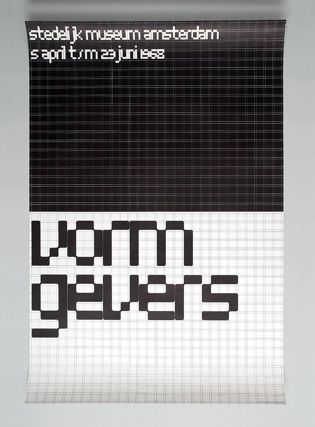
Vormgevers poster, 1968, for the Stedelijk Museum.
Still, that concept influenced his future work, like his poster for Vormgevers (Designers), for which he hand-rendered the lettering based on squares in a visible grid.
Crouwel developed a system for Amsterdam’s Stedelijk Museum where each piece—posters, brochures, advertisements—used the same grid. Although these pieces promoted art exhibits, they never depicted the art itself.
The type-centric design and common grid unified the museum’s communications, yet the system was flexible enough to remain fresh and interesting.
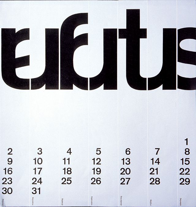
Wim Crouwel Calendar, 1964.
Hans Rudi Erdt, A. M. Cassandre, and especially Josef Müller-Brockmann are big influences on Crouwel’s work, and in turn, Crouwel remains a prevalent figure in the design world—, he was celebrated with a retrospective at London’s Design Museum.
Crouwel inspires young designers, including Philippe Apeloig and Spin, who created a series of posters based on the grid he developed for the Stedelijk Museum.
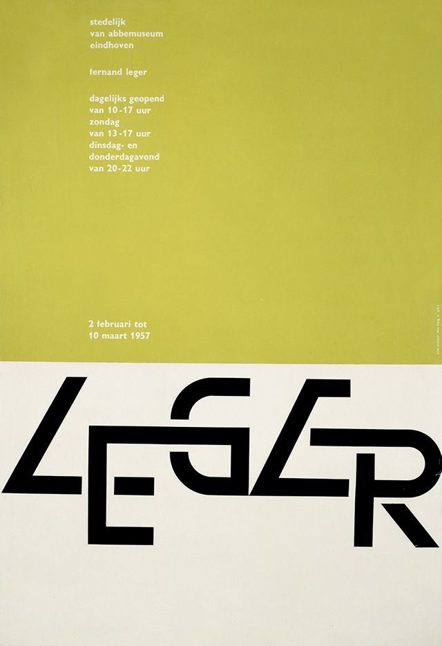
Wim Crouwel Leger Poster, 1957.
Interview
A short interview with Wim Crouwel at the Design Museum.
Top