There is a huge opportunity to make a sizeable income when you enter the B2B market. In fact, did you know that B2B companies generate more than double the revenue than that of B2C companies every year? Specifically, you’re looking at about $559 billion in B2B sales as opposed to $252 billion for B2C. While neither number is one to scoff at, it’s clear that businesses come ready to spend more.
That said, with more money to spend comes a greater level of expectation you have to contend with when you deal with a business customer. B2B leads require considerably more warming up before you can give them a sales pitch without turning them off.
In The Digital Evolution in B2B Marketing, it is reported that B2B buyers are 57% of the way through the decision-making process before they ever speak to anyone about a potential purchase. This means your site needs to be primed and pumped to sell them on your business.
But how do you do this with such a well-educated and oftentimes difficult-to-please target audience? A/B testing is one such inbound marketing tactic that will help you make significant improvements to your website that, in turn, lead to an increase in B2B sales. Specifically, with this type of audience, you should be targeting the call-to-action (or CTA) in your A/B tests.
What Is A/B Testing and How Does It Help B2B Sales?
Forward-thinking companies recognize that what makes their clients tick isn’t too hard to determine so long as they have hard data to back it up. Google Analytics is a good place to start, but it won’t tell you what exact changes are needed to your CTA’s design, wording, color, or placement in order to improve visitor reception.
This is why we have A/B testing.
For those of you new to this type of data collection and UX research, A/B testing is split testing for the web.
There is always a Version A, which will serve as the control for your “experiment”. This is the original version of your CTA. This needs to be in place since you already have a firm understanding of how it performs with your audience and it provides a fair comparison against any new design you test.
Then there is a Version B (and sometimes a Version C, D, and so on), which will serve as the test variable in the experiment. This is an alteration of your CTA. In order to effectively test your hypothesis as to what was wrong with the original design (if anything), you should only change one variable.
Once that’s set, you’ll run the test on your website, choosing what percentage of visitors will see each version of the site. After the experiment has run its course, you’ll review the results to see which version of the CTA performed better; in other words, which one received more engagement and lead to more conversions. You can then “push” the winning design to your site and monitor for the new and improved conversion rate and an increase in B2B sales.
5 CTA A/B Testing Ideas to Increase Your Website’s B2B Sales
If you’re liking the sound of this, but aren’t sure where to start with determining the variables, it’s always best to look at what’s worked in the past. Data should always play a major role in every decision you make for your business, but that doesn’t always mean it has to be your data.
Marketers and businesses have been very vocal about the power of A/B testing, especially testing done on CTAs since they’re typically the direct gateway to a boost in sales conversions. So, let’s take a look at previous A/B tests that have been run to see if we can drum up inspiration for your own tests:
Friendbuy’s Total Redesign
The team at Friendbuy created a short invitation on their homepage that invited users to test out a free product demo. While the promotional CTA did receive some engagement (at a rate of 1.44%), they suspected that wasn’t good enough.
Here is what the original CTA looked like:
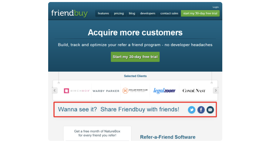
Because of the design best practices they had initially followed in terms of placement and knowing why visitors went to the page in the first place, Friendbuy surmised that a total redesign was in order.
In their A/B test, they created two completely new versions. Both gave the CTA a clearer button design and less ambiguity over what the message meant:
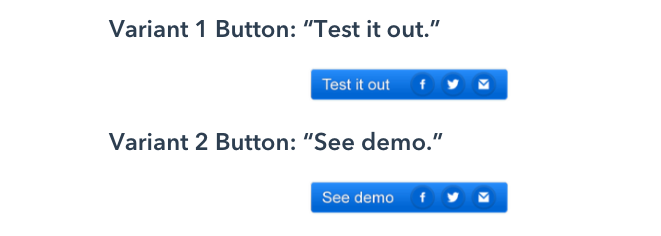
By cutting out the ambiguity and designing a button that was meant to get attention, they found that both new design options significantly outperformed the original. Version A “Test it out” resulted in a 2.47% click-through rate, whereas Version B “See demo” ended up with 4.49%.
Empire Flippers’ Revamped Text
VWO reported a case of where a simple change of wording in a CTA lead to a drastic improvement in conversions. Here’s what happened when Empire Flippers, a website flipping service, tested their CTA’s wording.
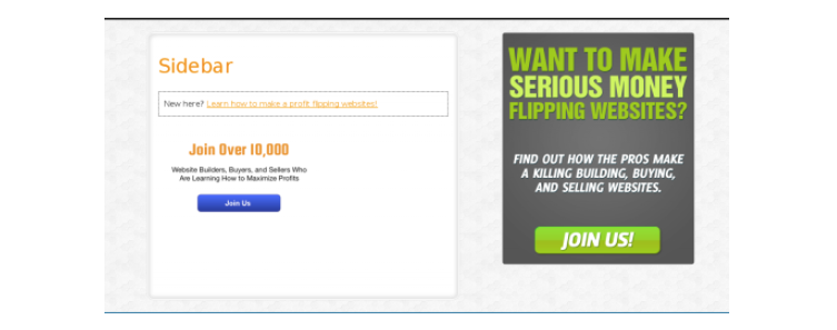
In the original version of the right-aligned CTA, Empire Flippers called on website-flipping entrepreneurs to “Join Us!” That instance of the CTA had a 2.88% conversion rate.
In the “B” variation, Empire Flippers swapped out that message for “Make Money Flipping Websites”.
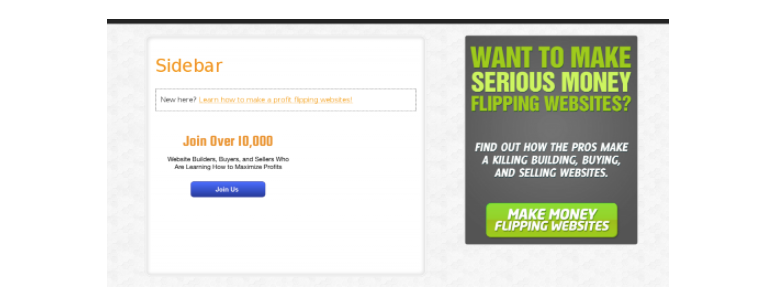
As a result of that change in wording, their conversion rate went up to 3.84%. Again, this is another argument for why you should always make your CTA wording explicitly clear.
MedienReich ComputerTrainings’ Homepage Links
MedienReich ComputerTrainings is a company that sells software training to businesses in Germany. The original version of their website advertised the three categories of training which they offered clients:

As you can see, each of the three CTA boxes was populated with a stock photo, header text, a brief description, and a red button to click through for more information.
In an attempt to increase engagement with this part of the homepage and, consequently, increase sales of their software training services, MedienReich ran an A/B test with a completely new set of CTA boxes in this section.
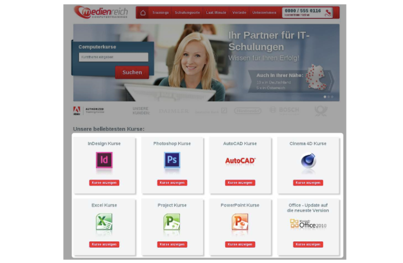
Despite the new design having nearly three times as many click-through options in this section, the site experienced a huge surge in growth. Specifically, B2B sales generated by the homepage jumped from $2,149.72 to $4,436.41. This just goes to show how simpler designs and clearer explanations of a service or product (in this case, showing off specific training and not just general descriptions) inspire visitors to take action.
Unbounce’s Landing Page Structure
When you run a pay-per-click campaign, you expect to see a significant return on your investment. While it doesn’t seem like Unbounce was totally dissatisfied with how their landing page drove visitors down to their conversion buttons, the marketing director believed there was a better way of structuring the page to ensure that everyone saw them.
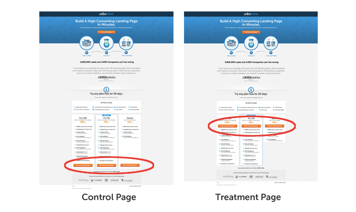
In the A/B test, they shuttled the orange CTA buttons up to the top of the pricing table. As a result, this restructured PPC landing page converted 41% more leads than the original that had the buttons located at the very bottom.
Delivra’s Trustmark
Email marketing automation service Delivra wanted more sign-ups for the free email marketing guide they were offering on their website. When examining the form and the button beneath it, they suspected that one thing might be missing that was keeping users from filling out the information and clicking through to claim their guide: security assurance.

Although a form asking for minimal information might not seem like a huge threat to business owners and marketers trying to claim a free report, Delivra found that their assumptions were right. All it took was one small privacy statement to be placed below the CTA for visitors to change their mind:
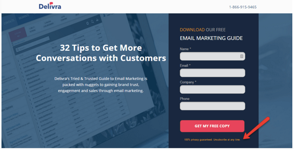
As a result, Delivra saw a 35% increase in the form submission rate. While this type of conversion may not have directly increased sales for Delivra, it did put them on the map as a trusted resource for those who downloaded the free report. And by increasing their confidence in something as mundane as a download, they likely helped to increase their confidence in using them as their email automation expert.
Conclusion
Of course, not every hypothesis you have about a lack of engagement with your CTA will be correct. This is why you run the non-committal A/B test to confirm your theory. Once you’ve found a winning formula, you can then go live with it. But A/B testing shouldn’t stop there. Perhaps changing the wording of the button would help too? Or maybe adding shading to the button design would make it more visible? That’s for you to figure out.
A/B testing is a great way to engage with your audience and receive a steady stream of feedback on what makes for the best experience on your site. By soliciting this feedback and making regular updates to your CTA design, you’re helping shape a more positive experience with prospective B2B customers who are already more than halfway through the decision-making process.
Related Topics
Top