The good old Call-to-Action (CTA) has become a staple of the web. They’re around to tell users exactly what we want them to do. Buy this book, download our free guide, contact us for more information, etc.
Sometimes, though, it all looks and feels like cheesy marketing talk that’s been both written and designed by someone detached from reality. They might even convince you to do the exact opposite of the intended action.
So, what makes a good CTA? Here are 10 examples of Calls-to-Action that are well-designed, cleverly written or just plain unique.
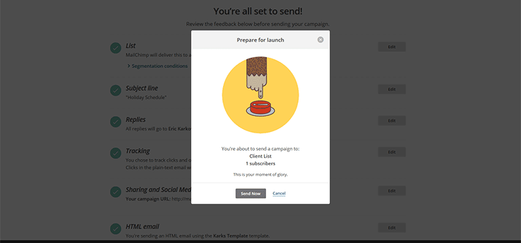
MailChimp
Full disclosure – I think MailChimp does as good a job with their CTAs as anyone. In fact, there were a number of instances on their site to choose from. But, my absolute favorite is their “Prepare for Launch” dialogue for sending out a mail campaign.
Even if there were no text, the animated chimp hand hovering above the red button alone lets you know what you’re supposed to do. It’s simple, fun and I feel a strange sense of accomplishment when I click the “Send Now” button.
ManageWP
ManageWP has made the bulk of their home page a CTA. The headline and brief descriptive text tell you exactly what their service does and simply asks for an email address to get started. The visuals are interesting and the content is right to the point.

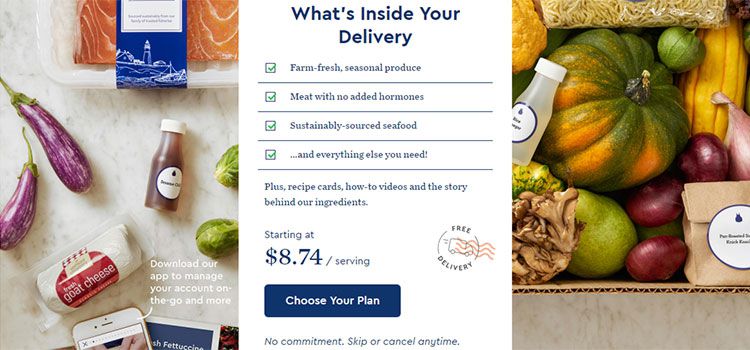
Blue Apron
Checking out Blue Apron’s site, their home page really is a series of CTAs. I love this particular section because it conveys what you’re getting and how much it costs in an easy-to-read format.
Even the little Free Delivery icon is a nice touch. Best of all, they used a background of fresh food ingredients to drive the point home. Who’s hungry?
Spotify
Like Blue Apron above, Spotify features a background of its main selling point in its CTA. But they take a decidedly simpler approach the rest of the way.
This slider highlights a few important things about the streaming music service, but mostly encourages you to click or scroll for further detail. It doesn’t try to wow you – just make it easier for you to sign up or learn more.

Zillow
Zillow is the place to go for all things related to researching real estate. And right from the start, you’ll find a CTA area that lets you do all the things. It’s all right there, without the need to search around. This is as useful as a call can get.

B&O Play
An offshoot of Bang and Olufsen, B&O Play carries on the minimalist design and branding of its parent. And this Call-to-Action is a perfect example. You get a big dose of beautiful industrial design, along with calls to see the featured collection or start the process of buying these slick headphones.
While it’s easy to look at this and say, “It looks nice enough, but so what?” the point is that you should treat CTAs as an important part of your overall brand. They should reflect who you are and what you do.

Mercy Corps
When you’re tackling some of the world’s most difficult situations, there’s no time to waste. Mercy Corps creates a sense of urgency with their CTA. The photo, coupled with a bold, serious headline ensures that visitors understand the gravity of it all.
They’re helping us to see the people affected, and providing us with a way to respond.

Nest
Home automation masters Nest bring the message of Earth Day and tie it in perfectly with their energy-saving thermostat.
The twinkling stars in the background coupled with the larger-than-life product shot really make an impact (it makes me think of a planet floating in space). What’s also nice here is that they allow the background some room to breathe.

Skagen
Skagen is a Danish company that sells minimalist watches, along with other fashion accessories. This CTA features an outstanding use of color and brand-appropriate simplicity. The lesson here is that, when you have a unique product, just let it speak for itself.

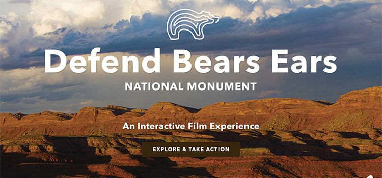
Patagonia
Patagonia is all about the experience of being outdoors. Their home page slider is a mix of products and causes – like this beautifully crafted image promoting an environmental film.
The images are big, bold and they aim to bring a little bit of the wild to your screen. It’s right on point with their target audience.
Calling for Clicks
A good CTA should consider the audience and the desired result of a user interaction. Color and imagery should be a reflection of your brand and help to convey the message. Motion is great, so long as it’s not outlandish. Text should be short and to the point.
The Calls-to-Action above all do a great job of guiding the user in a fairly simple manner. It goes to show that you don’t need something overly wordy or complicated to convince people to act.
Related Topics
Top