Mobile navigation designs come in many different shapes and forms. While it would be more intuitive and easy to understand for users if all navigation systems followed the same structure, the reality is not so simple.
Different applications present unique problems that can be solved using navigation design. For example, an app with seven or eight primary menu items would probably implement a hamburger approach. An app with three menu items would likely implement a tab bar of sorts.
Aside from this, there is simply the standoff between Apple’s iOS and Google’s Android, whereby the former recommends bottom tab bars versus top tab bars and hamburger navigations.
The upside is we see some remarkable innovation in navigation design, where designers are looking for a solution which best fits their product and users. In this article, we are going to round up some of the latest and finest examples.
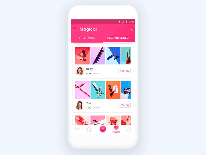
Pub Guide
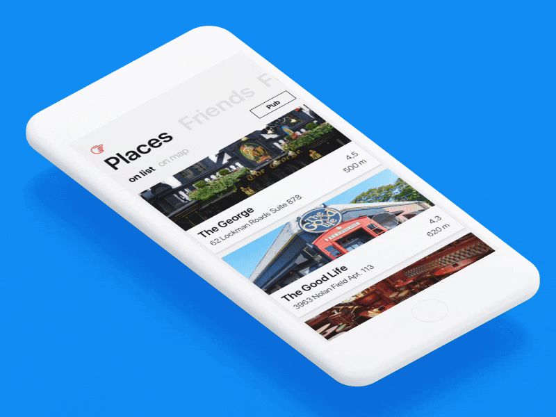
Pub Guide for Windows OS implements a unique take on the standard Windows navigation system, using clean bold fonts and a top-heavy layout.
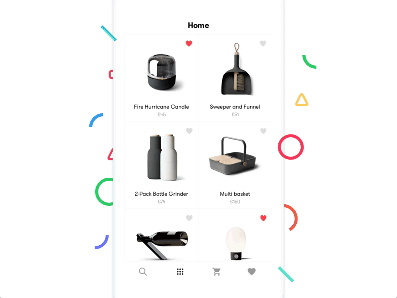
This beautifully executed example uses a bottom tab bar in combination with a top filter bar. The resulting interaction is both satisfying to use and visually impressive.
This side menu navigation uses a unique hamburger icon and stunning opening/closing transitional effects.
The Google Newsstand navigation concept uses a unique layout whereby there are three different stages of the same navigation menu. The top level allows for more focus on the topics, while the lowest level allows for the most readability and space for content.
Reach has come up with a very innovative way of implementing their search functionality. Rather than adding another menu at the top, the search is included as a tab item which opens a search bar with simple filters.
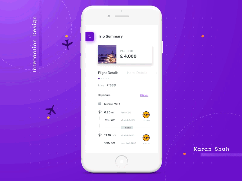
This navigation concept is impressive in the way it transitions from and switches between a horizontal layout, to a compact vertical layout with included progress indicators.
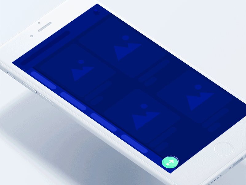
This animated concept uses some visually-pleasing effects to transition from hamburger icon to a full-width, full-height navigation list.
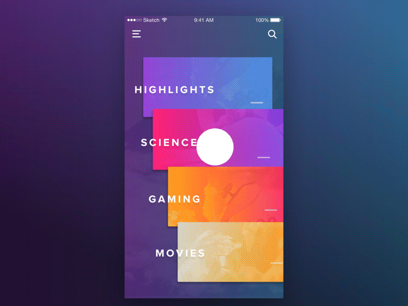
This side navigatio is unique in the way that it transitions from a full-height 90 degree list, to a wider horizontal list upon tapping the expand button on the lower left.
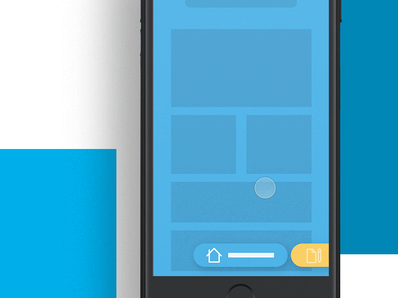
The bottom navigation of this application triggers some beautiful visual animation effects when the add button is tapped. The rest of the user interface is faded out and the focus is cast on the two new navigation items.
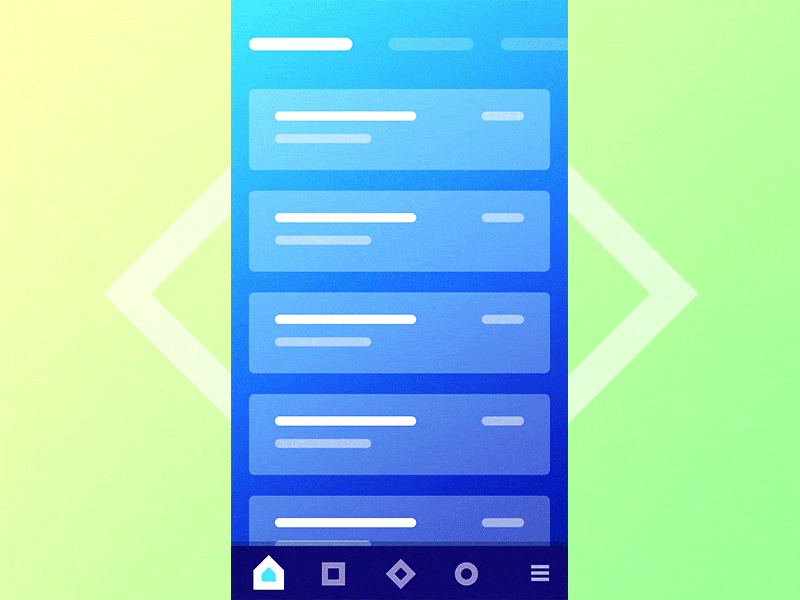
This interaction example for a mobile navigation is very well-thought out in that it initially displays the navigation items in full view for single tap access. When the user starts to scroll, this navigation is condensed to a hamburger icon to allow for an optimal viewing area for content.
Related Topics
Top