Various experiments are conducted these days with mouse pointers. Consider our recent posts regarding cursor effects and the use of circular cursors in web design. It feels like we are obsessed with this tiny device that indicates our movement across the computer screen. Without a doubt, there is a fixation on this subject.
There are many exciting solutions in the wild, yet most of them are just decorative extravaganzas whose aim is to impress. But what about making the web a better place? There is one small solution in this area that is intended to enhance the user experience, rather than contributing to the entertaining side of the project. Let’s consider it closely.
Bigger Cursor – Better UX
Two important things make this trend relevant.
First of all, in most cases, these developers have ditched the trivial arrow in favor of a circle. There is an inevitable shift of preferences towards round shaped mouse cursors, so there are no surprises here.
And the second thing is regarding the mouse behavior itself. Like all great ideas, this one is simple. When the cursor gets into key areas such as the logo, links, social media icons, navigation, etc. it becomes more prominent in order to highlight their importance. It can change size, color or transparency.
The solution benefits an interface in various ways, for example:
- It makes things a bit more interesting;
- It saves the interface from being mundane;
- It improves user interactions;
- It makes the exploration of a website more intuitive than usual.
In essence, this is nothing new. We are accustomed to employing hover effects to make the tiny details of a website such as navigation links or buttons prominent upon interaction.
However, the artists below have gone a little bit further and forced the cursor to enhance the interaction from another side. The idea is brilliant. Let’s consider these fantastic examples.
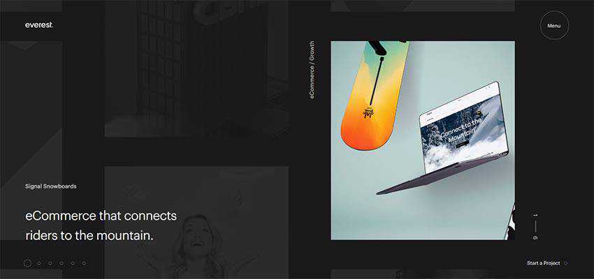
Everest Agency
Consider Everest Agency as a representative example of the trend.
It is a typical website of the present-day. Built with the help of the latest technologies, it looks sophisticated and elegant. There is a small, intricate slider that produces a favorable impression. The website is packed with stylish features.
As for the mouse cursor, it is a regular arrow pointer – with a twist. It’s outlined by a simple circle. When the cursor hits an area of the menu, the round-shaped tail grows in size and brings the element into the spotlight. Here, the solution feels at home.
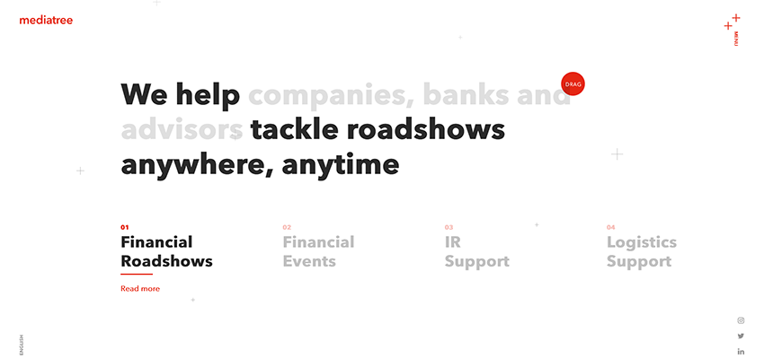
Media Tree
Media Tree boasts truly clean and modest aesthetics. The landing page feels fresh, crisp and incredibly airy. The solid mid-sized red circle that plays the role of the mouse cursor falls into the natural focus here. It effects not just the navigational elements of the website but also the content. What’s more, it is even supplied with tiny hints that show users what they need to do in order to see more. In such a minimalist environment, these playfully dished-up clarifications are just what the doctor ordered.
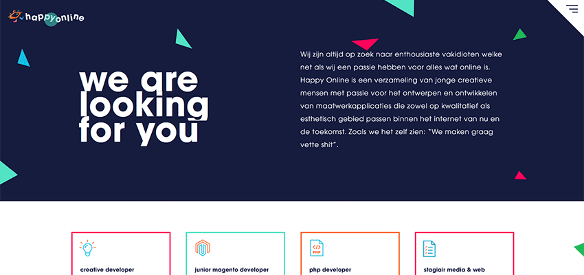
Happy Online
Happy Online gets its beauty from a geometric appeal. A bunch of colorful, relatively big triangles enriches the design. There are many boxes and stripes. Here, the cursor with a circular trail perfectly blends in. Each link gets an extra dose of attention upon hover. Simple, elegant and helpful.
Uptec
Much like in the previous example, the use of a circular cursor with extra functionality is entirely logical for Uptec. Note the huge hollow circles that are scattered throughout the hero area. They save the welcome section from looking boring.
There are also vertical lines and hollow typography. Here, the round cursor is well-suited to the entourage. The team has also added a pulsating effect to make it look like a small tracking device that you can quickly find whenever you need to. When it hovers over the logo, links, language switchers and images it changes its size, transparency and behavior – indicating that something interesting is hidden inside.

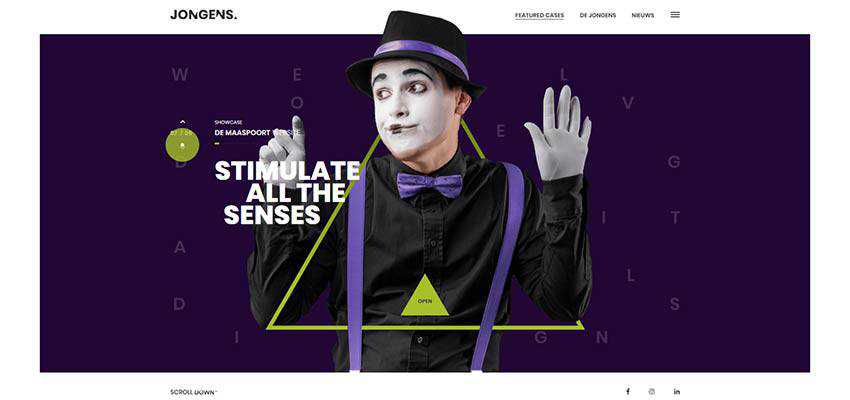
De Jongens van Boven
While in the previous examples the trend feels like a pleasant bonus, in the case of De Jongens van Boven it is a necessity. The website has a visually-heavy hero area with lots of layers, geometric details, and decorative effects. So, the vibrant pointer of a relatively large size that you can easily track is a must-have.
Here, you can see a mouse cursor that is a combination of two circles. The first one is small and solid, whereas the second one is big and semi-transparent. It highlights the navigational components by changing its size. It also changes color according to the slide, reinforcing the consistency of the design.
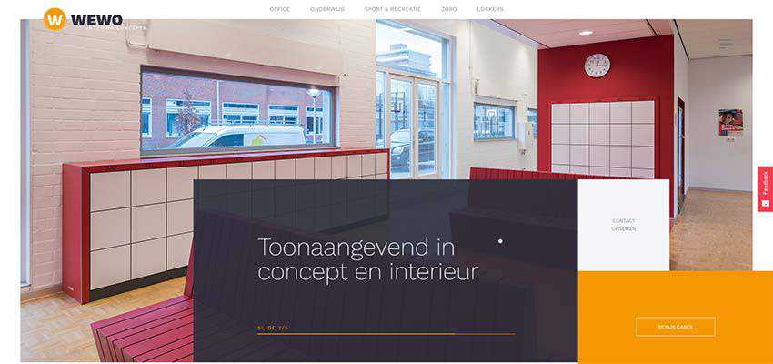
Wewo
Much like the previous example, Wewo also has a complex hero area. Although there are no bizarre animations, the extra layers are more than enough to make tracking your movement a bit challenging. So, the solution perfectly suits.
Note two things: The first is that the team uses various sizes of the cursor to pinpoint the essential areas. And second, an infra-ray effect that enriches interaction and makes it playful.
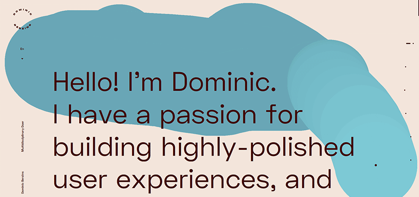
Dominic Berzins
If you feel like a small circle won’t make any difference in your website, you can always go for extreme measures by enlarging it a hundred times and forcing it to leave an attention-grabbing trail. Dominic Berzins shows this in his outstanding personal portfolio.
The aesthetic of his website is marked by minimalism, and you certainly do not need extra help for highlighting the important details. Nevertheless, the artist decided to make the cursor an eye-catcher.
Some may consider it as a too-much. However, not only does it fit like a glove here, contributing to the overall theme, but it also serves as a “wow” factor. That is to say nothing about literally drawing the track of your movement. Clever.
Going Bigger and Bolder
This trend is both exciting and promising. Its key feature lies in the fact that it is practical, and at the same time entertaining. And it certainly benefits user experience.
I can’t say that the mouse cursor is an irreplaceable thing, since recent studies show that more and more people browse the internet via cellphones and tablets. However, no matter what, there will be a category of people who will prefer the old-school PC or notebook. Therefore, it will always have its own place under the sun.
Tell us, what do you think about the use of large cursors? Do you find it amusing? Helpful? Or just useless?
Related Topics
Top