It’s easy to become bored with the ordinary – longing for something original and one-of-a-kind. That’s why common hero areas are bursting with eccentric ideas. They are aimed to not just impress, but also satisfy a user’s craving for creativity and originality.
However, animations and grandiose solutions are not the only things that can do the trick. Going off the beaten path with even the most trivial things can achieve the same effect. And vertical lettering is vivid proof of that. Becoming quite popular these days, it has grown into a tiny trend with some aces in the hole.
We do not see much use of vertical orientation in web design. Traditionally, it is a place where horizontal rhythm rules the roost, though this doesn’t mean that everything should revolve around it. As a rule, developers stick to the traditional models. However, diversity and deviation in habitual reading flow can be beneficial. What’s more, you do not need to take extreme measures. Small doses of vertical orientation are more than enough to produce a proper impact.
Archi Graphi
Here, the creative team has twisted the basic navigation by rotating it 90 degrees and reflecting it horizontally. You should read it from bottom to top – that is quite unusual, but intriguing. As a result, the welcome screen has got a zest without all of those overwhelming centerpieces. Also, note the top header: it feels incredibly spacious, and the logotype gets the overall attention by looking prominent without much effort. That is a smart approach.

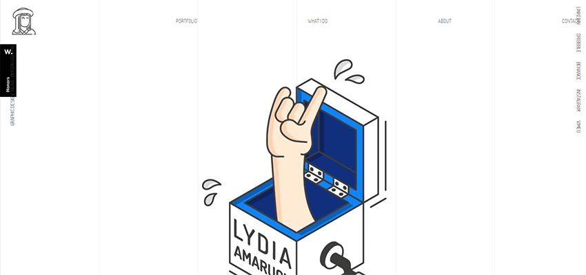
Lydia Amaruch
There are some other exceptional examples where vertical lettering is like icing on the cake. Consider Lydia Amaruch and her online portfolio.
Much like in the case of Archi Graphi, here the usage of vertical rhythm is episodic but well-thought-out. There is a traditional streamlined horizontal navigation, but it includes just the essentials. All the rest has been pulled to sides – literally. They echo with vertical stripes on the back, creating a harmonious aesthetic.
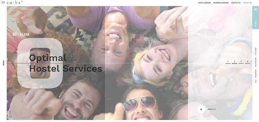
Yo:Ha
Yo:Ha adopts the same approach. Whereas the main navigation is hidden behind the hamburger button, links to the homepage and social media stay on the surface. Again, notice the overall theme. Here, vertical rhythm can be seen in various details, such as the slider that is broken into three semi-transparent panels and elongated symbols. Consistency marks the design of this website.
Ivan Ibanez / Gothamsiti
Ivan Ibanez and the team behind Gothamsiti show us how to apply vertical orientation to the entire navigation. As it turns out, it is handy to use – to say nothing about its attention-grabbing look. Note, these two examples have different themes, moods, and atmospheres. But, vertical navigation fits like a glove in both cases.
The personal portfolio of Ivan Ibanez has a boxy vibe. There are hollow blocks, split layout, ultra-thin lines and lots of white space. The vertical navigation beautifully finishes off the design.

The creatives behind Gothamsiti’s design have positioned links around the perimeter of the hero area – placing each one in a corner. In this way, nothing distracts the attention from the mysterious and creepy welcome screen. At the same time, all the gateways are exposed, making users feel comfortable.

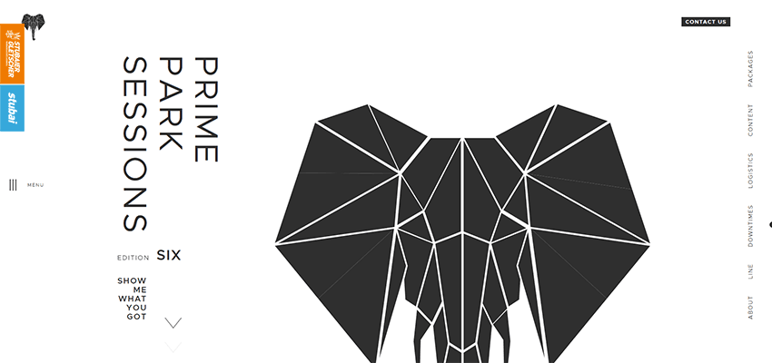
Prime Park Sessions
Let’s step away from navigation and explore examples of vertical lettering that is a part of the content.
Since vertical orientation looks a bit strange to the majority of us, it can be used to put an extra emphasis on the crucial things like, for example, a tagline. The idea can be seen in Prime Park Sessions. Here the nameplate of the agency is directed leftwards, just where we usually start to read. It also mirrors the vertical navigation on the right. As a result, the design feels complete and visually-interesting.
Luxury Villas
The team behind the design of Luxury Villas uses a vertical orientation for displaying the tagline. The latter is also provided with a relatively wide background so that it looks like a sidebar. Though it is not just an ordinary sidebar, it is a sidebar with zest. That is clever.

Kitamura Makura / Canatal
Another way of benefiting from the trend is to use it for headings. Consider Kitamura Makura and Canatal.
When it comes to telling a story, both teams prefer to focus the users’ attention on the vital things, such as content, rather than captions. Therefore, the headlines were moved to the right and rotated in 90 degrees, thereby naturally giving way to the text.
In the case of Kitamura Makura the caption has been pushed to the right edge, making it feel like a part of navigation. With Canatal, however, the caption is still a part of the block and overall design.


Protec / Building the Future
Protec and Building the Future have made things a bit more interesting by making vertical text a part of the entourage.
Protec features huge captions that stretch from top to bottom. They are carefully set aside and shown on the left side, giving the content top priority.

In the case of Building the Future, the vertical lettering is even bigger. However, here it plays merely a decorative role, strengthening the traditional caption featured at the top of the text block.
Regarding SEO, it is not a good practice since headlines should be a part of document hierarchy and enclosed in corresponding tags. However, sometimes you can go off the beaten path and win over customers with design rather than search ranking.

Kwok Yin Mak
While for the western world, vertical rhythm feels like something extraordinary and a viable trick to add zest to conventional designs, for our friends in the east it is the most natural thing. Let’s take a look at Kwok Yin Mak.
The design looks refreshing. The traditional black and white color scheme, lots of white space, logographs and of course vertical orientation make this interface look so special. The trend feels at home. However, even though we expect it to be here, the team behind the website has managed to save it from looking trivial.

A Pleasant Surprise
Vertical lettering is a rare guest, yet a welcome one. It is safe to say, that in the universe of everything horizontal, it is a little light that makes us smile. It pleases the eye with an unexpected twist in reading flow and effortlessly brings the essential things into focus.
It is a simple way to make things interesting without reinventing the wheel and going the extra mile.
Related Topics
Top