The smaller the screen, the longer the scroll.
That truism explains the rise of long scrolling: with mobile browsing overtaking desktop browsing, the popularity of small screens has urged designers to rethink their outdated “above the fold” mentality.
Long-scrolling creates plenty of new opportunities for storytelling, navigation, creative visuals, and a more immersive overall experience. As a result, we find several common techniques and strategies start to emerge:
- Parallax Graphics – Borrowed from the video game industry, this strategy of moving the backgrounds at different speeds creates a 3D effect and stimulating visuals that are more enjoyable to interact with.
- Screens as Pages – An important way to organize information on a single page, differentiating concepts into screen-sized sections, usually by changing the background, makes sites more cohesive.
- Sticky Navigation – One of the biggest drawbacks of long scrolling is disorienting the user, so having a navigation system that always stays in the same place on the screen gives users control and security to prevent getting lost.
- Animated Interactivity – Scroll-triggered animations add a fun level of interactivity that engages the user to a point where they enjoy scrolling regardless of the content.
- Atypical Direction – Due to the recent trendiness of long scrolling, sites can set themselves apart by scrolling left, right, or upwards.
- Indicators – Some users will not think to scroll on their own, so quick instructions like “scroll down” or another indicator avoids confusion – just be sure to distinguish these from other links or calls-to-action.
One of the pioneers responsible for breaking the page-by-page mold, Twitter remains among the best and most-recognized long-scrolling sites today. This format allows the tweets to be arranged chronologically while still seeming new and fresh.
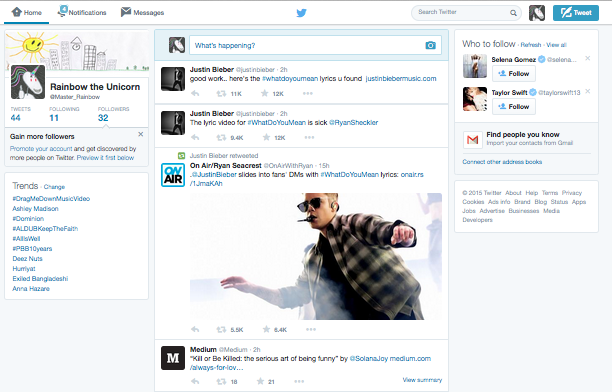
For social media sites and others with user-generated content, long scrolling is not just a trendy choice but a practical one. The neverending loading of new content from infinite scrolling allows otherwise chaotic content to be organized.

Heart Kids NW
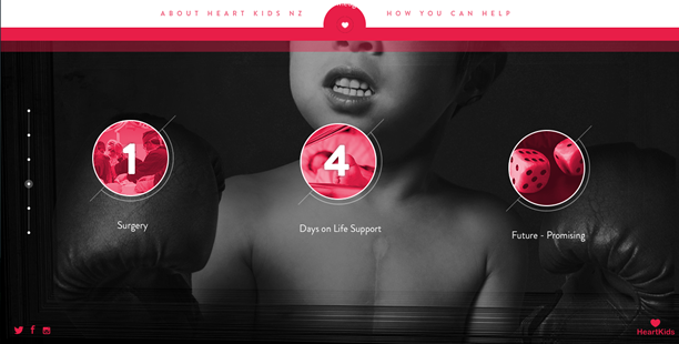
The New Zealand charity Heart Kids pulls out all the stops. The long-scrolling site combines animations (some scroll-activated), stunning color usage, poignant imagery, and cursor interactivity to promote its life-saving message.
Notice the unobtrusive “Scroll” icon and instruction on the landing screen, and the sticky call-to-action that always remains at the top.
The Boat
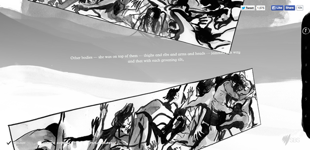
One of the most creative uses of long scrolling is SBS’s The Boat, something like an interactive novel.
The continual animations and clever use of motion and angles when new content appears draws the user/reader into an immersive experience that traditional, stagnant scrolling sites can’t match.
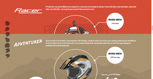
MCA Leicester: The Seven Types of Motorcycle Rider
This offshoot site for MCA Leicester demonstrates a smooth method to indicate scrolling without actually scrolling. The grayed-out helmets on the left side, stacked vertically, indicate (along with the title) that the user has only to scroll down to see more content.
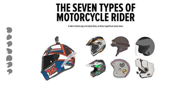
An additional tactic is the clever animation that presents each new screen, making the site somewhat of a long-scrolling/page-by-page navigation hybrid.
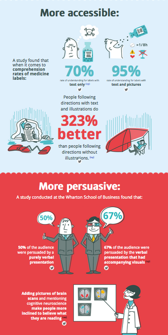
Thirteen Reasons Why Your Brain Craves Infographics
The natural style of long scrolling, where different sections and concepts are intrinsically united in a continual stream, makes them great for infographics.
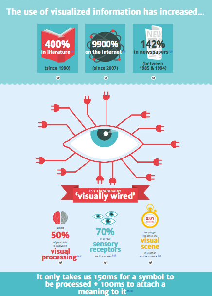
As Thirteen Reasons Why Your Brain Craves Infographics shows, the single-page format allows designers to fluidly present heavy doses of information in smaller, digestible bits.
Moreover, scroll-activated animations, such as the eye that moves with the scroll as well as background animations, negate the sometimes boring aspects of learning information.
Junko’s Story: Surviving Hiroshima
Another SBS site, Junko’s Story mixes the storytelling and infographic properties of long scrolling to tell survivor’s chilling story of surviving the Hiroshima blast.
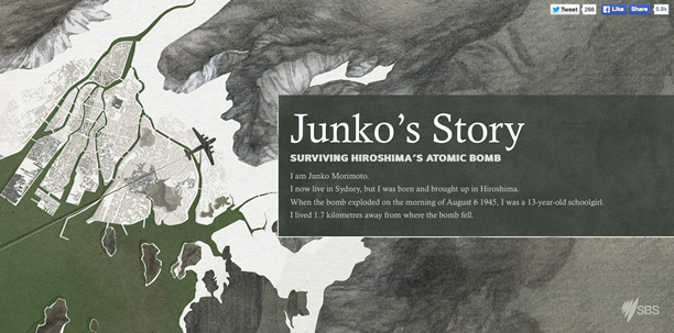
Due to the solemn nature, the site keeps a traditional format with plain text interspersed with graphics. However, the site retains a fresh and modern feel with scroll-activated images, such as the metal helmet above, that fade into view in the margins.
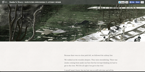
These display telling artifacts and factual infographics about Hiroshima – such as a map of the blast radius – which can be clicked for further details.
Beagle
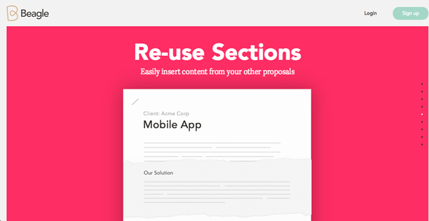
The site for Podio’s Beagle tool sets a page-by-page navigation to the long-scrolling format.
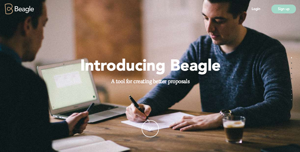
Each point in its value proposition has its own screen/page, however all are accessible through a linear scroll and are united by animations that carry user attention from one screen to the next, such as the piece of paper moving from the screen to screen above.
Bowhead – Tails and Whales
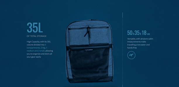
Like Beagle above, Bowhead takes advantage of long scrolling to display its value proposition point-by-point – though for a single product. The site uses animations like fades and slides to keep the content engaging.
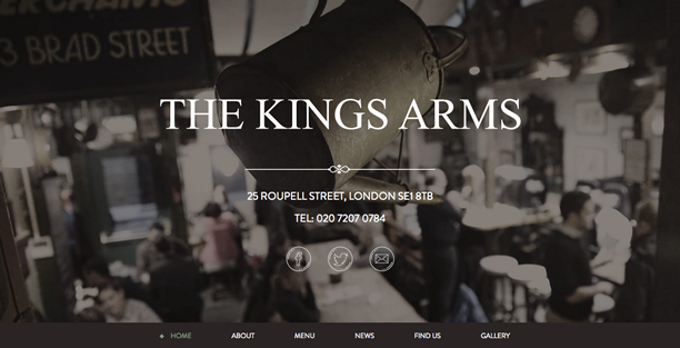
The Kings Arms
Not all long scrolling sites have to be flashy. The London pub The Kings Arms uses simple background divisions with no fancy animation transitions between screens.
However, a parallax motion on the background phones and additional cursor animations (not to mention an aesthetic layout) keep the site from appearing dull.
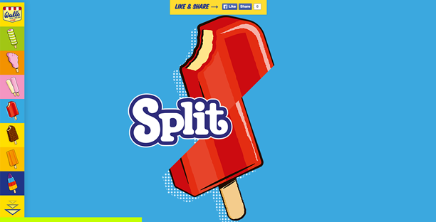
Wall’s Ice Cream & Airpure Car Fresheners
By contrast, the promotional site for the Wall’s Ice Cream and Airpure Car Fresheners collaboration is very flashy. Little more than images of the iconic popsicles, the long-scrolling site features entertaining animations between screens that make it worth browsing.
Notice sticky navigation on the left site and the progress bar at the bottom (which changes colors).
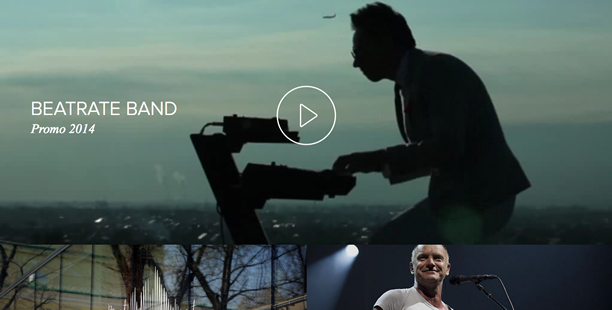
Beatrate Band
The long-scrolling site for the band Beatrate features a couple of experimental features for long scrolling, including autoplaying video and a horizontal image carousel.
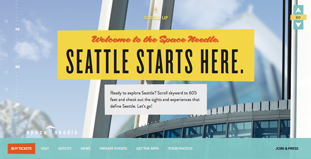
Space Needle
The Seattle Space Needle site is a perfect example of atypical scrolling direction. Under the pretense of traveling up the space needle (and beyond), it makes sense that users scroll up instead of down.
Conclusion
As the sites above prove, the most successful application of long scrolling is for its practical benefits, not to appear part of a trend.
There are many useful advantages of long scrolling: unifying disorganized information, interactivity, navigational liberties, stunning visuals, displaying extensive content (infinite scroll), linear storytelling, etc.
However, given the drawbacks like disorientation and occasionally loading times, you shouldn’t recklessly switch over. Understand the best techniques to make the most out of it.
Related Topics
Top