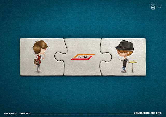
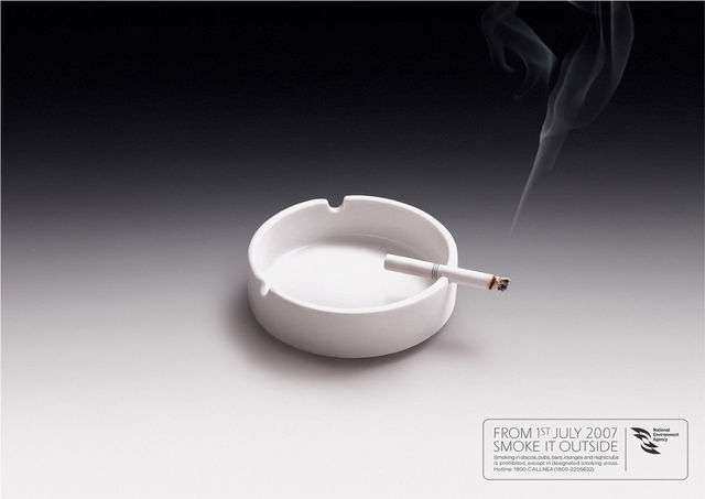
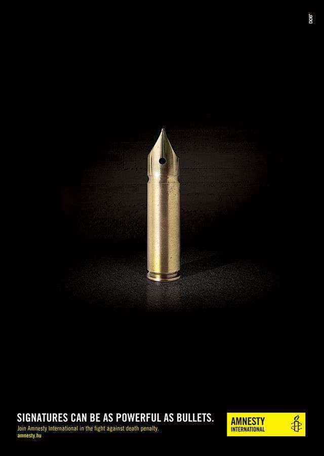
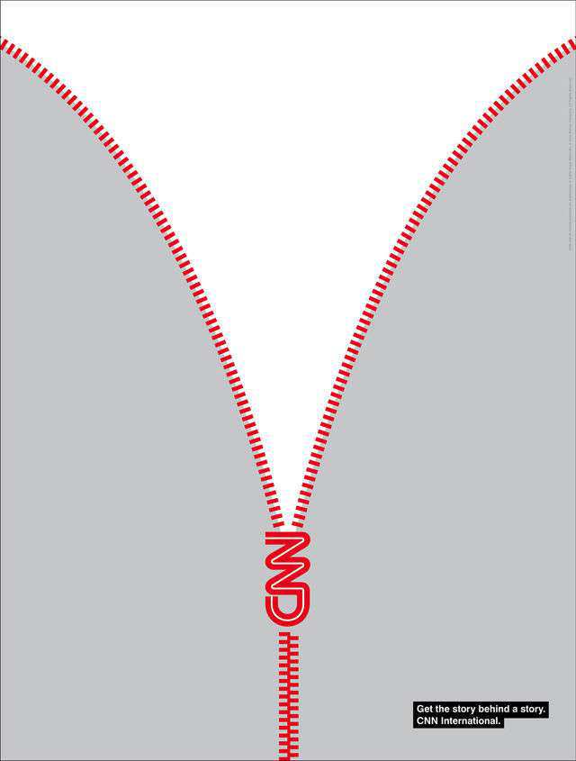
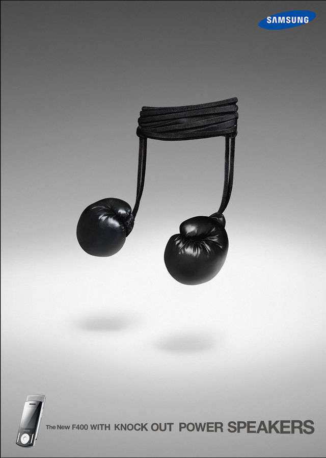
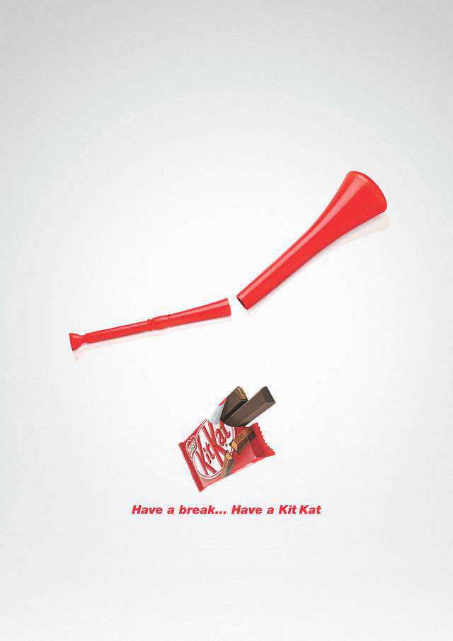
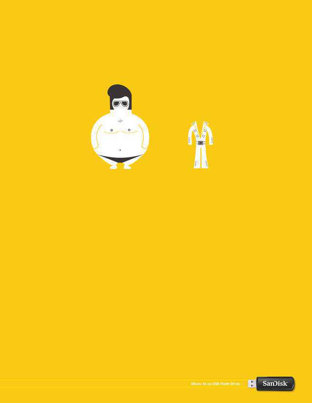
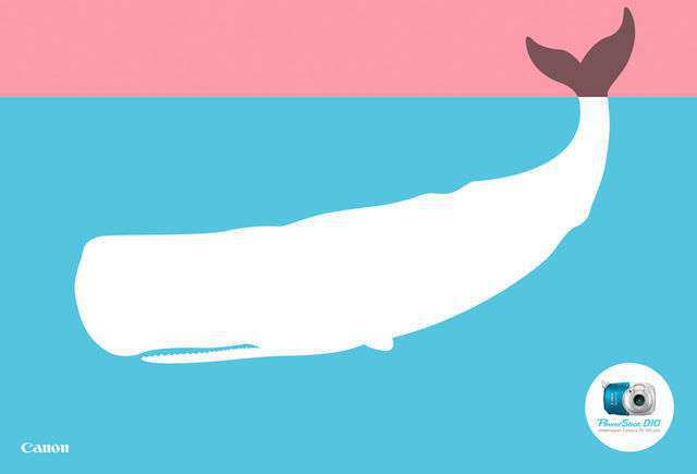
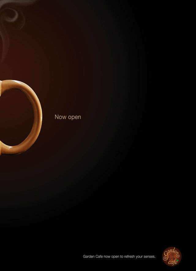
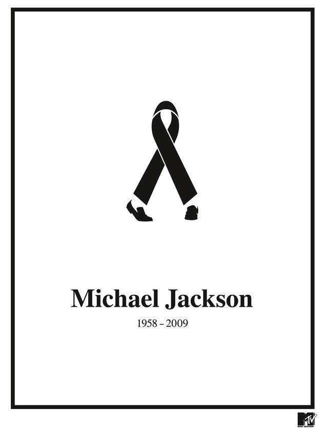
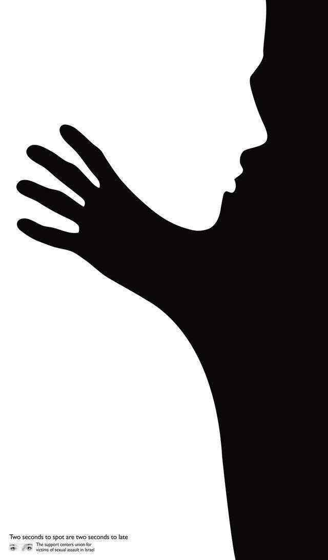
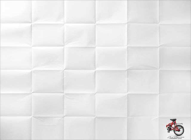
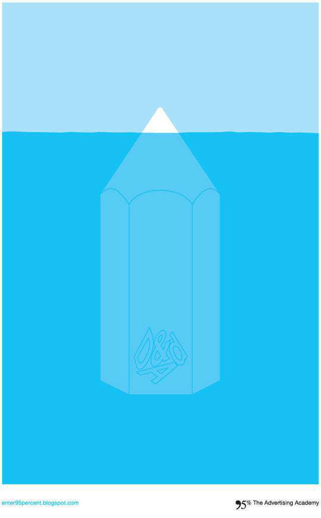
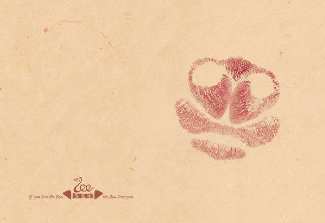
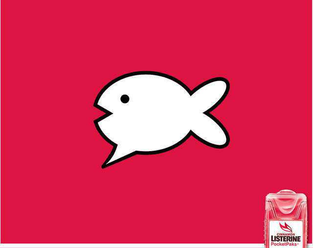
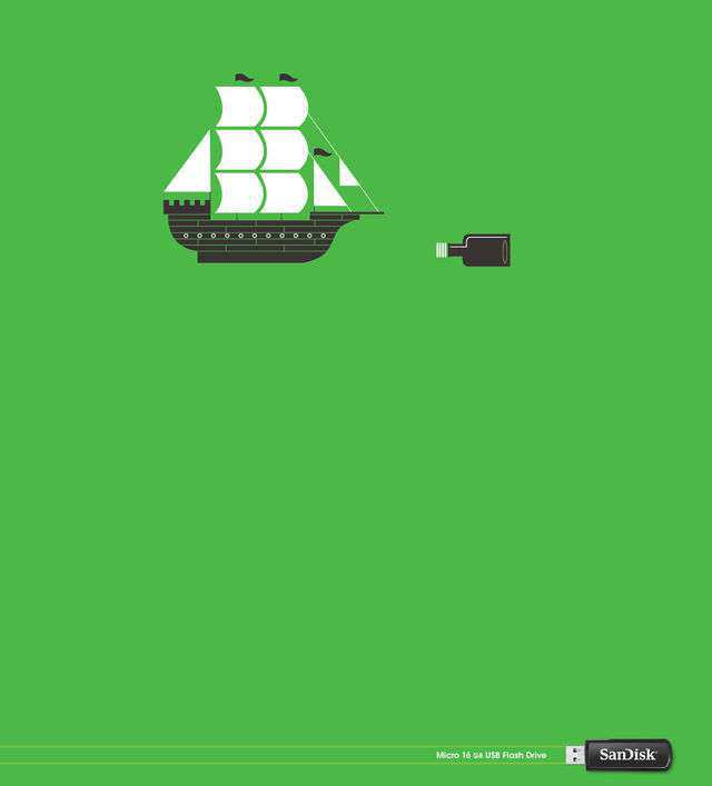
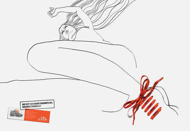
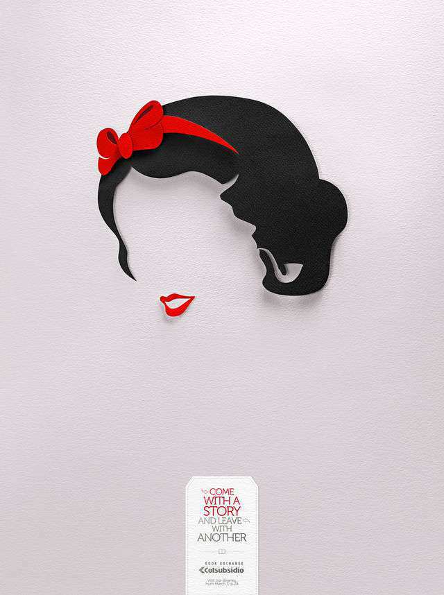
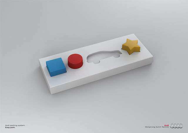
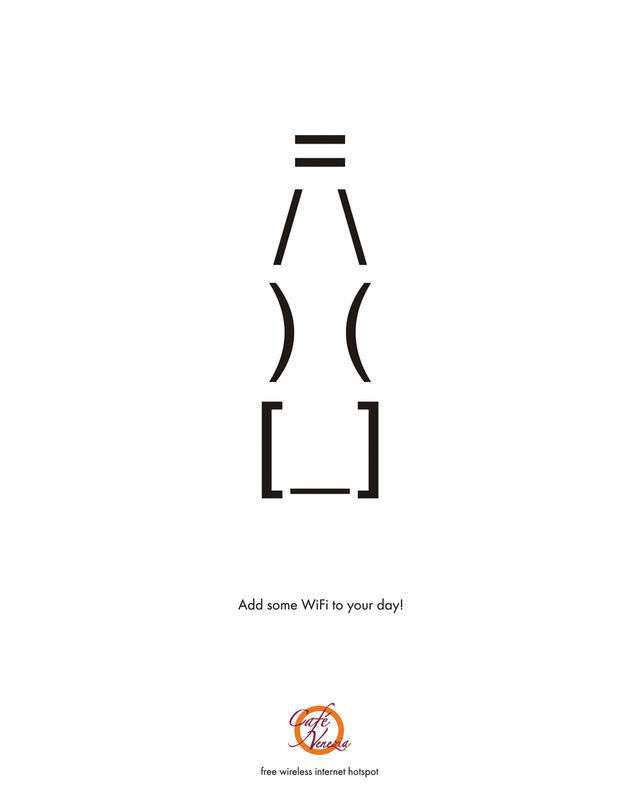
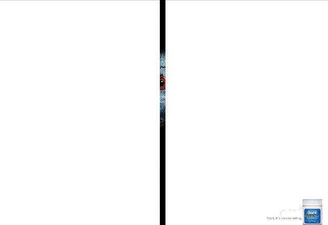
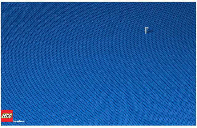
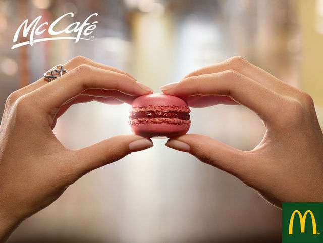
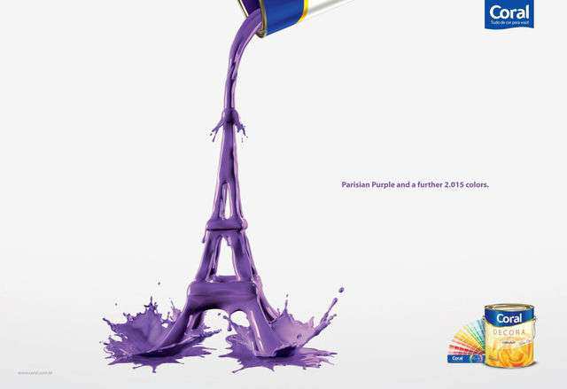
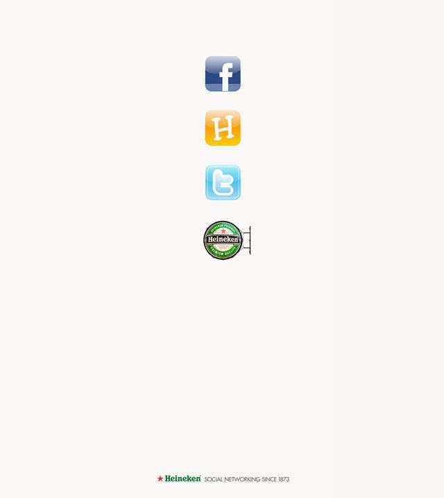
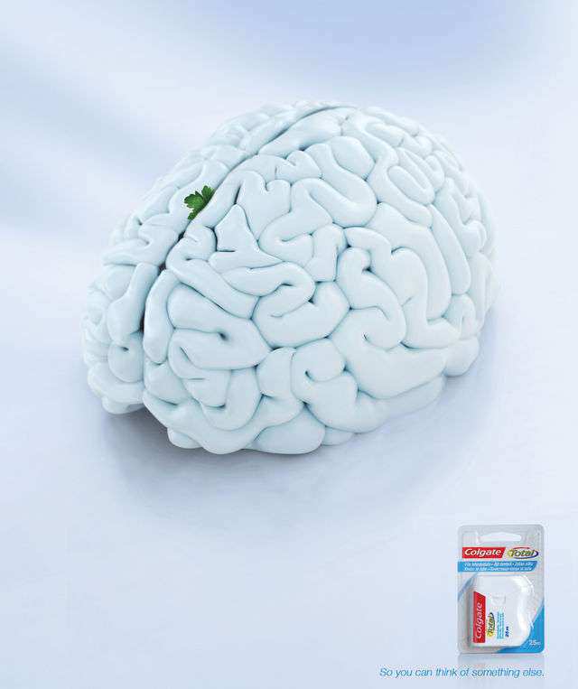
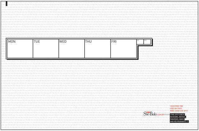
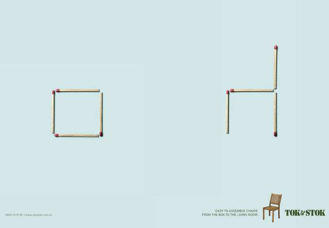
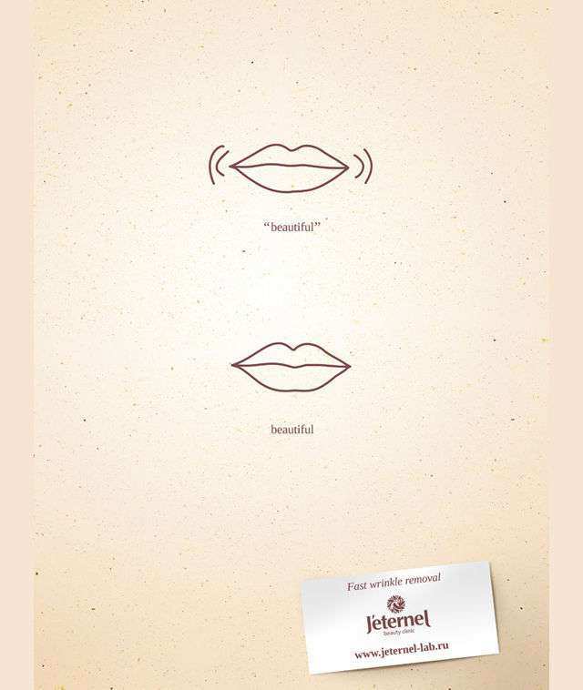
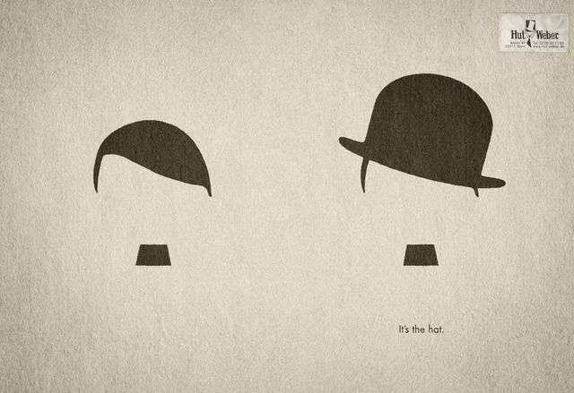
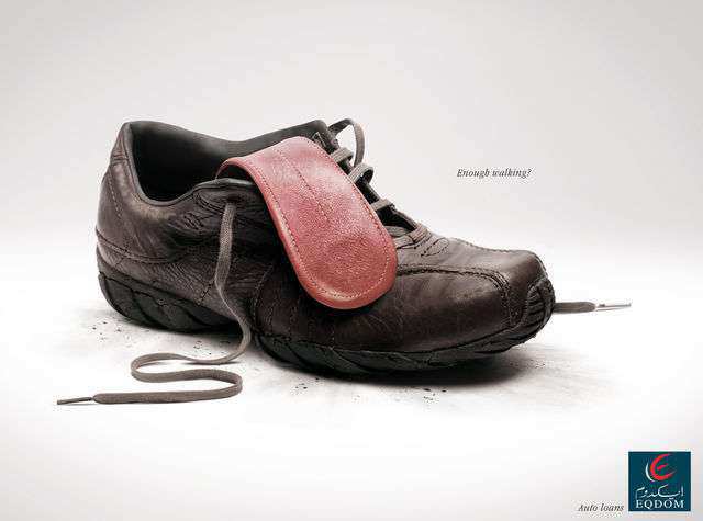
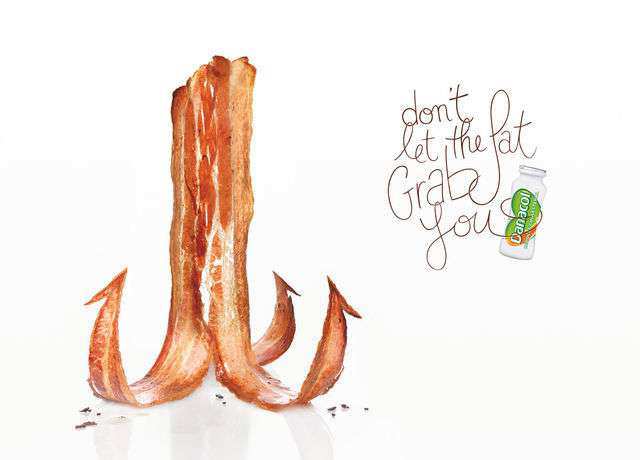
At first glance, minimal design seems so simple to pull off. Yet, when you sit down and attempt to create a minimalist design, it always feels like there is too much going on or like there are not enough elements to convey the right message. Minimalistic design can be quite difficult to pull off but when done right, it sets your design apart and immediately stands out in the sea of ads that are bursting with colors, words, textures, and other elements.
This just goes to show how effective minimalist design can be. In fact, if you think about it for a moment, you’ll realize that the most successful ideas are often the simplest ones. Add that to the fact that many famous historical figures (such as Leonardo Da Vinci who said “Simplicity is the ultimate sophistication”) favored simplicity, and it’s clear to see why minimalistic design has such an appeal.
The basic principle of minimalistic design is paring down your design down to the most essential elements needed. Minimalist design does away with unnecessary colors and textures and removes extra fonts.
Minimalism is everywhere nowadays, from websites and logos to movie posters and print ads. And if you’re working on a print ad right now, this roundup is just what you need.
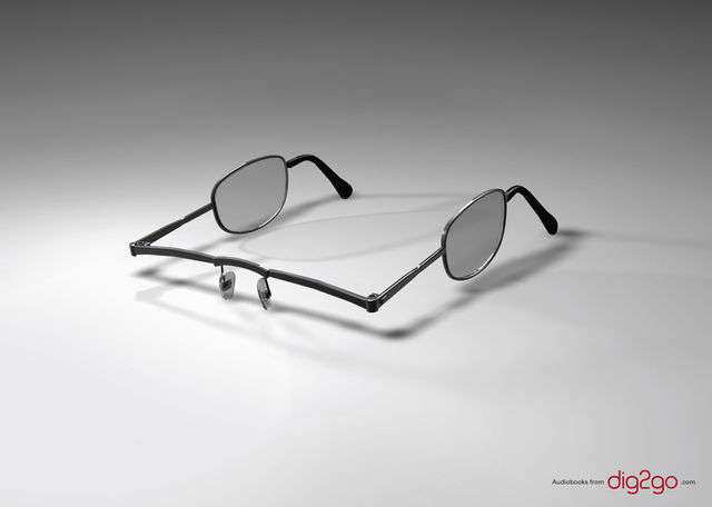
We’ve gathered the best minimalist print ads from all over that you can use for your inspiration. You can also make use of them if you’d like to learn more about the concepts of minimalist design and see how other designers use the basic principles of design to strip away unnecessary elements.
Related Topics
Top
