There’s a dangerous little lie the design community has propagated around the internet. Like every entrenched myth, it’s anchored in a bit of truth, which makes it difficult to weed out.
Unfortunately, it seems e-commerce is especially vulnerable to buying into the lie.
The truth: “You only have a few seconds to grab a shopper’s attention before they bounce and never return.”
The lie: “You have to do whatever it takes to really ‘WOW’ your shopper before they leave.”
Here’s the thing, your shopper isn’t looking to be “WOW’d.” They are looking for a solution. They’re looking for a product that solves their problem, need, want, craving, etc. The point is, they’re looking for “something.”
Your first goal is to convince your shoppers they’re in the right place. Make it easy to “find” what your shoppers are looking for.
If the utility of your store is missing, no amount of design will convert your shoppers. Unless you’re vying to become the next best digital version of the MOMA, your shoppers are on your site to buy.
Now of course, design and aesthetics are important. Having a great looking site with impressive features do play a role, but they’re the final touch point. They complement an intuitive experience. They don’t create it.
So, what are the most common ways e-commerce stores get their UI wrong?
You’re Using A Conversion Killer Front And Center
It’s a trend that won’t die. In the face of all the data that screams, “It doesn’t work,” they won’t go away. It’s almost a guarantee, if you have an e-commerce store, you’re probably guilty.
We’re talking about image sliders, rotating banners, auto-forwarding carousels. Regardless of what you call them, they’re conversion killers.
Study after study has proven, shopper’s hate these. At it’s best, the first slide averages a 1% click-thru-rate. All subsequent slides are practically and completely ignored.
Maybe you’re thinking, like so many other e-commerce owners evidently do, that your store is different. Industry stats aside, you’re the exception.
Okay, let’s deal with that.
Can we admit, we’re all creatures of habit?
It’s not a bad thing. We have to be. With the amount of information that we’re accosted with daily, if we didn’t rely on habit and patterns we couldn’t function. We’d be paralyzed by indecision.
To cope and function, we rely on mental models to navigate our world. In doing so, this creates patterns of behavior we all abide by.
One of these patterns has developed a behavior known as “banner blindness.” Simply put, when we’re online, we ignore anything that even remotely looks like an advertisement.
Even if you were to capture a shopper’s attention with your slider, data shows that it’ll only be a passing glance. The information isn’t processed.
And this isn’t new. Our banner blindness has been a thing and called out since 1997!
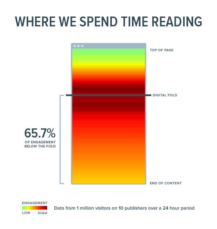
Furthermore, even if you’re especially crafty and your slider looks nothing like an ad, we’re all conditioned to ignore the top of the page. Designers and marketers target above the fold so often that we now scroll down to the “real” content, ignoring the top. In fact, nearly 66% of our attention span is spent “below” the fold.

Eye tracking heatmaps. Just look at all the love for that prime screen real estate from users ;)
Taking your slider’s dismal conversion outlook into account, you’re also slowing down your page speed. Instead of one effective panel, you’re expounding the amount of resources your page needs to completely load – and all for naught.
To make it even worse, a slider says one thing above all, that you don’t know what to say, so you’re trying to say everything.
Also, more times than not, the slider lacks any type of editorial control. So, each slide looks completely different from the next with no rhyme or reason. Not only do they look different, but the CTA strategy is often disjointed with no hierarchical order or cohesion.
Plus, from a general usability standpoint, slides either move too fast to digest or too slow to see all of them. They’re hard to navigate. They’re hard to use, especially on mobile.
Do you need even more evidence on why you should drop that slider from your storefront? Here’s a UX thread about sliders that’s been going on since 2011!
The next UI offense you’re most likely guilty of is a modern day twist on the slider, the oh-so-popular background video!
Are You Here To Entertain Me?
This trend is huge today, and it’s slightly controversial to say you should drop it, but here me out.
We’re talking about that super cool background video you have that makes everyone say “Ooooo!”
First, let me ask you. Why do you have a background video?
The reason isn’t rocket science. You like them. Other people like them. You see all sorts of other websites and storefronts doing it. It tells your story. It sets the vibe. It’s a no-brainer. Background video is where it’s at!
Does that describe you?
Most people throw them up without much thought, but have you stopped to think that you’re not alone in this approach? Has it occurred to you that maybe, just maybe, you’re copying other people, who copied other people, who copied other people…
I hate to break the news, but, designers do that. They copy, or get inspiration, from others, a lot. Designers rarely use data to influence what they do. If it looks good, then it looks good. It’s an easy sell.
Have you tested to see what your background video has actually done for your conversions or other site metrics?
If you can answer yes, if all your numbers are golden, if you can statistically prove your storefront is doing better with your background video than without, then you can skip ahead.
But, if you can’t, then you should ask yourself – “What is my background video actually doing for me?”
Yeah, yeah, I know what you’re saying. You need the video because it helps tell your story, it set’s the vibe for the whole experience.
I get it. Absolutely. Your video sets a certain aesthetic, but attractive doesn’t mean usable.
If you get cold and calculated about it, most of the time, it’s just distracting. Our eyes are attracted to movement. Unless watching the video is a conversion metric for your store, you’re distracting shoppers from the intended goals. Your shoppers are no longer seeing your headline and primary CTA, they’re seeing what’s behind it. That is, if they can actually see the video, more on that later.
If your aesthetic and your story are that vital to your conversion rate, then a background video is an inefficient means to communicate that message.
Instantly, the video is distracting. I don’t know where to click or what to do. Extra bonus points for being a slider
If it’s an aesthetic issue, you can set that with an image.
“No you can’t! An image isn’t anywhere near as powerful or sexy as a video is,” you say?
To which I respond, “Sure it is. Actually an image is easily 7.12% sexier than a video!”. Yup, background images can actually convert 7% better than background videos.
Maybe it’s not an aesthetic issue for you, and it’s a story issue.
If that’s the case, then you should create a product or feature video instead. It’s much more effective to tell your story with a video that a user can actually control and interact with.
Plus, a product video won’t kill your page loading time. They’re accessible across all devices. They’re intuitive. Best of all, they can average a 144% lift to your conversions!

The perfect example of where and how to use video to increase your sales and user engagement
Which takes us from strike one to strike two.
You know a background video is adding an incredible amount of weight and time to your page load. Even if you’re loading the video asynchronously, it still has to load. So, you can either prevent your page from loading for a few seconds, or you can leave a big blank box where your video should go.
A video takes a while to load, and we all know what even a single second delay can do to your store’s conversion rate.
Need more reasoning? Think about this.
According to data from by Akamai and Gomez.com, 79% of shoppers will not return to a store because of a slow (ie. bad) website experience, and 44% of shoppers will tell a friend about their bad experience.
That’s a lot if ill-will because of a slow page loading speed.
Put it another way, hypothetically, “if your ecommerce store is making $100,000 per day, you could lose up to $2.5 million in sales every year for just a 1-second page delay.”
Now, unless you can PROVE that your background video is actually increasing your conversions, is it worth that much of a risk to keep it up because it looks neat?
The next UI trend that’s killing your conversions is a designer’s best friend and your shopper’s worst enemy!
You’re Speaking An Ancient Language
We’re talking about your navigation’s oversimplification with ancient hieroglyphics, aka icons.
Sure, the minimalist look is sleek. It’s professional looking. It’s cutting edge. It’s a space saver. But, if shoppers don’t instantly know how to get where they want to go, they will get frustrated, leave, and never come back. A confused mind never buys.
![]()
[Source] Does the money icon mean refunds, gift cards, best sellers, or special promotions? Hrm…
Among other issues, icons have different meanings to different cultures and demographics. What’s intuitive to your millennial designer might be completely mind-boggling to a large percentage of your customer base. Outside of the home, print, and search icons, you’d struggle to find any icon that is universally recognized.
The most common argument against including text labels is that users can figure it out. People know what the shopping cart and three bar icons are. They know what to click if they want to see a product or buy.
Is that an argument you’re willing to stand by though? Even if that were true, if it were possible to increase engagement and conversions by 1%, wouldn’t it be worth exploring adding in those “ugly”(ie. helpful) text labels?
For example, the search icon is recognized by near everyone, yet an icon only approach can leave you with a dismal 6% engagement rate. Adding a text label to the search icon can increase that by 16.17%.
Okay, let’s forget about your product and secondary icons. Let’s talk about your global navigation. Are you using a hamburger menu to hide your navigation?
Of course you are. It’s a space saver, and it’s widely recognizable on mobile. So much so, it’s even crept into desktop storefronts.
Did you know it can take your desktop shoppers 5-7 seconds LONGER to use your navigation when it’s hidden. Worse, only 27% of shoppers will ever use the hidden navigation?
Microsoft recognized they were having issues with their icon-only toolbar. They tried changing the icons and their positioning, but it didn’t help much. What did help was the introduction of text labels next to the icons. It immediately fixed the usability issues and people started to use the toolbar more.
They also discovered users could only recognize 6 icons without a text label – thats users who had been using their software for over 2 years!
A user’s understanding of an icon is based on past experience. When there isn’t a standard universal acceptance and use for an icon, then a text label becomes a necessity.
Should you use icons? Of course, but include a text label. For the sake of your “slow” shoppers, help them buy from you a little easier.
Use the 5 second rule. If it takes you more than 5 seconds to think of an appropriate icon for something, then there’s a high probability it’s an ineffective communication choice. Guaranteed, your shoppers won’t have a clue what it means!
To put it bluntly, if a shopper can’t find what they’re looking for, they can’t buy it. Relying on your shopper’s patience and curiosity isn’t the best conversion optimization strategy.
It’s about conversions. It’s about your shoppers experience.
It should never be about your personal taste, what you like, or your own vanity.
It’s a fool’s approach to think you’re the exception and ignore what the data is telling you. Don’t bet on your design overcoming the user experience obstacles. It’s a dangerous game to be playing when it comes to your store’s conversion rate.
At the end of the day, you’re doing more than losing sales. You’re losing all that equity it took to get your shoppers through your digital front door – you’re annoying your shoppers and paying to do so, literally.
Imagine if every escalator, light switch, or bicycle worked differently, all in the name of “aesthetics.”
When it’s your store, it’s exciting. It’s easy to get caught up in the “newness” and forget what it feels like to be an average shopper.
When you mess with user expectations, you run a risk of confusing and annoying your shoppers.
Don’t lose your shoppers over something as silly as a design trend.
Related Topics
Top