The earliest era of the web brought with it a lot of experimentation. It was a new medium and designers looked for ways to best utilize their skills.
But standards were scant and proprietary browser code was rampant. The result was often a website that looked fine for some users, while being virtually unusable for others. Still, the burgeoning web design community wasn’t afraid to take chances. With that, some real gems came out of this time period.
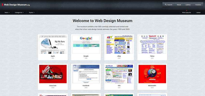
Thankfully, this history hasn’t been lost. Thanks to the Web Design Museum, we can get a sense of what the web once was. It’s a curated gallery of screenshots that show us how web design has evolved over time.
I spoke via email with project founder Petr Kovář. We discussed the origins of the Museum, its features and future plans. Below is our conversation, edited for brevity.
Q. What inspired you to start the Web Design Museum project and when did it launch?
I have been designing websites for over 20 years. I originally came up with the idea to create a Web Design Museum sometime in 2012. I graduated from university as a historian, and while at university, I was also studying the history of computer technology and the Internet. This is why I decided to join the two professions, a historian and a web designer, and launched the first version of the Web Design Museum project in May 2017.
Q. On the site, you mention a desire to show future generations what design was like in the early days of the web. What do you hope up-and-coming designers gain from the experience?
I have noticed that the younger generations of web designers and Internet users in general often have no idea that, even back in the year 2000, there were websites with a very attractive visual style and a great UX. It is not unlikely that the visual style of the turn-of-the-millennium websites might become an inspiration for the generation of programmers to come.
Q. I see that the Museum encourages users to submit screenshots of older websites. How much community participation have you had? Are there any particular types of sites you are looking for?
The main part of the museum are screenshots from my personal archive – which I have been compiling since 1996. Another part of the collection are screenshots from the Internet Archive portal.
Over time, I have received many tips from visitors to the museum on interesting sites and dozens of screenshots that should not be missing. However, what I would like to stress is that the purpose of the Web Design Museum is not to collect a huge quantity of screenshots of old websites, but to display only the sites that are somehow exceptional or original in terms of their visual style, impact or focus.
If readers search their old hard drives and find interesting websites, banners, flash pages or intranets from 1994 to 2006, which they believe should be part of the museum, please send them to us.
Q. One of the most interesting features is the Timeline section. It shows the evolution of several popular websites over the years. Are there any particular trends that stand out to you when looking through these sites?
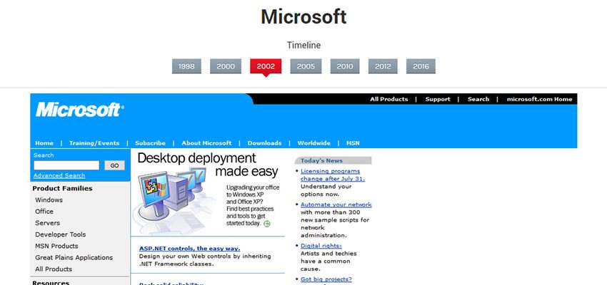
Timelines that capture the development of a website during a certain period of time are very popular among visitors. Many users are surprised at how their favorite website has changed over the past 20 years.
I would argue that there are two main trends. The first one is the evolutionary trend, where the design kept gradually developing in keeping with the previous versions, and the distribution of the main controls remained almost the same. Some of the examples include Google, Wikipedia, Amazon, or Apple.
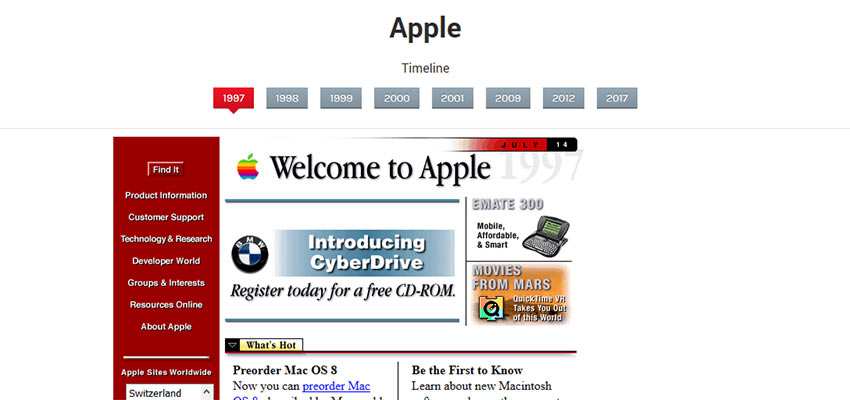
The other one is the revolutionary trend, in which every new redesign brought a complete makeover in terms of the visuals and controls. This trend includes, for example, Netflix, Coca-Cola, Microsoft, Skype, or MailChimp.
Q. Do you have any favorite designs from the Museum’s collection?
Some of my favorite exhibits are websites which came from the workshop of the already non-existent 2Advanced studio. These websites, created mostly using Flash technology, can be ranked among the best of the turn-of-the-millennium web design.
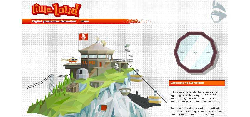
My personal favorite are also webpages designed in the style of pixel art, such as K10k, Habbo Hotel or Pixelsurgeon. It is always a pleasure to be able to include a website which was ahead of its time in terms of its visual style.
As an example, I would like to highlight Little Loud from 2003. (It was) designed in the style of polygon illustrations, a style which had not become popular until about 10 years later.
Q. Tell us about your future plans for the Museum. Are there any special exhibits in the works? Any plans to add websites from after 2005?
A fellow programmer and I are currently working intensively on a new version of the Web Design Museum project. We would like to launch the new site by the end of this year.
In the upcoming version of the Web Design Museum, there will be exhibitions with themes such as “web banners in the 1990s”, “the first internet search engines”, or “webpages in the style of grunge or pixel art”. We are also preparing an exhibition of erotic websites from the 1990s :-)
In the near future, we would also like to present examples of webpages created using Flash technology. The new version will also include a timeline capturing significant moments in the history of web design using short captions.
We are planning to keep adding websites from later years. In the latest version, visitors will get to see examples of web design from the year 2006.
Keeping the Early Web Alive
I found it incredibly fun to take a trip back in time and explore web design from the 90s and early 2000s. It’s a reminder of how far web design has come in such a short amount of time.
Thanks to Petr Kovář for taking the time to give us a “virtual tour” of the Web Design Museum. It sounds like some very exciting things are in store.
Related Topics
Top