CSS frameworks are pre-written CSS files that help web designers and developers create websites faster and more efficiently. They are perfect for those looking to launch projects without getting bogged down in the details of coding CSS from scratch.
In this collection, we’re focusing on smaller, lightweight frameworks. These minimalist frameworks all offer a simpler alternative to more comprehensive and popular systems like Bootstrap, Foundation, or Tailwind, which, while powerful, might not be the best option for every web project.
Although each framework mentioned here has been updated within the past year, you should still review the changelog before integrating them into your workflow or project.
Minimalist CSS Frameworks
These frameworks focus on simplicity and speed. They offer basic styling without heavy features, making web pages load faster and look clean. Ideal for projects that need a straightforward, no-frills approach.
Luxa CSS
A stylish, minimal framework for fast, clean web design, focusing on light and dark mode support.
lit CSS Framework
Offers simple, lightweight styles for web projects, emphasizing speed and ease of use.

Tacit Primitive CSS Framework
Designed for those without CSS knowledge, providing decent default styling without class names.

Pico Minimal CSS Framework
Emphasizes simplicity and elegance, with a focus on semantic HTML and responsive design.
Milligram Minimalist CSS Framework
A minimalist CSS framework that offers a bare-bones approach to styling with a focus on typography and grid.

Spruce CSS Framework
Provides a clean, efficient starting point for web designs, with a focus on utility classes and customization.
Mini CSS Frameworks
Mini CSS frameworks are incredibly lightweight and designed for maximum efficiency with the smallest possible footprint. They provide essential styles and components, perfect for small projects or when performance is critical.
Hoisin Sass Mini Framework
A Sass-based framework that provides a simple, spicy layer to web design projects, focusing on modularity.p>
mono/color Framework
Focuses on single-color aesthetics for web projects, promoting simplicity and uniform design.
Simple.css Framework
Aims for simplicity and speed, offering basic styling for quick web development projects.
mini.css Framework
A minimal, responsive CSS framework that provides a wide range of components with a minimal footprint.
Material Design CSS Frameworks
Inspired by Google’s Material Design, these frameworks bring its design principles to web development. They include predefined styles for animations, shadows, and colors that mimic the physical world.
Material UI
Inspired by Material Design, this framework offers components and animations for rich, interactive web interfaces.
MUI Material Design CSS
A lightweight CSS framework that follows Google’s Material Design guidelines for web development.
Atomic CSS Frameworks
Atomic CSS frameworks use a building-block approach, providing a vast set of single-purpose classes for specific styling. This method encourages reusability and helps maintain a clean structure, making it easier to manage styles without bloating the stylesheet.
Tokenami Atomic CSS-in-JS
A utility-first CSS framework for creating custom designs with speed and efficiency.
Print CSS Frameworks
These frameworks are tailored for printing web pages, ensuring content is displayed correctly and beautifully on paper. They handle adjustments like hiding non-essential elements, optimizing layout for print, and managing page breaks.
Gutenberg Print Framework
A modern framework for to ‘print the web properly.’ Both modern and old styles available..

CSS for Printing to Paper
Offers guidelines and styles for making web content print-ready, focusing on clarity and simplicity.
General Lightweight Frameworks
These frameworks offer a balance between features and performance. They provide a solid foundation for building responsive websites with a minimal impact on load times.
Cirrus CSS
A component and utility class framework for creating intuitive and beautiful web interfaces.

Vanilla Sass Framework
Offers a simple, extensible base for web projects, emphasizing responsive design and accessibility.
Stylify CSS
A utility-first framework that allows for rapid, customizable web design with minimal setup.

Picnic CSS
Provides lightweight, beautiful styles for web components, focusing on ease of use and simplicity.

Semantic UI
Offers a comprehensive set of components and tools for building semantic, friendly web interfaces.

Pure CSS Modules
A set of small, responsive CSS modules for all web design needs, focusing on minimalism.
Gaming-Inspired CSS Frameworks
Drawing inspiration from classic gaming consoles, these frameworks offer unique, nostalgic styling. They include styles and components that mimic gaming interfaces, such as the NES or PS One, adding a fun, retro feel to web projects.
Desktop-Inspired CSS Frameworks
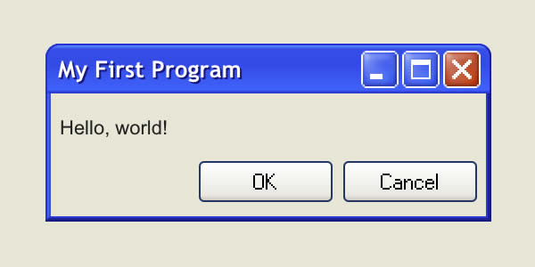
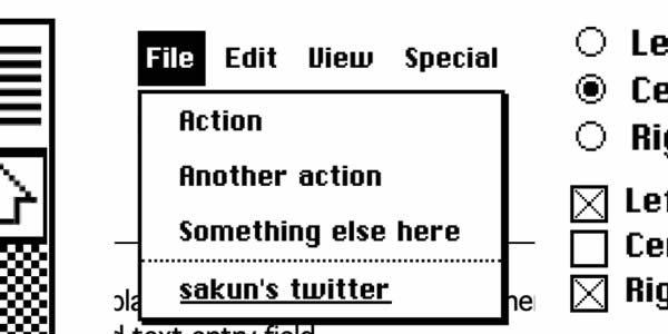
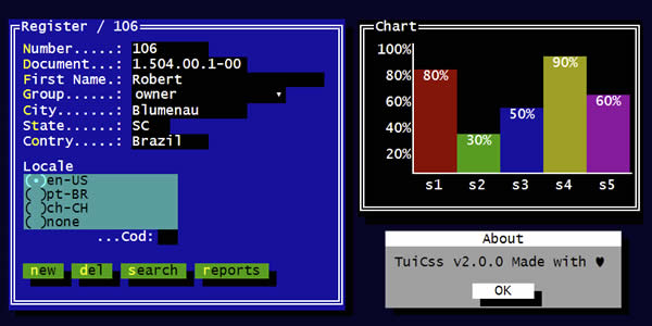
These frameworks recreate the look and feel of desktop operating systems, like Windows or Macintosh, within web applications. They provide UI components that mimic desktop environments, offering users a nostalgic and familiar experience.
Windows XP CSS
A Windows XP-inspired CSS framework for creating nostalgic, desktop-like web interfaces.
Retro Apple CSS Framework
A CSS framework inspired by early Macintosh design principles for creating retro-style web projects.
MS-DOS CSS Framework
Designed for building web applications with interfaces that mimic ASCII tables and MS-DOS applications.
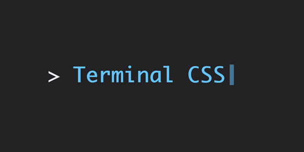
Terminal CSS
A framework designed for building terminal-like user interfaces, offering a unique aesthetic for web projects.
Unique CSS Frameworks
Related Topics
Top