You may wonder: “What can be so special about triangles? It is just a plain, primitive geometric shape. Not even a circle or square that have a hint of perfectionism.” And, you are absolutely right (at first). There is nothing special about it.
However, it is the first-ever polygon. It consists of a divine number of sides and angles: Three. And, it is quite rare in real life since squares and rectangles surround us. Just take a good look around: Walls, windows, doors, TVs, mobile phones and even the keys on your keyboard – everything is cubical or parallelepiped.
That’s why triangles are so special. They always catch an eye. Just remember the Flatiron Building – it is absolutely amazing. In the real world, it is challenging to find the proper implementation for this shape. But in the online expanses nothing is impossible – especially when it comes to web design.
Interactive and static globes and spheres populate plenty of projects these days, nicely playing with the modern high-end solutions. The use of triangles as décor in this chain of events makes good sense. It is just a natural outcome. And, to be honest, it has made quite a remarkable debut.
Cap Gun Collective
For several years, geometric shapes have been thrilling the minds of the designers. Geometry is a trend, that’s for sure. We were witnessing a rise of squares not that long ago. Not only are split screens still here, but they also got a revamp. Just consider Cap Gun Collective. Their team stepped away from split screens as we know them and offered a radically new vision. It implies dividing a screen into halves using a diagonal, resulting in two distinctive triangle shapes. This is an original solution that serves as décor and, at the same time, as a tool for delineating messages visually.

Huru
First and foremost, when it comes to the utilization of triangles as décor, we expect them to be used as a part of an entourage. For example, consider the case of Huru. A classic right-angled triangle with ultra-thin lines and lots of fresh air inside – banal, isn’t it? Not this time. Here, the triangle is an integral part of the aesthetic that goes perfectly well with the other decorative details. It adds an extra layer to the interface and contributes to the symmetry – mirroring the lettering on the left. At some point it even reminds us that a backpack that is being advertised here – to say nothing about supporting the whole ideology of simplicity and lightness that fills the entire project.
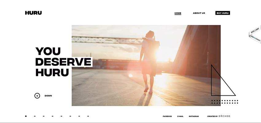
Bild Werk / Cworks
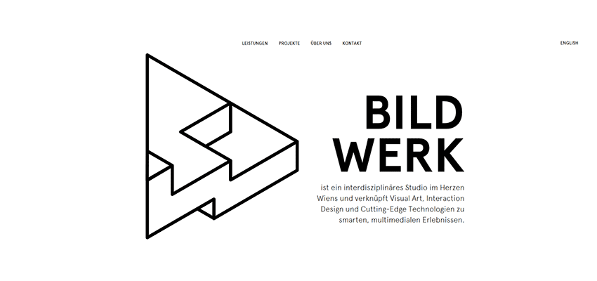
The other two trivial utilizations are presented in the home screen of Bild Werk and Cworks. The team of the Vienna-based interdisciplinary studio reminds us that triangles can be used as the prime illustration to enrich the hero area. Their triangle is more complicated than the one in the previous example. And it is even 3-dimensional. Note how the triangle balances the textual part. Yes, it does strike the eye. But thanks to a fragile line style and lots of white space, that results in a feeling of lightness. What’s more, not only does it portray the multidiscipline inherent to the studio but also creativity with a certain engineering quality.
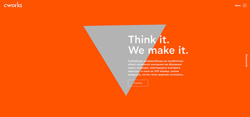
As for Cworks, their creative team leverages triangle as a part of a background. It stands in contrast to the overall monochrome orange canvas, naturally drawing attention towards the central part of the screen. On the one hand it is a playful feature that gives the design a zest. On the other hand, it is an unobtrusive focal point. The team kills two birds with one stone.
Takeshi Oid / Detaen Consulting
Let’s take the previous solutions to the next level and make them more intriguing and captivating. Consider personal portfolio of Takeshi Oid and Detaen Consulting, correspondingly.
The front page of Takeshi Oid’s personal portfolio is marked by a modern type of illustration that has a kind of abstractionism spirit. A flat triangle welcomes online visitors as a loader. Then it turns into a pyramid and takes up the center stage. As expected, everything is set in motion; and thanks to the parallax effect the hero area feels 3-dimensional.

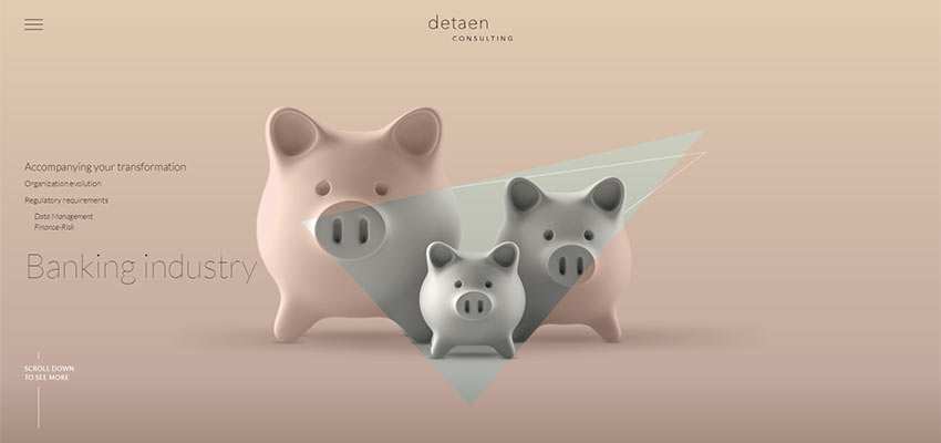
Much like in the previous example, the parallax effect lies in the heart of the solution. The team behind Detaen Consulting combines two popular techniques: Masking and parallax, resulting in a fantastic outcome. It is simple and at the same time original.
Aluxe / Reach Digital / Bonnefooi Roosendaal
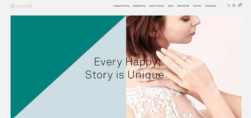
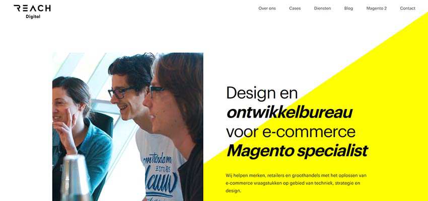
As we mentioned earlier, triangles can be used as a décor element of a background. Consider Aluxe, Reach Digital and Bonnefooi Roosendaal. The first two show an interesting take on a split screen, where one of the sides is broken into two parts using triangles. In both cases, each triangle has a solid color that stands in contrast to the other. In the first example, the tagline is located at the heart of the screen, making the triangles and image almost equal. In the latter case, triangles serve as a backdrop for the tagline, giving the text an extra focus.
In case of Bonnefooi Roosendaal, a triangle serves as a solid base for the logotype and menu – setting the mood and direction for these elements. It separates everything from the image backdrop and enriches the overall aesthetic. As a result, the top header gets an artistic touch where the triangle shape performs its vital role.

Circle Squarespace
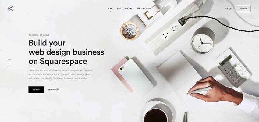
Last but not least, Circle Squarespace. Although there are no obvious triangles here, if you take a closer look, you will notice that the hero area features a stationery composition in the shape of a triangle. Not only is it a nice trick that adds a touch of creativity, but also the angle of the composition looks like an arrow that unobtrusively points towards the tagline.
Behold the Power of the Triangle
We have seen all kinds of trends in web interfaces. Some of them come and go; others stay and turn into the classics. The use of geometric shapes is one of those trends that has its own driving force.
After all, the skeleton of any interface is a well-thought-out mixture of geometric blocks that, in some cases, can’t be seen with the naked eye. Others, on the contrary, are exposed to the public. Like circles and rectangles, triangles nicely blend into the boxy structure of website designs. They have that certain charm that lets them stand out and add a touch of particularity to the overall impression.
Related Topics
Top