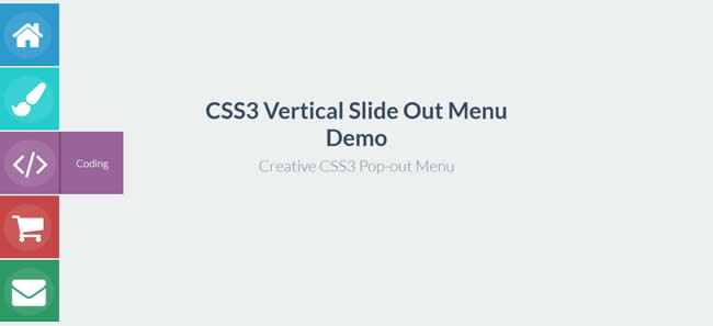
In this tutorial, we’re going to create a vertical slide-out menu using CSS3 transitions. The menus will be place on the left-side of the screen with the main links hiding off-screen at first, and they will then transition into view upon hover. No JavaScript will be used in this tutorial.
What You Will Need:
- Font Awesome Icons.
- Lato (via Google Fonts).
- A basic knowledge of CSS3 transitions.
- A little time and patience.
What We Will Be Creating::
Creating the Markup
For our markup, we will wrap everything in a container. We will then use an unordered list with the class icon-menu for our menu items:
<div class="container">
  <ul class="icon-menu">
    <li></li>
  </ul>
</div>
Next, on our list of items, we’re going to add the class icon-box with its title class (e.g. home, design etc.). Then we’ll add the Font Awesome icon (4x) and place an <h2> tag within an anchor tag:
You can visit this page here ) if you want to choose some other icons.
<div class="container">
  <ul class="icon-menu">
    <li class="icon-box home">
      <i class="fa fa-home fa-4x"></i> <a href="#">
      <h2>Home</h2></a>
    </li>
    <li class="icon-box design">
      <i class="fa fa-paint-brush fa-4x"></i> <a href="#">
      <h2>Design</h2></a>
    </li>
    <li class="icon-box coding">
      <i class="fa fa-code fa-4x"></i> <a href="#">
      <h2>Coding</h2></a>
    </li>
    <li class="icon-box shop">
      <i class="fa fa-shopping-cart fa-4x"></i> <a href="#">
      <h2>Shop</h2></a>
    </li>
    <li class="icon-box contact">
      <i class="fa fa-envelope fa-4x"></i> <a href="#">
      <h2>Contact</h2></a>
    </li>
  </ul>
</div>
Adding the Style
Before we move forward on to the main CSS, let’s add some general styles for both our minor elements and menu lists elements:
@import  "https://fonts.googleapis.com/css?family=Lato:400,100,300,700,900";

body {
  font-family: 'Lato',sans-serif;
  background: #ecf0f1;
  overflow: hidden;
}

a {
  text-decoration: none;
}

h2 {
  color: #fff;
  font-size: 22px;
  margin: 0 24px;
  font-weight: 300;
}

/*= ICON BOXES
--------------------------------------------------------*/
ul.icon-menu {
  margin-top: 16px;
}

li.icon-box {
  width: 120px;
  height: 120px;
  list-style: none;
  left: -47px;
  position: relative;
  margin-bottom: 3px;
}

li.icon-box.home {
  background: #2b99ce;
}

li.icon-box.design {
  background: #24cccd;
}

li.icon-box.coding {
  background: #9a639a;
}

li.icon-box.shop {
  background: #c44745;
}

li.icon-box.contact {
  background: #2d9a63;
}

.icon-box h2 {
  font-size: 20px;
  text-shadow: 1px 1px 2px rgba(150,150,150,1);
}

.icon-box a {
  display: block;
  padding: 0;
  width: 120px;
  height: 120px;
}

i.fa {
  position: absolute;
  pointer-events: none;
  color: #fff;
  margin: 16px 0 0 14px;
}

.icon-box a:focus,.icon-box a:active {
  outline: none;
}
On the styles above, we basically added width and backgrounds to each of the boxes where the icons have been placed, and then positioned them on the left-side.
Next, let’s animate the Font awesome Icons. For the hover effects we’ll use a combination of CSS3 transitions and transformations. When the user hovers over the Font Awesome icons, the position of the rgba background element in the 3D space will move using the 3-dimension vector whose coordinates describe how much it moves in each direction. The CSS3 transition property was also applied to the transform property for a smoother effect.
.icon-box a {
  padding: 120px;
}

.icon-menu i {
  border-radius: 50%;
  box-shadow: 0 0 0 50px transparent;
  padding: .2em .25em;
  background: rgba(255,255,255,0.1);
  -webkit-transform: translate3d(0,0,0);
  -moz-transform: translate3d(0,0,0);
  -o-transform: translate3d(0,0,0);
  -ms-transform: translate3d(0,0,0);
  transform: translate3d(0,0,0);
  -webkit-transition: box-shadow .6s ease-in-out;
  -moz-transition: box-shadow .6s ease-in-out;
  -o-transition: box-shadow .6s ease-in-out;
  -ms-transition: box-shadow .6s ease-in-out;
  transition: box-shadow .6s ease-in-out;
}

.icon-menu li:hover i,.icon-menu li:active i,.icon-menu li:focus i {
  box-shadow: 0 0 0 0 rgba(255,255,255,0.2);
  -webkit-transition: box-shadow .4s ease-in-out;
  -moz-transition: box-shadow .4s ease-in-out;
  -o-transition: box-shadow .4s ease-in-out;
  -ms-transition: box-shadow .4s ease-in-out;
  transition: box-shadow .4s ease-in-out;
}
For our main menu links, using the icon-box and title class within the <h2> tag, we will manipulate the position and appearance of each list item (on hover mode) with CSS3 transitions. This will add a smoother effect:
.icon-box.home h2 {
  z-index: -999;
  position: absolute;
  top: 0;
  left: 0;
  opacity: 0;
  background: #2b99ce;
  line-height: 120px;
  width: 120px;
  -webkit-transition: all .3s;
  -moz-transition: all .5s;
  -ms-transition: all .5s;
  -o-transition: all .5s;
  transition: all .5s;
  border-left: 3px solid #247eaa;
}

.icon-box.home a:hover h2 {
  opacity: 1;
  left: 120px;
  margin: 0;
  text-align: center;
}

.icon-box.design h2 {
  z-index: -999;
  position: absolute;
  top: 0;
  left: 0;
  opacity: 0;
  background: #24cccd;
  line-height: 120px;
  width: 120px;
  -webkit-transition: all .3s;
  -moz-transition: all .5s;
  -ms-transition: all .5s;
  -o-transition: all .5s;
  transition: all .5s;
  border-left: 3px solid #1da7a8;
}

.icon-box.design a:hover h2 {
  opacity: 1;
  left: 120px;
  margin: 0;
  text-align: center;
}

.icon-box.coding h2 {
  z-index: -999;
  position: absolute;
  top: 0;
  left: 0;
  opacity: 0;
  background: #9a639a;
  line-height: 120px;
  width: 120px;
  -webkit-transition: all .3s;
  -moz-transition: all .5s;
  -ms-transition: all .5s;
  -o-transition: all .5s;
  transition: all .5s;
  border-left: 3px solid #6d466d;
}

.icon-box.coding a:hover h2 {
  opacity: 1;
  left: 120px;
  margin: 0;
  text-align: center;
}

.icon-box.shop h2 {
  z-index: -999;
  position: absolute;
  top: 0;
  left: 0;
  opacity: 0;
  background: #c44745;
  line-height: 120px;
  width: 120px;
  -webkit-transition: all .3s;
  -moz-transition: all .5s;
  -ms-transition: all .5s;
  -o-transition: all .5s;
  transition: all .5s;
  border-left: 3px solid #9b3735;
}

.icon-box.shop a:hover h2 {
  opacity: 1;
  left: 120px;
  margin: 0;
  text-align: center;
}

.icon-box.contact h2 {
  z-index: -999;
  position: absolute;
  top: 0;
  left: 0;
  opacity: 0;
  background: #2d9a63;
  line-height: 120px;
  width: 120px;
  -webkit-transition: all .3s;
  -moz-transition: all .5s;
  -ms-transition: all .5s;
  -o-transition: all .5s;
  transition: all .5s;
  border-left: 3px solid #1e6b44;
}

.icon-box.contact a:hover h2 {
  opacity: 1;
  left: 120px;
  margin: 0;
  text-align: center;
}
Finished!
There it is! A nice vertical slide-out menus, ready to drop into your nest hosted project. With some basic knowledge of HTML and CSS3 animation, you can easily change the look of the menu and features for tiles.
Don’t forget to download the source files.
Related Topics
Top