It often seems like the most popular things can also be among the most divisive. That holds true for web design, just as it does in life. One prime example of this is the slider.
Various types of sliders or slideshows have been deployed on websites for years. And there was a time when it was difficult to find a modern site that didn’t use them. All of this despite a vocal backlash against the feature from the design community.
I admit that I was once a proponent of sliders. The argument that they allow for showcasing several content pieces within a single area was appealing. As was the opportunity to add both movement and interactivity in a fairly straightforward manner. There was a lot to like.
Having said that, I also find myself trying to avoid their use whenever possible these days. There are many reasons – including performance, accessibility, and the whole cliché factor.
That got me wondering: should web designers finally put the slider into the recycling bin?
A Way to Condense Content and Wow Users
Developing an effective content strategy is one of the great challenges in web design. Designers and their clients are forever searching for ways to display content in an attractive, easy-to-digest format. Great focus is also placed on ensuring that users don’t miss out on the important stuff. This is critical to making conversions.
Sliders came into popularity in part because they enabled us to place all of the must-see items right at the top of the home page. Want to display all of your big product sales? Need a way to get your latest news items above the fold? A slider provides a simple means to do so.
Presentation is also a pretty big deal. The more advanced slider implementations offer complex animation and special effects. It may well be the easiest way to add some expensive-looking interactivity to even low-budget projects. All told, there certainly can be a jaw-dropping quality to this sort of feature.
Put it all together, and it’s no wonder that sliders became ubiquitous. What’s not to love?

How Evolution and Harsh Reality Burst the Slider’s Bubble
Unfortunately, a lot of that initial luster has been lost. That’s because a number of harsh realities have come to light.
Take, for example, the studies that show users aren’t really waiting for or clicking through each slide. Then there’s the performance hit that displeases Google’s Core Web Vitals, among other metrics.
The web has also evolved to the point where both accessibility and mobile compatibility are major concerns. Sliders aren’t always so great in these areas.
And don’t forget the software developers who, in a competitive market, jam as much JavaScript and other bloat as they can into slider plugins. It turns out that these bells and whistles do have a cost.
What we’ve ended up with is a clever idea that has perhaps gone way past its initial intention. Despite this, clients still ask for sliders and seem perplexed when we advise against them. Sigh…

Slider Alternatives for Modern Websites
Sliders came along during a period of transition for the web. Robust content management systems (CMS) and powerful JavaScript frameworks were just beginning to take hold. The promise of CSS3’s advanced layouts were only starting to blossom.
So many web technologies have evolved to a point where there are now plenty of alternatives to the good old slideshow or carousel. Below are a few that stand out. They can be utilized separately or even combined to form a successful content strategy.
Hero Areas
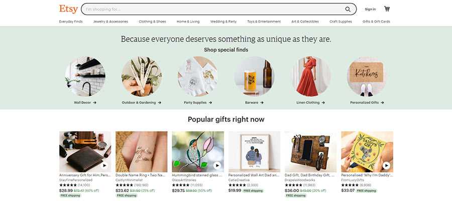
A hero area can be just as attention-grabbing as a slider. But, since they tend to focus on a single thing, they can be built to focus on conversions without hurting performance or accessibility. Plus, the inclusion of standard HTML content is likely a boon for SEO as well.

Card Layouts
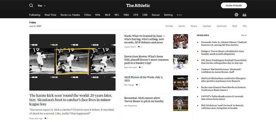
Multicolumn card layouts have long been a thing. But advancements in CSS layout techniques have made them much easier to create and manage. They can be both visually appealing and adjust beautifully to smaller screens.

Complex CSS Grids
Even if cards aren’t your thing, you can still create some amazing layouts with CSS Grid. A responsive design pattern that creatively highlights your top content is very much possible. Span multiple rows or columns, craft a highly visual space for your latest blog posts. The biggest limit here might be your imagination.

Video
While no one will accuse video of being great for load times, it can be an effective slider alternative. Just think: it adds interactivity and allows you to make several key points in a single space. Add in some great production, special effects and captions to make the experience a positive one for users.

The Slider’s Place in Web Design
While a slider may not be the most efficient solution for showcasing your top content, that doesn’t mean there isn’t a place for it in web design. There are still some great niche uses.
An interactive display of photos or (gasp!) presentation slides are great examples. This more or less serves the original purpose of a slideshow. Other creative possibilities, such as a portfolio or timeline, are also worthy of experimentation.
Anecdotally, at least, it appears that slider use may be on the decline as a homepage centerpiece. That’s great to see. The web has come a long way since the feature first started popping up. It only makes sense that designers move on to better solutions.
Top