There are always some key aspects in designing a website which you have to give full attention. Site navigation is one of these important features which is found in every single layout design. Nav links generally lead to the most important pages in your website and help visitors get around quicker. You’ll often find these above-the-fold where the page cuts off at the bottom of your web browser.
Considering some design ideologies we can determine powerful trends in building navigation menus. These roll over into many other realms of design including mobile and tablet PC. You have to think of navigation links as your visitor’s main control panel over the website. This is how people will maneuver through each of your pages and come to eventually find what they need.
You can build a professional design style using a fixed navigation bar in your website. This is often positioned just underneath the logo or directly at the top of your layout. I can reference a great example from the Fork CMS webpage.
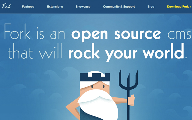
In this scenario Fork has actually placed their logo inline with the other links. Often you need a very wide layout style which allows for the top bar to span all the way across. You could alternatively limit the width based on a content wrapper and this will produce the same effect.
What I like about this style is the direct understanding that it just works. Users know to scroll towards the top and they will find all the major links required. You can even download the latest version of their CMS from the Download link to the far right. Take notice this is actually colored a bright yellow to stand out from the other typical page links.
Oversized Headers
The header area of your webpage layout is generally the first place visitors look for navigation links. When you’ve got super oversized fonts or icons these tend to draw even more attention. If you have the skills to design custom textures or graphics you can use these within a typical nav menu.
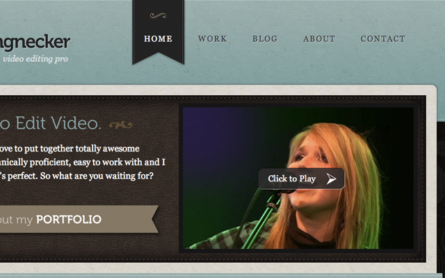
Take the example of Sarah Longnecker’s portfolio where she has the most important links floating towards the top right. Depending on which page you’re currently viewing the specified link will have a selected state with a background ribbon. This is a perfect example of how you can offer at-a-glance information to the user without taking up much room.
If you also notice Sarah has placed links in the sidebar and footer area of her layout. This isn’t to say these links aren’t as important. But when people visit her website they will mostly be interested in the main core pages. If you have time to spend browsing around you may enjoy some of her other blog posts, yet these are not fundamental to the website itself.
Vertical Parallax Scrolling
I have seen this trend become adopted much faster among web design firms and smaller portfolios. You can code a super long webpage in one file with all of your content together while the navigation links slide your position up and down the page. This is a similar style to parallax web design except we’re limited to the up/down directions.
The Snoggle Media website has a fixed navigation setup on the left side. As you scroll down the page it acts as a sticky of which you always have immediate access. What’s interesting is that each of the pages can actually be viewed individually. However from the homepage you also have access to each important section like the blog, portfolio projects, and contact form without leaving the root URL.
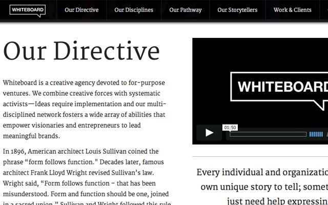
Whiteboard is another such example where you can begin scrolling down the page and a whole new navigation menu appears up top. As you click between these links the page will scroll around in a similar parallax fashion.
Their design also offers individual pages for most of the core sections. This is nice so that you can have a working permalink to share with others if needed. But their design is also very crowded – it works for some people however I find it difficult to digest all the information. Be careful with these types of fixed navigation links so that you aren’t alienating users who may be on older web browsers or smaller monitor screens.
Content-Heavy Dropdowns
We are all familiar with dropdown navigations which have a main top link along with additional sub-links. I have noticed a trend for larger blogs and magazines that have very detailed dropdown menus. These often include links to recent posts and other top category archives.
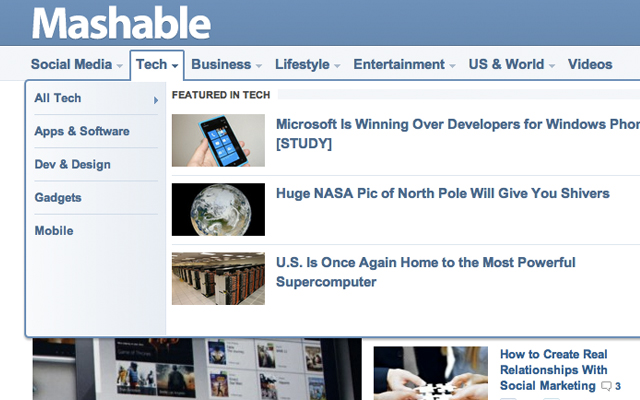
I can immediately consider the new Mashable navigation where you can hover over each of the top categories to reveal a whole lot more information. This dynamic dropdown window includes the latest posts from that category, along with other sub-categories you can choose. But this isn’t even the end of their dynamic efforts.
As you hover over each of the sub-links the story content will automatically refresh using Ajax. So as you hover over the different links inside Tech(Apps, Gadgets, Mobile) you’ll be given the latest stories published in each of these smaller categories. This is a brilliant idea from the user’s perspective as there is much less clicking around to navigate between pages.
Design Links into the Layout
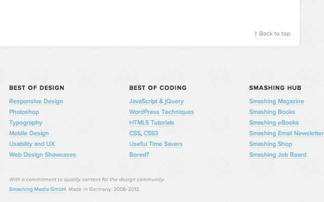
This is a trend much harder to spot than anything else. What you want to do is design your layout around the purpose of having tons of links between all your archives and main content. The newest Smashing Magazine design features website resources at the top with high-traffic categories in the left sidebar.
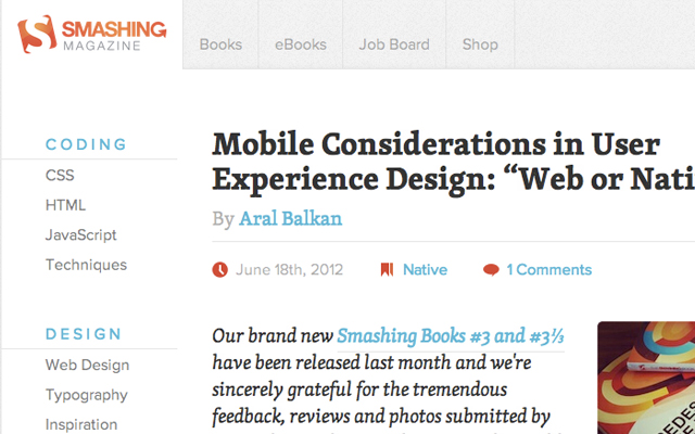
As you scroll down you’ll find more links in the right sidebar along with block lists inside the footer section. When you run a popular blog such as Smashing Mag you end up trying out new and distinct layout ideas. It just feels natural to find all of these internal content links scattered in different places. And the best part is they don’t feel awkward in the website – their layout almost seems to wrap around the links in a very comfortable position.
If you have a solid idea like this navigation system keep practicing until you’re satisfied. You probably won’t feel great with the first iteration, but as you try out new strategies you’ll be learning in the process. Designing powerful navigation menus is all about learning from your past mistakes and not being afraid to jump into unknown territory!
Final Thoughts
These are just some of the more popular design trends found in 2012. For as long as we have the Internet there will always be a need for websites, and these sites must have some form of navigation. The methods of building links will certainly change as newer standards are adopted.
However the functionality of these navigation systems will remain fixed. Users are very comfortable with the current system and it’s almost like a 6th sense picking up on how to move through different pages. If you have similar examples of unique navigation trends definitely share with us in the post comments area below.
Related Topics
Top