Developers are often so obsessed with extravagant solutions that they sometimes get carried away – forgetting how the simplest things can make an interface a better place. One such example is whitespace.
Creatives do not always give it proper credit. However, if you are building a comfortable user experience with a prime focus on the content, then whitespace is your friend. It’s the one that stands behind a pleasant UX, encouraging visitors to stay on a website. It creates order out of chaos and puts everything in its place. It assists in establishing visual paths and determining the priorities. It does all the heavy lifting behind the curtains.
These arguments may sound banal. Nevertheless, they are reasonable and based on a long history of experimentation. Without a proper amount of fresh air, your users will feel claustrophobic. The general experience will lack enjoyment.
Of course, whitespace will always be whitespace. You cannot transform it into a mind-blowing animation – it is just a blank space. However, this does not mean that it has nothing to do with the design. On the contrary, it is an integral part of it.
Today we are going to show you how whitespace skillfully sets the content apart from everything else, as well as plays an essential role in the overall aesthetics. Let us explore some designs with lots of whitespace presented as huge, organized gaps.
What We’re Looking For
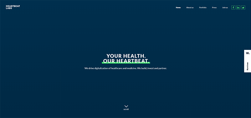
We will intentionally step aside from more traditional designs like Beyond Theory or Heartbeat Labs, whose hero areas can be deservedly called spacious.
Their welcome sections consist of only vital elements such as the tagline, navigation and whitespace. Without a doubt, they are filled with fresh air. They both look crisp. And, their slogans instantly catch an eye. However, there are other intricate ways of using whitespace. Therefore, we are going to consider only those interfaces where cleverly organized gaps run the show.

Olio Intini
The first example to examine is Olio Intini. The design team goes beyond just displaying content. They took the regular hero area, with an image and tagline, and made it look exceptional with a little help from huge gaps on both sides. These gaps easily direct everyone’s attention towards the central part of the screen as well as add an intricate charm to the design.

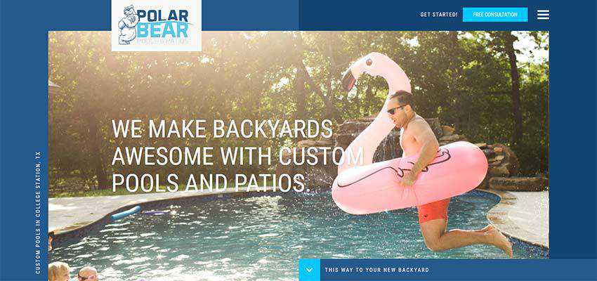
Polar Bears Pools
Olio Intini is a perfect primer for the balance between whitespace and content, even though the left and right margins feel bold and too large at first. Polar Bears Pools is a similar example.
The team behind the website’s design sticks to the same route. There are huge gaps on the left and right side. Yet in this case, the image-based section takes more space than in the previous example.
Nevertheless, the trick still works. What’s more, it is here where the boxy structure meets a generous amount of whitespace, carefully arranged in delineated blocks. As a result, the hero area looks fantastic. The huge gaps are an integral part of the overall aesthetic.
Archi Graphi / Azura
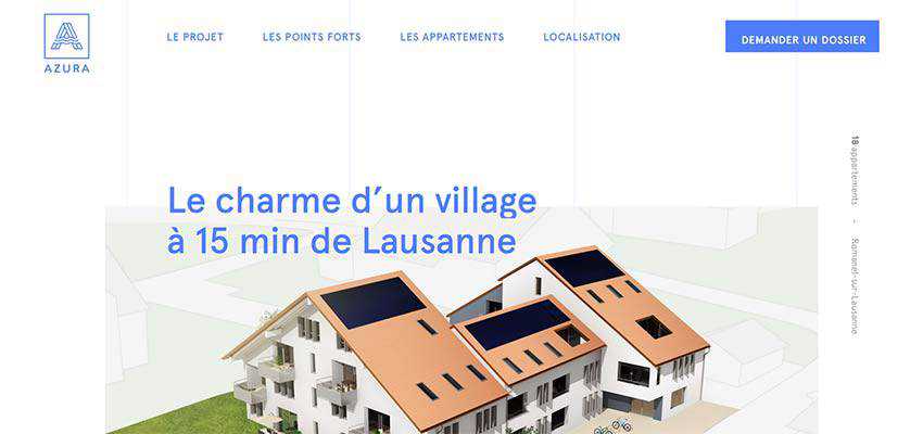
Archi Graphi and Azura show us how huge gaps naturally blend into designs with vertical rhythm. Both of them have hero areas with trendy vertical text; and Azura even features vertical lines in the back. Note there is a bulk of white space in the top header. This trick naturally brings the logotype in Archi Graph and navigation with CTA in Azure into the spotlight. The home screens are well-balanced, informative and visually appealing.

Tappezzeria Novecento / Gucci Gift
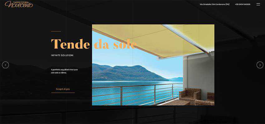
In the previous examples huge gaps strengthen the overall design, playing the role of a perfect addition. But in the case of Tappezzeria Novecento and Gucci Gift, they are just a necessity.
The hero area in Tappezzeria Novecento is content heavy. Without a proper amount of whitespace, it will scare users away with its informative pressure. Notice how the design team masterly plays with the gaps. The layout is asymmetrical, yet this works in its favor. The design feels original, although there is nothing grandiose about it – just a skillful combination of content, graphics, and whitespace. Simply ingenious.
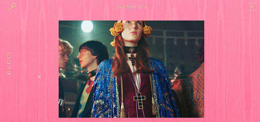
As for Gucci Gift, the audience will not be able to enjoy the interactive part of the website without a proper amount of whitespace from every side. Here, huge gaps are required to show the interactive canvas that lies behind the images in the center. They provide users with an actual place to play with the background.
Spindle / Kolaps
How about adding even more space by opting in favor of truly enormous gaps?
If you think that is too much, then take a look at Spindle and Kolaps. They look fantastic. It feels like the entire aesthetic, as well as the first impression, rely on this massive amount of whitespace.
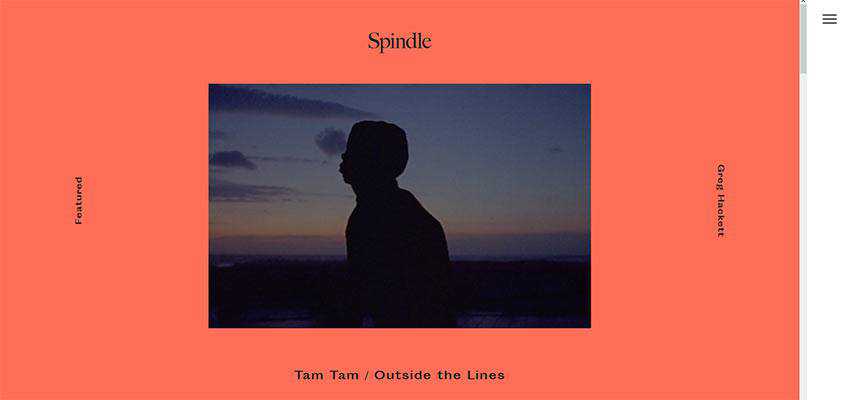
The team behind Spindle shows us the modern take on minimalism. The hero area is all about the relatively small image, vertical navigation, and text-based logotype. It looks neat, crisp and original.
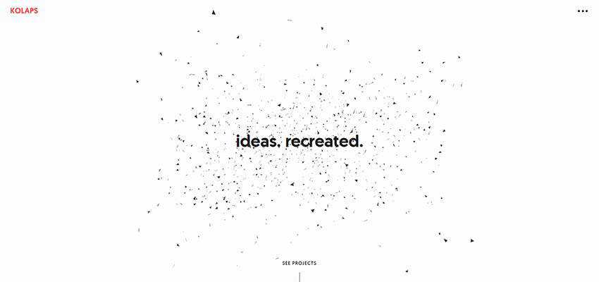
The team behind Kolaps benefits from the symbiosis of high-end animation and whitespace. These two perfectly complement each other.
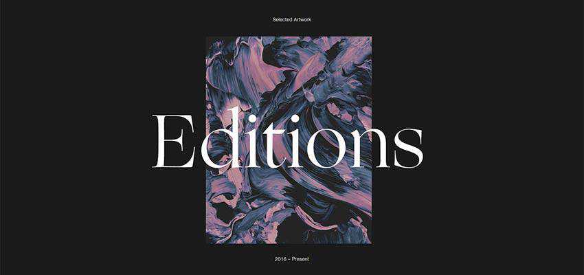
Editions – Jordan Sowers
Following the previous two examples of adopting large gaps, the team behind Editions – Jordan Sowers has opted in favor of incredibly large gaps on the left and right sides. Still, the solution does not look outrageous. It may look bold, but undoubtedly intriguing. It seems like you can never have enough whitespace.
The hero area of Jordan Sowers’ portfolio feels spacious and minimalistic. It screams out the portfolio works, drawing the overall attention towards the heart of the page.
So Much Fresh Air
To make a first impression is increasingly vital, no one argues with that. However, what is next? You cannot survive on just a grandiose hero area.
In the long run, content is a king and the way you present it is even more crucial. Whitespace helps it to ascend to the throne. recreating a proper entourage. And if you feel like using whitespace is dull, you can always twist the solution a bit. Try and leverage huge, well-organized gaps that serve the same duty but bring about a more exciting effect.
Related Topics
Top