Helping people easily navigate a website is one of the basic responsibilities of a designer. There are plenty of fancy features we can add. But what it all comes down to is providing functional navigation and plenty of visual cues.
This is fairly easy to accomplish on smaller sites. A five-page “brochure” site, for example, won’t have complicated needs. But larger sites can be more complex. Therefore, we need to implement features to help users sift through potentially massive amounts of content.
With WordPress, there are several options for enhancing content-heavy sites. Today, we’ll point out some techniques to help users find their way through your site. And, we’ll link to some handy plugins that will assist in getting the job done.
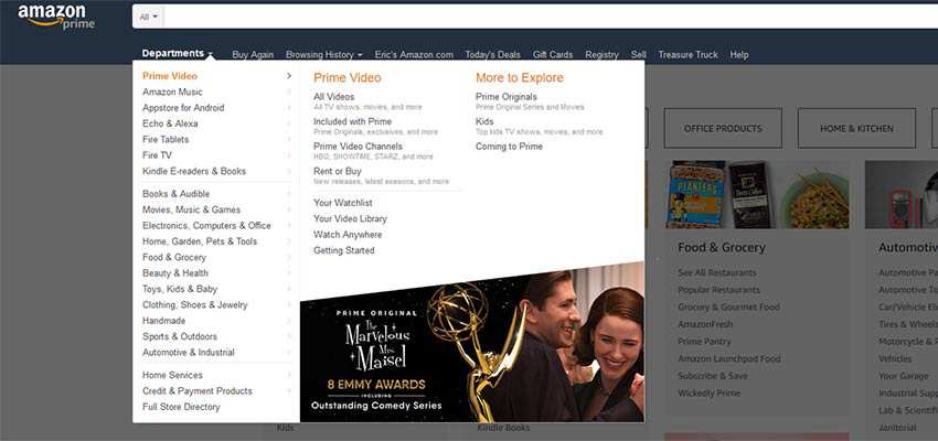
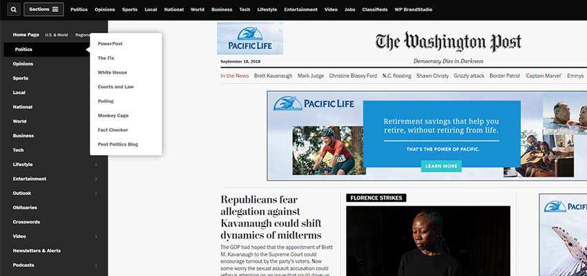
We often see larger sites that take advantage of so-called “mega” menus. When properly implemented, they can be quite useful. They allow you to organize lots of pages, sub-pages, and featured content into a small space. It can be much more user-friendly than multi-level “flyout” menus.
Still, it’s easy to go overboard. Many themes and plugins (such as UberMenu or Max Mega Menu) offer mega menu functionality with a whole lot of extras. For example, you might find the ability to add images or WordPress widgets into a menu. While these features can be compelling, they can also be very distracting.
If you plan on implementing mega menus, think about the real purpose behind using them: Making content easier to find. With that in mind, create a menu that:
Is Easy to Read
Overstuffed menus tend to be illegible. Therefore, think about what items absolutely need to be included. If fancy add-ons get in the way, don’t use them.
Sections of content should have clear separation and spacing. Text links need to be large enough and provide enough color contrast to be easily read.
Isn’t Overly Sensitive to Cursor Movement
Have you ever tried to navigate a large menu and, with one inadvertent movement of your cursor, it disappears? You lose your place and have to start the entire process over. It can be incredibly frustrating.
Larger menus should stay open until the user selects a path forward. If they want to close the menu, provide a clearly marked way to do so.
Is Mobile Friendly
Perhaps it’s a bit obvious, but any navigation solutions should also adjust to the needs of mobile users. It shouldn’t require any fancy dexterity to go through the content hierarchy.
Utilize Breadcrumbs
Breadcrumbs can be great for helping users navigate multi-layered content. Plus, they can also provide you with some SEO benefits, as well.
They are also quite easy to implement. In fact, if you use the Yoast SEO plugin, breadcrumb functionality is already built in – you just need to turn it on and add some code to your theme. For even more fine-grain control, Breadcrumb NavXT is worth looking into.
When adding breadcrumbs to your site, consider:
Length of Trail
One thing to be mindful of is the length of your breadcrumb trail. As a general rule, you should only display links directly relevant to the current page.
For example, if you’re viewing a sub-page of the “About Us” section, show only the parent page and (optionally) the current page in the trail. That means you can leave out the home page. Short, relevant trails are less confusing and more attractive to look at.

Placement
Breadcrumbs don’t need to be the most prominent visual on the page. But they should be easy to spot and read. Often, placement above the content with some surrounding whitespace will do the trick.
Boost WordPress Search Capabilities
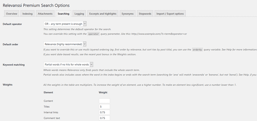
The default WordPress search functionality doesn’t consider things like custom fields or even weighted relevance. So, improving the search capability via a plugin is a must.
Thankfully, there are some terrific options for providing better results. Relevanssi, for one, lets you tweak search settings to your heart’s content. For something a bit more visually appealing, Ajax Search Lite will add the popular “live search” functionality to your site.
Whatever path you decide to take, you’ll want to ensure that your search is as user-friendly as possible. Consider implementing the following features:
Search All the Things
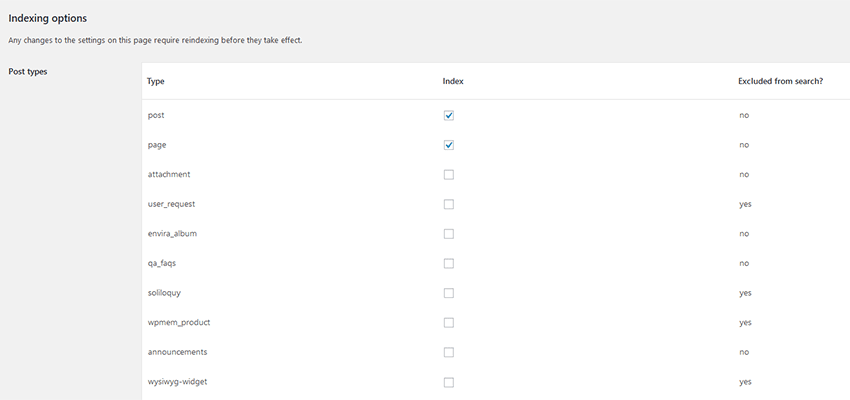
Users should be able to search through not just standard posts and pages but other custom content as well. Items like custom fields, custom post types, WooCommerce products, etc. should be accessible through search.
Weighted Results
Just because two posts have the same keywords doesn’t make them equally valuable. That’s where the ability to add “weight” to certain criteria can help users find the most relevant results. For instance, newer posts, or posts in a specific category, might carry more weight than others.
Show What Matters
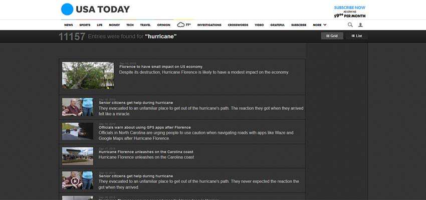
How we display search results can have a big impact on usability. Simple things like showing post meta (publish date, categories, author, etc.), featured images, and highlighting search terms within content make results easier to scan.
The User’s Toolbox
Ultimately, it’s up to us to provide users with the tools that will improve their experience. The goal should be to simplify things as much as possible. If our solutions are too complicated, we’ll see it reflected in high bounce rates and tiny session times.
If budget allows, usability testing is a great way to find out exactly what pain points exist. But there are steps you should take, even before any testing. It’s important to think about how users will get around and design features to enhance that concept.
And, regardless of what WordPress plugins you use, try to keep things simple and intuitive. Your visitors will be all the better for it.
Related Topics
Top