Our rendering technology is unthinkable, yet we still study Mondrian. Great minimalist work is striking, elegant, and classic. Within the colorful world of advertising, a minimalist ad stands out from the crowd. They can be a hard sell, though—a poorly conceived minimalist advertisement showcases its flaws and looks amateur to a client.
Want to create a killer concept for minimalist graphic design? Here are five steps to get you started.
Put your subject’s zeitgeist to work for you.
The most powerful minimalist ad campaigns work because they use the public’s existing product knowledge as a platform for new ideas.
What is iconic about your subject?
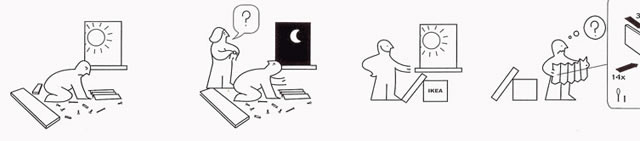
Don’t limit yourself to logos. Think about the zippers and stitching on jeans, the dome and Phillips head of a screw, and the distinctive graphic design of IKEA instructions

What is beautiful about your subject?
ADD.org ran a successful campaign geared toward athletes. In it, beautiful line drawings accentuated the action and musculature of people in motion.
What is funny about your subject?
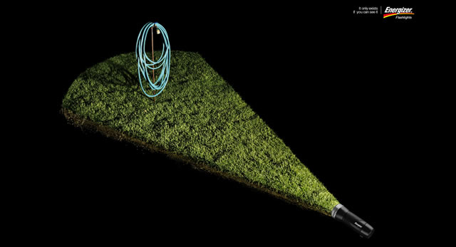
What is the funniest quirk? The funniest use? Think of Energizer’s minimalist flashlight ads locating your hand, the light switch, and a huge spider.
Create a visual Portmanteau
A common trope in minimalist ad design is the unexpected juxtaposition of two important concepts. Using graphic design to create a bridge between these two concepts has been the basis of many successful campaigns
Are there two obvious concepts for you to connect?
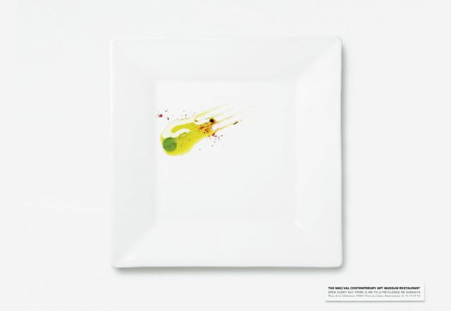
When the MacVal Contemporary Museum of Art advertised its restaurant, it connected the ideas of modern art and food by creating stark modern art out of food itself.
Is there an association you’d like to encourage?
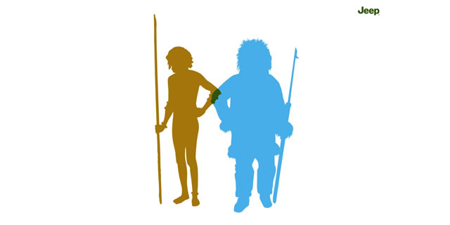
Jeep used this strategy to bolster the rugged image of their cars by juxtaposing the silhouettes of an Inuit and an Amazon warrior, intersecting to create the unmistakable shape of a Jeep.
Play games.
At its best, minimalist graphic design is fun. Jog your creativity with some quick brainstorming games.
A popular game amongst cartoonists is to retell an entire movie in four panels.
Can you retell your subject in one?
If your subject were a Pictionary topic, how would you draw it?
Add Value
By now, you should have a couple of good ideas for your minimalist design. You need to make sure that your work complements your concept.
Make the design elements sing.
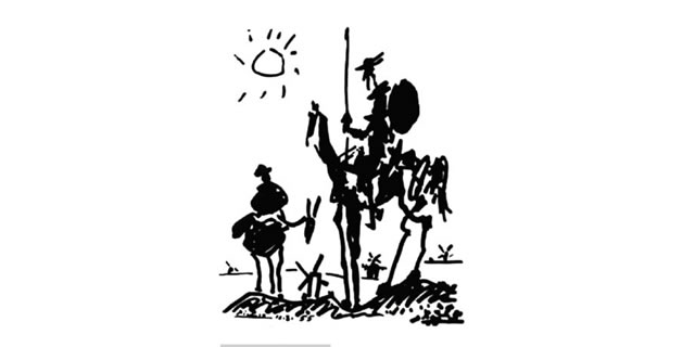
Remember Picasso’s Quixote? This minimalist work of art stood the test of time because of its expressive linework, excellent craftsmanship, and striking composition. How can your graphic design better tell the story of your concept?
Don’t cut corners, and don’t cut and paste.
Lazy execution makes great ideas look cheap. Don’t copy the ladies’ room icon directly if you can redraw it with more engaging proportions. If your design requires brushwork, this may be time to put aside your tablet and dust off your sables.
Minimalist ads separate the true graphic designers from the folks who simply decorate a page. Go ahead and revel in your minimalist masterpiece. Your page of mostly negative space is a stark, beautiful and straightforward expression of an idea.
Related Topics
Top