Black-and-white typography was the first featured in printed books. It’s been around since ancient times, and everybody has seen some example of it first hand at some point. Why, especially in a world where we can print letters in any colors imaginable, does black and white typography still captivate us so much?
The Ultimate Contrast
Black is the darkest color possible. White is the lightest. Combining them, whether it’s black text on a white background or white text on black, instantly creates the deepest contrast you can ever achieve. Contrast is a known eye-catcher – it’s bold, dramatic and makes edges look crisp and sharp. No colors can exhibit the high-contrast sharp look as well as black and white.
The benefits of black-and-white typography include:
- High contrast
- Sharp edges
- Versatility
- Dramatic look
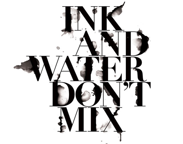
Image Source: Craig Ward
Two Colors and Everything in Between
Unlike any given combination of two colors, black and white can literally be used to convey any subject. Graphic design-wise, the term “black and white” includes all possible combinations of the two colors, which means that you also have access to the entire spectrum of grays as well.
This presents a wide variety of options you can use for design, including:
- Smooth shading for three-dimensional type
- Gradients
- Complex textures, such as bumps or spikes
- Photo-realistic materials (ice, feathers, glass, smoke and so on) from which to make type
- Detailed patterns
- Interesting light and shadows as if the type were a real object
Image Source: Mrtyn on Deviantart
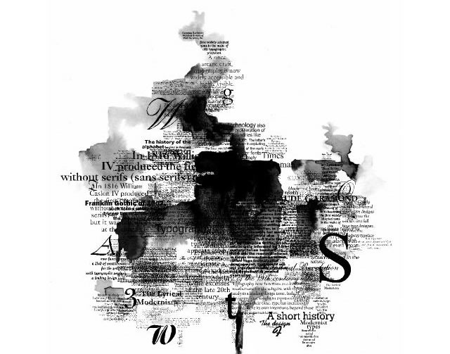
Image Source: Tpography Tree by Fikriye
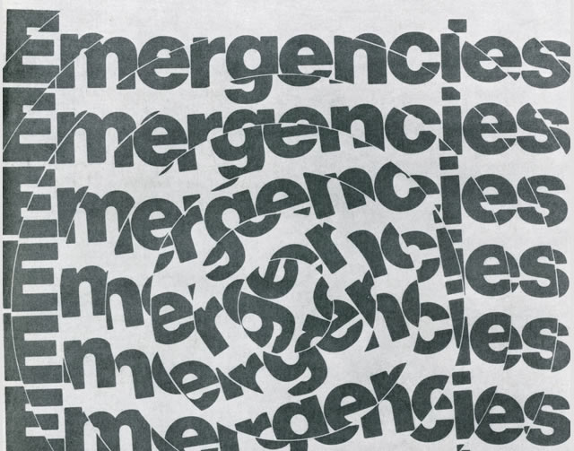
Image Source: American Graphic Design 66 by Alki1
Two Tone Design
Despite the options that gray shading offers, sticking to pure black and white is often the route that designers take. This preserves that striking light-dark contrast while at the same time creating a certain look.
Depending on the type and the presentation, a designer can use black and white to convey the sketchiness of hand drawn art, the shininess and wrinkly texture of leather and more.
A limited palette shouldn’t limit your creativity – here are just some of the possibilities for pure black and white typography:
- Black text with thin white stroke on a white background
- White text on a white background with thick black negative space to show letter forms
- White text with black stroke on white background
- Black text with white lines to show contour on white background

Image Source: Inject Knowledge Question Mark by CHIN2OFF
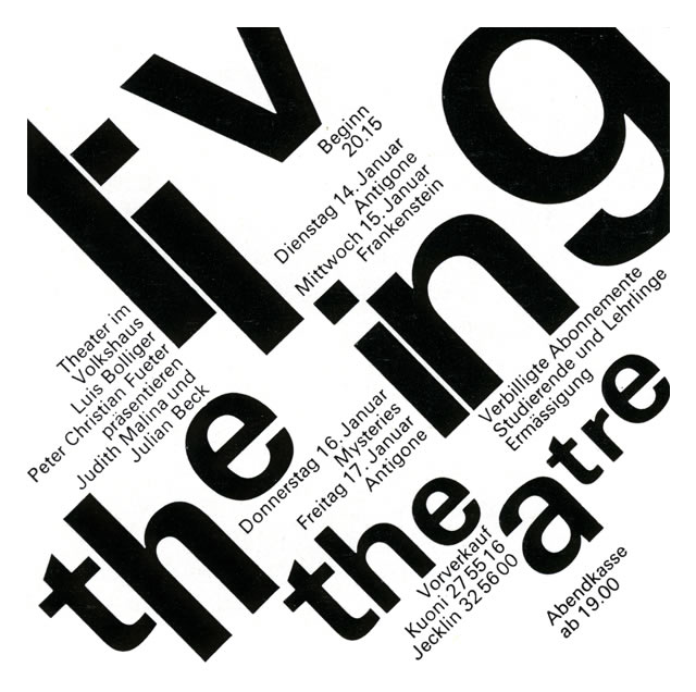
Image Source: Swiss Student Graphic Design by Alki1
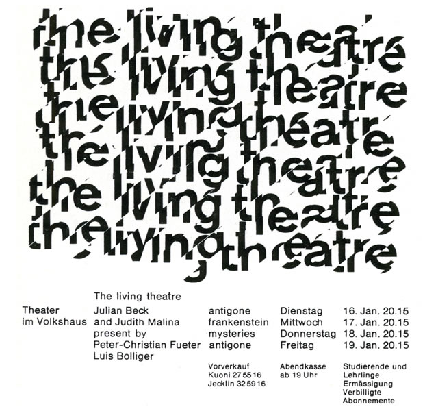
Image Source: Swiss Student Graphic Design by Alki1
Affordable Printing
Another advantage of black and white typography is that it costs less to print. While other two-color designs take two different kinds of ink, black and white requires only one – black – if you print it on white paper.
Unless you’re careful, shades of gray sometimes give the impression that your printed media is in black and white to save on printing costs. Pure black and white can actually look more expensive due to its elegance, even though it isn’t.
In Conclusion
Black and white typography may be the oldest type in existence, but it’s far from boring and out-dated. In fact, it holds its own against color typography even now.
If you want designs with focus on form, texture and creativity rather than flashy colors or special effects, black and white is the way to go.
Related Topics
Top