In this article we discuss the importance of navigation design patterns using examples from some of the hottest websites and web apps.
Once someone starts using your website or web application, they need to know where to go and how to get there at any point. If they can’t navigate through your your application easily, you’ll quickly lose them. Thus, designing effective navigation in your web application is crucial.
1. Jump to Section
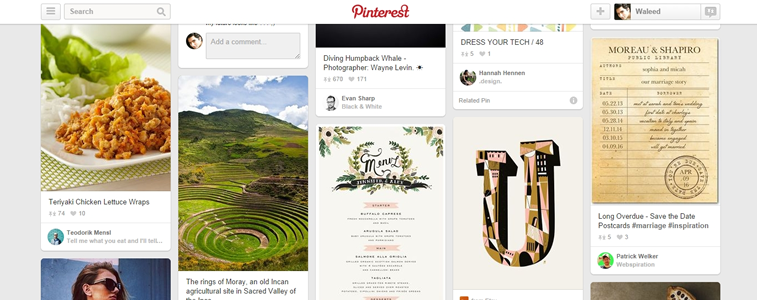
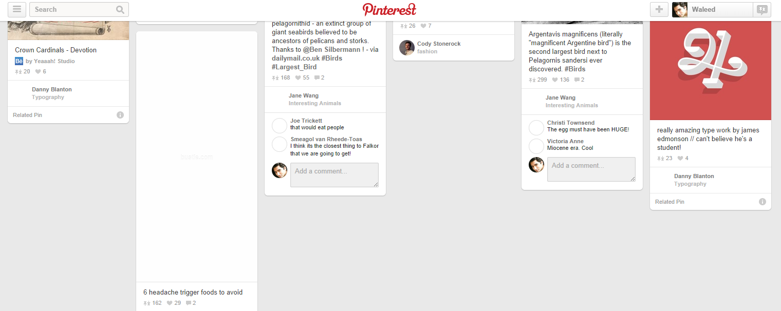
Example: Pinterest.
Problem: The user wants to jump through whole sections of a web app or content quickly.
Solution: Create a shortcut button or hot spot that takes users directly to a certain part of a web app, typically at the beginning or end but more commonly other specific points.
For example, users can click a tab or button to scroll to the top of the page from wherever they are. This comes in handy especially if you’re also implementing the Infinite Scroll pattern (see below) and the page can get really long as new content is loaded one after the other.
If users want to access controls or information that is only visible at the top of the page, returning there after several pages worth of scrolling can be a nightmare. Pinterest solves this user headache by showing an unobtrusive “jump-to-top” button that instantly scrolls the user back.
2. Single-Page Web Apps

Example: Gmail.
Problem: The user wants a central place to view or take actions on most or all content so they don’t have to waste time navigating between pages.
Solution: Use modern web development techniques to build a single-page app that doesn’t need to reload itself as the user browses through it. This pattern is more of a complete restructuring of how the web works rather than something you can hack into your app afterwards. In a way, the “page in a single-page app isn’t really a page in the traditional web sense, rather it’s more of a particular data view. Single-page web apps load asynchronously (using AJAX), in that they perform instantly without the user having to wait for separate pages to load between operations.
Gmail is a good example of a single-page app that integrates multiple actions into a single “page”. The trend of single-page designs is a less-hardcore implementation of this UI pattern, where all content can be accessed on the same page. This makes browsing much faster and responsive, blurring the line between desktop and web apps.
For web apps like Spotify, the single-page app pattern becomes essential when you consider that the user might play music in the background but also browse through more music at the same time; having a single-page app eliminates the need for a page reload, so the music can keep playing.
One consideration you’ll need to make when implementing a single-page app is the URL structure. Because content is loaded dynamically using JavaScript, URLs can become useless and accessing a particular view can become impossible if not done right. Web apps like Gmail and Twitter overcome this by explicitly generating unique URLs for each view, which also solves the problem of the browser’s Back button becoming unusable.
3. Recommendations
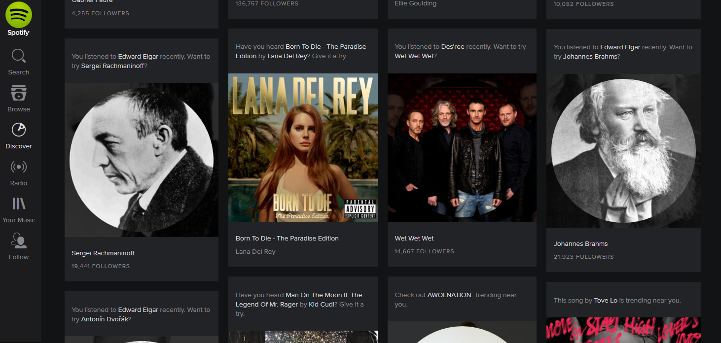
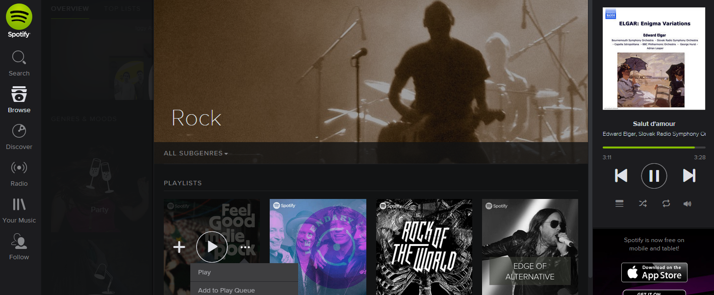
Example: Spotify.
Problem: The user wants to know which content to view.
Solution: Show content suggestions and recommendations at various points to help the user browse through your content. Using the information from the user’s profile preferences or their past interactions in the app, Facebook, Eventbrite, Spotify and Yelp among many others generate tailored recommendations for their users to help them discover new and related content or connections.
These recommendations can come in the form of “popular” or “recently posted” items. Facebook provides “related” pages based on the user’s interactions with posts in their timeline as well as a more dedicated recommendations section where users can discover new pages and people to follow. The stream of content available to users can be endless especially in social web apps that feature user-generated content. As discussed in Web UI Design Patterns 2014, providing a robust recommendations engine in the UI can be a great way to help them discover new content.
4. Related Content
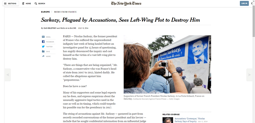
Example: New York Times.
Problem: The user wants to browse similar content if the current content isn’t exactly what they’re looking for or they simply want more.
Solution: Show similar or related content to help the user find more items that are similar to what they’re currently viewing. Like Recommendations (above), this is becoming an essential UI pattern for web apps that feature user-generated content, except rather than tailoring the suggestions based on the user’s preferences or previous activity, Related Content is more about showing related items based on the way they are categorized and tagged.
Amazon, TIME and New York Times are good examples of sites that show items and stories similar to the one currently being viewed. Medium takes this a step further by allowing readers to suggest related content by adding a link to the article’s Further Reading section.
5. Next Steps
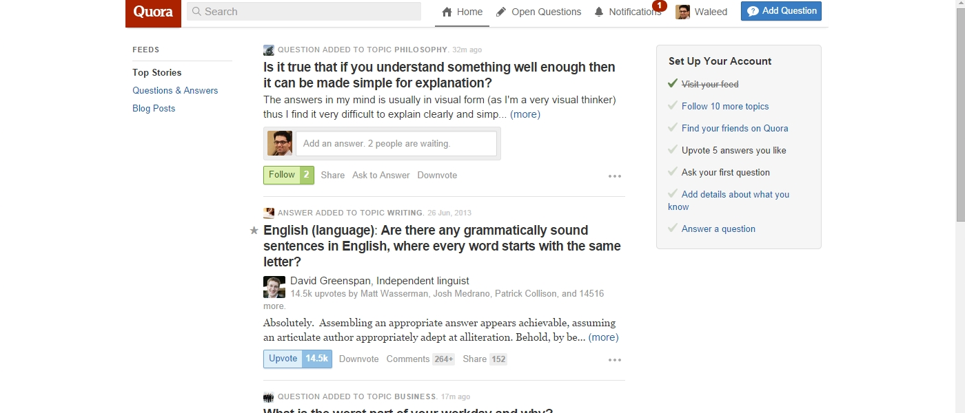
Example: Quora.
Problem: The user wants to know what next steps to take after finishing a task.
Solution: Give the user a clear list of next steps that they can follow to enrich their experience. Quora for example creates a to-do list for users to follow to complete their profile. LinkedIn does the same by showing a list of sections the user can add to their profile, pairing it with the Completeness Meter pattern to provide users with an incentive.
Most complex web apps have multiple user flows, so providing users with a to-do list can be a great way of guiding them along. Another pattern this can be paired well with is Related Content; Medium does this well, by showing the teaser for another article when the user reaches the end of the current one. This keeps the user engaged and immersed in your UI.
6. History / Recently Viewed

Example: Amazon.
Problem: The user wants to recall what they interacted with last.
Solution: Let users pick up activities where they last left off. For example, Amazon keeps track of the user’s browsing history and shows recently viewed items so that they can get back to them easily if need be. Many web apps also keep track of what the user has been doing and the Facebook Timeline is the ultimate example of this. Not only does a user’s Timeline record posts made and photos uploaded, it also logs interactions with other pages and 3rd-party web apps like Spotify in an interactive history that the user can refer back to whenever needed.
Google Play Music and Spotify keep track of recently played songs. This pattern helps users keep track of content they’ve interacted with and can also serve as a way of bookmarking things to do later.
7. Featured Content
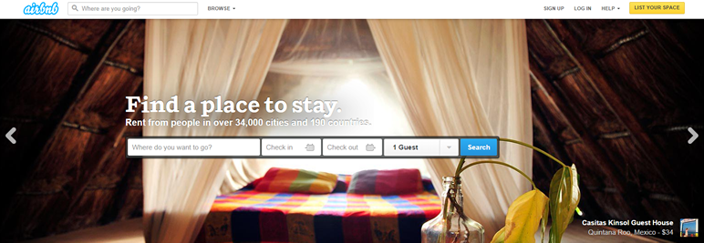
Example: Airbnb.
Problem: The user wants to know what kind of content can be created with the app.
Solution: Feature specific content front-and-center for users without it getting lost in the mix of often time-related content. This content could be paid, popular, new, or some other important variable.
Featured content serves to show users the possibilities and helps them understand what the platform can accomplish as well as the things other users are using it for. Sites like Airbnb, Etsy and Flickr show random content on the front page that helps users explore the site without having to make a commitment beforehand, as well as encourages existing users by helping them reach greater audiences.
On the other hand, it can also help particular pieces of content gain traction by giving it particular importance. Paid or “featured” content can be marked as such to clarify expectations.
8. Infinite Scroll
Example: Pinterest.
Problem: The user wants to browse through all content.
Solution: Automatically load the next set or page of content when the user reaches the bottom of the current page, creating the effect of an infinite scrolling page. This way new content is automatically loaded and the user does not have to wait after clicking on a “next page” link. Infinite scrolling works best when there is a lot of content to show, as with most social media giants like Facebook, Twitter, Pinterest and Tumblr among others.
However while its great for browsing content, especially multimedia galleries, two basic problems are that users can become disoriented and lose their place. If they want to skip to a particular point or bookmark to come back later, infinite scroll can cause problems. Facebook works around this when browsing a Timeline by creating a pagination/infinite scroll hybrid that lets you jump to a particular month or year. Pinterest integrates the Scroll to Top pattern, with a small button that lets users jump back to the start of the page.
9. Walkthroughs & Coach Marks

Example: Slack.
Problem: The user wants to know how to use the different features of the application.
Solution: Design a walkthrough or tutorial that demonstrates how each function works. A lot of web apps have begun using this technique to show users around when they first launch and there are two basic ways of doing this.
Some web apps, like Slack go the route of overlay instructions, highlighting important parts of the UI with “coach marks” to explain what they do. Slack takes things to the next level by integrating a chat bot that helps users set up their profile. This makes perfect sense given that Slack is a chat app, and the “Slackbot” walks the users through filling in their profile information like phone number and display name like a conversation.
Alternatively, Tumblr presents a walkthrough to help the user get acquainted. This walkthrough is also a great time to collect important information that goes beyond simple registrations, much like a setup wizard. The importance of this pattern cannot be stressed enough for any application that isn’t immediately intuitive because the more a user knows about your product, the more reasons they’ll have to come back.
10. Overflow Menus
Example: Spotify.
Problem: The user want quick access to additional options or actions they can perform.
Solution: Hide extra options and buttons in an expandable menu so that they don’t clutter the main interface. Both Facebook and Google use “overflow menus” to maintain very clean user interfaces on their web apps by hiding the most important secondary options in an expandable menu.
This can also be used to show the most important actions in terms of engagement. For example Pinterest keeps a share on Facebook button visible to help speed up a common and desirable user action on each “pin”. Alternatively, an overflow menu can be used to contain additional menu items or actions as they are incrementally added to the UI.
11. Morphing Controls
Example: Pinterest.
Problem: The user wants to perform different types of actions, but there’s limited screen real estate to show all these controls.
Solution: Replace buttons and on-screen controls with alternative functionality. Depending on what the user is currently doing, the UI could entirely replace an element with another, e.g. “do” and “undo” or “add” and “delete.” This makes sense when the alternating actions are related in some way. Pinterest and Facebook use the same button for “like”/”unlike” to save space and also indicate the current state to the user. This UI design pattern saves real estate, makes undoing any action quick and clean, and is an overall playful solution.
Example: Houzz.
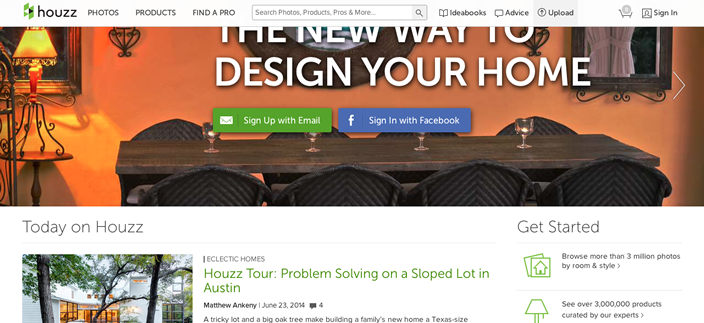
Problem: The user wants to have access to the menus anytime while on the web page.
Solution: The top, side, or bottom navigation stays in place while a page is scrolled. In some cases, headings from sub-sections may also become fixed while scrolling and replace or be appended to the existing fixed navigation.
The main navigation bar for both Google+ and Pinterest sticks to the top of the page, allowing users to quickly access those menu items and filters whenever they need to. When paired with the Infinite Scroll pattern, a sticky navigation menu can be a great convenience for users who scroll past more than the first page’s worth of content.
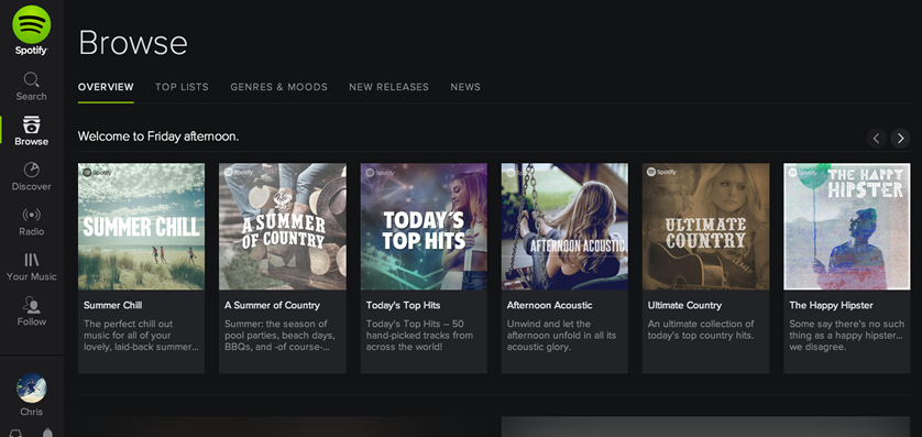
Example: Spotify.
Problem: The user needs a way to navigate between different sections of the app, but there’s limited space to show this information.
Solution: Important sections of the UI can be presented in a list, which the user can scroll through to get what they want. This also leaves the header and footer of the UI free for more “universal” navigation, such as action bars. Traditionally, most navigation patterns have been horizontal in the form of tabs or buttons. The vertical navigation pattern has emerged as a significant evolution to navigational design to deal with user-generated content like user timelines and infinite scrolling content.
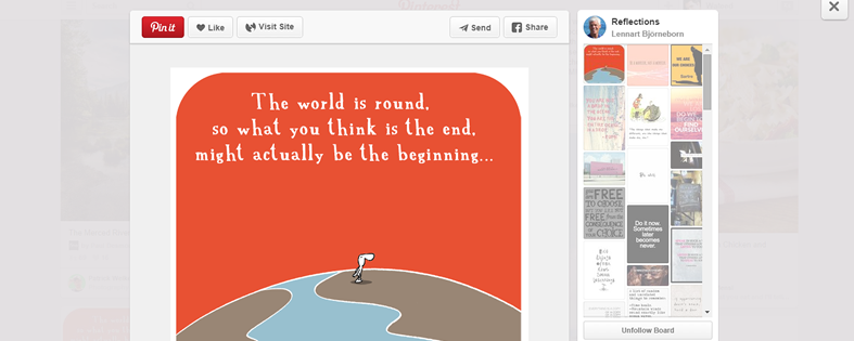
14. Popovers
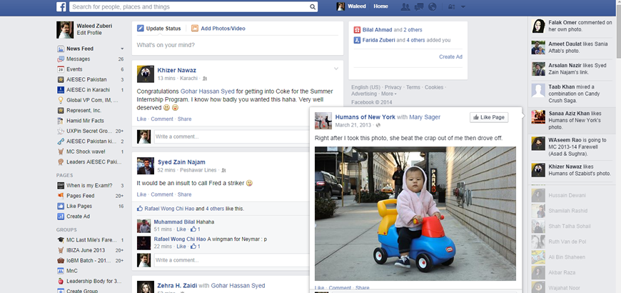
Example: Facebook.
Problem: The user wants to view relevant information without losing their current place in the UI.
Solution: Show important notifications and additional information in popovers. This UI pattern has the advantage of providing a lightweight and straightforward way of viewing additional information or taking a particular action, but they do so without pulling the user out of their current activity.
Pinterest and Fitocracy use modal popovers for quick actions, and Facebook uses popovers to quickly show snippets of content from the Activity Bar. The popover UI pattern is important for actions like these because they are being performed on the data and this way users always know what these controls apply to.
With the content still visible in the background, the user can tweak sorting options or change the font size without having to go back and forth between the views – it all happens right there. Popovers and modal windows can also be used to display important notifications or notices where it’s essential to get the user’s attention because dismissing them requires a tap or swipe.
15. Slideouts, Sidebars & Drawers
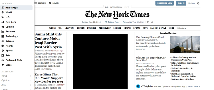
Example: New York Times.
Problem: The user needs a way to navigate between different sections of the app without being distracted in each individual section.
Solution: A secondary section of the application – such as navigation, chat, settings, user profiles, etc. – is tucked away in a collapsible panel hidden under the main section when it is not needed. When accessed, it usually either moves the main section aside or slides over it. Since the slideout is in a separate layer from the main content in the application, there’s a lot of flexibility in terms of how content can be laid out inside the drawer – icons, text, and even simple controls are viable options to provide quick access to important actions here.
Often times, the drawer can be hidden under a “hamburger menu” or a simple arrow that indicates there’s more content there. It’s an easy way to hide all the less important things in a “side drawer” so that you only have to focus on how to distill the most important information in each view. Examples can be found everywhere. Asana, Spotify (search box), and Facebook (chat boxes). Some more specific examples include Houzz, which has a sub-navigation drawer that disappears as you scroll down and reappears back at the top; and the New York Times, which hides a side drawer that appears on the left when the user clicks the ‘sections’ button at the top left side of the page. As you scroll down in Pinterest, an up-arrow button appears for easy navigation back to the top, and in its ‘How It Works’ page.
16. Links to Everything
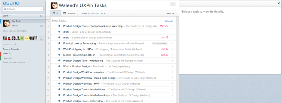
Example: Asana.
Problem: The user needs a consistent way of navigating through content without being distracted by additional content.
Solution: Most or all user content within the app is linked, giving users the freedom to explore and find the exact information they’re looking for without hitting dead-ends or being distracted by a litany of hyperlinked text, additional buttons, calls to action, etc. that you would normally see on a website. If they want to interact with a piece of content in the app, odds are that they can tap on it and go to a new view for a more detailed experience.
Content-heavy web apps like Asana and Spotify let users explore all kinds of content by clicking on it, for example clicking on an artist or user takes you to their profile, items can be clicked on, table heads can be clicked on to sort and many other actions.
Keep track of where your users are supposed to navigate, whether they ever view the navigation elements, how often they navigate to certain areas of the application, where they’re coming from and going to in the application (i.e. the user flow) and so on. Keep rearranging, re-sequencing, re-sizing, and tweaking those navigation elements until you get more of the desired actions. And, of course, think deeply about how the user is actually using your mobile application when they’re trying to get to certain parts of the application – make sure you’re not missing something obvious.
Related Topics
Top