Ask any average adult what object they can’t leave the house without, and you’ll get, along with keys and wallets, a mobile phone as the answer.
Data shows that as of 2023, 6.8 billion people own a smartphone, and that by 2027, that number will rise to 7.7 billion.
These numbers only prove that mobile devices have crossed the border from being a luxury to becoming a basic necessity. If, in the past, our phones were only mere instruments for communication, today, we rely on them when we’re working, entertaining, and shopping.
Optimizing Forms for Mobile Devices
The rise of smartphones, for instance, did not only make shopping easy for consumers. It was also a welcome addition to the already growing online shopping industry.
Over time, not only were business owners busy tending to their brick-and-mortar and/or online stores, they began realizing the importance of mobile devices alongside other channels in reaching their customers.
Forms play a massive part in online shopping, and they have become a staple element in the mobile platform as well. We usually find them when we’re ready to checkout, and the site asks us to provide certain details such as shipping name, address, telephone number, and credit card information.
However, many shoppers find filling in forms tedious, and this can cause the customers’ interest to wane. In addition, online shoppers are usually faced with time pressure and the possibility of an erratic internet connection, and both of these can affect your mobile conversion rate.
Listed below are ten ways you can speed up the performance of your customers’ mobile transactions and make their online shopping experience satisfactory.
1. Include Only the Important Details in Your Forms
If you don’t have the patience to fill a whole web page worth of forms when shopping online, your customers probably feel the same. There’s a difference between answering a full-on membership form and filling in a simple one and buying something from an online store.
Compared to the latter, the former option can be dragging, and you risk losing your customer when they get bored once they find out they have to provide three different phone numbers.
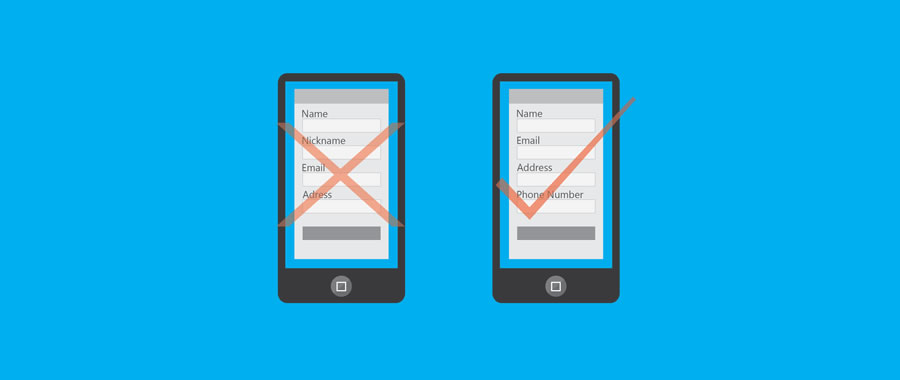
Make mobile shopping convenient by giving your customers a simple yet complete order form. Do this by asking only the important details such as their full name, email address, phone number, shipping details, and credit card information.
You can also include a dropdown menu of the states or countries you deliver to, or better yet, allow your mobile app to ask the customers to use their location. This way, getting their address will be faster and more accurate.
2. Use Top-Aligned Labels & Fields
Smartphones have a limited view compared to computers, so it’s important that you design a form that can maximize this constraint. One way to do this is by using vertical alignment for the fields of your form.
You see when you use a horizontally-aligned form, there is a tendency that not everything will fit in a smartphone’s view, and it’s either the label or the input field that will be compromised. Such a case can be cumbersome to shoppers and can diminish their interest.
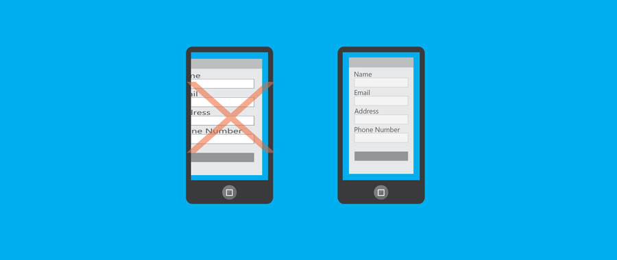
On the other hand, if a form’s labels and input fields are arranged vertically, then it will be easier for your customers to view the information being requested and the ones they’re typing in.
This will help them feel secure about the transaction. It will also minimize them missing a field or, even worse, having to do it all over again.
In addition, minimize visual clutter from your forms. Your ‘What Is This’ and ‘Learn More’ buttons can be placed on the mobile version of your site. If you must have it on the form, place it somewhere on the page where it will not distract your customers from shopping.
3. Make Use of Collapsible Menus & Dropdown Lists
Another constraint caused by the limited view of mobile devices is that we have to do a lot of scrolling to see an entire page or fill up a form. While scrolling through screens is normal when using smartphones, many shoppers would prefer a speedy means of buying items online.
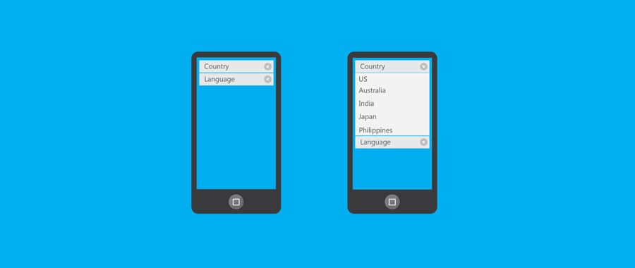
Using collapsible menus and dropdown lists can help you reduce the time spent by your customers in accomplishing mobile forms. Instead of making your customers scan until they find their choice in a pool of multiple options, you can group specific items into categories.
Collapsible menus are also useful for tying up the details of several major products that you want to put on a single page. Just remember not to start the details as collapsed.
4. Utilize Appropriate List Selections
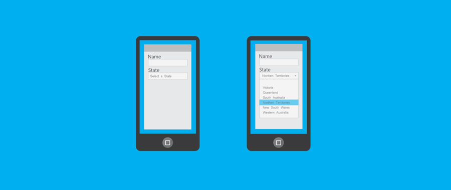
In cases where dropdown lists or collapsible menus are not ideal for your mobile forms, you have two other options in open predictive search fields and locked dropped down lists.
An open predictive search field allows your customers to input keywords of the item or service they are looking for and lists the closest possible results. This kind of form is ideal for long searches or for products that do not follow any specific arrangements.

Locked dropdown lists, on the other hand, is ideal for listing specific items in the menu and in following a particular order, say alphabetical or chronological.
5. Opt for Single Input Entities
You’re probably familiar with input fields found in forms both in the desktop and mobile versions of websites. In some cases, these input fields are split into two to three sections, such as names, addresses, and phone numbers.
While this has a valid purpose in desktop versions of sites, it may not be as effective as when used in forms for mobile devices.

More often than not, split input entities require mobile shoppers to tap into all three (or two) fields just to answer one label. If you’re going to do this a lot on one form, your customers might lose interest in proceeding to checkout.
In other cases, split entities can also be ambiguous and may confuse customers. When designing forms for mobile platforms, use simpler fields instead of splitting them.
For instance, instead of putting up two separate fields for a first name and a last name, use one field instead for a full name. This will help your customers accomplish the form faster.
6. Format Your Form’s Buttons
The ‘submit’ button is the final step to online shopping and also happens to be the most important button on your form. As such, you need to make it stand out so that your customers remain engaged until the end of the transaction.
Make the button in your form appealing by making its width about 1/3 of your form and by assigning it a bright color. Also, instead of simply using the words ‘submit’ or ‘send,’ use more energetic calls to action such as ‘Register Now’ or ‘Submit Application.’

However, avoid using colors that are too bright or make your buttons move too much because these may distract your customers from clicking.
You can use a subtle change in color or hover over the button when it’s clicked so that your customers would know that they’re finished with the transaction.
7. Set Scale with Viewport Meta Tag
The view a mobile device can provide customers may compel them to zoom the page, but accidentally doing so may make the shoppers lose focus on the page. You can control this by using a viewport meta tag on your forms.
This will prevent your customers from inadvertently zooming the page or, worse, losing track of the form altogether.
<meta name="viewport" content="width=device-width, initial-scale=1.0">
8. Exploit Data Persistence
Shopping via mobile phones can be daunting for some customers because there are more risks in clicking back to the previous page and reloading until your customer decides to abandon their cart after losing their data.
Mitigate this potential problem by giving your customers the option to open a new tab when they click any link that is not on the form.

Also, in cases where they can’t go back to previous pages, give them warning signs such as ‘Agree,’ ‘OK,’ or ‘Cancel.’ By doing this, you’ll be able to tell your customers whether the data was stored in your site or the browser and help them decide to proceed to checkout.
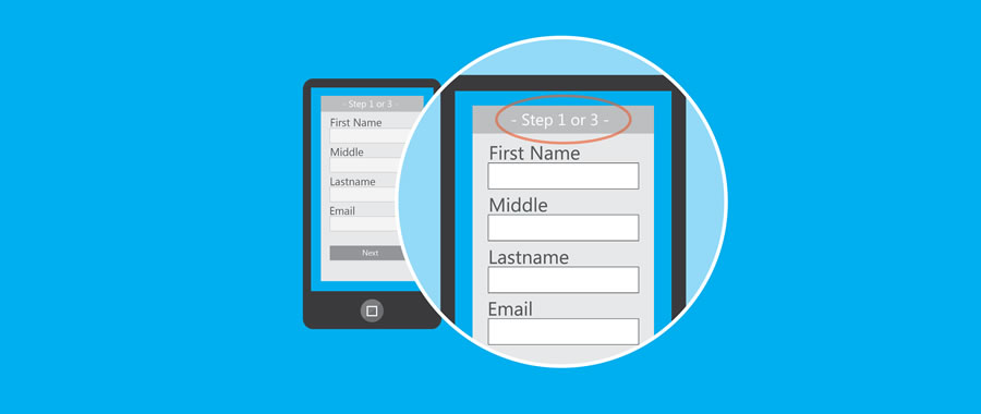
9. Help customers track their progress
Not all shoppers are keen on filling out forms. It would help if you could provide them with a way to tell how close they are to being done.
You can do this by showing a progress bar on top of the form and determining which step they are – say, by percentage or just a simple chronology. Keep in mind to limit the steps as much as you possibly can to save your customers time.
10. Make the Form Load Fast
Another factor you shouldn’t forget is the rate your mobile form loads. If the page takes a while to complete, your customer might not convert. The fact that your customers have reached the form tells you that they’re ready to buy.
Don’t disappoint them with slow-loading pages. The speed of your forms will also rely on the elements you put on the page, so be wary of big images.
As Always, Test Across Systems And Setups
These days, the variety of mobile devices and their interfaces can make tailoring your forms for each one a bit tough.
As such, make sure that you conduct tests of your forms on different types of mobile devices and take into account operating systems, sizes, and browsers. Through testing, you’ll be able to cover each base and make sure that your form works on every available device.
Top