While we have been living for almost twenty years in the new century (the magical number of 2020 is already looming), the last decade of the previous one makes its presence felt periodically, encouraging us to take a pleasant walk down the memory lane.
What is the 90s for you? I bet you remember a great deal of it. There are a whole lot of things that shaped the decade and made us who we are now. It was marked by a vibrant pop culture starting with Seinfeld, Spice Girls and Harry Potter. It ended with Nokia’s first mobile phone, the emergence of Google and the creation of Amazon. It was the rise of the World Wide Web that was not only tangible, but also irrepressible and almost uncontrollable.
From time to time we are witnessing projects in web design that are intentionally made with this era in mind. They’re not exactly blasts from the past – as they aren’t primitive, rustic or crude. Actually, they are re-imagined versions of those websites.
But instead of imagining what that era would be like if we had all the modern fancy tools and solutions, it is more like some kind of eulogy. The 90s may be resting in peace, but their spirit never dies. As proof of that, we managed to build up a collection of websites that have a powerful 90s vibe.
Erik Bernacchi
We are going to begin with the personal portfolio of Erik Bernacchi. Although the author named it “the preposterous”, to our mind it is just incredible and a bit hilarious. The website reminds us of the aesthetics of old-timey computers. Big folders, rustic boxy feel, and most importantly lots of free space stand behind the beauty of this project.

Mr. Milu
The personal website of Mr. Milu is built around the same concept. It is a refreshing, re-imagined and ultra-modern take. It has some 90s qualities, such as the boxy vibe, lots of fresh air and geometric feel. This all brings about the primitive and straightforward appearance that was a calling card of 90s UI. But still, the coloring and flat 2.0 design betray the recentness.
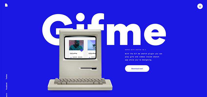
Gifme / Bruce Clay
From home screens to actual computers, the teams behind Gifme and Bruce Clay’s personal portfolio gave top priority to the classic Macintosh computer. It’s the heart and soul of the aesthetic. In the first example, the computer indeed occupies the center stage. In the latter case, it is just a part of the retro design that perfectly fits in – making its contribution and enhancing the context visually.

Pixel for Dinner / History of the Web / Lucas Bigot
We move from computers to video games. There are many ways to establish an atmosphere from the 90s in your project. Displaying some hints from the classic video games of that period is a great one. This approach is realized through the enigmatic digital scenery, drastic coloring, along with glowing and glossy effects. Vivid examples of this approach are Pixel for Dinner, History of the Web and the personal portfolio of Lucas Bigot. Each one has its own vision of this method.
Pixel for Dinner grabs overall attention with a cryptic, cosmic ambience.

The home screen of History of the Web also welcomes visitors with the enigmatic digital scenery. It aims to tell the story behind the curtains. Be ready to behold some fantastic visual material that reveals the beginning of the Internet in all its glory.
There are several things to note and enjoy in Lucas Bigot’s portfolio: typography, coloring, effects and the way of displaying works. Everything is inspired by the decade.

Cameron’s World
If you want to touch websites from the last decade of the 2D millennium, you have found the right place. Cameron’s World is your final and ultimate stop. The site is brutal, crude and truly original. The artist took the current obsession with the 80s and 90s in the literal sense, having blessed us with a fantastic site that is indeed a blast from the past.

Darn Senneff
Our collection would be incomplete without the personal portfolio of Darn Senneff. The overall beauty and experience of the project are built with the help of 8-bit graphics. It has a spirit of old-school. The storytelling here is a refreshing take on a superhero universe, recreated with the 90s in mind.

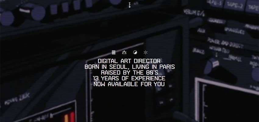
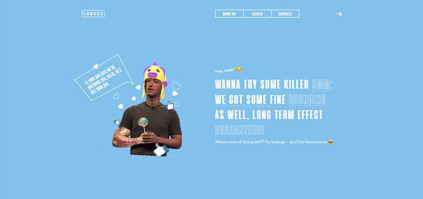
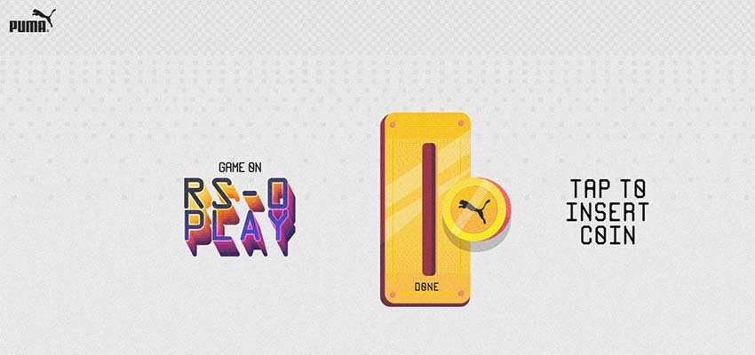
Y78 / Lobods / RS-0 Play
There are some more exceptional examples of websites with the 90s vibe like Y78, Lobods and RS-0 Play by Puma. These projects get their beauty and charisma by getting the most out of several decades. Each one is unique, authentic and sensational. Each one shows its vision of the retro style.
PopCorn TV
We want to finish our collection with a playful contribution to the pop culture of the 90s and 80s. Although its appearance is far from being called a design from the 90s, it was made with that era in mind. And, it will undoubtedly catch your attention and keep your interest alive.
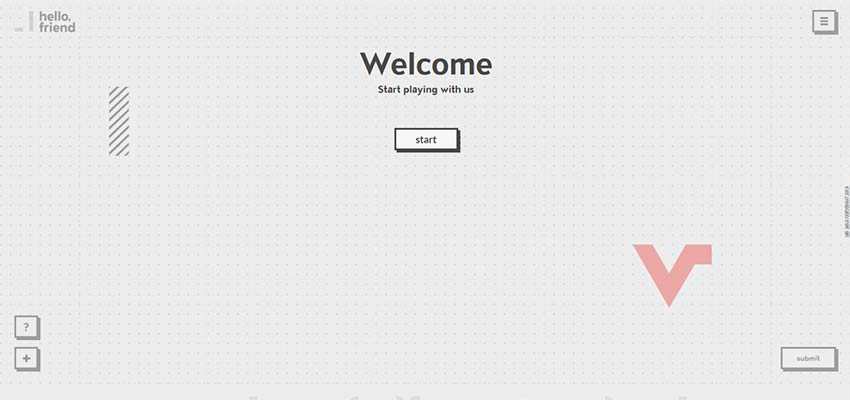
PopCorn TV is an online quiz. It lures you deep into the project right away. The object is to try and recall as many TV dramas and smash-hit movies as you can to complete the challenge. So take a trip down the memory lane and tell us how many can you name.

Why the 90s Still Matter
The last decade of the 2D millennium was cool. It was not so bright and shiny like the disco-inspired / aerobics-obsessed 80s, yet it also had its own extravagances and memorable moments. We saw the rise of the Internet and the birth of lots of projects that are considered to be the Goliaths of the web industry.
The websites were primitive, oversimplified, slow and crude. But what’s really important is that this decade gave us freedom and opened the door into the digital world.
Related Topics
Top