Honest usability techniques when applied properly will expand your site layouts beyond the elite in web design. When you can open your mind to new ideas it’s possible to manifest brilliant visions into your web pages. This hierarchy plays double for user interface objects and forms.
I’ve included a few examples and tips below on building usable design forms. Best practices for signup forms have changed dramatically over the past few years. With the help of 3rd party technologies it’s much easier to get your company up and running. Especially if you include a newsletter or e-mail signup list on the same form!
I’ve also included a couple great examples to take a look at. The principles of design are one thing, but understanding and envisioning your own signup forms will open another realm of possibilities.
Big, Bold Typography
On any signup page your goal is to keep visitor’s attention span for longer than a few seconds. Ultimately you’d like to persuade some user interaction out of them, but it’s unrealistic to expect a 100% signup rate.
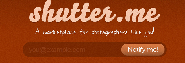
By showcasing your website’s logo and message in bold type it’s hard for visitors to miss. This technique can be found on many great apps and launches coming up. A new photographer’s marketplace shutter.me offers an elegant solution to one large signup form. This generally increases overall participation because there isn’t very much work required from the user’s standpoint.
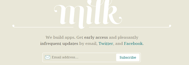
Another great example is newly launched Milk, Inc. – a new incubator for mobile companies. It was founded early 2011 from ex-Digg CEO Kevin Rose and designer Daniel Burka. Their Milk landing page features a brilliant logo design and some external social media links.
The only signup form again points towards simply your e-mail address. The form is elegant and not too harsh on the eyes. I really enjoy their use of typography and fancy lettering with borders. It gives you that old fashioned milkman feeling of nostalgia, another properly induced emotion to attract higher signup rates.
You’re also utilizing a lot more space stemming from large page content. When users are entering their signup data it is much easier for them to point out mistakes and see what they’re doing in real-time. And for those who believe the big text seems over-sized and goofy, they’re meant to feel small and out of focus in comparison. It really imprints your brand as an important and dominant image!
Empowering Bright Colors and Graphics
The eyes are a powerful tool which are constantly on alert for new information. Once a visitor lands on your page they’ve commonly made up their mind about registration within the first few seconds. If you have a cluttered form with countless fields to fill in, you may well lose out on new registrations.
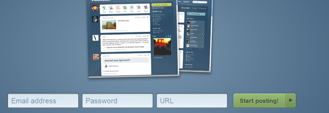
We can learn a lot from these lessons by keeping this minimal. The Sweet Twitter App for Mac has a beautiful landing page. Featured links connect out to the official Twitter page and give you a bit of information about their plans.

You only need provide a name and e-mail address to continue. A Twitter handle box is added for those Twitter users who are looking for more frequent updates. However it’s not a required field, which is important to consider when designing web forms. Many users won’t be interested in offering this information even if they do have a Twitter account. But it never hurts to leave the options open.
Reorganize the Signup Process
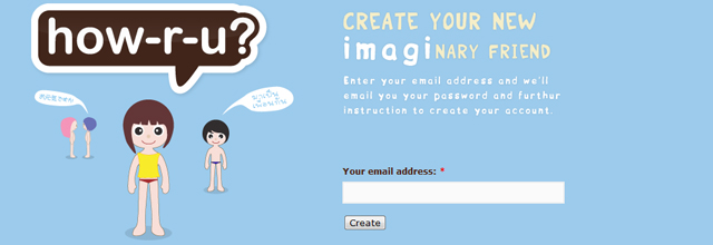
Another adorable app HOW-R-U features some amazing vector artwork. Their signup form is just a standard e-mail box with some alternate links onto their site. After signing up you’re led back to the home page to confirm your address and new account.
Once you’ve validated then you’re brought to another screen for entering in any further information. This is a brilliant technique as it gives the user an option to fill out as much profile information as they’d like. But it keeps the original signup form easy to use and slowly leads the user along a perfected UX pathway.
There isn’t even a password requirement, which is very out of the norm. This must help with database storage since many accounts will build up over time. However you can’t guarantee how many users will verify and continue using the web app. Thus users can set their password after validation and going through the necessary signup steps.
Depending on your target audience and website niche, this may benefit or hinder your signup process. Try some basic A/B split testing techniques on your audience and record the results. This will give you some insight on how to appropriately plan your signup form.
Make Life Easier
Most visitors are spending time online to relax and unwind. They are often eager to try new services, but not if it requires passing a generalized comfort zone. This is why it’s so important to reel your visitors into your signup form and ease the process on them.
Make sure nothing is confusing and you have earned their trust. The Tumblr signup screen is a magnificent example of what I mean. They include a few screenshot examples for how Tumblr works and what your account will look like. If you access the main page without logging in you’ll be shown both a signup and registration form.
This performs great with most visitors since it saves loading time and effort. But if visitors were to get confused they may just leave the site in frustration. Although it seems self-explanatory by the submission buttons, there aren’t any headers of separation between either of the forms. Granted their layout is very new-age focused, and I really like their CSS3 effects throughout each page.
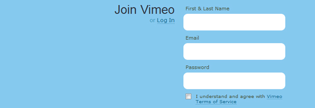
Additionally the Vimeo signup form is widely regarded and praised amongst designers. It features brilliant vector artwork and animations beyond any website I’ve seen. They only require 3 fields as a name, e-mail address, and password. The process is brief and actually a bit fulfilling towards the end!
Signup Form Design Gallery
Below I’ve included a small collection of signup forms in a gallery style. These are just some of the many countless examples to be found throughout the web.
If you have similar ideas for signup form collections please let us know. Offer any links in the discussion area below, and we can catalog a small collection of inspirational signup forms to share with the design community.
TinyBas
GetFlow App
Soundz.fm
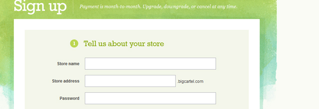
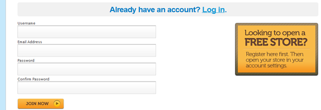
bigcartel
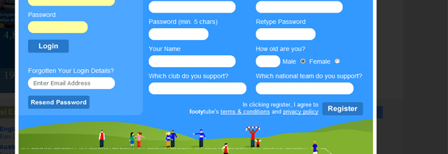
footytube
Kontain
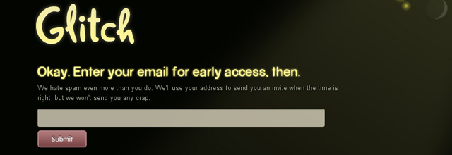
Glitch
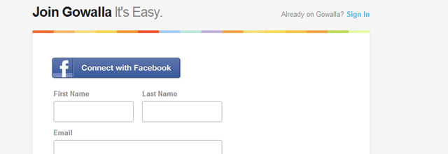
Gowalla
Twitter Chirp Conference
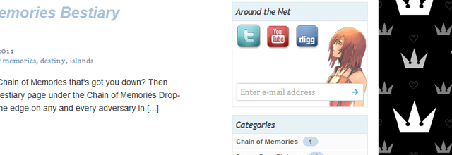
Destiny Islands
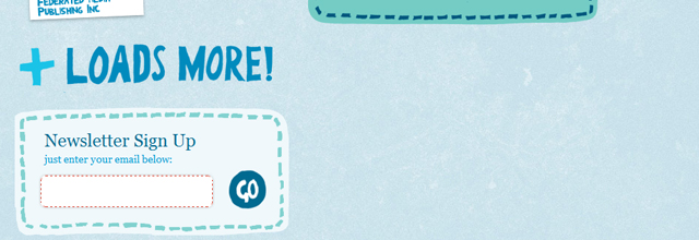
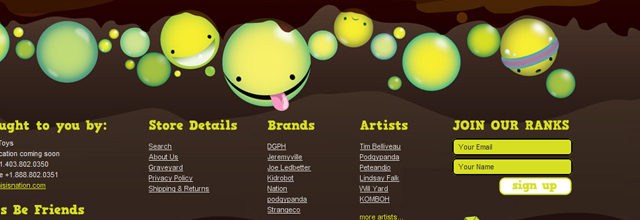
Nation Toys
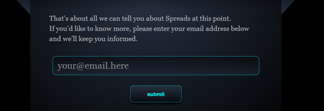
Spreads App
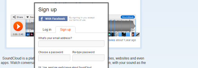
acosmin

acosmin
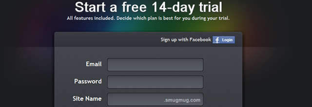
SmugMug
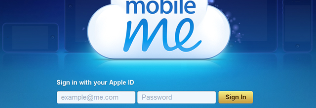
MobileMe
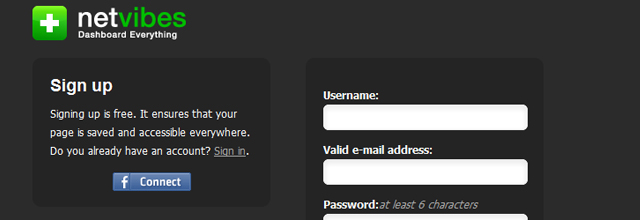
Netvibes
Aviary
brightkite
Storenvy
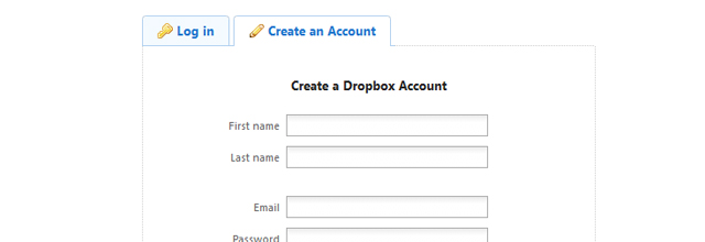
Dropbox
LaterThis
Ping.fm
Related Topics
Top