Unlike traditional layout techniques, Flexbox makes it simpler to design complex layouts without having to use floats or positioning. This method plays a crucial role in responsive web design, allowing elements within a container to adjust smoothly as screen sizes change. This adaptability ensures that websites look great on any device.
Using Flexbox for layout adjustments comes with several benefits. It reduces the need for extra HTML elements, making your code easier to manage and cleaner. Flexbox also provides better control over alignment, distribution, and spacing of items within a container, even when their sizes are unknown or dynamic. This level of control is invaluable in a web environment where user experience is key.
From learning the basics to exploring advanced techniques, this collection aims to equip you with the tools and knowledge needed to master Flexbox. Whether new to Flexbox or looking to refine your skills, this CSS toolbox will provide all the necessary resources.
You may also like these toolboxes: CSS Animation, SVG Workflow Tools, Styleguide Tools, or Tools for Formatting CSS.
Flexbox Interactive Learning Guides
These guides offer hands-on learning experiences for mastering Flexbox. You can interact with the exercises and see immediate results, making it easier to understand how Flexbox works in real web design scenarios.
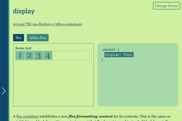
CSS Flexbox Please!
Interactive examples showing Flexbox’s power in creating layouts, making it easier to understand and apply Flexbox properties in web design.
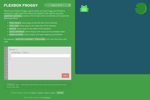
Flexbox Froggy
A fun, game-based learning tool where you use CSS Flexbox to guide a frog to its lily pad, teaching Flexbox concepts along the way.
Interactive Guide to Flexbox
Offers a hands-on approach to learning Flexbox with interactive examples, making complex concepts easier to grasp.

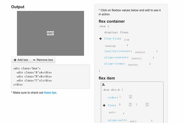
Flexbox Guide
A visual guide to Flexbox, showcasing how different settings affect layouts, ideal for quick learning and reference.
Flexbox Getting Started Guides
Perfect for beginners, these tutorials offer step-by-step instructions on how to start using Flexbox. They cover basic concepts and setup, helping new users quickly grasp the fundamentals of Flexbox layout techniques.
Getting Started With CSS Flexbox
An introductory article that breaks down the basics of Flexbox, perfect for beginners looking to get started with flexible layouts.
What The Flexbox?! Video Course
A free video course covering all aspects of Flexbox, helping designers master layout techniques through concise and practical lessons.
A Complete Guide to Flexbox
A detailed reference guide offering snippets and explanations of Flexbox properties, serving as a go-to resource for developers.
Flexbox30 – Learn Flexbox
Learn Flexbox with 30 code tidbits, a practical approach to mastering Flexbox through daily, bite-sized lessons.
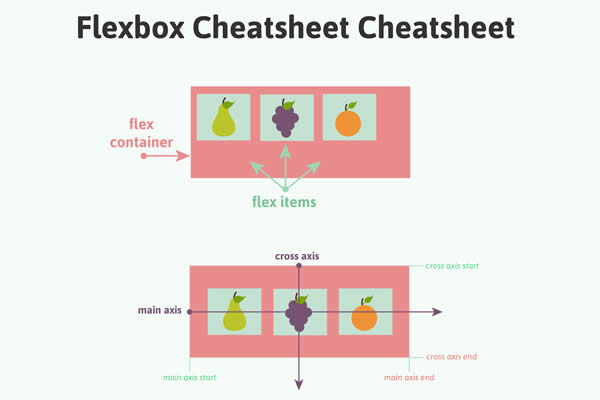
Flexbox Cheatsheets
Quick reference sheets that summarize Flexbox properties and commands. They’re ideal for designers and developers who need to recall syntax or functionalities without sifting through detailed documentation.
A Field Guide to Flexbox
A cheatsheet that simplifies Flexbox properties and their uses, making it easy to find and apply Flexbox solutions quickly.
Interactive Flex Cheatsheet
Offers a visual reference for Flexbox, allowing users to experiment with properties and see immediate effects.
Flexbox Frameworks & Libraries
Leveraging the power of CSS Flexbox, these frameworks offer flexible, responsive layout options. They simplify the creation of complex designs that automatically adjust to screen sizes, making them great for mobile-friendly websites.
OrbitCSS
Designed for simplicity and rapid development, offering basic styles and utilities for web projects.


Bulma CSS Framework
A popular open-source framework based on Flexbox with an extensive collection of responsive components.

Flexbox Grid
Offers a simple grid system based on the CSS flex property, ideal for modern web design.

Ginger Grid Flexbox Grid
A framework for creating Flexbox grids, simplifying the process of designing responsive layouts.

Flexbox UI Layout Templates
These templates offer pre-designed layouts using Flexbox. They serve as practical starting points for projects, showcasing how Flexbox can be applied to achieve various layout goals.
Flexbox Case Studies with Examples
Presents common layout challenges and their Flexbox solutions, demonstrating Flexbox’s versatility in solving web design problems.

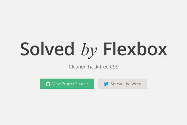
Solved by Flexbox
Highlights how Flexbox addresses common CSS problems, offering cleaner, more efficient solutions to traditional layout challenges.
Flexbox Patterns & Examples
A collection of interactive Flexbox layout patterns, providing ready-to-use solutions for common design challenges.
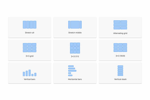
Common CSS Flexbox Layout Patterns
Offers practical Flexbox examples for common UI elements, helping designers implement Flexbox properly in their projects.
Flexbox Web-Based Tools
These tiny tools will help you create flexbox layouts. They offer visual interfaces to experiment with flex container properties, simplifying the design of complex web page structures.
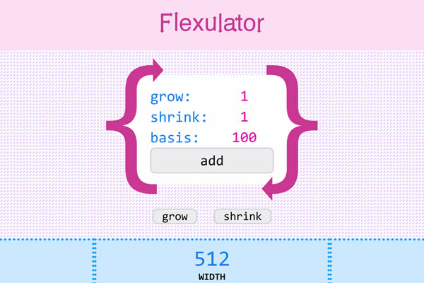
Flexulator
A calculator that helps design CSS flexbox layouts by visually adjusting and measuring space between items.
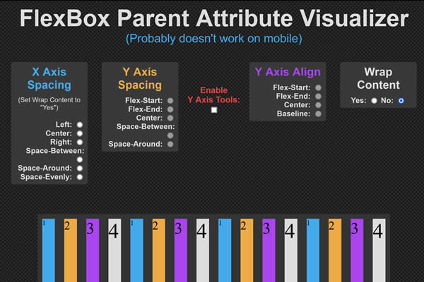
FlexBox Container Visualizer
Interactive CSS grid layout generator with customizable rows, columns, and areas through a visual interface.
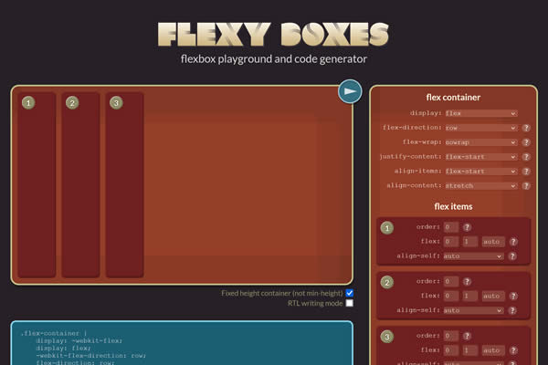
Flexyboxes
Tool for creating flexbox layouts with a live preview, including options for direction, wrapping, justification, and alignment.
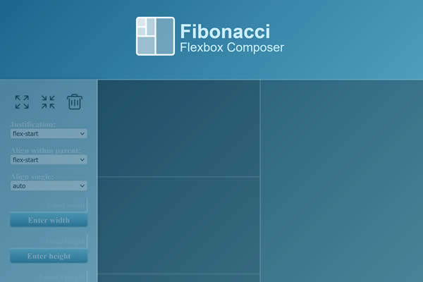
Fibonacci Flexbox Composer
A Flexbox page builder that allows for intuitive layout creation, demonstrating the flexibility and power of Flexbox in web design.
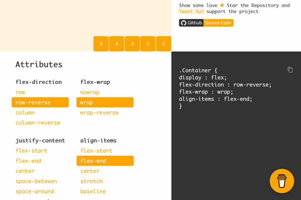
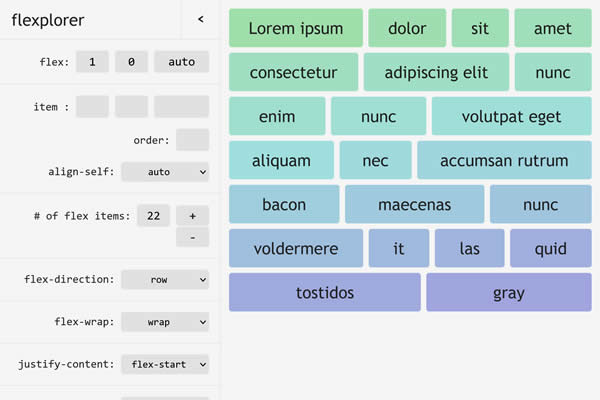
Flexplorer
An interactive tool to explore and generate Flexbox code, making it easier to understand and apply Flexbox properties.
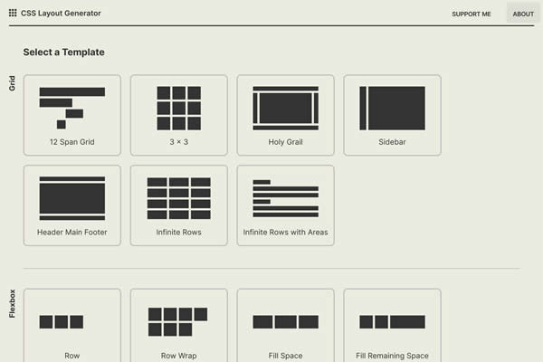
CSS Flexbox Generator
A handy tool for quickly generating custom Flexbox code, streamlining the process of implementing Flexbox in web projects.
Test CSS Flexbox Rules
Provides a visual guide and interactive tools to learn Flexbox, aimed at making Flexbox concepts accessible to all skill levels.

Flexbox CSS Snippets
These Flexbox snippets are handy for quickly implementing common layout patterns without having to write any CSS or HTML from scratch.
- Create Better CSS Layouts with Flexbox
Insights and CSS snippets on using Flexbox for better web layouts. - Flexbox Snippets for Creating Magazine Layouts
Provides CSS snippets and techniques for creating news and magazine-style layouts using CSS.
Simplifying Complex Layouts
Flexbox simplifies the creation of complex designs, making it easier to produce layouts that adjust seamlessly across different screen sizes. This adaptability ensures your websites look and function perfectly on any device, providing a superior user experience.
By utilizing these guides, tools, and resources, you will streamline your workflow, reduce coding complexity, and achieve precise control over layout adjustments. These advantages highlight the importance of Flexbox in modern web design, underscoring its role in crafting responsive, user-friendly websites.
Related Topics
Top