Each of these free web-based tools and apps have been built by web designers for web designers. They all offer a time-saving solution to some of those monotonous or even complex CSS tasks you may need to perform from time to time.
Without needing to install anything, all you have to do is bookmark, and save them for that day when required.
From assessing your website’s accessibility to generating sophisticated flexbox or grid layouts, refining typography, choosing the perfect color scheme, copying and pasting CSS animations, to beautifying code screenshots, this collection covers a broad range of web design needs.
No matter what kind of CSS time-saver you’re searching for, you’ll likely find it here. Keep these tools at your fingertips to make your CSS workflow quicker and that little bit easier.
CSS Grid Tools
These tools will allow you to construct grid CSS layouts quicker. They offer interfaces for defining columns, rows, and areas, making layout adjustments straightforward and code generation instant.
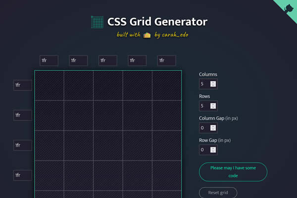
CSS Grid Generator
Create CSS grid layouts with a simple visual interface, allowing for adjustments to columns, rows, and areas.
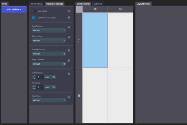
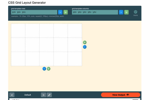
CSS Grid Layout Generator
Another tool for designing CSS grid-based layouts, offering a straightforward visual editing experience.
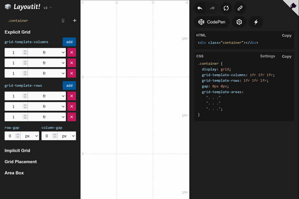
Grid Layoutit
Interactive tool for generating CSS Grid layouts, featuring drag-and-drop grid template areas and code output.
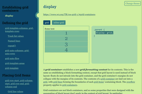
Grid Cheatsheet
Visual guide to CSS Grid properties, offering quick reference to grid-related CSS properties and values.
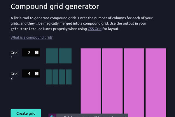
Compound Grid Generator
Demonstrates complex CSS Grid layouts, showcasing advanced grid features and layout techniques.
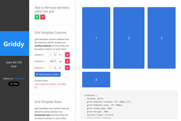
Griddy
Simplifies the process of creating CSS grid layouts with a visual interface and generates the corresponding code.
Angry Tools CSS Grid
A user-friendly tool to design CSS grid layouts, providing visual feedback and code snippets.
CSS Animation Tools
These CSS animation tools offer user-friendly interfaces to define keyframes, animation timing, and other effects, enhancing user engagement without needing JavaScript.
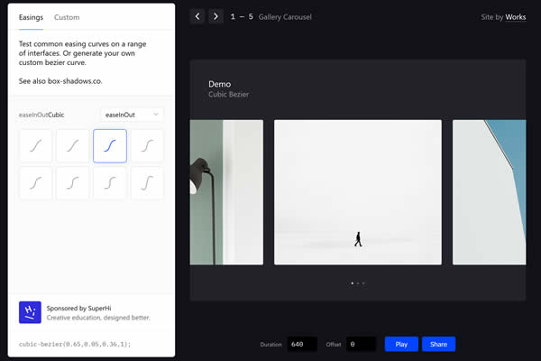
Easings
Provides a collection of easing functions for smooth animations, complete with CSS and JavaScript code snippets.
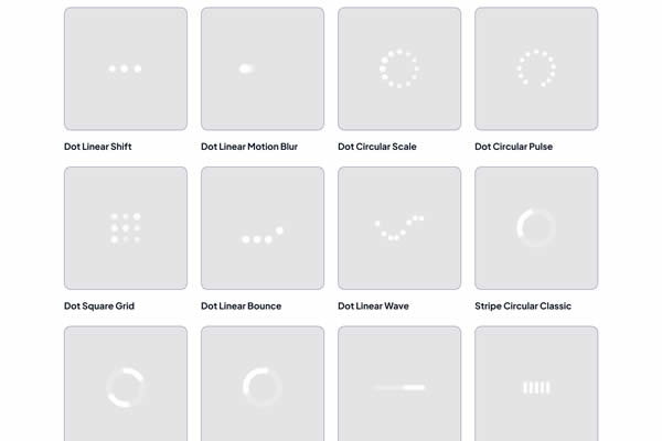
CSS Spinner & Loader Tools
These tools offer various types of copy and paste spinners and loaders that can be easily integrated into your web projects to maintain user attention during loading periods.
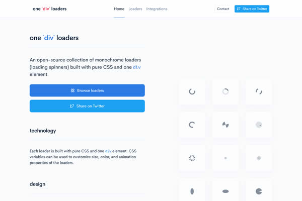
OneDivLoaders
Create CSS-only loaders with a single div, offering a variety of animations for loading screens.
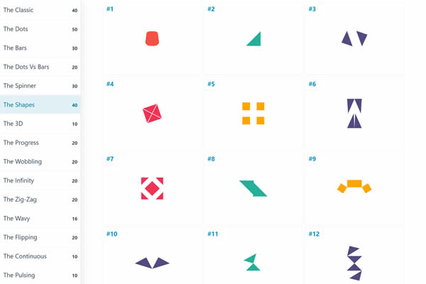
Loadership
A vast library of CSS and SVG loading animations, customizable for any web project’s needs.
CSS Loaders
Collection of simple, reusable CSS loading animations to enhance user experience during page or content loading.
SpinKit
A collection of loading indicators animated with CSS, providing a variety of designs for web projects.
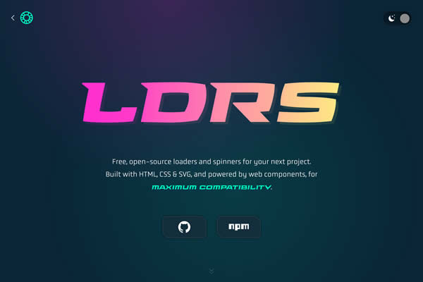
LDRS Loaders
A set of playful, lightweight loaders and spinners with customizable colors and sizes for web interfaces.
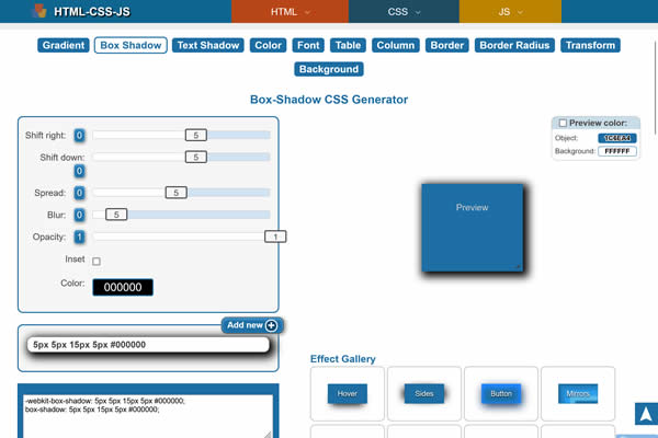
CSS Box Shadow Tools
These tiny tools will help create depth and emphasis on elements through shadow effects. With easy-to-use sliders and color pickers, these tools will generate the CSS code for soft shadows, glows, and more.
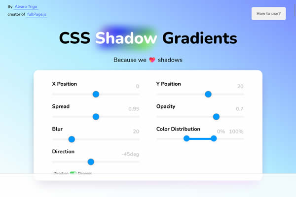
Shadow Gradients
Unique tool for creating gradients that mimic shadow effects, adding depth to designs.
Box Shadow Generator
Provides a simple interface for crafting and customizing CSS box shadows, complete with code output.
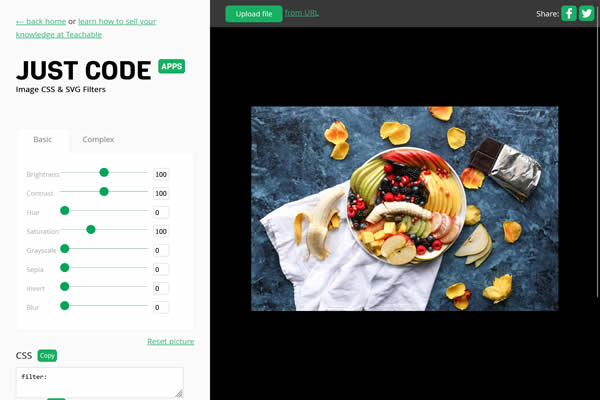
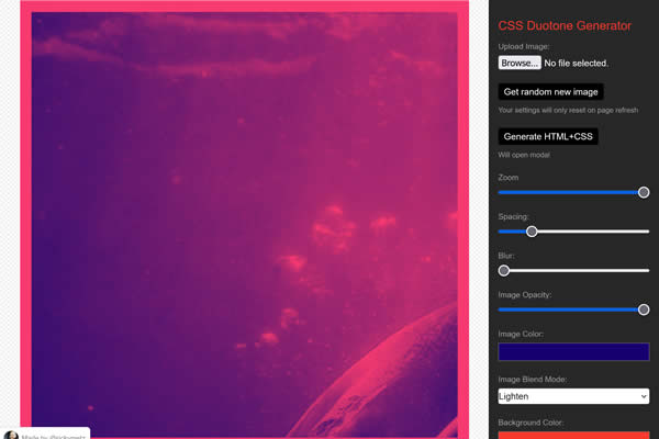
CSS Image Filter Tools
From blurring and color adjustments to custom filters, these image filter apps provide live previews and code snippets for enhanced image styling.
CSS Filters Generator
Web-based tool for applying CSS filters to images, providing a live preview and code snippet output.
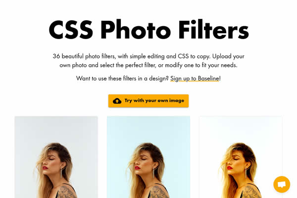
CSS Photo Filters
Offers a range of preset CSS filters for images, simulating various photo effects and styles.
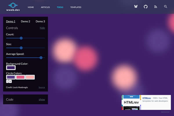
CSS Background Generators
These tools allow for the creation of animated and dynamic backgrounds. They offer options for gradients, images, and videos, enriching your web designs with backgrounds that can be static, animated, or interactive.
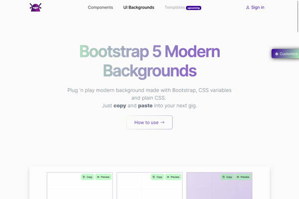
Bootstrap Backgrounds
Generate and customize unique background designs for websites, including gradients, patterns, and images.
Animated CSS Background Generator
Generate unique animated backgrounds with customizable CSS code for web projects.
CSS Patterned Backgrounds
Generate unique background designs with gradients, patterns, and shapes for web projects.
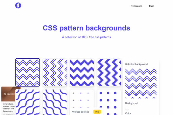
CSS Pattern Tools
These tiny tools specialize in generating repeatable, tileable patterns for web backgrounds. With options for shapes, colors, and level of complexity. They will provide unique ways to fill background spaces with visually appealing designs.
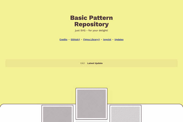
Basic Pattern Repository
Interactive tool for creating and customizing seamless patterns for web backgrounds.
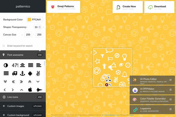
Patternico
Online tool for creating seamless background patterns, with options for shapes, colors, and transparency.
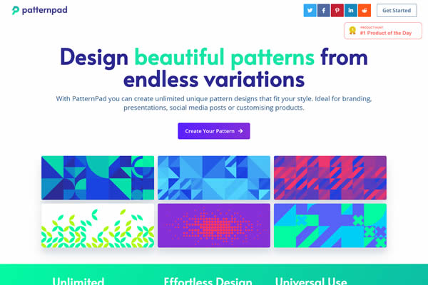
PatternPad
Web-based platform for designing and customizing vector patterns for backgrounds and other uses.
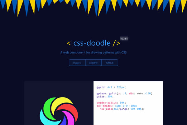
CSS-Doodle
A web component for drawing patterns with CSS, enabling complex designs through simple CSS rules.
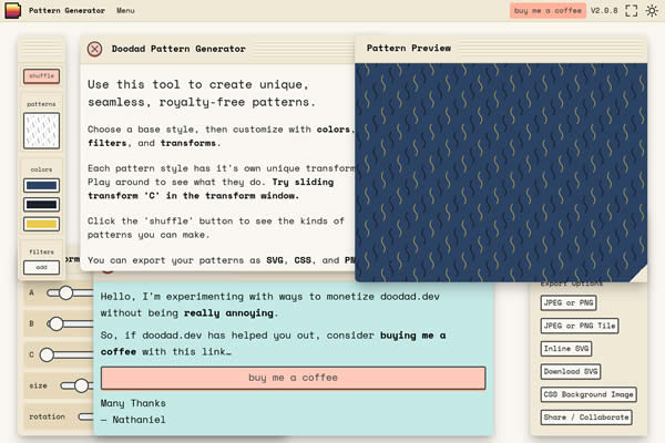
Doodad Pattern Generator
Create customizable patterns and textures for web and print projects with ease.
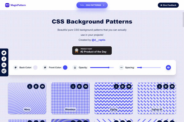
MagicPattern
Design tool for creating unique CSS backgrounds, offering patterns, gradients, and shapes.
CSS Gradient Tools
Quickly create smooth and seamless gradients with these tools. They provide interfaces for radial or linear gradients, allowing for the customization of direction, color stops, and opacity for vibrant backgrounds or element fills.
Components AI Gradient Generator
Advanced tool for generating complex gradients with customizable colors and angles.
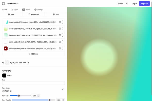
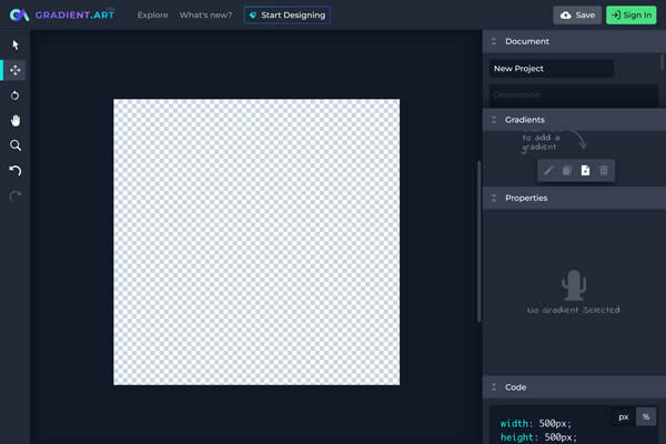
Gradient.art
A creative platform for designing and customizing multi-color gradients for digital design projects.
CSS Generators
These tools are quick and efficient ways to produce ready-to-use CSS snippets for multiple design needs.
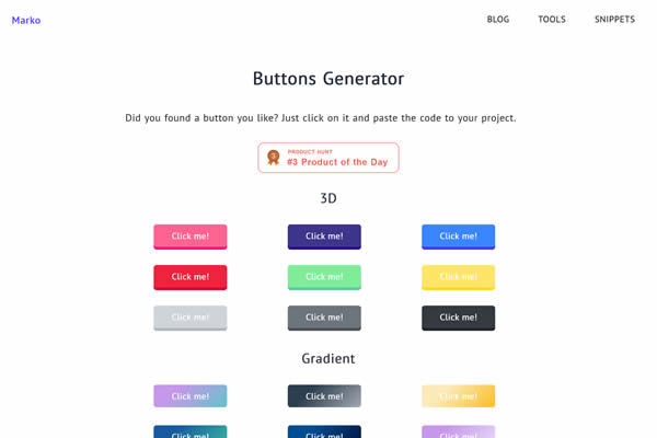
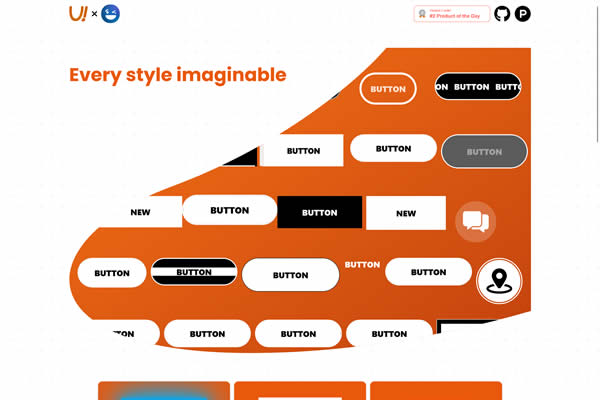
UI Buttons
Online generator for creating and customizing buttons for web interfaces, providing CSS code.
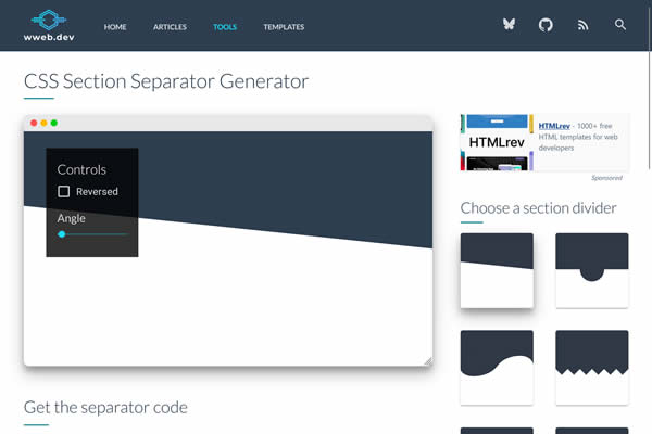
CSS Separator Generator
Create unique and creative shapes as section separators for web pages, with customizable options and CSS code.
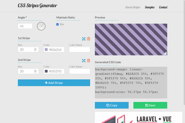
Stripes Generator
Online tool for creating striped patterns for web backgrounds, with customizable colors and orientations.
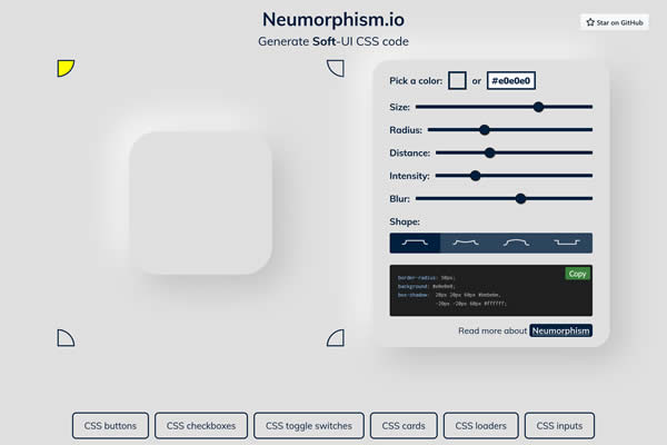
Neumorphism.io
Generate soft UI (neumorphism) styles for elements, offering a modern look with inset and outset effects.
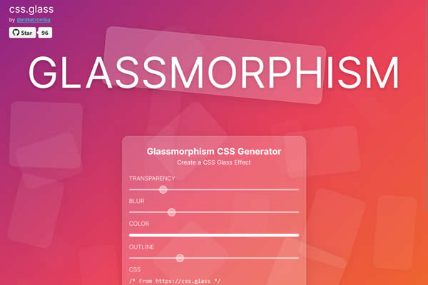
Glassmorphism Effect Generator
Tool for creating frosted glass effect backgrounds and overlays using CSS.
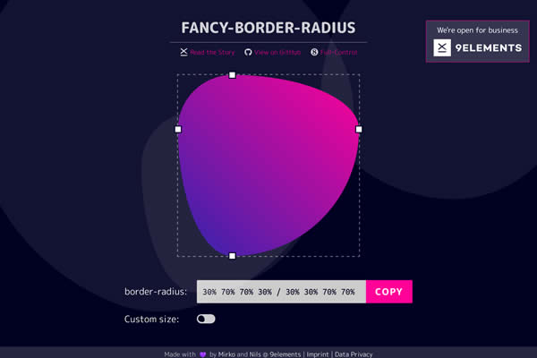
Fancy Border Radius
A visual tool to create complex border-radius shapes, offering immediate visual feedback and code snippets.
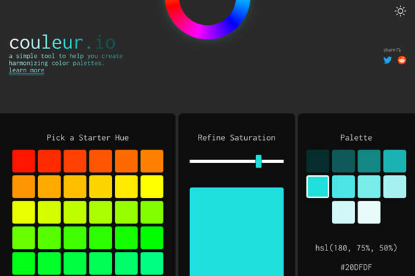
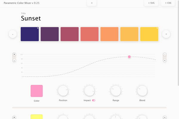
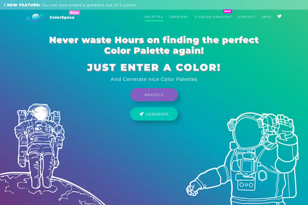
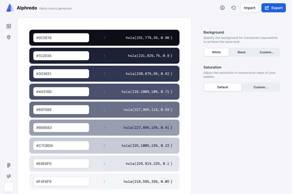
CSS Color Tools
Copy and paste palette generators, color pickers, and tools to ensure color harmony and contrast and help select complementary colors for cohesive designs.
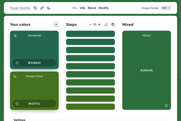
Hue.tools
A comprehensive color tool for creating, converting, and analyzing color palettes and gradients.
MyColor
Generates color schemes based on a selected color, offering gradient and palette options for web design.
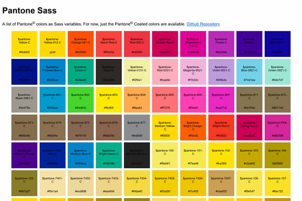
Pantone Sass
A Sass library for using Pantone colors in web designs, offering a broad color spectrum.
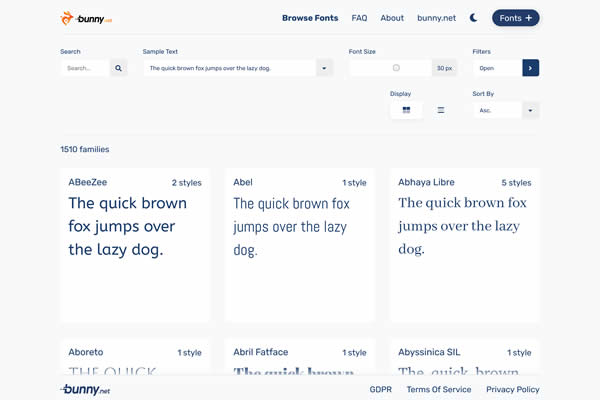
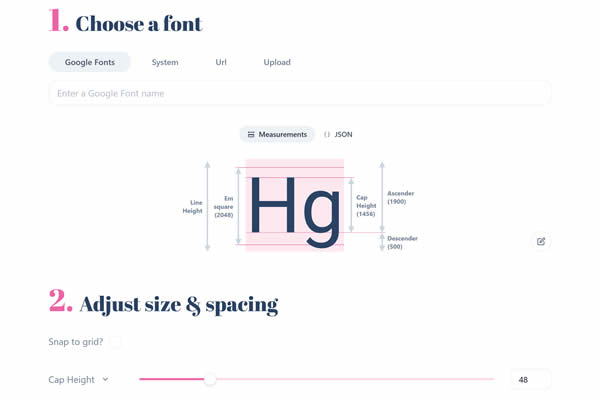
CSS Typography Tools
These simple tools focus on text and readability. They allow for the manipulation of font sizes, line heights, and spacing, providing previews and code for typographic perfection in web design.
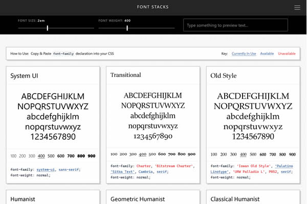
Modern Font Stacks
Offers modern, web-safe CSS font stacks focused on improving typography across different devices and operating systems.
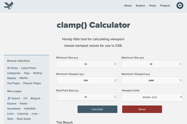
Clamp Calculator
A tool for calculating CSS clamp() values, ensuring responsive and scalable text sizes across devices.
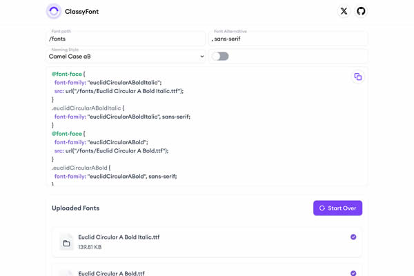
ClassyFont
Provides a collection of stylish fonts, enabling easy exploration and integration into web projects.
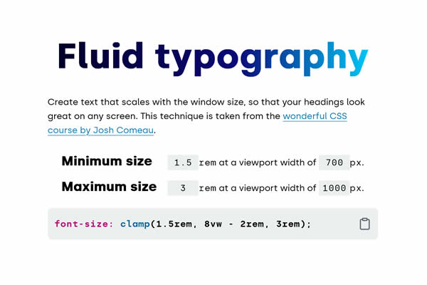
Fluid Typography
An online calculator for creating fluid typography CSS rules, ensuring text scales smoothly across devices.
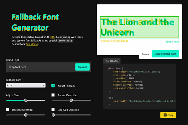
Fallback Font Generator
Tool designed to minimize CLS by fine-tuning web fonts and system font fallbacks with specific @font-face descriptors.
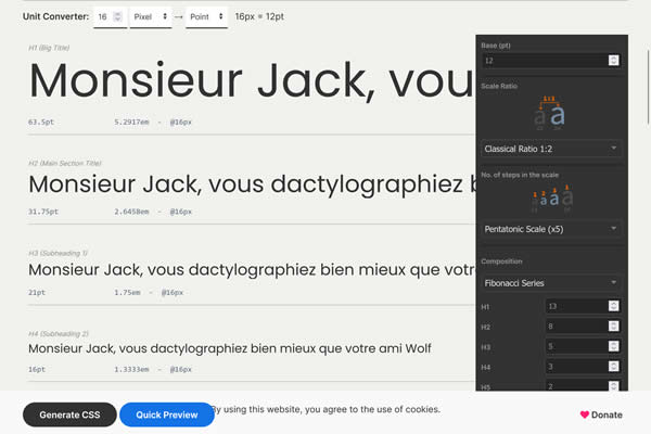
LGC Typographic Scale Calculator
A tool for calculating and visualizing type scales and layout grids, aiding in design consistency.
Capsize
Manages the space above and below text, enabling more precise typography alignment in web design.
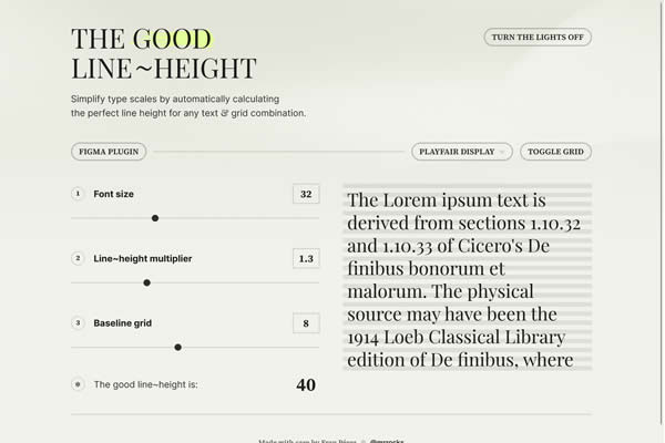
The Good Line Height
A tool for calculating the ideal line height for any font size, improving text readability.
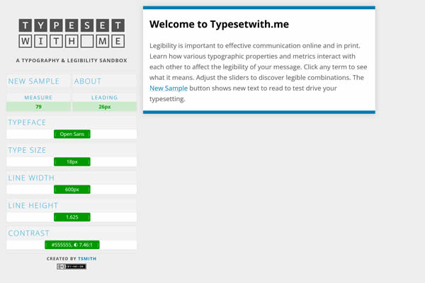
Typeset with Me
An interactive playground for experimenting with web typography, including font choices, sizes, and spacing.
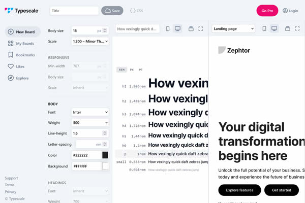
TypeScale
A visual calculator for creating harmonious type scales, with options for different scales and font weights.
CSS Icon Tools
From generating icon fonts to SVGs, these tools simplify the process of integrating and styling icons, ensuring crisp, scalable graphics across devices.
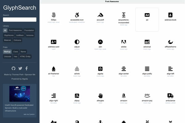
GlyphSearch
Search for icons from popular libraries like FontAwesome, Glyphicons, and others, streamlining the icon selection process.
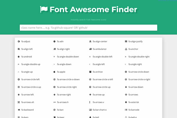
FontAwesome Finder
Find FontAwesome icons easily with a searchable database, simplifying icon integration into projects.
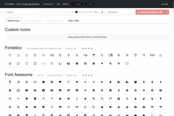
Fontello
A tool for creating custom icon fonts, selecting only the icons you need from various sets.
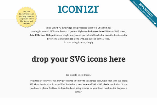
Iconizr
Convert SVG images to CSS icons, optimizing them for web usage.
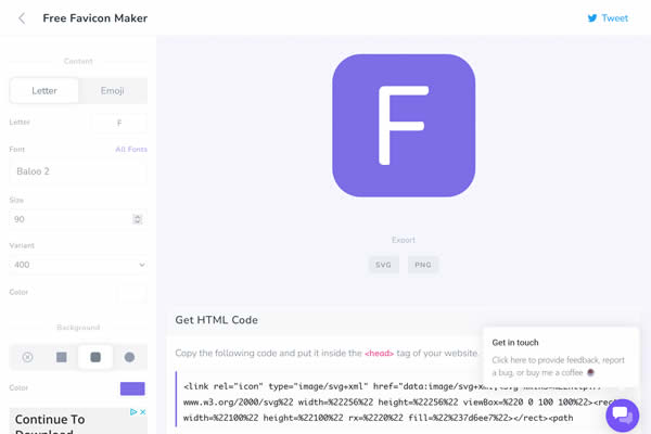
Formito Favicon
Generate favicons for all platforms and browsers with a simple upload, ensuring brand consistency across devices.
CSS Quality Checkers
These tools will analyze and optimize your CSS files. They identify unused styles, redundancies, and potential improvements, helping to streamline stylesheets for faster load times and better performance.
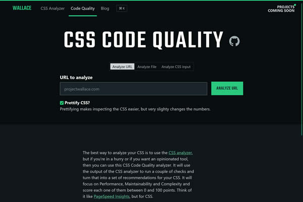
CSS Code Quality Analyzer
Insights into CSS code quality, tracking changes over time to maintain clean and efficient stylesheets.
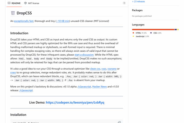
DropCSS
A highly efficient and fast tool for removing unused CSS, reducing file sizes and improving load times.
Web Accessibility Tools
These tools ensure web content is accessible to all users, including those with disabilities. Recommendations for improvements to enhance usability for everyone.
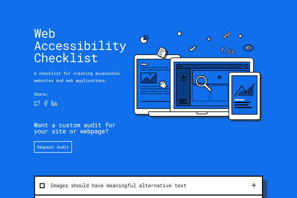
Web Accessibility Checklist
A comprehensive list of accessibility guidelines to ensure your web content is accessible to all users.
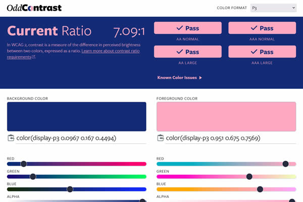
Odd Contrast
Analyze and improve contrast ratios for text and background colors, for better readability and accessibility.
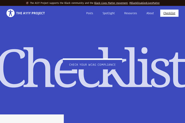
A11Y Project Checklist
An easy-to-follow checklist for web accessibility, covering key areas to improve user experience for everyone.
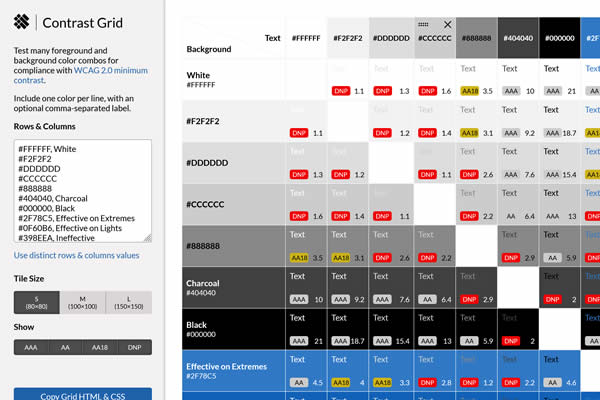
Contrast Grid
Evaluate text and background color combinations for accessibility compliance, ensuring readability.
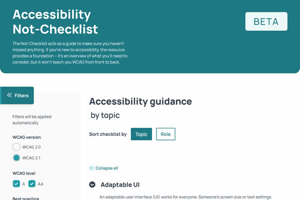
NOT Checklist
A reverse checklist for common accessibility mistakes, helping to avoid potential issues in web design.
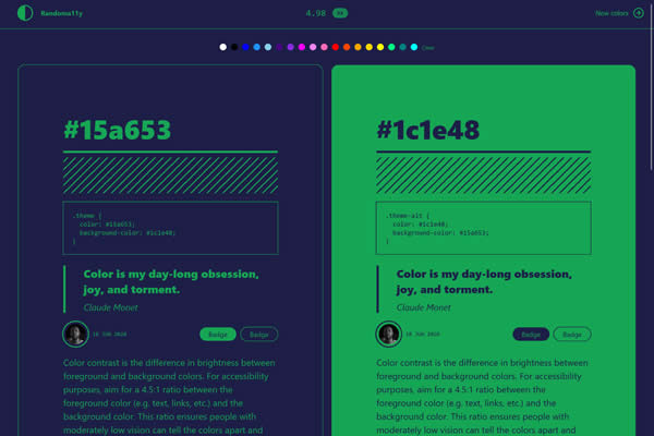
RandomA11Y
Vote on accessible color combinations and explore high-contrast color pairs for your designs.
Interactive CSS Learning
Through exercises, tutorials, and live coding environments, you can learn more about CSS properties and best practices in a practical, engaging manner.
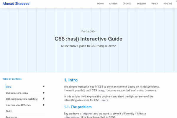
CSS :has() Guide
An informative guide on using the CSS :has() pseudo-class for more dynamic styling options.
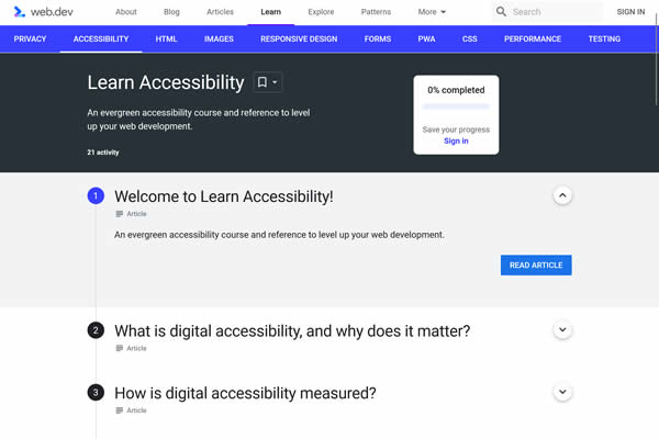
Web.dev Accessibility
Learn about web accessibility with practical tips and guidance to make sites accessible.
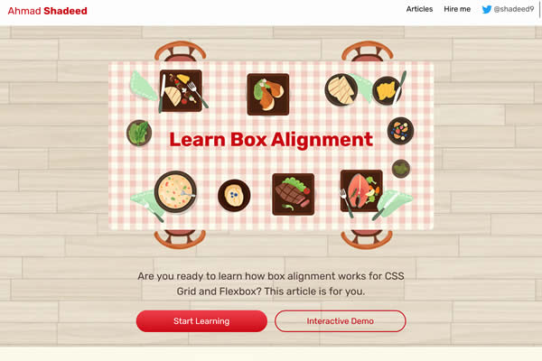
Learn Box Alignment
Comprehensive guide to CSS Box Alignment, offering examples and explanations on aligning elements in various contexts.
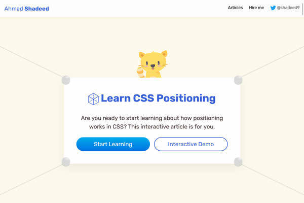
Learn CSS Positioning
A comprehensive guide on CSS positioning techniques, explaining how to control element layout properly.
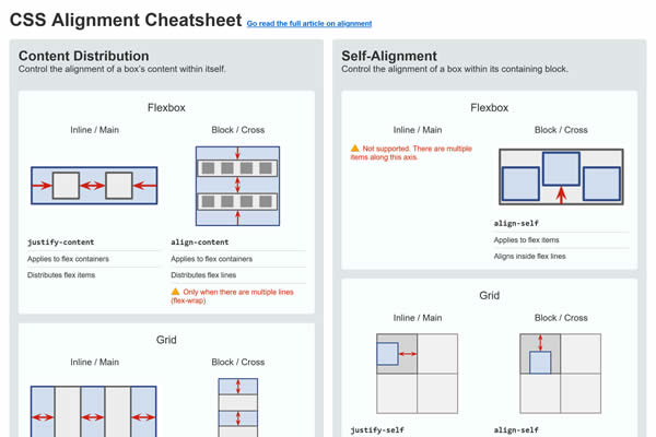
CSS Alignment Cheatsheet
A cheatsheet for CSS alignment properties, helping to quickly understand and apply alignment options.
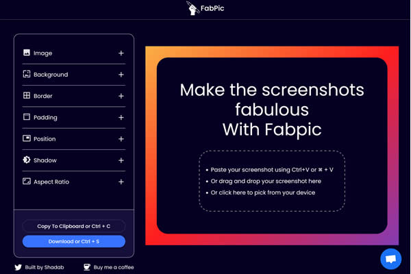
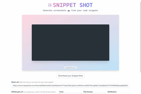
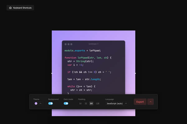
Generate Code Screenshots
Ideal for tutorials, blogs, or documentation, these tools stylize code for readability and aesthetic appeal, supporting various programming languages and themes.
SnippetShot
Capture and share code snippets with syntax highlighting, making them easier to read and understand.
Related Topics
Top