It seems like every designer has a horror story or two (or seventeen) about getting ripped off by a client who refuses to pay.
Once it happens, there’s not too much you can do. It sucks, but it’s the simple truth.
If you didn’t get a contract or a clear payment process established in the beginning, a lot of the time you’re just going to have to eat the loss. You can’t sue someone without a legally binding document, so the only thing you can do is plead, pester, threaten, or try something possibly illegal like a CSS kill switch (only use this in extreme circumstances!).
That ain’t a pretty picture.
You Got Screwed – Now What?
You’re probably going to want to slap me for this, but I’m going to say it anyway: I suggest learning from your mistake and preparing to do things better next time. I think I may be turning into the agony aunt of the design community: “Learn from your mistakes!” “A penny saved is a penny earned!” “Don’t eat your dessert with a salad fork – what are you, some kind of barbarian?”
But really, it’s often the only thing you can do if you find yourself in an unfortunate money situation with a client. Perhaps you can’t afford to hire a lawyer or debt collection agency to get your money back from the jerks who stiffed you (although if you can, it can be a good “last straw” solution for a really stubborn client). After you stomp and wave your arms at your cat and/or spouse, it’s time to draw up Plan B.
The bright side to dealing with deadbeat clients is that there’s always a next time. And what should be the first thing you do with your next client? Negotiate. There are plenty of resources if you need some tips on how to negotiate a client contract, like this one or this one.
But since getting paid has been an issue for you recently, I would start by getting an upfront deposit, ideally 50% if possible. Yes, it can be awkward and require some negotiating skills. But is a little awkwardness really worse than getting stiffed again? I think it’s preferable to letting someone get away with being unprofessional and terrible to you.

Choose Your Clients Well. I Mean It.
You should be picking your clients as carefully as you would pick the person you want to marry. It sounds weird until you actually think about it – you’re entering into a relationship with this person. Relationships have rules and each person has a responsibility to clearly communicate their needs to the other person.
Don’t try to make a bad client into a good one; as I’ve mentioned in previous articles, it will never work out. Ever. Any client who exhibits the telltale signs of crappiness is only going to get worse and worse as a project drags on. You know this already. Don’t do it to yourself. Prevention over cure is always the best way.
Don’t Give Them A Reason To Get Annoyed
Let’s be honest here. Designers aren’t always noble warriors of integrity, put upon constantly by big, bad clients looking to rob them blind. I know because I’ve hired them. There’s rarely an excuse for non-payment, but sometimes, a designer’s conduct can leave a client desperately looking for one.
What do I mean by this? Oftentimes, designers are genuinely unaware of how they’re coming across to their clients, and believe that a particular client’s decision to get funny with the money comes out of nowhere, when in fact, the designer has been communicating poorly, or sometimes not at all.
I promise I’m not going to start attacking designers (I’m a designer too), since I know the industry is full of hardworking folks with integrity, but I’ve hired some people who were just flat out unprofessional no matter which way you cut it. I always paid, in full and on time, but boy did I feel crummy about it sometimes.
One designer who shall remain nameless and genderless actually took an unannounced, four-day ski trip with their significant other right in the middle of the work week! I couldn’t reach them at all; my messages and emails were met with dead silence. For four days – a week before deadline. I was so shocked I couldn’t even think of what to say when they returned, all rosy-cheeked and oblivious (oh, how shall I fire thee? Let me count the ways).
Of course, that’s an extreme example, and I’m sure none of you here would ever do something like that. But I wanted to provide a bit of context for those who might not realize that their actions are aggravating a client who has appeared perfectly reasonable up until now. Probably the biggest issue I have with many freelancers, as a client, is that they over-promise and under-deliver.
Too Much Confidence
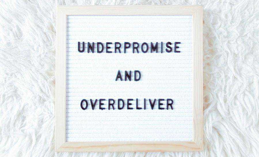
Under-promise and over-deliver. Always. Never the other way around. I can’t tell you how many times I’ve hired designers who claimed they’d have a website ready for me in some ridiculously short amount of time, and then not only failed, but failed spectacularly to do so.
Instead of the “48 hour” or “3-days, max” ETAs I was promised, I waited for weeks; sometimes even months, before I got any work. It was dreadful. Eventually I got smart, and learned to stop working with designers who made impossible claims, because 99.9% of the time, people who promise you the moon end up delivering nothing but stinky cheese.
Designers, if you make wildly extravagant claims to prospective clients, you are shooting yourselves in the foot. Even if you think the time period you’ve given is “reasonable,” it’s usually not, and you’ll end up grossly underestimating the time it will take you to complete a task. You’ll be attracting all the wrong kinds of clients to yourself, and driving away all the right ones.
Good clients know that if something sounds too good to be true, it usually is. Be honest with yourself and figure out how long it’s actually going to take you to complete a project. Then multiply that number by three. That’s the time period you give to your client. Then make sure you finish under that time. Under. Not over, guys. Seriously.
On Time, Every Time
Okay, time to switch back over to freelancer mode. As a freelancer, I have never had a client who refused to pay me, or who was abnormally late with payment. Why? Perhaps some of that is due to luck – sometimes a payment issue can truly come out of left field. It’s happened to big name designers as well as the little guys. Mostly, though, I believe my 100% payment success rate is due to me always taking the same precautions I’ve outlined for you today.
I never work with anyone I feel sketchy about, and you shouldn’t either. Don’t be so desperate for work that you’re willing to overlook a client’s red flags. Draw up a set of non-negotiable rules in your contract, and (this is important) stick to them no matter what.
It doesn’t matter if you’re doing business with your grandmother, your head or state, or your pet bullfrog – if any prospective client complains about the rules, politely show them the door. You work hard enough for your income. Don’t work even harder just to get it in your bank account.
Related Topics
Top