Companies hire me to improve the conversion rate of their websites. Sometimes, their underlying belief is that the main problem resides in single, isolated elements such as CTA buttons. I am asked to provide a solution that later will be (A/B) tested and, if positive, implemented.
A/B testing is important for CRO (as are CTA buttons), but it needs to be adopted within a more comprehensive approach. This approach is user-centered design, which I believe is the best strategy to improve conversion rates.
User-centered design is a methodology; a broad framework of processes where the focus is placed on the users. It encompasses not only the design of the user interface, but also activities such as user research. The intent is to create a product shaped around the needs, desires and limitations of the users, rather than forcing them to adapt to it.
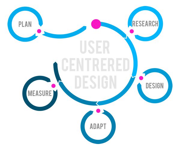
What is User Centered Design? [Source]
A strategy for CRO that takes into account these activities is recommended, and represents the optimal solution. But crucial improvements can also be achieved by directly modifying the user interface in accordance with the principles of user-centered design.
Get Rid of Obstacles
UX issues are obstacles on the path to conversion and should be removed. They often belong to these categories: lack of feedback, doubts, and user fatigue. The overall goal is to minimize the cognitive load – the amount of mental effort imposed by the user interface in order to use a website.
Let’s have a look at some common issues and how to get rid of them to clear the path to conversion.
Visual Clutter
User interface elements that are not helping users achieve their goals (and your business goals) are detrimental. They are a source of distraction, and require additional effort to distinguish them from the helpful elements.
Show only the information that is needed in any particular situation. Avoid colors, images, links or layouts that don’t add value. Leave sufficient white space between elements.
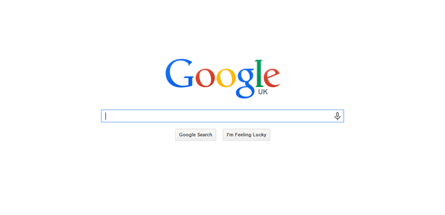
Great use of whitespace from Google
Steps
The path to conversion consists of a series of steps. A good solution requires a minimal number of steps. A better solution requires a short number of easy steps. Adopt solutions that reduce the mental effort of the entire process, rather than increase the mental effort to reduce the number of steps.
Content
Too much text can overwhelm and discourage the user. Follow these indications:
- Omit the needless: Use the minimum amount of text required to convey your message.
- Make it easy to read: Good contrast, sufficiently large font-size, short text lines, short sentences and paragraphs, and short sections with enough white space in between.
- Create a conversation: Use “you” to address your users, answer their questions (what they came to your website for), and avoid jargon.
- Illustrate the content: Images, illustrations and charts are often an efficient way to convey a message faster and clearer.
Links
If the anchor text is not clear, users might avoid a link because they are unsure of what will happen next. Write meaningful links that indicate what the user will see or get. Use a verb to invite the user’s action.
Forms
Forms are critical. Follow these indications:
- Reduce user fatigue: Minimize the number of fields that the user has to fill in. Ask only what you really need (remove optional fields). each extra field increases user fatigue and negatively affects conversion rates.
- Group logically: Group related information in sets.
- Give feedback: In a multi-step form, clearly label each step to give the user insight about the entire process from the start. highlight when a step is completed to show progress.
- Avoid doubts: In drop-down menus, the answer options should cover all the possibilities and not force an answer. Add the option “other” if required.
Live Chat
Sometimes users have doubts or need immediate assistance while performing a task on your site (e.g. filling in a form). If they can’t find an answer, they will leave. Live chat support saves conversions, prevents users from sharing negative reviews, and allows you to discover pain points for further improvement.
Touch
Mobile phones traditionally suffer from low conversion rates. It’s important to understand that different devices have different usage patterns. When designing for mobile phones, the key is to always simplify. Reduce the amount of text and introduce even more white space around elements on the user interface.
Simplify the forms, and “think thumb” rather than pixel. Remove or replace heavy visual elements to improve the site’s speed.
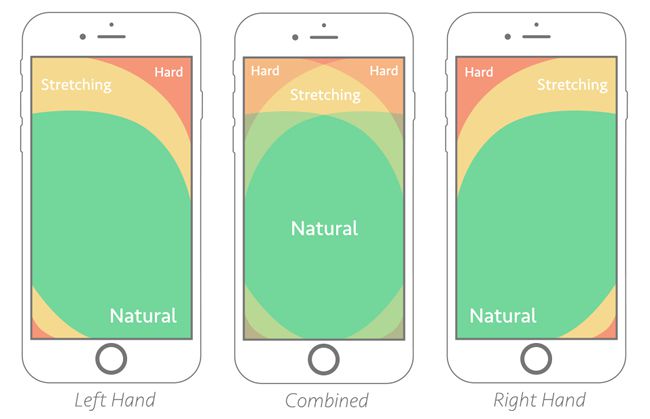
The Thumb Zone (via SmashingMagazine.com)
Be Persuasive
Visual Design
Your visual design is the first impression your website will make, and it has a big influence on whether users will trust its credibility. Users are more likely to give an attractive application the benefit of the doubt and spend more time on it. Visual cues can be used to prioritize tasks and draw the eye to the correct functionality.
Invest in good, professional photography and illustrations, be clever with your color palette and typography, and respect the (white) space.

Value Proposition
A value proposition is a statement of how your product or service will benefit your users. Make your value proposition clear, specific, and visible. Reassure users that they are on the right website and that you will deliver on your promise.
CTA
The design of a call-to-action button has a big influence on its effectiveness. Your goal is to avoid doubts in the user’s mind and reduce friction:
- Make it look like a clickable button and give it a color and size that emphasizes it. Create white space around it.
- CTA buttons are for action. The text should be short and start with a verb. Use the words your users use and clearly state what users will get if they click on it.
- When designing for mobile devices, don’t simply resize the page. Make the CTA button big enough so that it can be easily tapped, and add more white space around it (proportionally).
- Avoid the “banner blindness” effect. Make sure that the CTA stands out, but still fits with the overall design of your website. Keep it simple.
- Avoid choice overload and give priority. If there are several actions you want to direct your users to, assign priorities. Make it clear which one is the most important in accordance with your business goals.
- What follows the CTA is equally important. Be consistent, keep things simple and avoid distractions.
Conclusion
Conversion rate optimization shouldn’t simply focus on isolated elements. It should instead adopt a comprehensive approach to achieve better results. User-centered design principles inform design decisions that are crucial to improve conversion rates.
Related Topics
Top