Cryptocurrency is one of the biggest mysteries of our times. Is it a real thing? Is it a fraud? No one can tell for sure. People are split into two camps. Some are convinced in a future with decentralized control and an alternative medium of exchange that is secured by blockchain; others are strong believers that Satoshi Nakamoto’s invention (widely known as Bitcoin), along with other cryptocurrencies such as Ethereum, Litecoin, Monero, etc. is just hype dished up in a different wrapper.
However, we are not here to dig for the truth. We are here to explore crypto-inspired concepts that boast of having truly exceptional designs. We have divided our collection into two parts: One uncovers impressive examples of website design; while the other reveals fantastic mobile app design.
Website Design Concepts
The distinguishing trait of the majority of crypto-related web design concepts is a high-tech vibe. Opting in favor of prevailing black here is quite predictable. Namely this color, or shall I say an absence of color, is associated with secrets and mystery – exactly the feelings that blockchain technology evokes in most people. Here are some remarkable examples made with this notion in mind.
Blocksphere
Blocksphere is an exceptional concept for a blockchain holding company. It gets its beauty from several important things: Dominant black with white as a core color for text and highlights, digital typography, particle backgrounds and some trendy details such as vertical lettering, ultra-narrow sidebar and footer navigation. As a result, this masterpiece by Nextpage charms with a powerful high-tech atmosphere and a note of mystery.

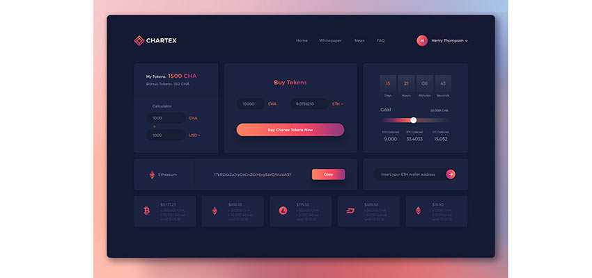
Crypto Agency. Cryptocurrency
Crypto Agency by Hanna Prydanchuk is centered around the same bunch of tricks as the previous example. However, there are some interesting findings: Pink color for highlighting and drawing attention to the important stuff, crossed out headings, elegant graphs and of course, backgrounds with geometric touches. The concept looks simply amazing.

ICO dashboard by Vita Spenser
While the previous artists show their vision of front-end design, Vita Spencer’s concept features a backend. It gets the most out of a card layout, looking organized and neat. As for coloring, along with dominant dark tones, the artist leverages gorgeous gradients that give the design a sophisticated note.
Hero image by uixNinja
The team behind uixNinja illustrated their view of a crypto company’s website through several designs. The hero image has a dark aesthetic. But this time blue colors run the show, oozing confidence and intelligence. The Ethereum redesign shows exquisite charts and clever use of neon-like colors. There are many things to explore. The concept looks incredible.
Cryptomaker
Dark colors, especially those that lie in a blue spectrum, are also valid choices. They ensure trust and bring a businesslike vibe to the scene. Consider Cryptomaker, a landing page of the fictional application for monitoring crypto signals. Unlike all the previous examples, this concept uses white as a core color for the background, yet with royal blue as a secondary tone and neon green for placing focal points. It does not have a hint of mystery, but it has a real business appeal that inspires confidence.

CRYPTO – ICO and Cryptocurrency Theme
Another alternative is purple. It exudes an image of ambitions, mystery and stability. In tandem with white, it makes the design look sophisticated and creative. CRYPTO – ICO and Cryptocurrency Theme is an example that sticks to this notion. It delivers a strong first impression, offering a top-notch experience.
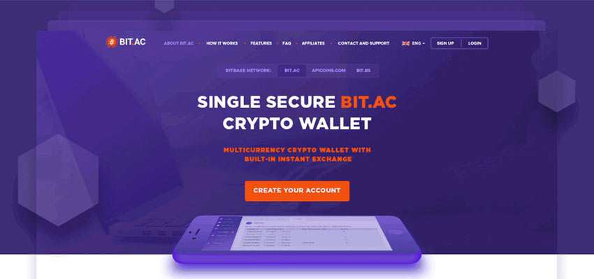
Bitac Site
Bitac Site’s design relies on three main colors, where purple is used for the background and orange for focal points. The page managed to effectively cover lots of content, thanks to classic linear layout and lots of fresh air. Overall, the concept looks intriguing and alluring – yet a bit modest.
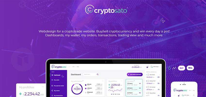
Cryptosato
Cryptosato is similar to the project of Vita Spenser mentioned above. It is a clever take on a dashboard where the user can monitor their wallet, orders, transactions, etc. As expected, everything is arranged into cards with a sidebar for navigation. The interface is content-heavy, but without looking overwhelming.
Mobile App Design Concepts
The design of mobile applications does not differ much from the website concepts above. They also bet on a mysterious atmosphere – going for dark colors, techno-like elements and subtle details.
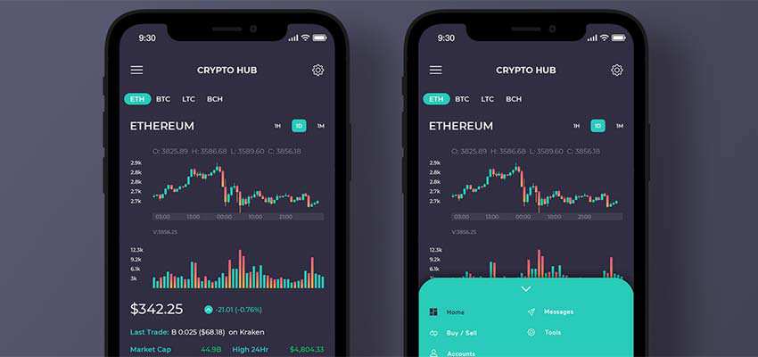
Fintech Bitcoin Mobile App and Crypto Hub
Here, dark aesthetics take center stage. Fintech uses beautiful neon tone to delineate graphics and CTAs; whereas Crypto Hub employs almost the same blue shade and also pastel red for charts, stats and even as the background for tiny nav panels.
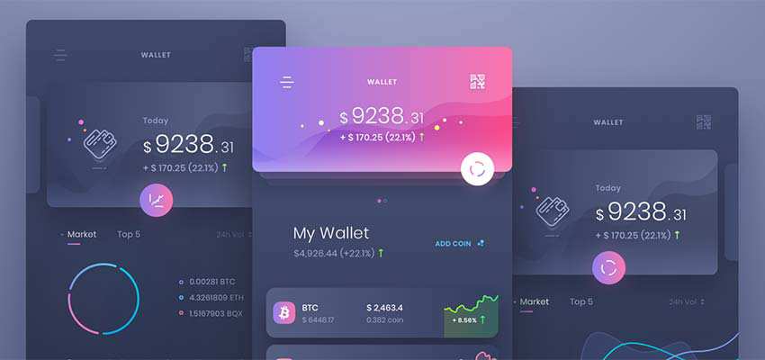
crypto wallet by uixNinja
This example took a fancy to purple shades. Heavily sticking to the dark background and relatively subdued typography, Crypto wallet boasts a top-notch appearance. Gorgeous gradients and glowing touches not just add spice, but greatly enrich the aesthetics. However, an optimal balance between content and whitespace keeps things in order and saves the concept from looking visually overwhelming.
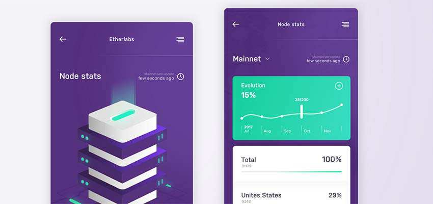
Ethereum nodes by Marcin Paluch
This concept by Marcin Paluch skillfully maintains visual clarity. The layout is intuitive, and the coloring is eye-pleasing; purple and vivid turquoise perfectly collaborate with each other. Individual elements are properly aligned, making the overall interface feel uncluttered and refined.
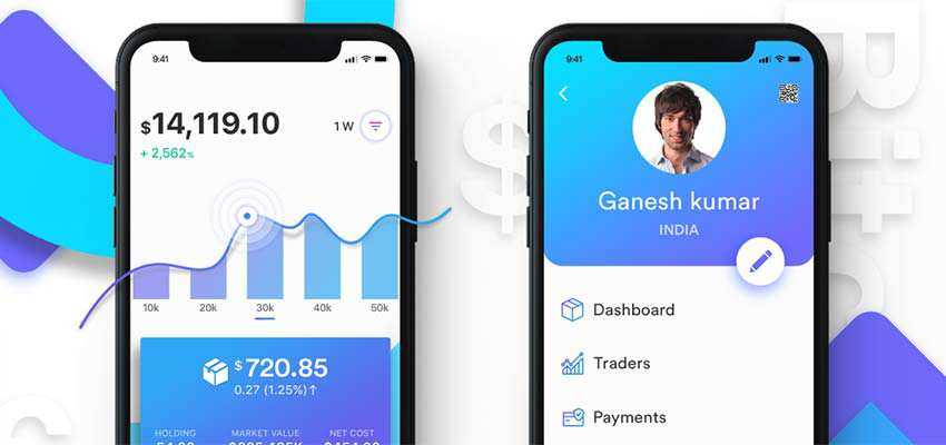
Cryptocurrency Wallet
Cryptocurrency Wallet has an inviting nature. It bets on a casual language and careful color choice. Blue and white form a harmonious symbiosis. Gradient and subtle shadows spice up the design, adding visual interest.
Crypto App
Crypto App is presented in two color options: dark and light. The first one feels intricate and a bit mysterious, whereas the second looks clean and elegant. Gorgeous, greenish gradients mark both interfaces, taking the center stage.

Defining the Crypto Current
All the featured concepts fit the general atmosphere of cryptography. They look sophisticated and elaborate with a certain dose of mystery and secrecy. They also go for high-tech vibe as it hints to the various advanced algorithms that lie at the heart of producing, or mining, crypto coins. Designers prefer dark coloring, neon shades, line art and brilliant gradients. They use these elements to skillfully create enigmatic and highly-alluring interfaces.
Related Topics
Top