The move from physical to digital magazine content is an exciting process. Over just the past few years we have witnessed thousands of new brands and templates begin to surface. Magazine editors have wisely chosen the Internet as a medium to share their news stories.
This not only reaches a wider global audience but also allows for the free flow of information. Without constraining signup fees these magazines can grow much faster with a lot less marketing. But to design such a magazine style WordPress theme can be difficult if you are unsure of where to start. I have offered a few ideas below to kick-start your creativity into magazine design mode!
When new visitors land onto your site they may feel a bit overwhelmed by the amount of content. Magazine homepage layouts often include a massive list of recently published articles – but you’ll also find plenty of widgets related to post archives and social media.
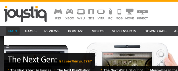
You should build the main navigation links for your magazine to stand out like a sore thumb. This means fewer people can get lost in the shuffle looking through your sidebar and header. If you don’t have a lot of static content I recommend building a larger sub-navigation comprised of blog categories. This still gives the illusion of a “big” navigation which provides alternative reading material to explore.
This same concept can easily apply to your footer area as well. Columns have been popular in recent years, although dividing into horizontal sections is also very trendy. Ultimately your goal is to provide easy access to the magazine’s most important pages. By default the majority of Internet users are conditioned to expect these links in the header area. You can duplicate this menu in your footer and possibly include other prominent links.
Keep Ads Outside of Content
Advertising is the sole means by which 80-90% of web magazines earn a major profit. You can setup a premium subscription service or offer paid downloads, but these aren’t always easy to implement. And web advertising isn’t exactly a problem these days. But when you have images overlapping important content the layout loses credibility.
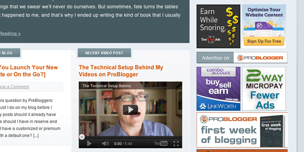
Just stick to the standard ad zones you encounter on many other popular blogs. Problogger assigns a whole sidebar area full of ad blocks, and their readers know what to expect.Freelance Switch is very similar in design and includes different-sized ad blocks all throughout the sidebar. Another strong paradigm is to include a single horizontal ad mixed in with your headlines(generally after the first 2-3 posts).
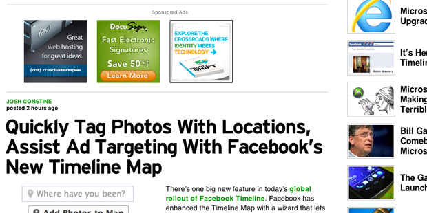
TechCrunch uses a familiar system with 125×125 ad blocks placed mid-way down the page. These will grab your visitors’ attention much more clearly, but can also prove as an annoyance when overdone. Try to stay away from animated gifs and flash banners other than within your sidebar so visitors aren’t thrown off by dynamic content.
Featured Article Images
Fans of the WordPress CMS should know about the Featured Image options included with each post. There have been countless tutorials outlining the subject and how you can incorporate these images within your layout. Many design blogs including Speckyboy use this image feature as article thumbnails to offer a glimpse into the post topic.

The best part of this system is how easily you can change each of your images from within the WordPress backend. When editing a post you simply upload your choice of image from the bottom-right corner box. Some magazines such as FreelanceFolder use larger images to fill out the whole page. Try to feel how your layout would flow best and which size of images(if any) would fit in.
Utilize a Comment System
WordPress comes bundled with a standard comment system that works pretty well. There are additional plugins which let you customize the features to include threaded comments and user voting. But when you launch a full magazine I recommend moving onto one of the more popular comment networks.
The two(2) biggest competitors are Disqus v. IntenseDebate which have been written about many times over. I personally enjoy Disqus as I’ve found a lot more people who have an account and are willing to leave comments. Yet with IntenseDebate you can offer rich OAuth support so users can login and comment via Twitter, Facebook, or other popular social networks.
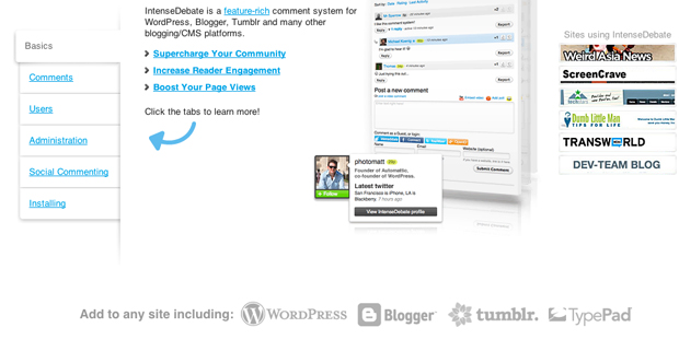
If you’re torn I recommend trying them both out for a couple of days. The individual WordPress plugins are easily customizable and 100% working up to the current WP v3.3 release.
Free Mag Themes
What trends article could be complete without a set of free WordPress themes? Magazines for the web are becoming commonplace and now is the time to jump onto this bandwagon. If you are uncomfortable coding an entire theme from scratch I recommend using one of these 50 free WordPress themes as a base. It will save you the stress of extra frontend coding and thus you’ll be able to launch your website that much sooner.
Design Showcase
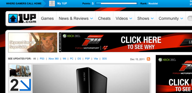
1UP.com
#offthegrid
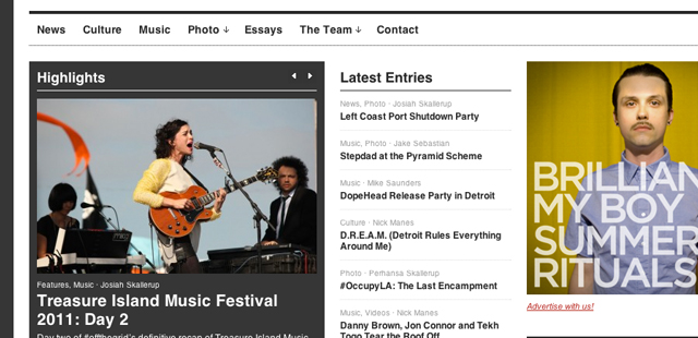
The Finished Box
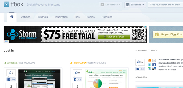
WorldNetDaily
MagPress
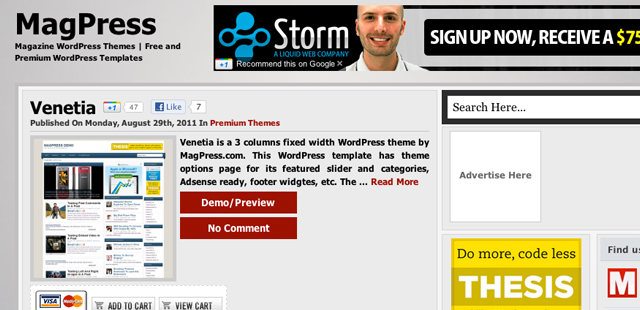
Spin Magazine
NZ Herald
Macalicious
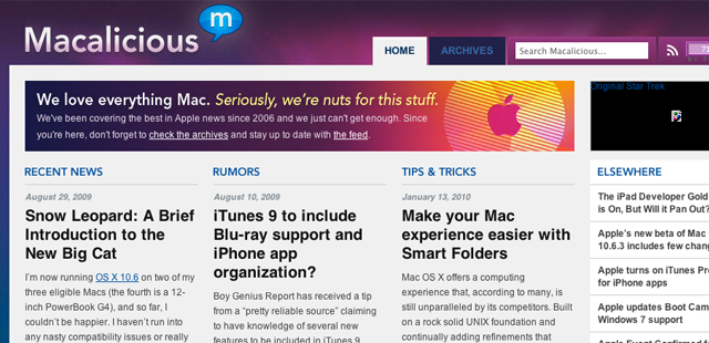
Pocket-lint
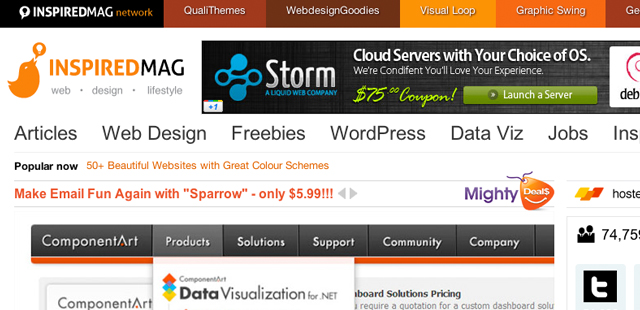
Inspired Mag
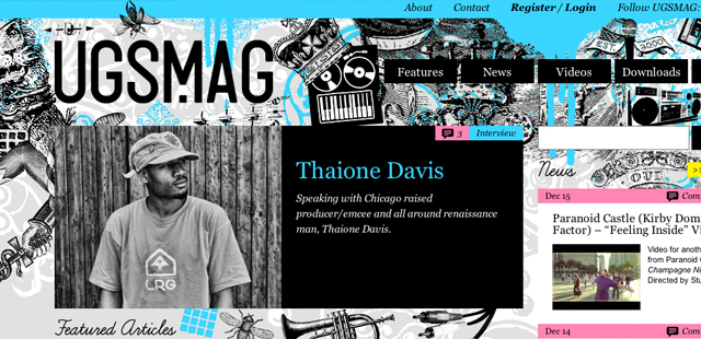
UGSMag
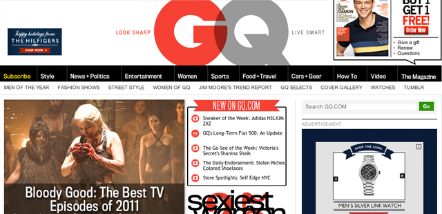
GQ Magazine
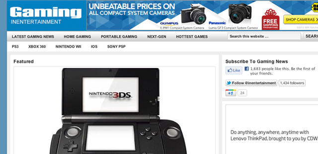
In Entertainment
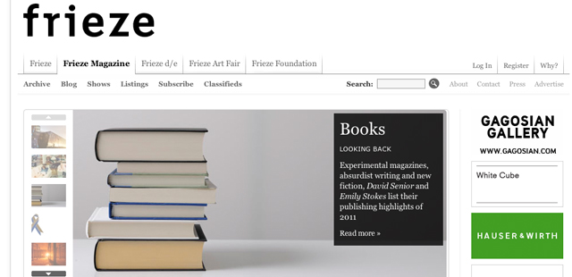
Frieze Magazine
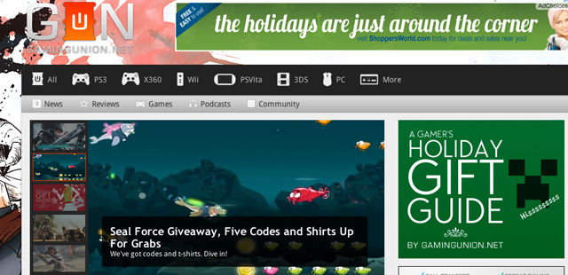
Gaming Union
Advertising Age
Related Topics
Top
