When dealing with mobile interface design you have to consider a number of factors. Not all devices are built the same, and so each visitor will have a different experience and you have to cater for that. Obviously some of the more popular devices are running iOS or Android operating systems. But what else can we delve into?
For this article I’d like to share some ideas on design trends in mobile apps & website layouts. Visitors accessing your application or website on their phone/tablet will be expecting a truly creative interface. You need to think in terms of the ultimate user experience when sitting down to craft any new mobile product.
Keep your Layout Organized
Regardless of the type of mobile product you’re building, content should usually come out on top. Users of your website mobile app are on there for a reason. Possibly searching for answers to a question, or accessing profile data or checking out new publications. Your visitors really care about the page content, and your interface design is often an afterthought.
It’s good if you can split up content based on page hierarchy. Mobile content especially does not have room for extra navigation links. Possibly consider building a single listview with a whole column of links down the page. Then as users tap through these links you have the full screen to load content, plus it’s easy navigating back.
This will leave you plenty of space for larger typography and images. This technique naturally fits mobile applications, but you can also plan this into a website. The quickest solution is to code an entirely separate mobile layout based off a single listview. Or you could alternatively build a mobile sliding navigation hidden just out of view.
Adjustable Typography and Color Schemes
This isn’t always an option but using liquidity in your typography means it’ll be easier to support a broad spectrum of users. The biggest adjustment would be for mobile websites to keep their font sizes normal when on a monitor, but increase size when displayed on a tiny mobile screen.
The best way to accomplish this is through sizing fonts in em units and adding -webkit-text-size-adjust: none; into your stylesheet. This property will stop mobile Safari and other webkit browsers from automatically adjusting font sizes according to screen resolution. It’s an annoying feature that can really mess up your naturally-sized text when transitioning from portrait into landscape mode.

I have also seen a trend recently popular with adjusting color schemes on mobile platforms. There are websites which offer this feature in the typical desktop view. However I feel it would impact the mobile viewing experience more profoundly.
One of my favorite examples is within the Instapaper iOS app. After signing into your account on the settings page you can change the layout scheme from light to dark. There are times when you’ll be struggling to read some text on a white background and it would be easier if the whole layout was darkened. This isn’t an enormous problem solver but it does grant your visitors some extra mobile-friendly functionality.
Start with Mobile and Scale Out
I have read this argument countless times and still agree that it just makes sense. When you are designing an entire website layout from scratch you should start the process focusing on mobile screens. If you can build a killer layout for mobile, you’ll easily be able to scale it up larger and display wider on full-screen monitors.
You’ll solve a whole host of problems with this method, starting with mobile navigation. You will rarely find a clear solution how to follow through with a custom navigation menu. It’s all about practicing different techniques and figuring out what would work best for your layout.
Do you need any dropdown menus? Are these menus going to be 2 or 3 levels deep? These answers will directly affect your situation when designing navigation for mobile.
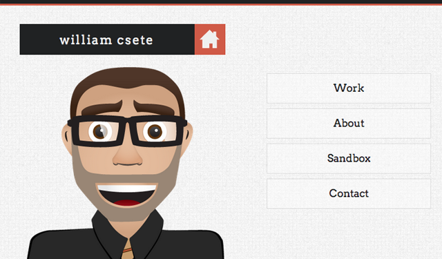
William Csete has a brilliant mobile responsive website which adapts very naturally to page resizes. When updating the width of your web browser the layout will snap into position. His top navigation links eventually break into square boxes which are clearly defined and resizable. This method works beautifully when targeting a portfolio layout using just a couple main heading links. But also notice many other elements in the layout resize as well – namely lower in the page towards the footer area.
Designers can learn a lot just by studying trends on other mobile interfaces. Ideas are only “trendy” if they catch on with a particular crowd and slowly grow in popularity. The same thing happened when web 2.0 was brand new and everybody was designing rounded corners and glossy gradient buttons.
Alternative Solutions for Consumption
It would be great if your whole layout could flow naturally with the webpage content. But I can think of a few examples where you may not be able to support a completely minified layout redesign. Even building mobile applications you’re stuck inside the Android and iOS SDK limitations.

When you are offering specific media content such as image galleries or video libraries you may consider offering an alternative viewport. Give your users a chance to leave the current page and explorer a mobile-optimized version with just the core content exposed. This gives your website credibility for primarily supporting mobile content, and you won’t need to fully redesign your app interface or website layout.
The mobile layout design should initially encompass your content and display pages in a simple, organized fashion. But it’s understandable that sometimes people would rather read something on a larger screen. Instapaper and more recently Pocket are two solutions where your readers can save content into their accounts and access those links at a later time. It’s not a complete alternative for a well-designed interface – but it does cater to a particular audience who would use these features either way.
Final Thoughts
In the design world practice makes perfect and whenever you’re in doubt just keep pushing forward! The best way to solve creative interface problems is through direct confrontation. Accessibility will always be a problem but mobile designers are constantly searching for new solutions.
I hope this article can address some key points towards building accessible mobile content on any digital interface. Whether you’re crafting native applications or mobile websites, content must be squeezed onto smaller screens and be portable anywhere in the world. Don’t be afraid of testing out new venues for creative problem solving. Additionally feel free to share any thoughts or questions you have in the post discussion area below.
Top