Fluid design is ultra-adaptable, user-friendly, and cooperates across devices – a necessary design foundation for the modern web user. However, it’s surprising how many web designers don’t understand the role fluid design plays in modern web design.
I’ve compiled some of the things you may not know about fluid design so you can better incorporate this valuable concept into your future work.
Responsive Design Evolved from Fluid Design
You’ve more than likely heard the term “responsive design,” or designing websites to “respond” to the device and screen on which they are viewed. Web traffic on mobile continues to grow, meaning more people than ever are browsing their favorite websites, shopping, paying bills, and consuming content. Responsive design incorporates media queries into web page design so media elements such as text, videos, and images, wrap and scale to fit the user’s screen.
Fluid design is one of several design elements that modern web developers rely upon to streamline high-quality content and create a better user experiences for users. In order to successfully leverage fluid design as a viable web design element, it’s important to understand its relationship to responsive and adaptive design.
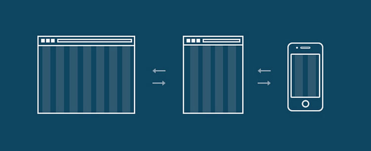
Adaptive design, as the name suggests, causes page content to adapt or change based on the device used to view it. The drawback is that pages must be created with specialized coding for every possible device. This can be time-consuming and cumbersome, and thanks to the speed at which new devices hit the market today, it is often difficult to keep pace with changing hardware trends.
Responsive design breaks down media queries into break points, so the same page scales according to how it is viewed. This eliminates the need to code the same page for multiple devices and offers a more consistent experience to customers across multiple devices. While adaptive design may work well for older, established websites with long web histories, newer websites need to establish value to Google, Bing, and other search engines’ algorithms quickly.
Fluid Design Operates in Percentages
Fluid design functions on percentages instead of fixed units of measure. For example, instead of scaling a piece of content to a certain number of pixels or a specific length, you would set it to take up a specified percentage of the viewable page area.
As the screen resolution increases, the white or negative space between content segments would expand accordingly. This offers a more consistent viewing experience across multiple devices, without the need to code multiple versions of the same page
The only drawback is that while the page adjusts to the user’s screen, the elements of the page may not adjust in tandem. Switching to a different display could distort the content. While mobile devices offer easy touch-enabled zooming on many devices, adjusting distorted content on larger displays could prove difficult.
Distortion doesn’t need to be an Issue
Critics typically cite visual distortion as the main negative aspect of fluid design. However, one of the tools designers can use to prevent distortion is fluid typography, or typography that adapts as the webpage scales to different screen sizes.
Well-conceived fluid typography hinges on the web designer’s ability to scale typography units to viewport units, or the percentage of the browser’s viewable area. This allows the designer to set the font size to change depending on what percentage of the page is viewable.
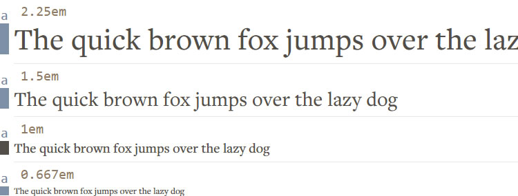
Another way to implement fluid typography is through a modular scale. A modular scale is a set of corresponding font sizes that are proportional to each other. For example, you could develop a set of ten sizes, each one being 1.5 times larger than the previous one. Since manually zooming a webpage can sometimes cause fixed typography to distort, having a modular scale offers a more consistent experience at various viewing levels. Designers must carefully scale their font sizes to whatever works best with the overall page design.
Fluid Design Can Offer Better UX
User experience (UX) is vital to making memorable interactions with potential leads. The ability to provide this on a variety of internet-capable devices is a tremendous asset, but designing adaptive layouts for multiple screen resolutions can be cumbersome.
A clunky, dysfunctional website does not inspire trust, nor does it grab the user’s attention. Modern marketers are always looking for new ways to connect to leads in meaningful ways, and a well-optimized website quickly establishes value to a potential customer.
Fluid design is more user-friendly than fixed layouts and can offer users a more consistent experience across multiple devices or screens. It accomplishes this by optimizing pages’ white space depending on the user’s screen resolution. Although some pages can end up distorted after a drastic change in viewing screen resolution, switching between devices doesn’t change the page’s layout.
Additionally, there is no need to develop multiple pages for specific device types. Fluid typography can help smooth out text distortion, and most devices allow for easy zooming so users won’t find multimedia content troubling.
Google Prioritizes Mobile-Friendly Sites
Fluid design aims to capture a wider range of potential visitors, and you’ll be reaping search ranking benefits as well since Google offers priority ranking to sites optimized for mobile. If you’re just starting and want to capitalize on the potential of fluid design, make sure you approach web design with a focus on mobile first.
Fluid Design Can Improve Page Load Times
A well-optimized site is going to load faster than others, and Google considers this when compiling search results. Modern consumers are accustomed to well-functioning websites, and with the immeasurable amount of competition in the modern market they are very quick to turn to a competitor if your website loads too slowly.
Mobile-friendly fluid design can provide your visitors with a consistent experience on a wide range of mobile devices. Since the performance boost also helps your SEO results, this is a huge benefit.
Fluid Design Boosts Aesthetics and Functionality
While visual distortion may be an issue for some pages on some devices, approaching fluid design with a mobile-first mentality is a great way to capitalize on its potential in. Scrolling is typically more functional for mobile users.
Since people generally scroll with thumb motions, fluid design is fantastic for sites that incorporate long or endless scrolling. With the right static navigation tools and responsive typography, users can have a consistent experience no matter how long they scroll.
More designers are also trying to break away from the long-accepted grid design concept. Fluid design offers more freedom in page layouts, and touchscreen functionality makes organic webpage designs more viable. Customers can expect a similar experience should they switch to desktop viewing, but as mobile web traffic continues to eclipse desktop, designing for mobile first remains a priority.
Ultimately, the role fluid design will play for any given website will vary by case. Nowadays, it’s essential to understand the potential fluid design can have. If you’re considering a website redesign or starting from scratch, fluid design can be a fantastic method for creating visually stunning webpages that will appeal to a wide range of viewers. Since the majority of those viewers will be using mobile devices, a mobile-first approach to fluid design is strongly advised.
Consider how you can use fluid typography, static navigation, and touch-enabled scrolling to your benefit this year. Fluid design done well can provide consumers with memorable, consistent experiences with your brand across a range of mobile platforms, so don’t skip this opportunity to stretch your brand awareness.
Related Topics
Top