There are many tiny trends in web design these days. We have already discussed lonely but eye-catching mouse tails, manipulations of the mouse cursor and triangles as decor. Each month brings us some exciting ideas that blossom into outstanding user interface features. They make interfaces truly engaging and refreshing, saving them from feeling ordinary. One such fresh trend is the use of lines in design.
The trend is not something new, extraordinary or unexpected. For several years, we’ve seen an increase in the popularity of geometric solutions: abstract Three.js-powered centerpieces, overlapping rectangles, triangles scattered throughout the hero area, etc. It seems that now it is the line’s turn to impress the online audience.
Surprisingly, using lines as a decorative tool has a particular potential. Thin lines can easily add to gentle or delicate aesthetics. If it is a fat line, it can naturally contribute to the so popular these days brutal design. What’s more, let us not forget that lines can also play the role of a guide that leads a visitor’s eyes from one point to another, forming a visual path. It is also a time-proven way of laying emphasis.
Let’s explore several outstanding examples of lines in web design and see for ourselves what they can bring to a project.
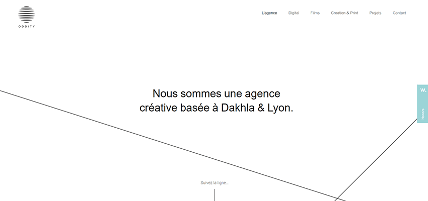
Oddityline
I believe the nameplate of this agency says it all. Not only does the logotype have lines but also the name of the agency. So it is not surprising that lines can be seen throughout the entire project. First, they greet us in the hero area. Then they follow visitors on their way through the page. The overall design is based on lots of fresh air, a ton of white space and classic black and white coloring. Here, lines feel at home.
Pixavio
Much like the previous example, the geometry sets the tone for the project. The whole beauty of Pixavio’s design is obtained with the help of rectangles of various sizes, along with different decorative elements such as dots, circles, zigzags, etc. Here, lines ideally fit in. They are used to enrich the hero area, highlight headlines and even put an extra emphasis on the submit button on the contact form.
Gabiano
While the previous examples are centered around sharp angles, the team behind Gabiano opts in favor of the smooth curved lines of a round shape. Circles are everywhere: in the logotype, social media icons, slider and even typography. The lines naturally interact with the hollow round plane figures as well as skillfully give the taglines and headlines an extra focus.

This is Garcy
Tom Garcy chooses lines to spice up the background, thereby saving the design from looking oversimplified. Thanks to the pale grey tone they almost merge with the white canvas. Yet, they still subtly break the screen into several blocks, highlighting the text. On other pages, lines are used to tie the design together and add some zest to the aesthetics.

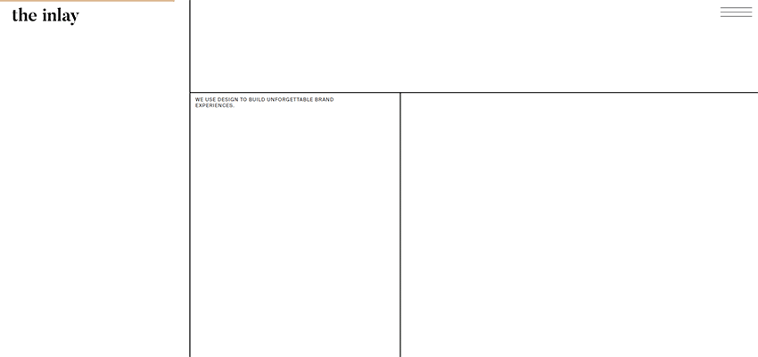
The Inlay
Much like in the previous example, lines in The Inlay divide the screen into several parts, giving the team behind the project an opportunity to properly handle the considerable amount of whitespace. The design feels spacious, airy, clean and of course minimal. Nevertheless, it does not look boring whatsoever. On the contrary, it looks great. This magnificent lightness and smart usage of space bring a fantastic overall impression.
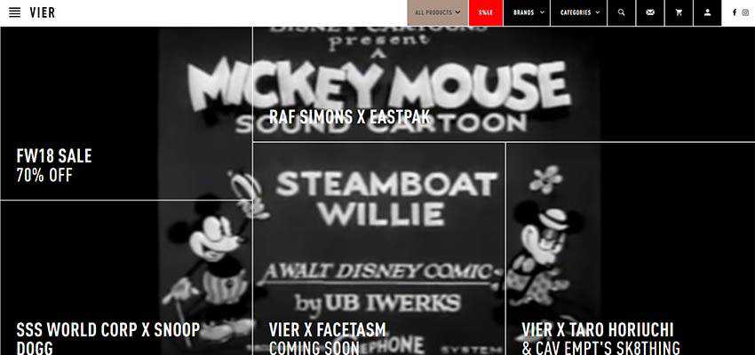
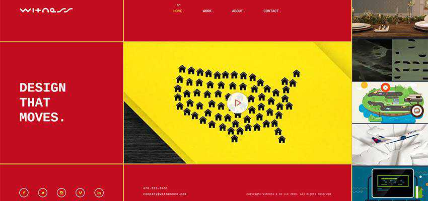
VIER ANTWERP / Witness
VIER ANTWERP and Witness follow the same route, but in their cases, the trend feels brutal. Lines form the subsections here, delineating the grid. While in the two previous examples the solution looks delicate and elegant, here it was brought to the surface showing the crude, primitive nature of lines.
Fly Digital
Within Fly Digital you will find lots of lines. It is here where beautiful line style meets bold and extravagant neon coloring, resulting in an outstanding outcome. Outlined typography, hollow squares and rectangles, and of course lines that glow in the darkness – the design is minimal but brilliant.

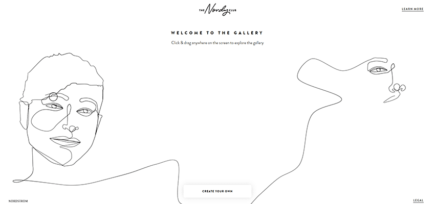
The Nordy Club
Here the line is standing behind the artistic side of the project. Not only does it create beautiful hand-drawn portraits on the home screen, but it also guides visitors from the beginning of the dialog to ”the entrance of the portal”. It draws the attention and keeps the interest alive, playing an important role in the prelude.
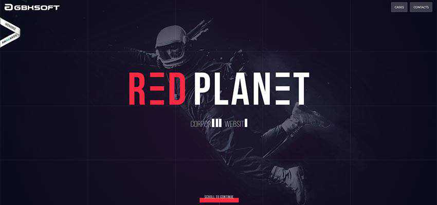
Red Planet
Unlike the previous example, lines in Red Planet’s home screen are barely perceptible, but they are there. They are so delicate and subtle that not all of them come to the forefront at first. However, they perfectly blend into the cosmic theme of hero area, enriching it with geometric allure. Lines can be seen everywhere you go. They strike the harmony throughout the page.
Yukie Nail New York
This design has lots of lines – both vertical and horizontal. They are used for various purposes: some of them are purely decorative, while others are navigational like the short lines used as slider navigation or the hamburger button. All of them are thin so that they can naturally complement the delicate feminine atmosphere of the project, nicely playing with the hollow buttons.

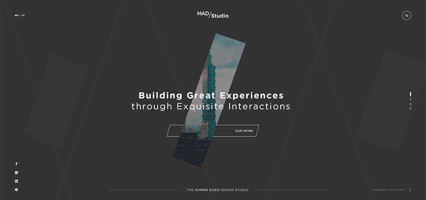
Mad Studio
The team behind Mad Studio uses lines mostly for decorative purposes. They do it cleverly. As you may have noticed here, the lines are mostly diagonal. The reason is simple: here the diagonal line is a heart and soul of brand identity. Note the logotype: there is a small diagonal line. Diagonal position can be seen in various details. For example, the narrow oblique rectangle located at the center of each slide, CTA and of course the background graphics. The ultra-thin lines perfectly support the theme and, thanks to their dynamic behavior, give the project a modern touch.
Follow the Lines
Lines are just lines. Whether they are ultra-thin or fat, whether they are straight, curved or zigzag. It is just a primitive geometric substance. However, web design is a place where anything can win a spot under the sun; and such a simple thing has potential to become a tool to impress.
We have examined a dozen examples where lines have gotten an opportunity to show their inner genius and shine with creativity. Some of them were purely decorative while others played an important role in creating a comfortable user experience. Tell us, which one draws your attention?
Related Topics
Top