Hamburger icons are everywhere. They carved a niche for themselves without any intention to leave us anytime soon. Hate it, love it – just deal with it. Much like the real world, online expanses, including both web and mobile interfaces, have some tasty and irresistible junk food.
Taking the web by storm more than five years ago and provoking some mixed feelings in developer and designer communities, the hamburger button is a valid solution that is recognized by everyone and used on a daily basis. Yes, it has its pros and cons. Not every project is able to derive benefits from it. All in all, it is a portion of junk food that, when overused or used unwisely, can make your project sick. Nevertheless, it has won its way up to the big leagues.
What’s more, it took its time to mature and grow up. At an early age, hamburger buttons were mainly connected to ultra-narrow slide-out panels. They often included just the necessary links and sometimes social icons, mostly taking after mobile interfaces and following their minimalistic approach. These days it by no means concedes to other time-proven navigation techniques.
To vividly prove this in practice, we have collected ten splendid examples where hamburger icon bites off more than it can chew, pushing boundaries forward. It hides behind the scenes – not just a regular menu, but the sterling mega-menu. At long last, it has an entire screen at its disposal. So, why not to take advantage of it and provide visitors with as many guiding points as possible, making their stay pleasant and productive?
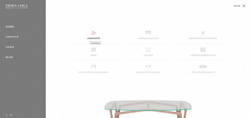
Prima Linea
The first example to consider is Prima Linea. They are a furniture brand with 30 years of history. So it is not surprising that their website has a ton of material to embrace and uncover. As a result, their navigation menu (hidden behind the tiny hamburger icon) comprises not a just typical list of menu items like contacts or a blog. It also displays a range of products, where the appropriate visual material accompanies each category.
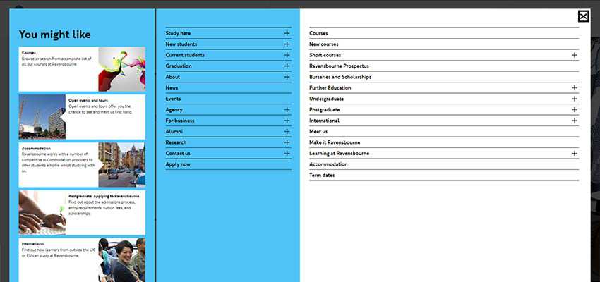
Ravensbourne
Prima Linea’s menu looks like a child’s play in comparison to the navigation section presented in Ravensbourne. It feels like the team behind the university’s website tries to cover it all. The screen is broken into three parts. The first one displays the scrollable list of essential things and links dished up in a classic blog-style manner. The other two represent the common mega-menu, where the left side reveals the parent links and the right side is used to show the so-called drop-down part. Although there is a whole bulk of data in here, everything looks good and organized.
Big Dog
The team behind the Big Dog strikes a balance between the contextual and visual part of the navigation, yet still taking up all the free space. This time the section is split into two. The first part is a classic: It includes only the primary links and social media icons. The second part is aimed to impress with the help of skillfully presented portfolio pieces.
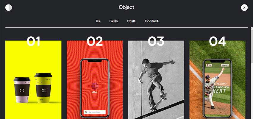
Object
The creatives of Object studio are also quite obsessed with using visual material in the navigation section. Their hamburger button reveals the whole page, not just a screen. It includes four main links and two rows of the best portfolio items. They aim to hit the target right away and win over customers with some actual stuff.
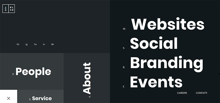
Blab Studio
If you think that images in the navigation screen are too much for you and your visitors, then Blab Studio offers a viable alternative. In their navigation section, everything is presented via text. However, it does not mean that it is stale and boring. On the contrary, designers managed to make everything look exciting and intriguing. The well-thought-out boxy aesthetics, bold typography and lots of fresh air do the trick here.
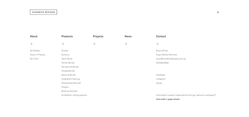
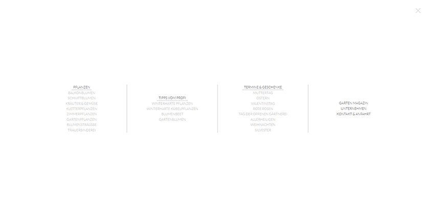
Chadwick Designs / Blumen & Pflanzen
Chadwick Designs and Blumen & Pflanzen opt in favor of traditional mega-menu solutions. Each one covers a whole range of links. Both of them bet on the classic structure: Column layout that creates order out of chaos and presents all the menu items in an organized manner. Also the color and background choice is worthy of note. Chadwick Designs, as well as Blumen & Pflanzen, heavily rely on a black-and-white color scheme, thereby achieving the proper level of readability. This makes everything look clean and tidy.
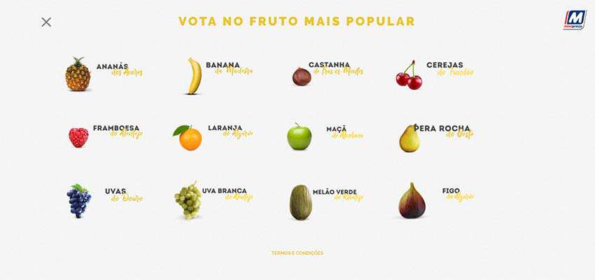
Minipreco
If all these text-based navigations featured above are not your cup of tea, you can always mix and match text and images to reach an equilibrium. This technique won’t overwhelm visitors with lots of visual material. But it also won’t make everything look boring. The team behind Minipreco is one of those who try to please everyone. Their navigation menu employs a pairing of title and corresponding icon that makes the section feel playful and engaging. The solution is simple. A bit primitive, but still eye-catching.
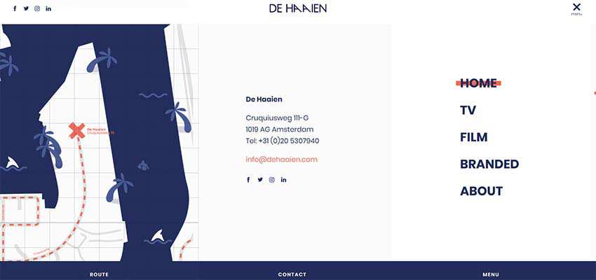
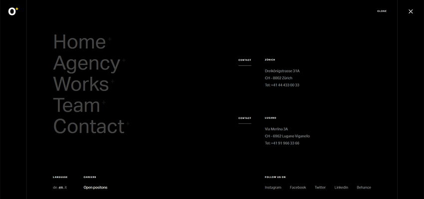
De Haaien / Octoplus
The previously mentioned examples here try to embrace chaos, dishing up as much data as possible. The De Haaien team takes a standard footer area that we are accustomed to seeing these days on the majority of websites with a concise menu, address, social links and a map. Instead, this all moves into the navigation section. The solution is neat, clean and just what the doctor ordered.
If you still try to avoid graphics in the navigation and make everything lightweight, serious and conservative, then Octoplus is undoubtedly your source of inspiration. Their navigation screen also was influenced by a typical footer area. But, this time it includes just the main menu, contacts and a couple of links that the team found to be vital for readers.
Good Things Come in Small Packages
Do not judge a book by its cover. And, do not fall victim to the misconception that the size of the hamburger button dictates the amount of information hidden behind it. Little pigeons can carry great messages. And hamburger buttons are like those little birds that hide huge parcels, but with mega-menus in them.
Remember, nothing limits you in space. You can use not just a tiny side panel, but the entire screen and even a page. Though of course, play it safe. No one likes things overdone. Exercise caution since mega-menus always stay mega-menus wherever they are.
Related Topics
Top