Images play important roles in websites, helping to improve conversions, enhance user experience and increase their engagement. There’s almost nothing better than an ideal image to draw the eye to where you want it to go. That’s why more than two-thirds of the web’s data is comprised of images.
However, using images has its downsides. The processing power required for large images is often too great for small devices, it can be a challenge to manage large numbers of images, and bandwidth usage can be costly.
In this article, we’ll look at how you can save your users bandwidth and time by loading and rendering well-optimized images lazily and progressively.
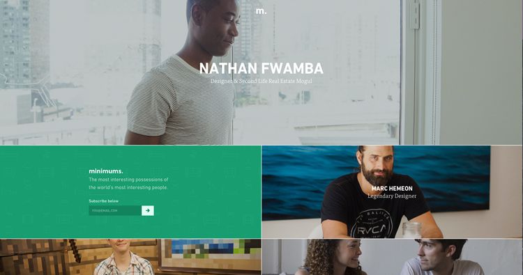
Minimums.com – Improving the UX of the site
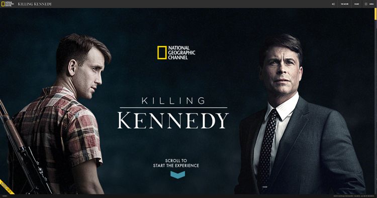
Kennedyandoswald.com – Increasing user engagement
Well-Optimized Images
The first step in optimizing your images is choosing the right image format.
And the first format you should consider should always be SVG. We should use SVG illustrations as often as possible, taking advantage of the way they can be resized, reshaped, restyled and even further compressed. A lot of photos on the web are designed to portray concepts, rather than specific people, places or things. In these cases, vector graphics may even be an improvement to using photos, especially stock photos.
We will always need some bitmap images. There are cases where you just need to use a photo to get your point across, or display a product, or show off a real person’s beautiful smile.
Currently, JPEG is still one of the best formats for bitmap images because of its widespread support, and the various compression algorithms available. You can get large, good-looking JPEGs that are surprisingly small in file size.
However, WebP is fast becoming a competitor to JPEG, and its compression is far, far better. It’s already supported in Chrome and Opera (and presumably any other Blink-based browser), and will soon be supported Firefox. Safari and Edge are hopefully not far behind. In the meantime, you can use the <picture> and <source> elements with the type attribute to send WebPs to browsers that support them, and JPEGs to everyone else.
PNG and GIF are, of course, better suited to those occasions when you need transparency or animation, respectively.
Lazy-Loaded Images
Lazy loading is the practice of not loading content until the user scrolls down far enough to see it. This practice can save a lot of bandwidth, and is especially useful on pages where the call to action (CTA) is right at the top of the page. If half your users hit the CTA button without reading further, why load other content when you don’t need it?
Here’s how it typically works: You use JavaScript to see if the space where the image will load is within the viewport. If yes, then you load the image. This approach works well enough, except that you have to run that check every time the user scrolls, or resizes the browser window. This can, somewhat ironically, hamper performance.
Fortunately, the new IntersectionObserver APIoffers a fix. With this API, you don’t bind the image loading to scroll or resize events. You bind it to an “image entering the rendered area” event, which would only happen once per image, presumably.
However, the IntersectionObserver API is only currently implemented in Chrome and Opera. It is being developed in Firefox and Edge, though, so it will be a viable solution in most cases before long.
IntersectionObserver will be great for people that want to build their own solutions. For the rest of us, there’s lazysizes. It’s a fully-functional, highly-optimized, and battle-tested lazy image loading library that writes out responsive `sizes` attributes for you, too.
It works on every major browser, today (and there’s even an experimental version with IntersectionObserver support).
A good example is shown below:
Progressive Images
A “progressive” image starts off low-resolution, and progressively enhances itself over time. There are two ways we can achieve this: progressive encoding, and placeholders.
Progressive Encoding
JPEG, GIF and PNG all provide different forms of progressive encoding. Browsers can paint low-res approximations of progressively encoded images to screen, long before the full file has been downloaded.
For a thorough deep dive into progressive JPEGs, please see “Progressive JPEGs and Green Martians” by Jon Sneyers on the Cloudinary blog.
Placeholders
Placeholders don’t actually make images load faster, but they can help your users remain patient. They simply tell the user that images are on the way, if the user will just wait a second. These are typically used on sites that have to load a lot of images.
Placeholders come in several varieties:
- Empty spaces that match the dimensions of the image to be loaded.
- Icons – Like empty spaces, but they use a picture icon to represent the content that is yet to be loaded.
- Solid colors – Like empty spaces, but filled with color.
- Low-res versions of the images – Some sites will load a small, blurry version of the image first, then transition the full image in when it’s ready. Low-res image placeholders can be combined with responsive and lazy loading techniques to make sure that users get only the bytes they need, when they need them. The classic example of this is Medium.com.
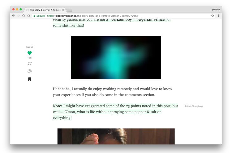
Blurred version of the image loading…
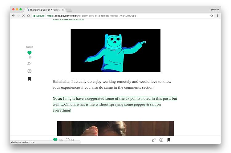
Image downloaded and fully loaded on the page
Codepen Demo here:
Did We Mention SVG?
José Manuel Pérez, who inspired this article, developed a newer, more experimental placeholder technique. He runs an edge detection algorithm on the images (with Canny edge detector) that creates a stylized illustration of the image, which is then replaced by the actual image once it loads.
The illustrations are animated SVG files, so they load very quickly. Here’s a live demo, and here’s the official tutorial on Github.
There are still some potential drawbacks of using placeholders. Simply put, if the JavaScript meant to load in the image when it’s ready and breaks for any reason, the user might get stuck with a very blurred version of the image (or whatever placeholder you’re using). When Medium.com first started using their placeholder method, they got a lot of complaints about just that.
Putting It All Together
In the end, images are bandwidth, and bandwidth is money. You need to decide whether you want to, or have to, use a photo in the first place. If you do, select the right format for your project. Optimize your images as much as you can. Then decide how much you can rely on JavaScript.
Lazy loading and placeholder solutions both tend to rely quite a bit on JavaScript, and if that breaks, so does your site. JavaScript can, of course, break for any number of reasons, including slow connections, slow devices, outdated software and other factors. That’s why you need to know your user base, and make your decisions accordingly, while implementing fallbacks.
If you load your well-optimized images lazily and progressively, your site will feel faster, and your users will love you for it, even if they’re not quite sure why.
Author’s Note: This article is inspired by the work of José Manuel Pérez. A lot of the information presented here appeared, in one form or another, in a talk Perez gave at Render 2017 in Oxford, England. If this article inspires you, check out his original talk.
Related Topics
Top