Illustrations in web design never fall off the radar. Creatives love to play with various genres of them. They even manage to set new trends every now and then.
Only recently, we discussed human illustrations that give a “warm” personal touch to projects. Today we have run into isometric illustrations that lay claim to the title of being the “new black” these days. Indeed, it is a small, promising trend that pleases an eye with its artistic, geometry-inspired nature.
Isometry is an excellent tool for transforming a flat composition into its 3D equivalent. While the community is not ready to go back to everything skeuomorphic, it is one of the ways to both add dimension and stay within the general mainstream. The more so, the art of a 30-degree angle has a certain charm that is quite difficult to resist. Such works always look neat and clean. They are rich in details appeal to the audience effortlessly.
Sound interesting? Just take a look at these attention-grabbing examples…
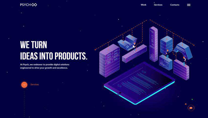
Psych X86
In essence, it is a regular solution. The welcome section is split into two. The left side embraces the tagline, introduction, and a call-to-action button. Whereas, the right side includes an illustration. We have seen this a million times. However, the isometry gives the section a certain spice, setting it apart.
Not only does it serve all the standard purposes such as supporting the headline, or enriching the design, but it also portrays the agency’s sphere of expertise. Thanks to a 30-degree angle, the team has an opportunity to show the devices in all their beauty and create a composition that says it all. It also perfectly blends into the tech atmosphere of the website, making its vital contribution.
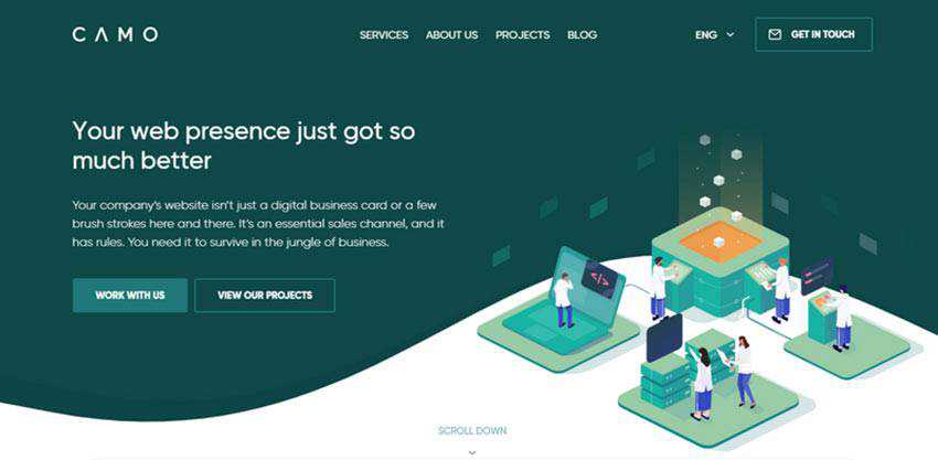
CAMO
CAMO is another point in case that will charm you with its marvelous, businesslike appeal and tech vibe.
The 3D illustration goes well with the overall theme. Pastel coloring, smooth shapes, vigilantly crafted human characters: everything is polished. The team has done an outstanding job. Much like in the previous example, it depicts the agency’s sphere of expertise, showing it in a fanciful manner.
And that’s not all. To make this illustration even more impressive and attention-grabbing, it was partially set in motion. There is a lot of activity down here, yet everything is unobtrusive. The solution certainly inspires trust and confidence in the company.
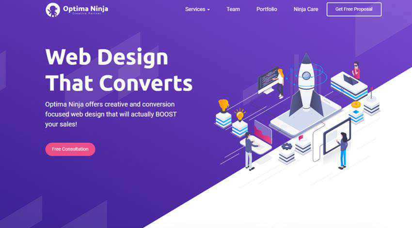
Optima Ninja
The team behind Optima Ninja skillfully combines two trendy features: human characters and an isometric approach, bringing about spectacular scenery. Although the artwork is not dynamic, it clearly states the philosophy of the project.
What’s more, it is not alone in its struggle to enrich the overall experience and lure users in. There is a whole range of illustrations that share a common thread. Vigilantly scattered throughout the entire landing page, they make the web project feel fancy, playful, personal and closer to the online audience.
Code Crew
Much like Optima Ninja, the creatives of Code Crew get the most out of isometric illustrations. They do so by using them to support inner sections that, as a rule, always stay overlooked.
Each piece of art gets everything right. Coloring, positioning, objects, and characters – together they create a true symbiosis, delivering the right message. The hero section also has a powerful charisma of isometry. Yet with small exception, instead of vector drawings there are real screenshots of websites and applications from the portfolio that are presented at a favorable angle. This makes an exploration of website coherent on various levels.

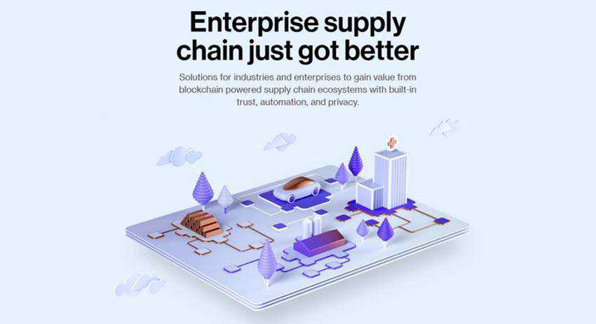
Chronicled
Chronicled sets itself apart from the previously mentioned examples thanks to the digital renderings that populate the website. They are made in the same style to reinforce the consistency of the user experience.
While the previous illustrations look vector-like and authentic, these ones certainly feel incredibly computerized and artificial. They may lose a bit to their highly-detailed rivals, yet they are just ideal for a platform that concerns blockchain ecosystems. Looking pretty much neutral, these 3D compositions not just enhance the interface but also make things clear to the audience.
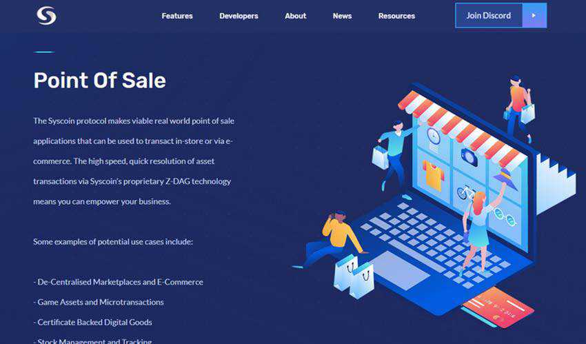
Syscoin Platform
Syscoin Platform is another website in our collection that comes from the crypto world. Befitting of the subject, the team behind it uses lots of visual material to educate regular users and clarify some complex concepts. Every piece is to the point. The creative use of human characters go beyond just telling a story, making the project look familiar and friendly.
Laszczuk
The creative team behind Laszczuk has built the entire aesthetic on the basis of isometry. Using it as the primary tool for enriching the background, the creatives have crafted focal points that unobtrusively guide visitors from top to bottom.
They have also added flat rectilinear figures with four sides to complete the entourage. Also, note the style of illustrations: grunge textures are mixed with rough gradients to add a lot of character.

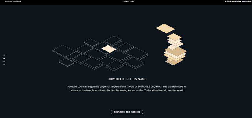
Codex Atlanticus
Codex Atlanticus goes for a classic appeal that sets the stage pretty efficiently. The website has a clean, dark background with a traditional white text on the fore. Nevertheless, it does not feel boring. The key of its appealing appearance lies in several animations, where isometric illustrations take up a central role. The website tells a story using primitive 3D scenes that appeal to the audience, thanks to their simplicity and clarity.
The View from a Different Angle
Among style choices, isometric is one of those that skillfully combines simplicity and intricacy. On the one hand, the approach is primitive and straightforward since you do not have to play with shadows, light, and gradients to give the design a 3D feel. On the other hand, it is sophisticated as it lets you show many sides of the composition, giving you space for experiments. This unique combination is what makes it so special.
As for the practical side, the approach is also universal and versatile. Even though isometry has a natural techno vibe, it easily collaborates with absolutely different projects. Whether you create a corporate website for a law firm (like in the case of Laszczuk) or a website of an agency that offers crypto services (such as Syscoin Platform), it will serve its duty well.
What’s more, it requires artists to handle geometric principles such as orthographic projections, thereby forcing both sides of the brain to work. This can lead to spectacular results – our collection is proof of that.
Related Topics
Top