The way we use color seems to change so much these days. Only several months ago we were discussing the vibrant color schemes that were seen in many details of the interface, starting with gradient-based overlapping layers for hero areas and ending with bright, bold call-to-action buttons scattered throughout the page.
Today, we have seen a small shift towards monochrome solutions. Though they are not as monotonous as you may think, they feel a bit different. They are more mature and intricate in comparison to those that we are accustomed to seeing.
Let’s take a look at some exciting examples of this technique in the wild.
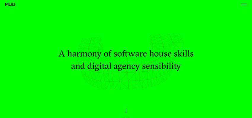
MUG
MUG has a minimal hero area. It features only the important stuff – such as a menu, logotype and tagline. However, it is not primitive at all. There is a large animated letter “U” that is supposed to remind of a mug placed in the background, to give a zest to the design.
And there is that pure, clean, almost neon-green canvas. It is just gorgeous. It grabs the eye instantly, producing quite an impression. It makes the entire design pop without overwhelming readers. It looks modern. And most importantly, it goes perfectly well with the overall design. It supports the animation, reinforcing its influence. And, at the same time, gives way to the tiniest details – like the hamburger menu icon. It also promotes a sense of harmony and balance.
Here, the single-tone background is an integral part of the design that has a say. Therefore, the monochrome hero area looks pretty interesting and engaging.
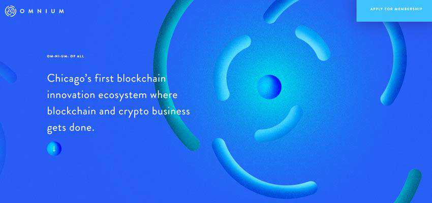
Omnium Blockchain
Much like the previous example, the team behind Omnium Blockchain has also set their eyes on one tone, and it is blue. The choice is not accidental. Everyone knows that blue is widely associated with reliability, responsibility, and authority. It fits like a glove, exuding vibes of a business-like appeal. It tries to inspire trust and win over clients in a pretty controversial area.
The monochrome solution holds the theme together and does not let people get distracted. It makes an essential contribution to the project’s overall image and general impression.
Creative Canopy
There is another blue in our collection, yet this time the situation is more complicated and intricate. Creative Canopy is an excellent example where the monochrome solution lies at the heart of the website’s beauty.
Unlike the previous primers, it does not feature just a clean canvas with casually placed UI elements: It is a fully illustrated piece. There are different shades of blue that are used to give the picture depth and diversity. It does not feel boring at all. It drums up interest thanks to a smart idea and fantastic realization. What’s more, this approach is seen through the entire homepage – creating a consistency of user experience.

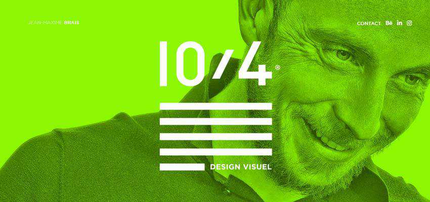
Dix4 Agency
Monochrome solutions stay in the lead when it comes to using overlapping layers. Consider Dix4 Agency as a vivid example. Here, the hero area is enriched with an extra colorful layer that sets the design off with its unique flavor.
There is a whole range of colorful layers that change every second to make things even more exciting. It is a monochrome area with a twist that is a central part of the overall theme. This approach can be seen in other areas as well, bringing positive emotions everywhere.
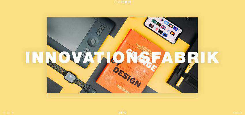
ONEFOUR
The team that stands behind the design of ONEFOUR takes the same route. Much like in the case of Dix4 Agency, the creatives do not stick to just one tone. They use various shades to engage visitors with the ever-changing background.
From yellow to blue, the canvas excites onlookers with beautiful colors. The trick works great here, since the hero area is scarce in details and overpopulated with fresh air. It certainly requires some spice to live up to its name, and the solution saves the day without ruining the whole beauty of its minimalism.
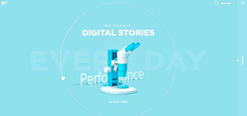
MST Agency
The team behind MST Agency does not use only a monotone layer or background, they employ it on the entire scene to impress visitors. The welcome section of their website meets the audience with a traditional slider. Each slide is a composition where one tone rules the roost.
All the details of the scene blindly obey it. The idea is interesting. You can see a certain compositional harmony. The line between looking boring and looking fantastic is so thin that it inspires.
Three59
Three59 uses a beautiful dark grey as a part of its play. It is an integral part of the composition that sets the mood of the website. It helps the interface to feel businesslike and authoritative. And since the project is packed with dynamic details to make the user experience exciting, a strong monochrome background like this is just an ideal partner.
It sets the stage for the foreground elements, adds a little spunk to the project and balances all the interactive details.
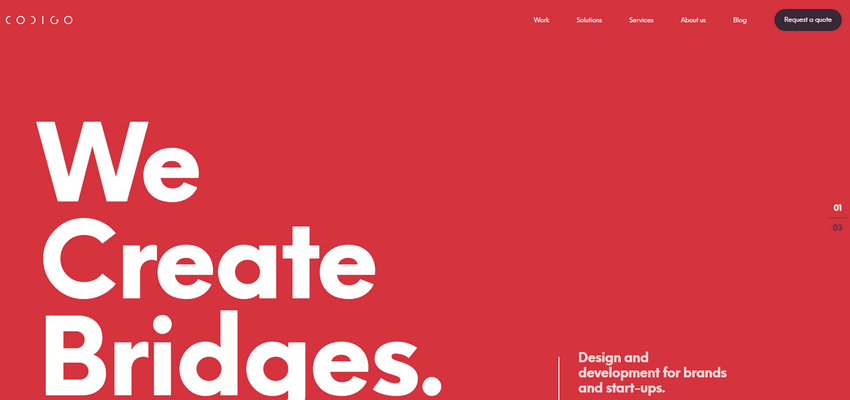
Codigo
Codigo is a classic example of this technique. It features just a clean monochrome surface that serves as a solid foundation for the foreground elements. It gives way to the tagline and navigation.
There are a few things to note here. First of all, the color choice favorably highlights the tagline, making it a focal point as well as strengthens readability all over the place. Secondly, it benefits the aesthetics. It is not just a primitive red; it looks stylish. You can almost feel its bold personality. And finally, it is a part of the brand identity that stands by itself without any need for support.
Making the Most out of a Single Color
Coloring always lives its own life. It never sticks to the rules established by Pantone – at least in the web design sphere. It has its own trends and favorite solutions. It has a fickle nature. One day everyone is up to bright and garish gradients; another day everyone is obsessed with modest and monochrome concepts. But one thing is sure, everyone pursues beauty and harmony.
The monochrome hero areas have their charm. Even though they can’t boast of bright “makeup,” opting in favor of just one color is enough to create an outstanding design with marvellous aesthetics that will impress visitors.
Of course, there is a pitfall. Monochrome solutions can be boring. It is here where you need to practice your wit and creativity to use just one color and with all of that stay fun and appealing. We hope that the above examples show you how to do this in practice.
Related Topics
Top