The dialog window is one of the most commonly used elements in a website’s user interface design. It is used for multiple purposes, including displaying notifications, carrying a subscription form, alerting of errors/warnings, and drawing a visitor’s attention to vital pieces of information. When dialog windows are designed effectively and used right, they can ease the user’s task.
Previously, creating a dialog window required that you to use a jQuery plugin like Pop Easy, jQuery UI Dialog, or Twitter Bootstrap Modal. But now with the introduction of HTML5’s new <dialog> element, it has become much easier for developers to create popup dialogs and modals on a web page.
Initially, the <dialog> tag entered the HTML5 spec as a great solution for marking up conversations, but it was dropped from the HTML5 specification back in 2009. Nonetheless, it’s back again in a new form.
In this post, I’ll take you through the <dialog> element and show how you can make the most of it. Let’s begin!
If you want to see the <dialog> element in action or play around with the code, view the live demo here.
Browser Support for the <dialog> Element
Unfortunately, browser support for <dialog> is limited for now. The element is currently only supported in Safari 6.0 and Chrome Canary. Even though Chrome Canary fully supports the tag, you must enable a flag to use it. Go to chrome://flags and enable the flag “Enable experimental Web Platform features”.

After enabling the flag, you must re-launch the browser fot the changes to take effect.
The HTMLDialogElement Interface
The HTMLDialogElement interface, which is included in the HTML specifications for the <dialog> element, has numerous properties and methods that you can use to make your dialogs appear and disappear. They are as follows:
Methods:
The HTMLDialogElement interface has three methods for opening and closing dialogs.
show(): This method is used to show a dialog. Users can still access other contents of the HTML document as long as a dialog box is open.showModal(): Used to launch a “modal dialog”, which prevents a user from accessing anything except the dialog window on a web page.close(): Used to close a dialog. You can passreturnValueas an optional parameter that will update the propertyreturnValue.
Properties:
There are two properties included in the HTMLDialogElement interface.
returnValue: Retrieves the parameter that was optionally passed intoclose().open: This property is a Boolean value. Iftrue, the dialog will be visible to the user. Otherwise, it’ll be hidden.
Events:
When a dialog is closed, a close event will be fired.
dialog.addEventListener('close', function() {
Other code will go here…
});
Apart from these key methods and properties, the <dialog> element also supports:
form[method="dialog"]: Used to integrate a form with a<dialog>. Only valid inside a dialog.autofocus attribute: Used to give focus to a form control inside a dialog.cancel event: Acancelevent is fired when a modal dialog is closed via “Esc”
Now after understanding the basics of the <dialog> element, let’s get practical with some examples.
Creating a Dialog
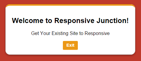
Firstly I’m going to show you how to create a simple dialog. The code given below defines a simple <dialog> element with some content, a close button to hide the dialog, and a show button to launch the dialog.
<dialog id="Dialog">
<h2>Welcome to Responsive Junction!</h2>
<p>Get Your Existing Site to Responsive</p>
<button id="closeDialog">Exit</button>
</dialog>
<button id="showDialog">Show Dialog</button>
When you test the above code in your browser, you’ll see nothing except the “Show Dialog” button without any functionality, as shown in the screenshot given below:

To open and close the <dialog> element, you need to use the JavaScript .show() and .close().
(function() {
    var dialog = document.getElementById('Dialog');
document.getElementById('showDialog').onclick = function() {
dialog.show();
};
document.getElementById('closeDialog').onclick = function() {
dialog.close();
};
})();
Now if you click the “Show Dialog” button, you can see the dialog window in the browser. Clicking “Exit” will close the dialog window. Here is the screenshot:

Adding Style to Dialog
You can add CSS styles to your dialog just as you would do to any other element. By default, the dialog window will be displayed horizontally centered while overlaying other elements. If you’re comfortable with the default position and look, no further CSS is required. Otherwise you can add you own CSS to fit and design the dialog window to your taste, like I’ve done below:
dialog {
top: 28%;
width: 400px;
border: 1px solid rgba(0, 0, 0, 0.3);
border-radius: 15px;
box-shadow: 0 3px 7px rgba(0, 0, 0, 0.3);
border-top: 5px solid #eb9816;
}
button{
display: inline-block;
border-radius: 3px;
border: none;
font-size: 0.9rem;
padding: 0.4rem 0.8em;
background: #eb9816;
border-bottom: 1px solid #f1b75c;
color: white;
font-weight: bold;
margin: 0 0.25rem;
text-align: center;
}
button:hover, button:focus {
opacity: 0.92;
cursor: pointer;
}
Creating a Modal Dialog
If you want to prevent your users from accessing the content of your HTML, you can make use of modal dialog windows. As the modal dialog window grays out all other things other than the dialog will be displayed, users will be unable to select the grayed-out text or click to select buttons while the dialog window is open.
Creating modals is similar to creating dialogs, with the only difference of using the .showModal() instead of .show(). There is no need to make any changes in the HTML code.
(function() {
    var dialog = document.getElementById('Dialog');
document.getElementById('showDialog').onclick = function() {
dialog. showModal();
};
document.getElementById('closeDialog').onclick = function() {
dialog.close();
};
})();
While default dialogs are displayed horizontally centered, modal dialogs are displayed vertically as well as horizontally centered in the viewport. Also, you can close a modal dialog by pressing the “Escape” key.

Adding Modal Dialog Background Color
The <dialog> element features a pseudo-element called "::backdrop", which only works with Modal Dialogs. Using this element, you can dim the main page in order to communicate to users that it’s not accessible. You can position and style a backdrop by taking advantage of standard CSS properties:
dialog::backdrop{
position: fixed;
top: 0;
left: 0;
right: 0;
bottom: 0;
background-color: rgba(0, 0, 0, 0.7);
}

Implementing <dialog> with a Form
A form can be integrated with a <dialog> element by using form method="dialog". Upon form submission, the dialog window will close and return the value of the submit button via the dialog.returnValue property.
Here is the HTML code for the form dialog:
<dialog id="formDialog">
<form method="dialog">
<p>Do you agree with terms of use?</p>
<textarea>
Enter your text here!
</textarea>
<button id="submit" value="yes">Yes</button>
<button id="submit" value="no">No</button>
</form>
</dialog>
<button id="showformDialog">Open Form Dialog</button>
Use the following JavaScript for the form dialog.
var formDialog = document.getElementById('formDialog');
document.getElementById('showformDialog').onclick = function() {
formDialog.showModal();
};
document.getElementById('submit').onclick = function() {
formDialog.close(value);
};
document.getElementById('formDialog').addEventListener('close', function() {
alert(formDialog.returnValue);
});
Note: For better understanding, I’m using formDialog in place of Dialog in my demo.
If you want to see the <dialog> element in action or play around with the code, view the live demo here.
Conclusion
With the reincarnation of the <dialog> element, it has become much easier for developers to create dialogs without using a jQuery plugin. Even though Chrome Canary and Safari 6.0 interpret the <dialog> element properly, there is a polyfill available to make sure that other browsers will support the element.
Related Topics
Top