What guides you when it comes to choosing a color scheme for your project? I bet you have some arguments and principles. For instance, we are all aware of the fact that every color has its personality and psychological undertone – making it responsible for evoking specific emotions.
For example, blue inspires trust and is widely associated with a business. That’s why numerous companies and agencies choose it as a primary one. Red ignites appetite – that’s why the majority of food and beverage industry goliaths use it in their logotypes. Green is used for everything natural and environmentally-friendly, and so on. Like it or not, color influences our subconsciousness. It is a vital point to consider.
Also, do not let us forget about such important things as user experience, brand identity, and Pantone. When it comes to UX, coloring plays a crucial role in achieving optimal readability level. From the brand identity point of view, the general image of your company in the real world certainly impacts its online presence. And as for Pantone and their “Color of the Year,” to be honest, this nomination hardly influences the world of web and mobile interfaces. Nevertheless, sometimes it can be truly beneficial to follow the mainstream and create something that is considered to be trendy (at least this year).
Cut to the chase: There are many points to consider before finally settling upon a color palette. As a rule, the majority of teams out there are guided by common sense and do not dare to experiment with the coloring. Instead they opt in favor of some oldie but goodies like neutral palettes, black and white, blue buttons as CTAs, etc.
Today, we are going to examine a dozen websites that are enriched with sunrise-inspired coloring. Why sunrise? First and foremost, it is unique and uncommon. Secondly, sunrise is the beginning of a new day. For some it can be a fresh start; for others, it can be a continuation. And finally, it includes the whole gamut of tones and hues starting from light-hearted pale pink and ending with troubled dark blue.
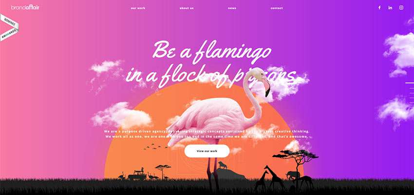
Brandaffair
We are going to start with Brandaffair, which thanks to its splendid horizontal gradient, catches an eye from the get-go. The aura here is utterly mesmerizing. Not only does the sunrise-inspired gradient go well with the design, but it also enhances the slogan and strengthens the entire impression.
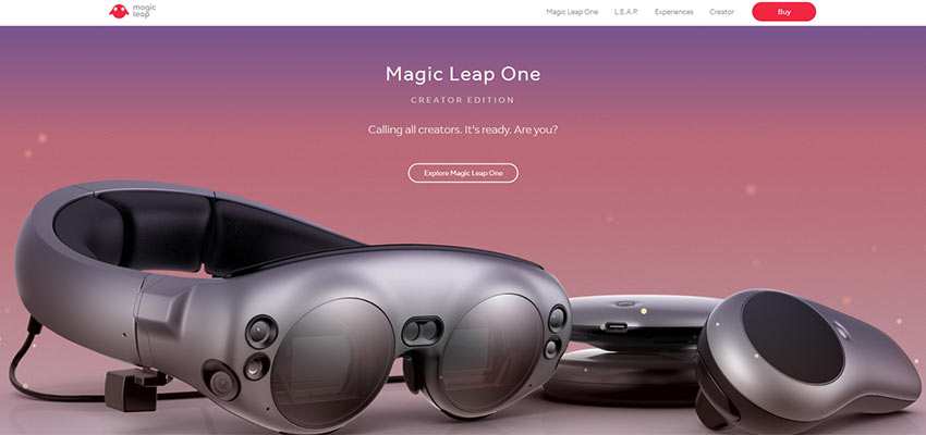
Magic Leap
The vertical gradient in Magic Leap’s front page is not as radiant and cheerful as in the previous example. Yet, it feels more natural and lifelike. It oozes creativity and a bit magic – precisely what is needed for supporting the title that states “Magic Leap One.”
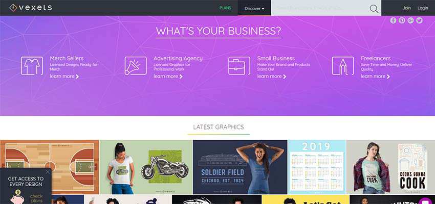
Vexels
Vexels masters the traditional realization of a horizontal gradient that starts with blue and ends with fuschia. We saw a lot of this several years ago. Surprisingly, these days it does not look outdated nor tasteless. Indeed, it is like a breath of fresh air that ideally complements the overall light aesthetics. It adds charm and zest to the experience.
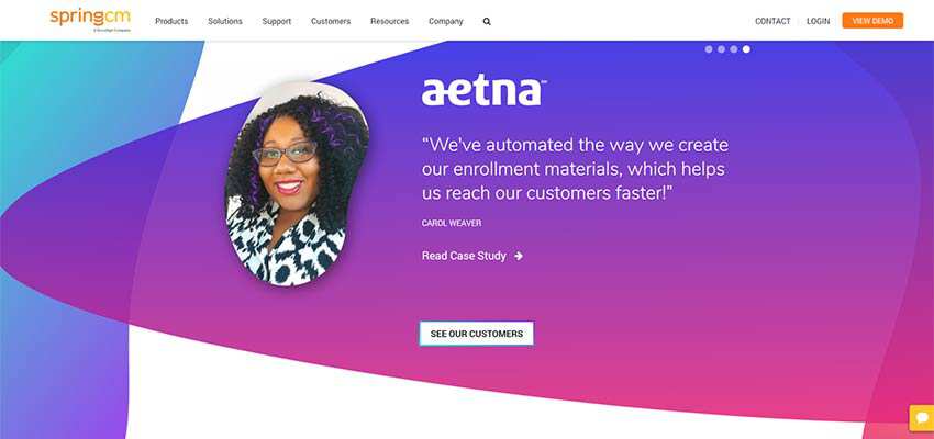
SpringCM
Much like the previous example, SpringCM also utilizes the sunrise-inspired gradient as a background for a section. Yet with some little tricks that imply semi-transparent overlay areas. They save the solution from feeling banal.
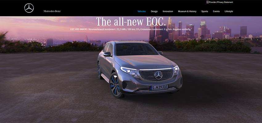
Mercedes-Benz EQC
The official website of Mercedes-Benz EQC is marked by a beautiful natural gradient. The homepage depicts a splendid picture backdrop taken at the break of dawn. Colors are simply magnificent.
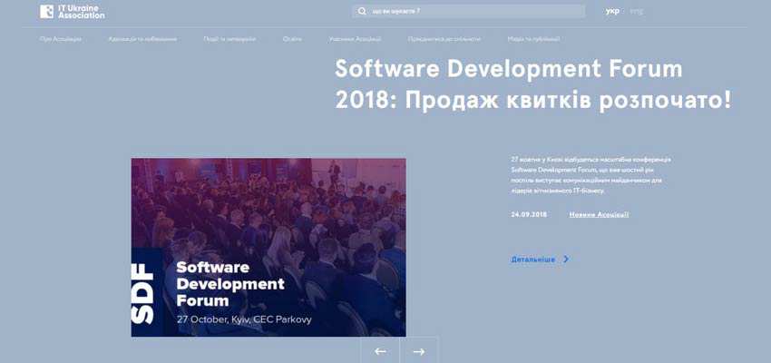
IT Ukraine Association
The website of IT Ukraine Association adopts a classic way of using a sun-kissed gradient. It is applied as a semi-transparent overlay screen above the image. On the one hand, it gives the title a solid backdrop – making the lettering more prominent. On the other hand, it skillfully separates the image from the context.
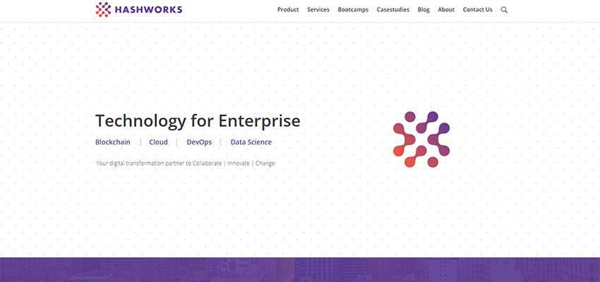
Hashworks
Hashworks is conservative with its coloring. While the white is used as a primary tone, blue and magenta were not even secondary here. They are used mostly as accents that help to set focal points – unobtrusively drawing visitors’ attention towards essential things like the logo.
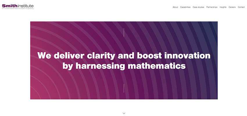
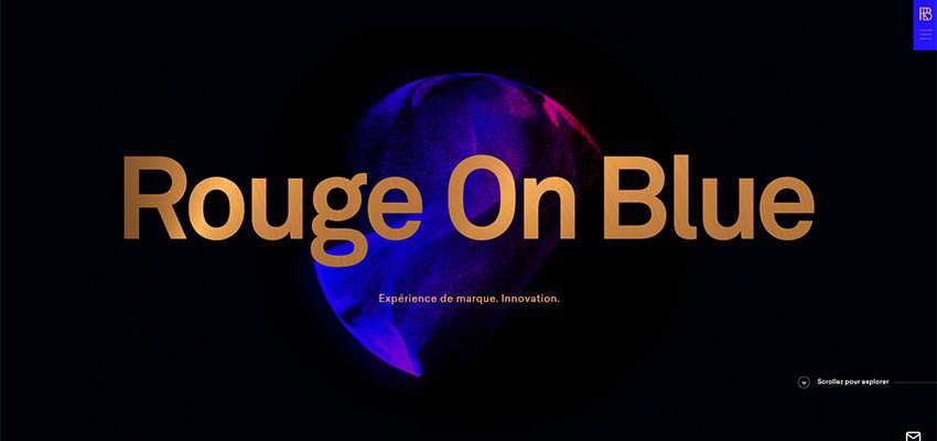
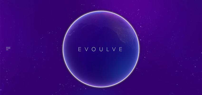
Smith Institute / Rouge on Blue / Evoulve
Smith Institute’s hero area leverages a sunrise-inspired gradient to strengthen the high-tech vibe of the project. The teams behind Rouge on Blue and Evoulve follow the same route. They also combine gradient and cutting-edge 3D solutions, coming up with an interesting effect.
Thus, the team behind Rouge on Blue is up to creating an innovative atmosphere. The home screen of their website greets visitors with a fantastic particles-based sphere that is always in motion. There is no evident gradient. However, thanks to dispersion of the particles, it feels like the line between two tones wears off.
At the heart of Evoulve lies an interactive globe. While it rotates around its axis the coloring changes from pale blue to soft fuschia. The feeling is pretty much innovative and techy.
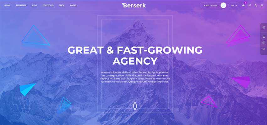
Berserk / PAO
The trend has also extended to the creators of WordPress themes. Let’s take a look at PAO and Creative Agency Berserk. Both products get their beauty from the sun-kissed color palette, though they go for some different tones.
The Berserk theme by NikaDevs uses a bit of a cold sunrise-inspired scheme that can be seen mostly in winter. Nevertheless, the choice plays into their hands since the product looks businesslike with a touch of creativity.
The PAO Studio’s theme, on the contrary, opts in favor of some bright and frisky tones, resulting in an innovative and energetic feel. It grabs the attention right away.
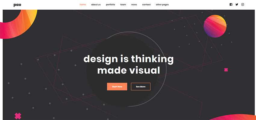
Although these are just theme demos, the well-thought-out coloring chosen for presentation is one of the factors that can help to win over customers. In both cases, the palette assists in separating themes from the competition and bringing about the proper gamut of emotions.
A Color Concept with Great Flexibility
Sunrise-inspired coloring is a multipurpose tool. It can evoke various emotions. Whether you need to establish a joyful and cheerful atmosphere like in the case of Brandaffair, high-tech ambiance like in the case of Evoulve or businesslike air like in the case of Berserk. Each one lets the design stand out from the crowd and grab the attention of users.
Related Topics
Top