It is a common practice to mix and match typefaces in order to find the perfect pair for a website. As a rule, designers choose one font for the header and another one for body text. The first one is fancy and bold in order to make the titles attention-grabbing. Whereas, the second one is often simple to make the text easily readable.
There are even popular options and trendsetters here. This stage of website design sits well with the creative crowd, although sometimes it requires a refreshing and renovation to keep moving forward. And most recently it has gotten a shot in the arm.
The combination of hollow and solid lettering is a brand-new trend in web design typography.
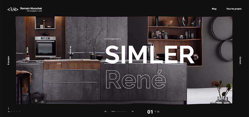
Romain Murschel
The personal portfolio of Romain Murschel is a perfect example of this little mainstream idea that tries to compete with big old players in the arena.
Here the hollow and solid styles are used to highlight the names of each project presented in the slider. This trick catches an eye with its originality and intricate beauty. And it also goes perfectly well with the ultra-modern design of the website, along with some innovative features, such as the liquid-like behavior of the canvas.
What’s more, note that the title is relatively large, but it does not overwhelm nor overpower visitors. Neither does it distract attention from the beautiful image in the background; it just sits pretty and does its job quite well.
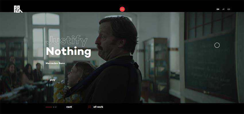
Production Portugal
Production Portugal is another excellent example. Here, the hero area is marked by a fantastic video background, and the slogan of the campaign is presented as two words. “Nothing” strikes you from the first moment, and then “Justify” joins the impact – resulting in a favorable outcome.
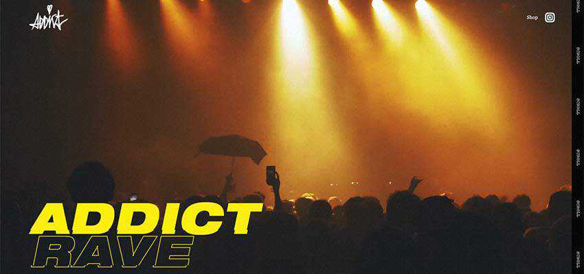
Addict Rave
Much like the previous example, Addict Rave also features a video background. To stand in contrast, the title was not only set in a large size, but also divided into two vivid parts using solid and hollow stylistic choices. “Addict” is an obvious star here, whereas “rave” is a perfect addition.
Coveo Music
The trend has a sound foundation for thriving. It has some good real-life applications. First and foremost, this combination can be used to place emphasis on the selected word – like in the case of Coveo Music.
Here we can see an intricate take on a slider. A list with names of works is first to greet us. When you hover over the title, an image shows up, and the title changes its state from solid black to hollow, signaling that it is the current selection. Neat and smart.

Tilt Story
As you may have guessed, the solid and hollow stylistic options used together can quickly liven up a single word. It provides a larger visual weight and slightly dims another one by making it visually lighter. However, the hollow shape still catches an eye because of its elegant and sophisticated look.
Consider Tilt Story. The team behind the project uses this trick to do just that. They highlight the name of the work and still dress the nameplate of the agency into something fancy and voguish. The first thing that you read here is “Biting back”, but still the upside down “Tilt” is the second thing that strikes an eye.

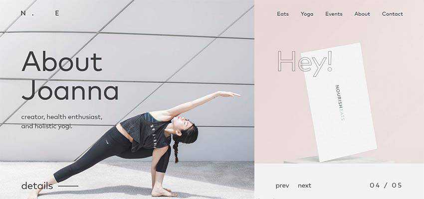
NourishEats
The second reason for this trend to thrive lies in its ability to naturally place accents and set up complementary elements without going the extra mile.
Consider NourishEats. The front page greets the audience with an asymmetrical split screen, where the left side has a priority over the right. We can see it thanks to several things. Obviously, the size of the section indicates that. What’s more, the style of the lettering also clears this up. “About Joanna” looks more solid and bold than fragile and airy “Hey”.
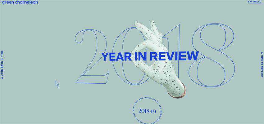
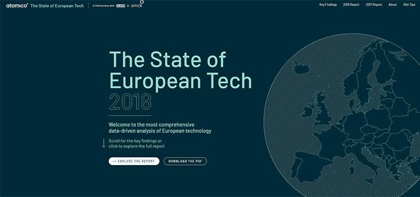
Year in Review by Green Chameleon / The State of European Tech
Year in Review by Green Chameleon and The State of European Tech employ the same tactics. Both websites feature solid lettering to display the name of the project and hollow lettering to indicate the year.
While in the first example the year is placed in the background, in the second example it is an integral part of the text block. In both cases, they look relatively prominent, serving as perfect additional elements.
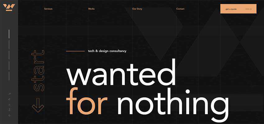
Wanted for Nothing
In the case of Wanted for Nothing, you stumble upon a solid title that mutes other items on the screen. However, thanks to the hollow appearance of the word “start”, it naturally occupies its proper place in the composition, stirring users into action.
Dolly – Agency / Vincent Saisset / Betamatters
And finally, this trend is a great way to make the typography look decorative and the message speak louder. Consider Dolly – Agency, Vincent Saisset, and Betamatters.
The creative team that stands behind the design of Dolly Agency plays with the trend within one word, instead of two. As a result, we can see an interesting take that makes the title perfectly blend into the environment and, at the same time, make a statement. It is a mixture of the bold and robust “start” and delicate and elegant “end” that easily wins attention.

The website of Vincent Saisset employs this solution to save the portfolio section from being banal. Here the regular list of titles not only presents artworks, but also plays a decorative role – adding to the overall artistic atmosphere.

Betamatters has a visually-massive hero area, nevertheless this does not stop the nameplate and welcome message from standing out. This is another fantastic tandem of hollow and solid typography in action.
Note the digitally-inspired entourage with lots of wires and cylinders. The name of the company is hollow and dimensional – it fits here like a glove. The welcome message is set in solid typeface and also goes well with the composition. It naturally stands out from the crowd.

An Effective Combination
We are accustomed to seeing a combination of type families in hero sections that are used to dish up the header and the welcoming block in an inviting way. Today, we can witness some changes in this practice.
These changes are not something brand new, but they are clever and smart. Mixing hollow and solid styles for typography is so simple and elegant that users accept it effortlessly. This small solution has given the time-proven everyday practice a facelift.
This technique makes things interesting in an unobtrusive way and, at the same, time skillfully highlights essential details. It also has some real-life applications. So, in the right hands it can be turned into something both incredible and practical.
Top