Both a website’s header and footer play an important role in the overall user experience. Each one provides an opportunity to establish branding and offer up a large dose of utility.
Headers have long been the focus of designers, as it’s the first thing a user will see upon visiting a site. We often use it as the main source of site navigation, but it can do more. A well-thought-out header could prove to be even more useful with features like search, ecommerce functionality and accessibility options.
The footer sometimes gets ignored, being relegated to display a copyright and perhaps a few links. This is a great waste of potential – especially for content-heavy websites. While we sometimes see a footer that is more or less a rehashed copy of the header, there are other area-appropriate items that we may be missing.
Today, we’ll take a look at some header and footer layouts that can serve as an inspiration. They make great use of their space and offer users a great deal of value.
Headers
Kicklox
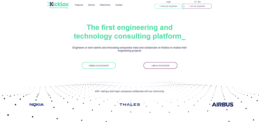
The folks behind Kicklox did a fantastic job in developing a header that is easy to use and quite useful. Their potential users are a bit unique in that they might be engineers or those in need of hiring one. What’s nice here is that they’ve actually provided users with an option for choosing which category they belong to. It’s a prime example of how we can add utility that’s specific to a site’s purpose.
Undeveloped
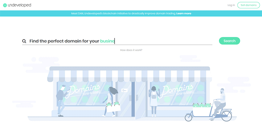
Undeveloped has an incredibly minimal and sparse header – and it makes perfect sense. They’re in the domain business and their goal is to get you to either buy or sell domain names. Their header focuses solely on this goal, without any extra clutter.
BucketListly Blog
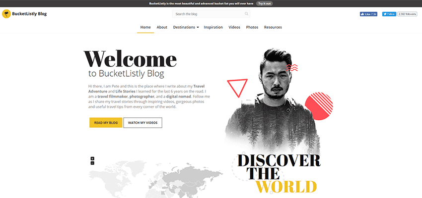
One of my pet peeves about headers is that we often try to jam so much information into a relatively small space – even on large screens. Here, the BucketListly Blog makes great use of the available real estate, stretching the full width of an HD screen. The navigation is incredibly simple and easy to spot, while the subtly designed search field above it isn’t trying to take attention away from more important things.
Fabienne Delvigne
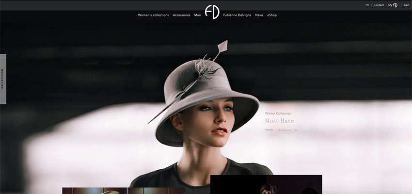
Fabienne Delvigne’s header is attractive, compact and has everything users need. The design blends in perfectly with the content below – adding a cohesiveness that I’ve rarely seen. Plus, the more utilitarian choices on the upper right are noticeable, but not intrusive. Also worth noting is that the header folds up quite nicely into a “sticky” version upon scrolling down the page.
The New England Journal of Medicine
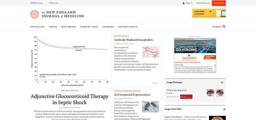
When designing a website for an organization like The New England Journal of Medicine, there are so many needs to consider. Users not only have to be able to easily navigate through the various sections of content, but there’s also account management, subscriptions and other potential uses that require attention. In other words: The header has to do an awful lot. Something with this many needs could easily overwhelm users, but here it doesn’t. There’s great use of space and color to help guide users through the site’s many possible choices.
Weboo

It’s not often that we see a footer being used as the sole source of navigation. Weboo pulls this off quite well, with an easy-to-understand “step” method of getting from one page to the next. Even better is that you can either click or use your mouse’s scroll wheel to navigate.
Block Collider

This is not your typical footer. Sure, there’s your standard mailing list signup. But check out the craziness happening at the very bottom. Two large animated blocks linking to related sites add a little excitement. When was the last time you saw a footer do that?
Dorpstraat Stellenbosch
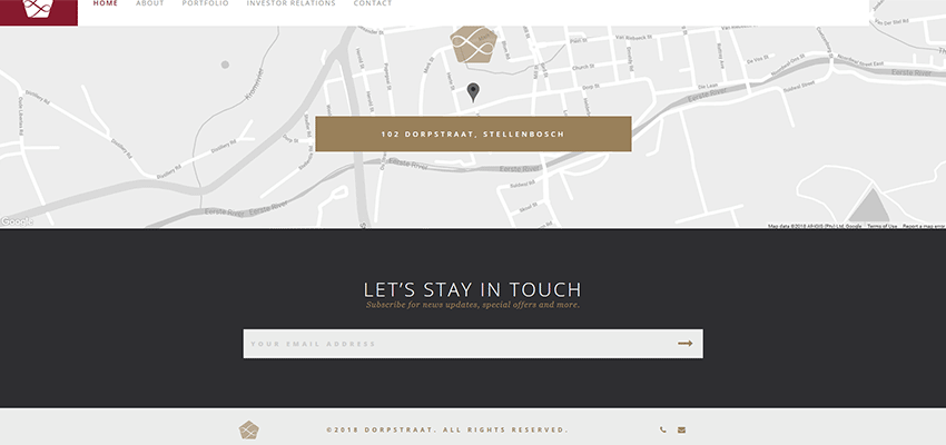
There’s nothing incredibly fancy about Dorpstraat Stellenbosch’s site footer. But again, we see a design that focuses on a particular action. They want you to sign up for their email list and aren’t shy about asking – but in a tasteful sort of way.
Orenda Security
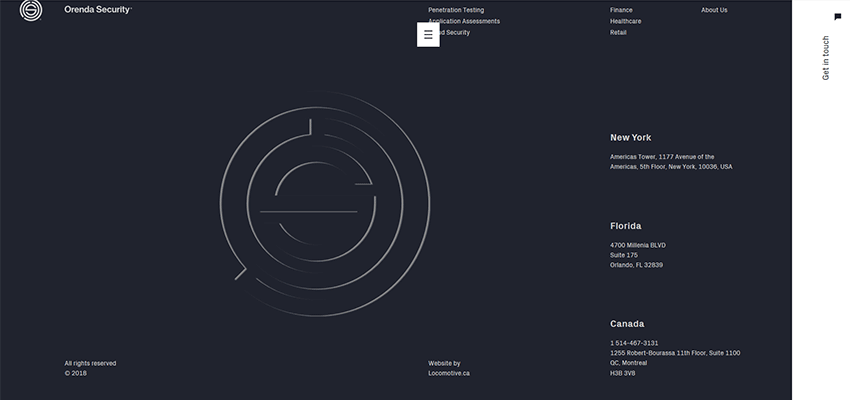
Here’s a case of using the site’s footer to accomplish just as much branding as you’d typically see in a header – only on a larger scale. Orenda Security features a large, animated logo, navigation and contact info in a full-screen view. That’s something unique that you might only attempt to do with a footer, and it works quite nicely.
Dedeman Hotels & Resorts International
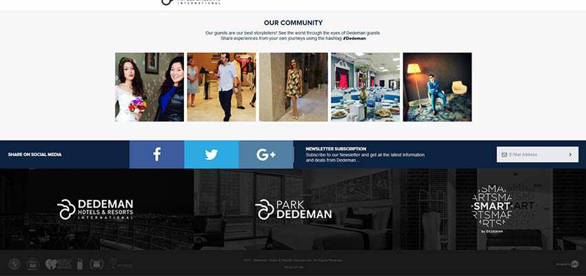
There’s an awful lot of utility to Dedeman’s footer area. Newsletter subscription form, social sharing and affiliated sites are all there and beautifully put together. So often, we try to make footer design elements tiny and almost unnoticeable – not so in this example. All the desired actions are big, colorful and easy to use.
The Top and Bottom of It
One of the most valuable lessons to be learned from the examples above is that it’s okay to create a header or footer that is unique to your brand. That doesn’t mean you necessarily shy away from some tried-and-true principles. But it does mean that we have some creative freedom to do things that both look good and are useful. May it inspire you to use your creativity to build something that gives users everything they need, but with your own personal touch.
Related Topics
Top