The classification of fonts is still unclear, even with the various classes and categories that have been created by some of great type lovers of the years. Some may consider categorizing fonts separately, others may think of it is a common division…
I honestly believe that this debate will go on forever. The classification is not what is the most important aspect, the way designers work with each individual and unique font should be.
The Structure of a Letter
Let’s start by having a look at the structure of a letter:
- Baseline is the imaginary line that is the base of all letters, they “sit” on it.
- Cap height is the imaginary line that is determined by the top edge of uppercase letters. It can have the same height with the ascender but it can also be different, depending on the font.
- Meanline is the horizontal line determined by the top extremities of the majority of lowercase letters as “a”,”c”, “e”, “x”.
- Descender is the part of the “g”, “j”, “p”, “q”, “y” letters that is situated bellow the baseline.
- Ascender is the opposite of descender. It is determined by the top of “b”, “d”, “f”, “h”, “k”, “l”, “t” lowercase.
We may all discuss the classification of serif fonts and sans serif. Unfortunately, not many know what the true distinctions are:
- Serif is the extra stroke of the letters. Sans serif, as you must have figured out, is the lack of those strokes; the characters have a prominent cut.
- “x” height is the height of a lowercase letter “x”. This might seem kind of unimportant at first glance, but it is used in CSS as a measuring unit (mostly because the lowercase letter “x” has no ascenders or descenders).

The Various Types of Fonts
Old Style or Garalde
This type of font was designed by the printers of the Renaissance and it takes up many Roman elements. Some specialists consider Old style to be a synonym of Garalde, other consider Garalde as being a category of Old style (together with Venetian). It is characterized by the low/moderate contrast between thick and thin strokes and the serifs are usually rounded. It is defined by excellent readability.
Some of the most used fonts in this category are: Garamond, Minion Pro, Palatino, Centaur & Bembo.

Transitional
As the name states it is a transition element between Old style and Modern fonts. This type of fonts can be recognized by its characteristics: the majuscules and the ascenders of the lower case are on the same line, breaks are oblique or horizontal, and the axis is slightly oblique or horizontal. Rounded serifs are more formal than Old Style, but less formal than Modern.
By far the most used font from this family is Times New Roman.

Modern or Didone
These fonts have very strong features: thin horizontal strokes but thick vertical ones, extreme contrast between strokes, serifs aren’t rounded and joined vertically. The Modern fonts have appeared in the eighteen century, the creators being the Didone group which was based in France and the Italian printer Giambattista Bodoni.
Some of the most important exponents of this kind of types are: Century, Bodoni, Didot & Bookman.

Slab Serif
The influence of the Modern style is powerful, but these fonts have other features that make them stand out. The serifs are square and larger; the same line weight and the serifs are usually perpendicular on rectangular ends. There are five different subcategories: Egyptienne, Clarendon, Italienne, Latin & Tuscan.
Some examples of slab serif are: Rockwell, Memphis, Figaro & Excelsior.

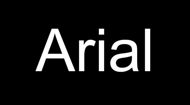
Sans Serif
This font was created at the beginning of the nineteen century, but it took almost a hundred years to gain the popularity it deserved. The main feature of the sans serif is the lack of any serif (in French “sans” means without). These fonts impress with their simplicity and large usability. It is considered as the most abstract form of the letter-alphabet.
The most important fonts are: Helvetica, Arial, Futura, Century Gothic & Gill Sans.
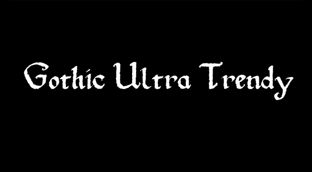
Gothic Scripts
These fonts look like they had been handwritten in the Europe of Gutenberg age and because of that it is very easy to determine their origin. Gothic Scripts are characterized by the elaborated and complicated shape of the letters and it is used mostly on diplomas, invitations and other formal occasions. It is highly recommended to use them only in lowercase and avoid uppercase. Other names for this category are Black Letter or Old English.
The most prominent fonts are: Cloister Black Lite, Black Forest & Linotext.
Handwritten
These are the fonts that look like they have been handwritten. They have a natural look and letters have a cursive, current aspect and are highly rounded. These fonts are not very legible.
Good examples are: Rage Italic & Cristopherhand.

Decorative or Novelty
Decorative fonts are easier to classify. They are the fonts that can’t be included within any of the above categories. The main purpose of such letters is to create a mood or to try to be original and this is the reason why they are rarely used in print or web content.

Dingbats or Ornamental Fonts
A cool idea was to replace the alpha numeric characters with symbols, drawings, pictures… and so ornamental fonts appeared. Dingbats usually have no real purpose, but are very useful and times visually beatiful.

Conclusion
I can’t say the classification I have outlined in this article is correct, only that it is based on my best judgment and experience; it is only a good opportunity to explore type and more importantly to establish the elements that make a small individual letter part of a family (of fonts). If you have a better classification, i would love to hear about it in the comments.
Related Topics
Top